CROUDOH
BRAND IDENTITY
BRAND STRATEGY
PACKAGING
COLLATERAL

STRATEGY
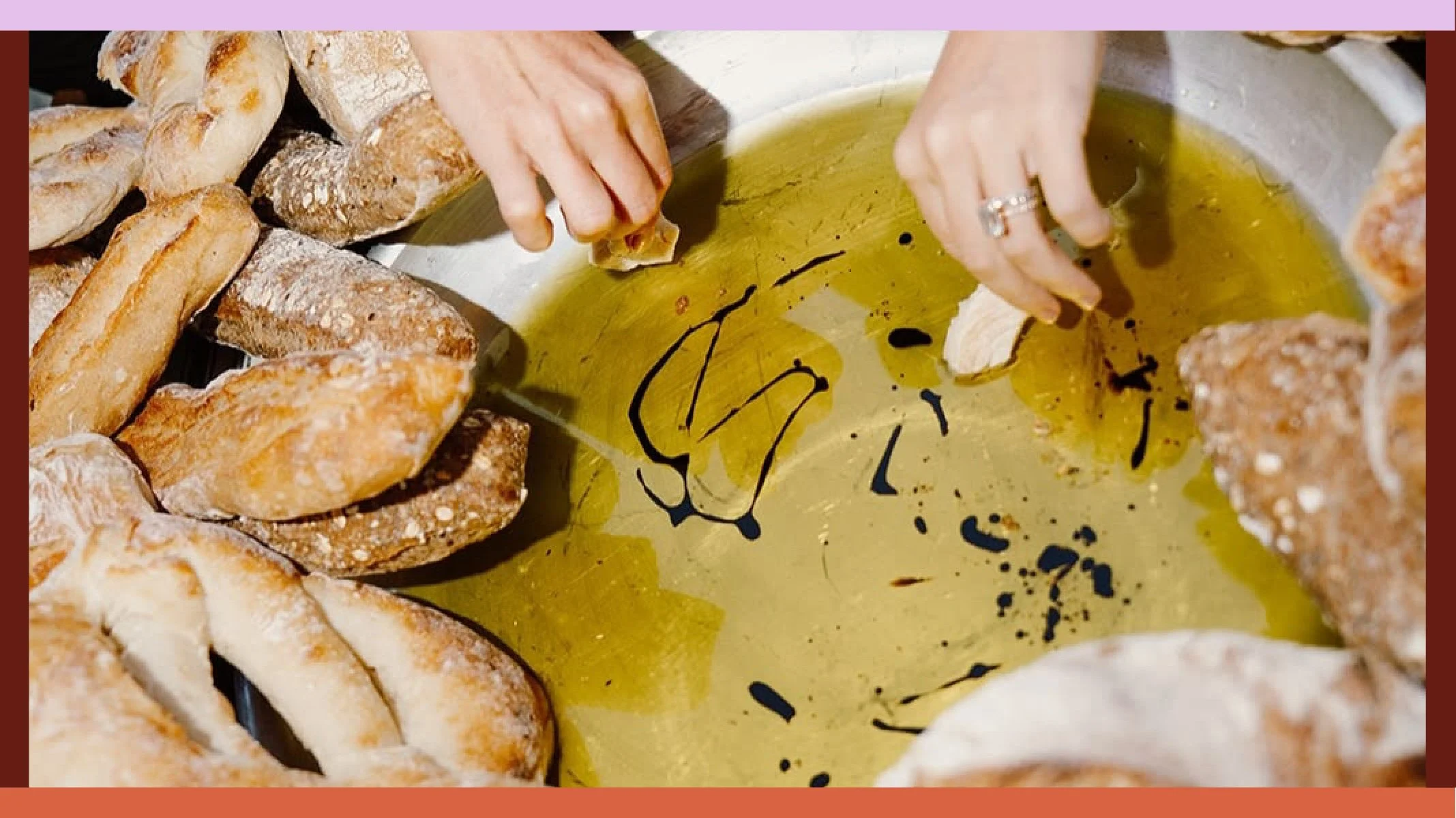
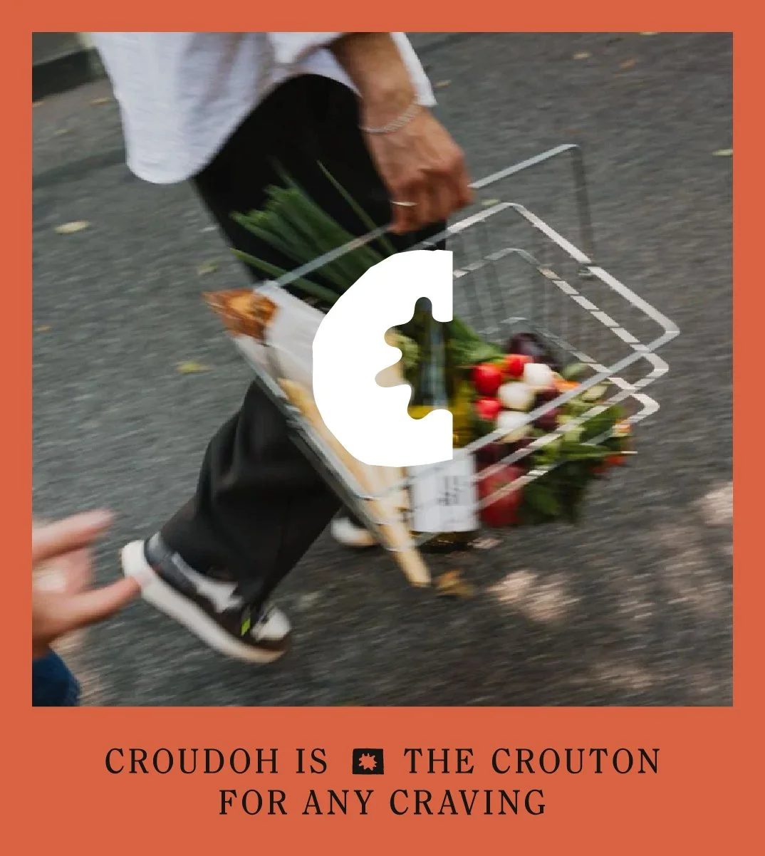
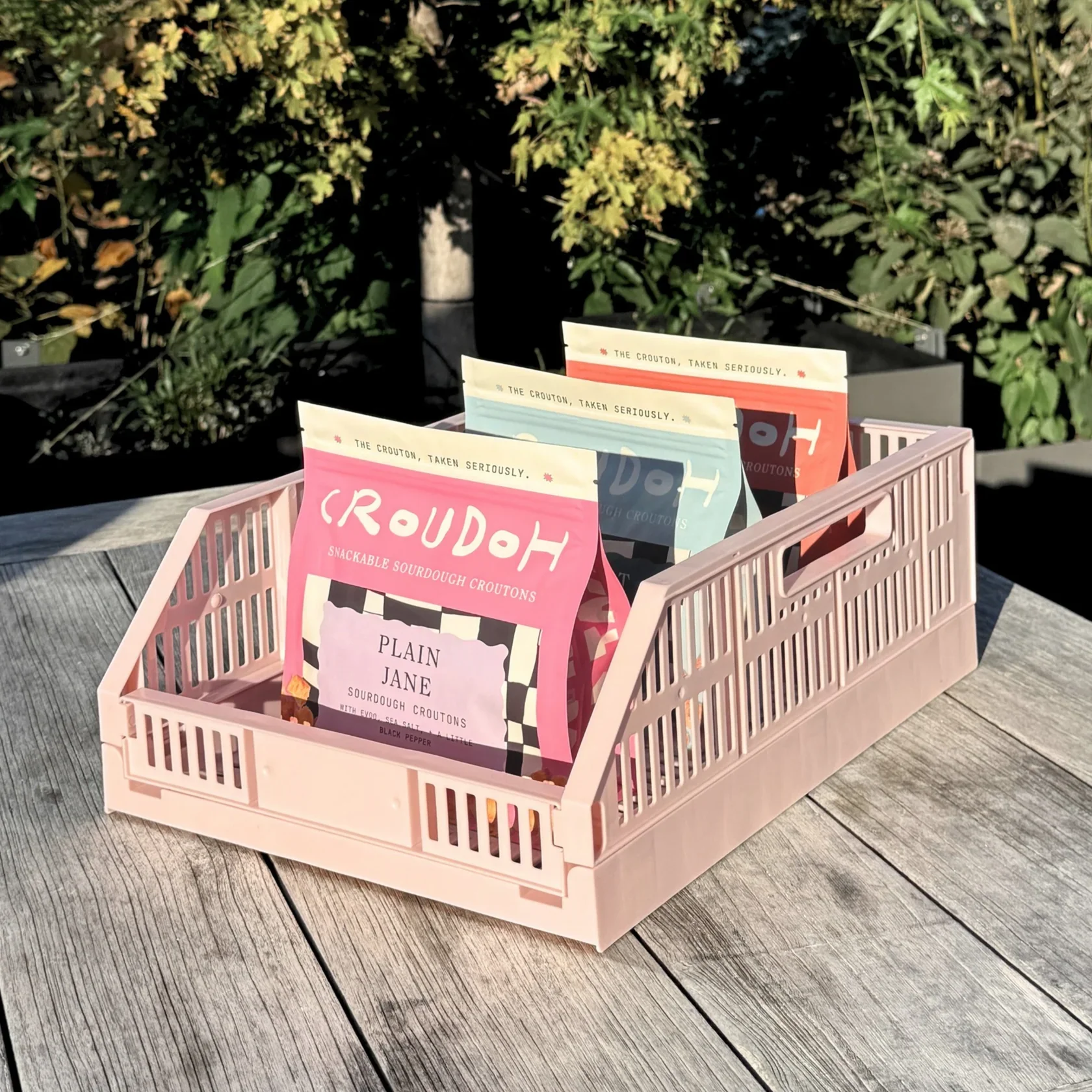
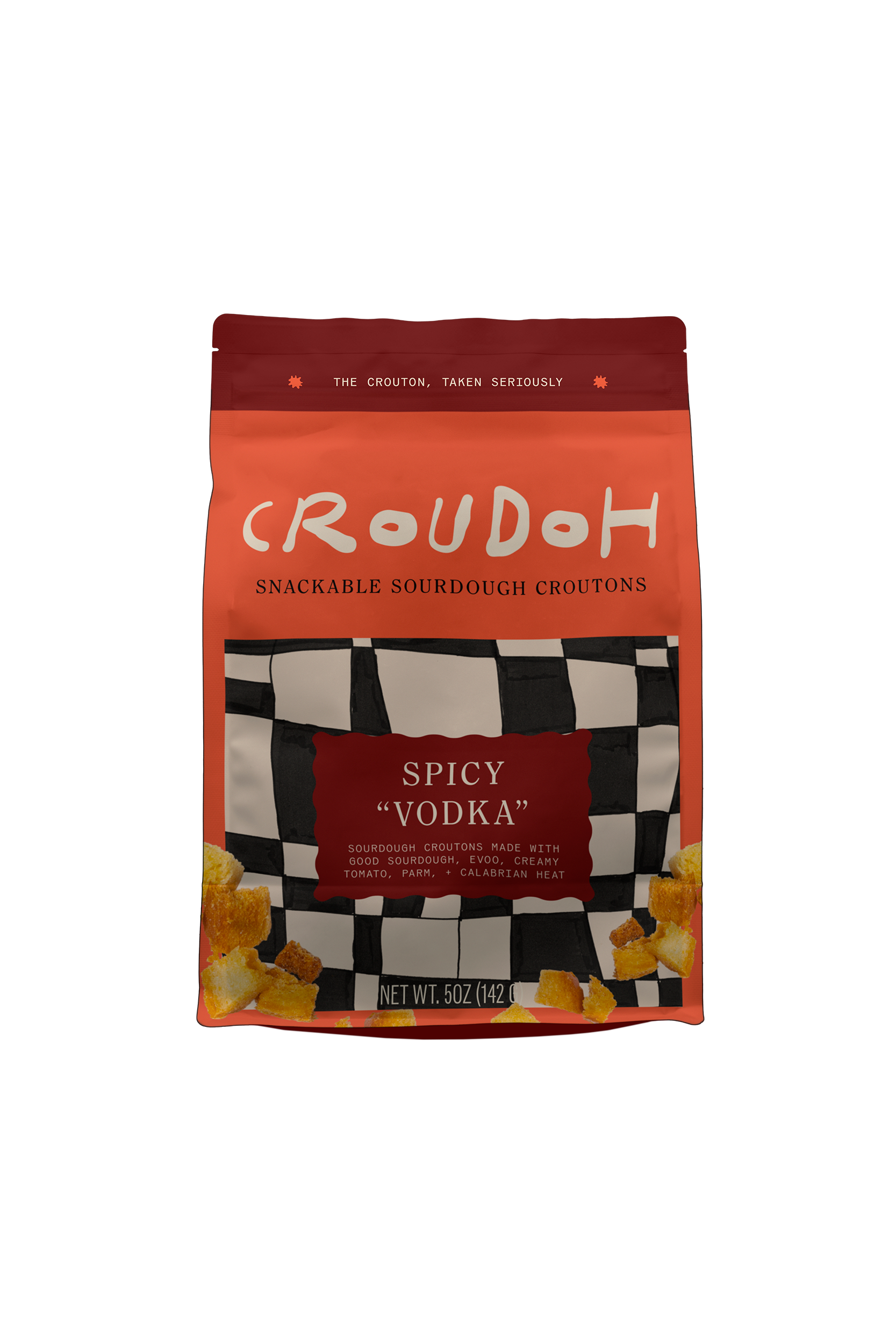
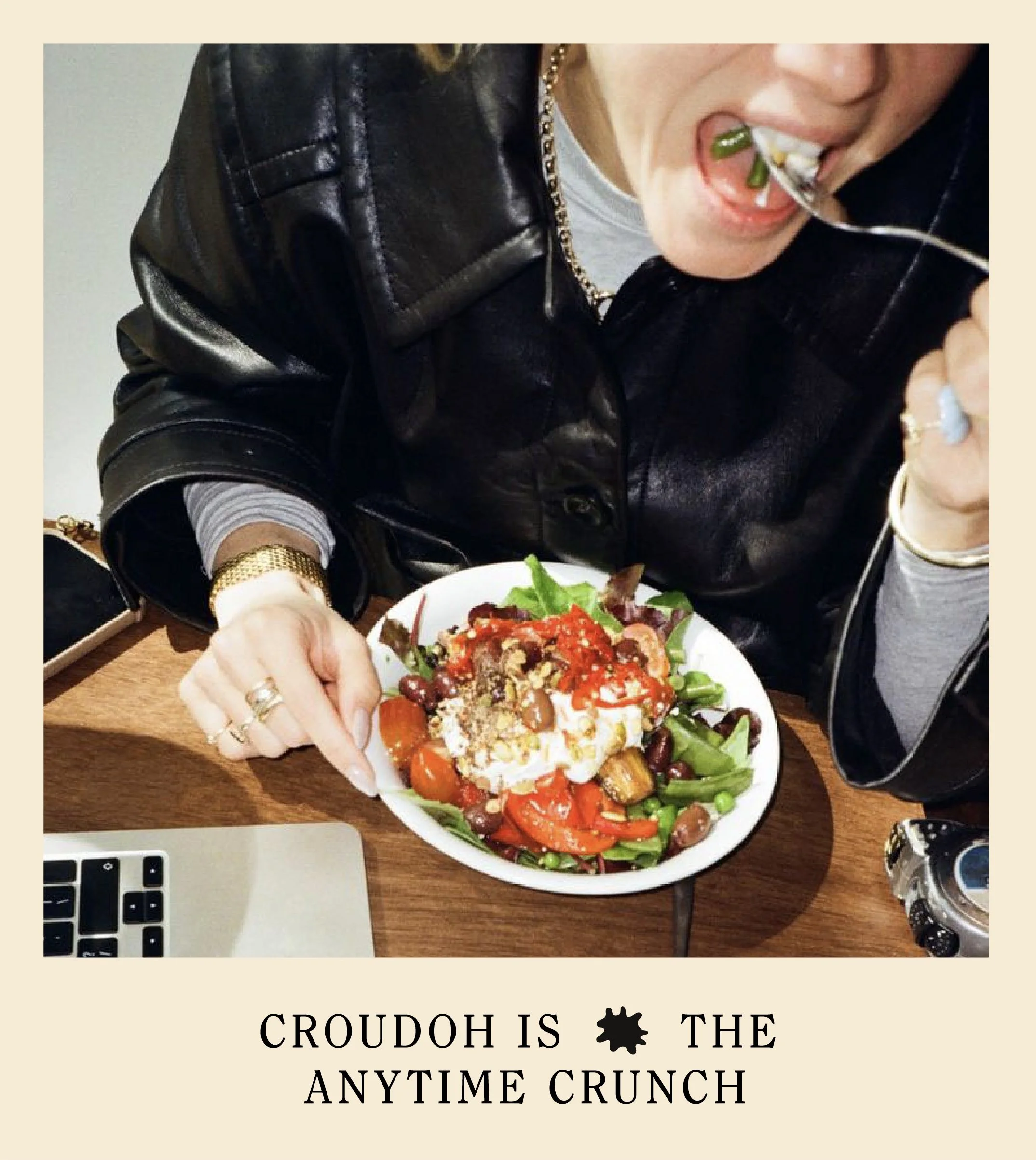
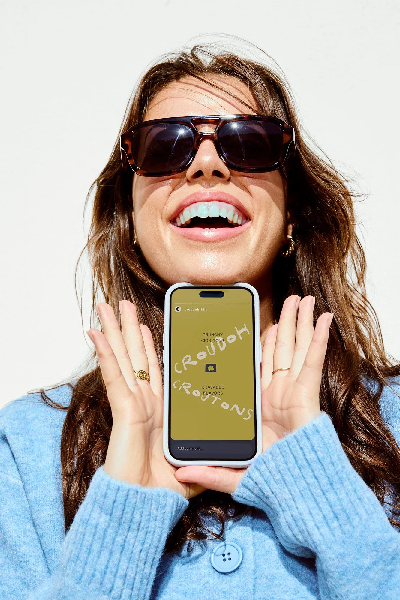
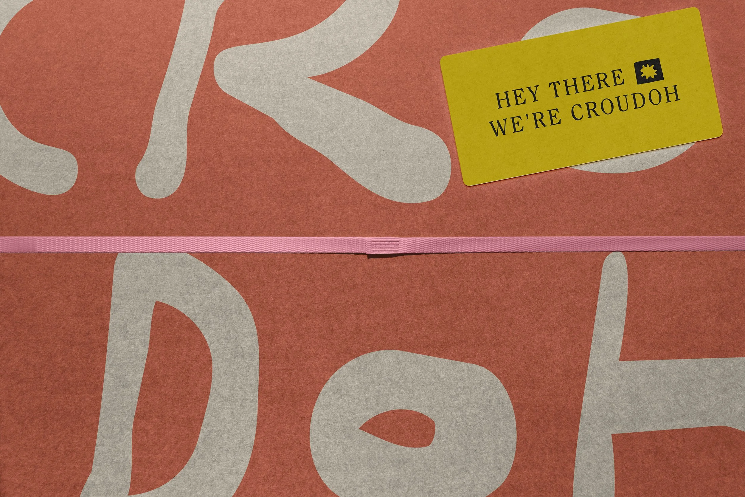
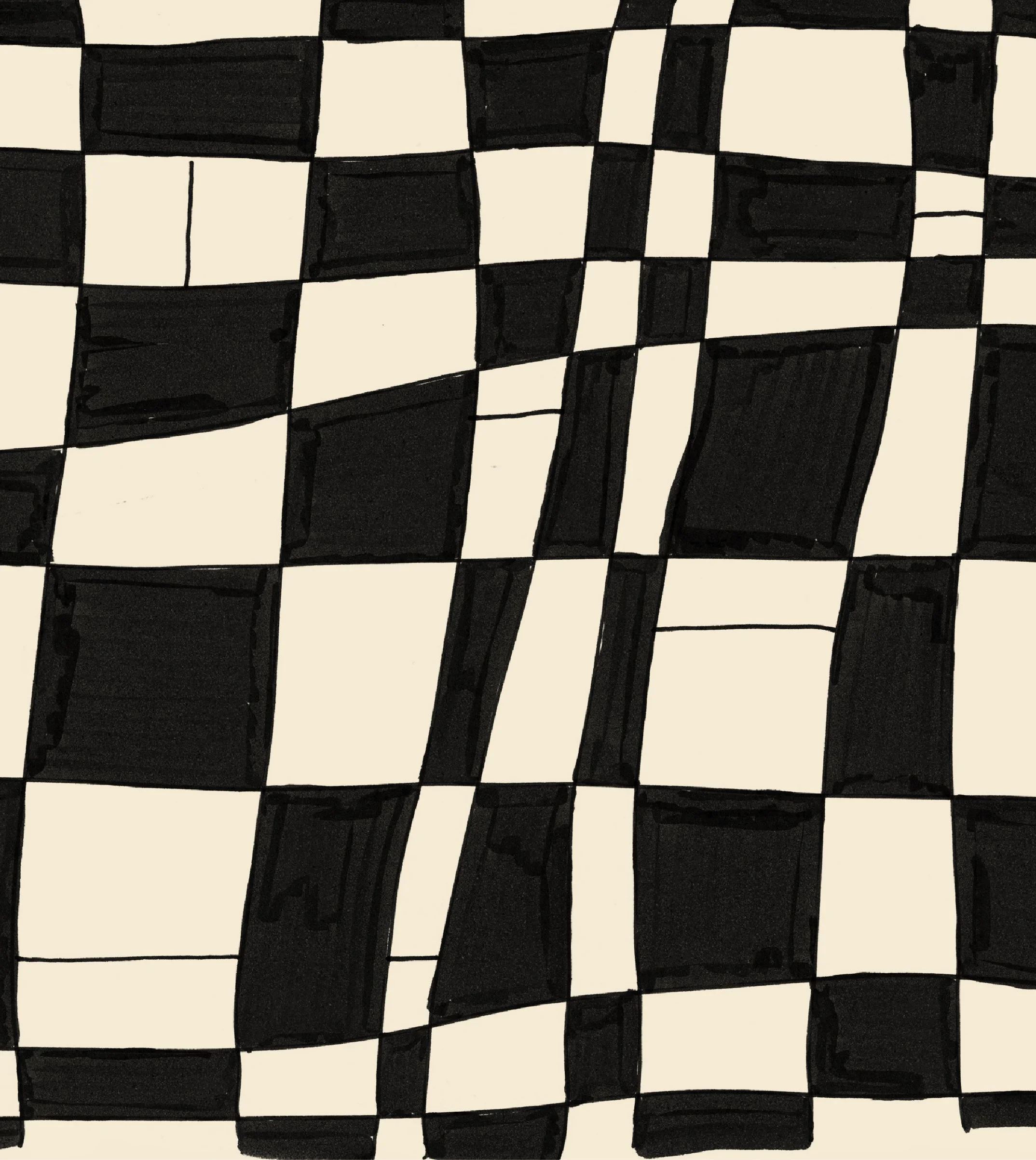
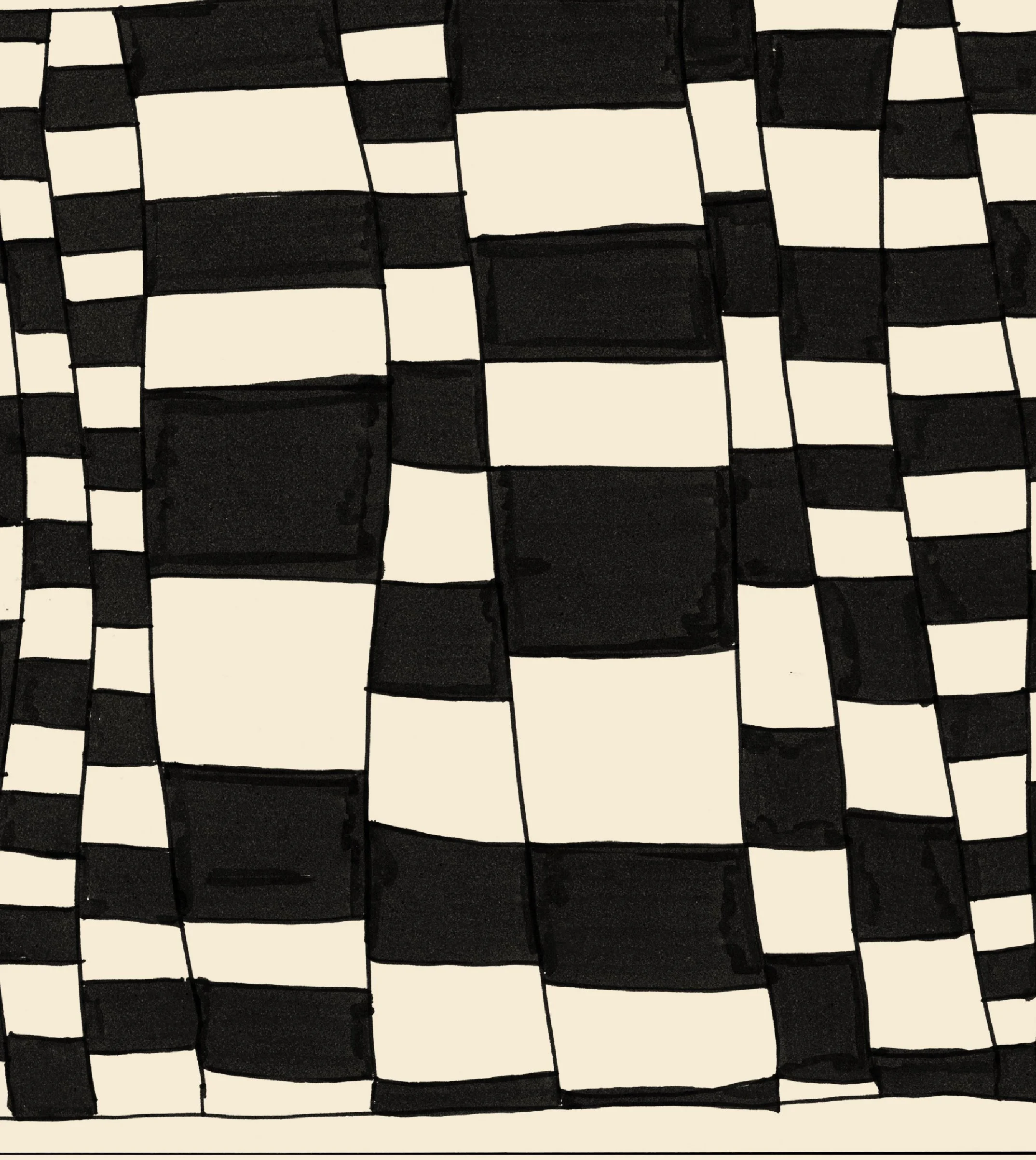
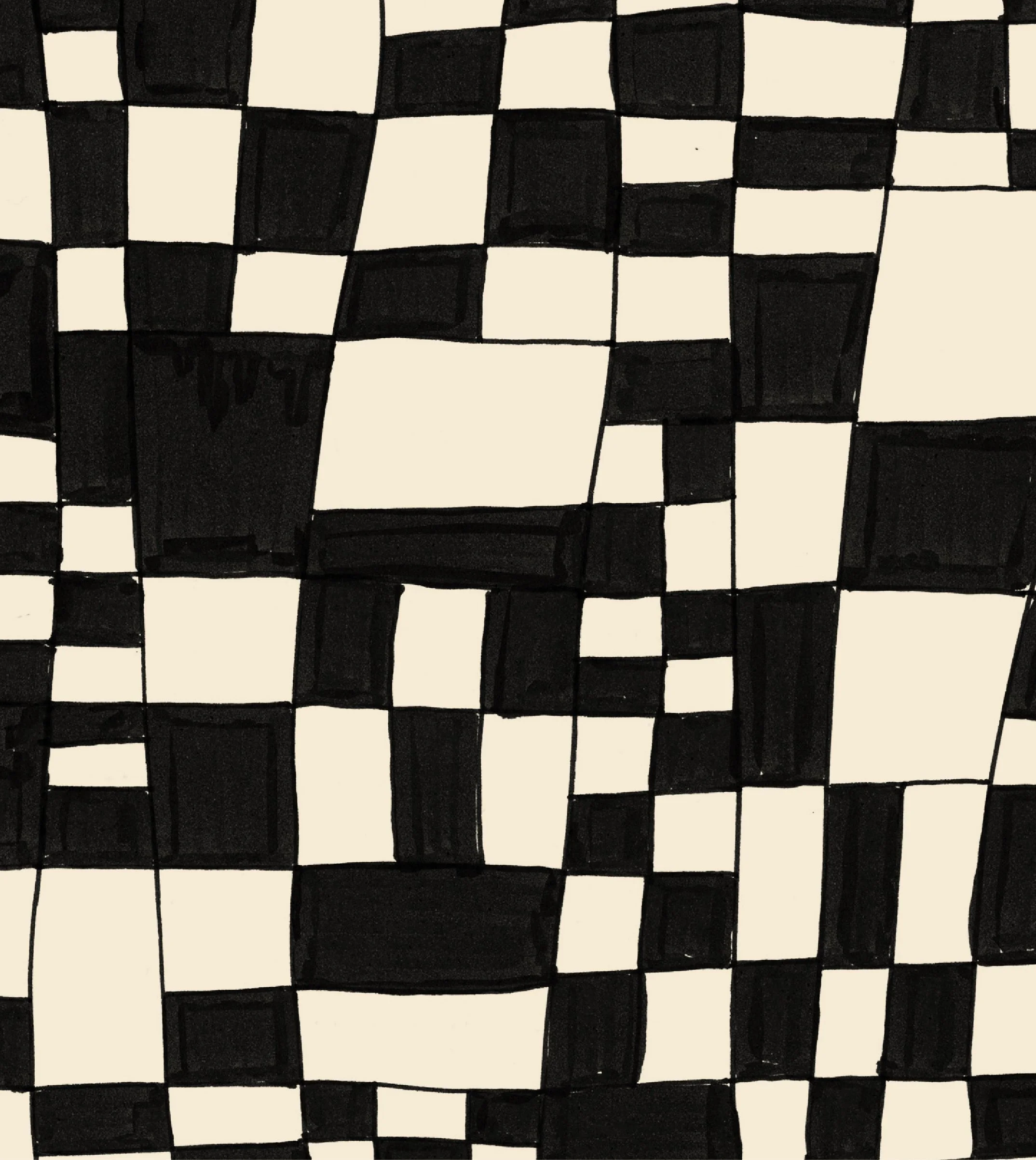
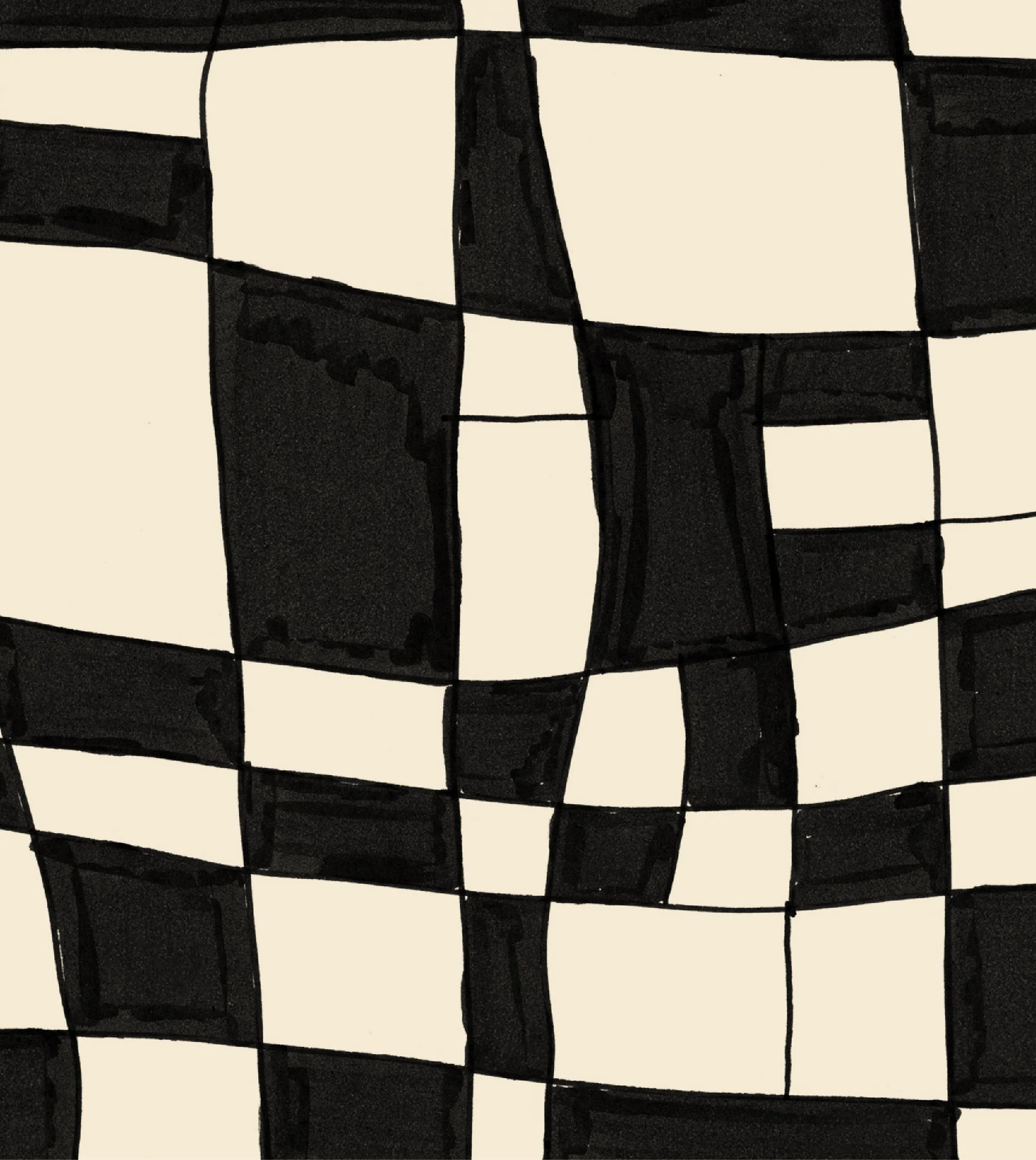
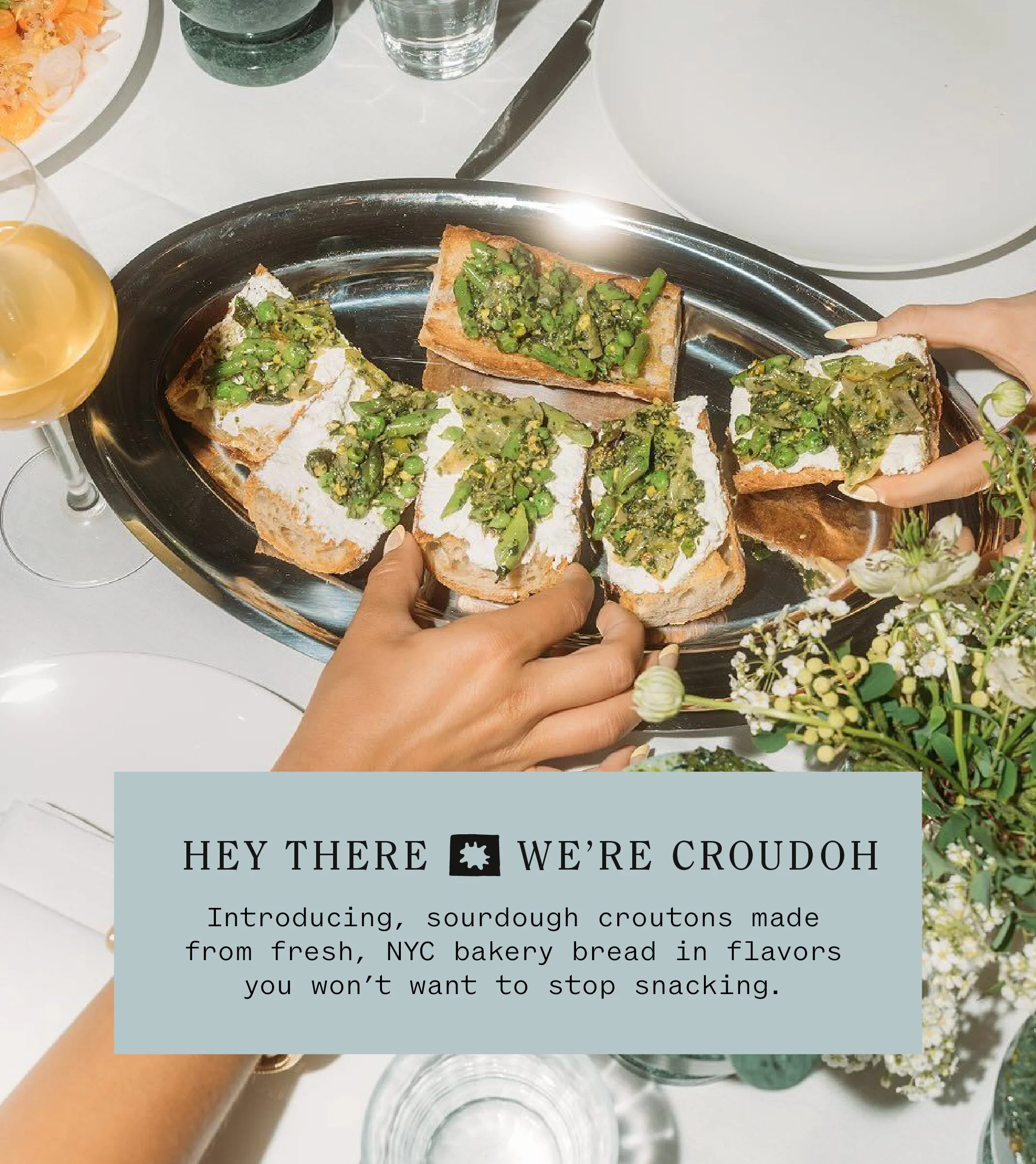
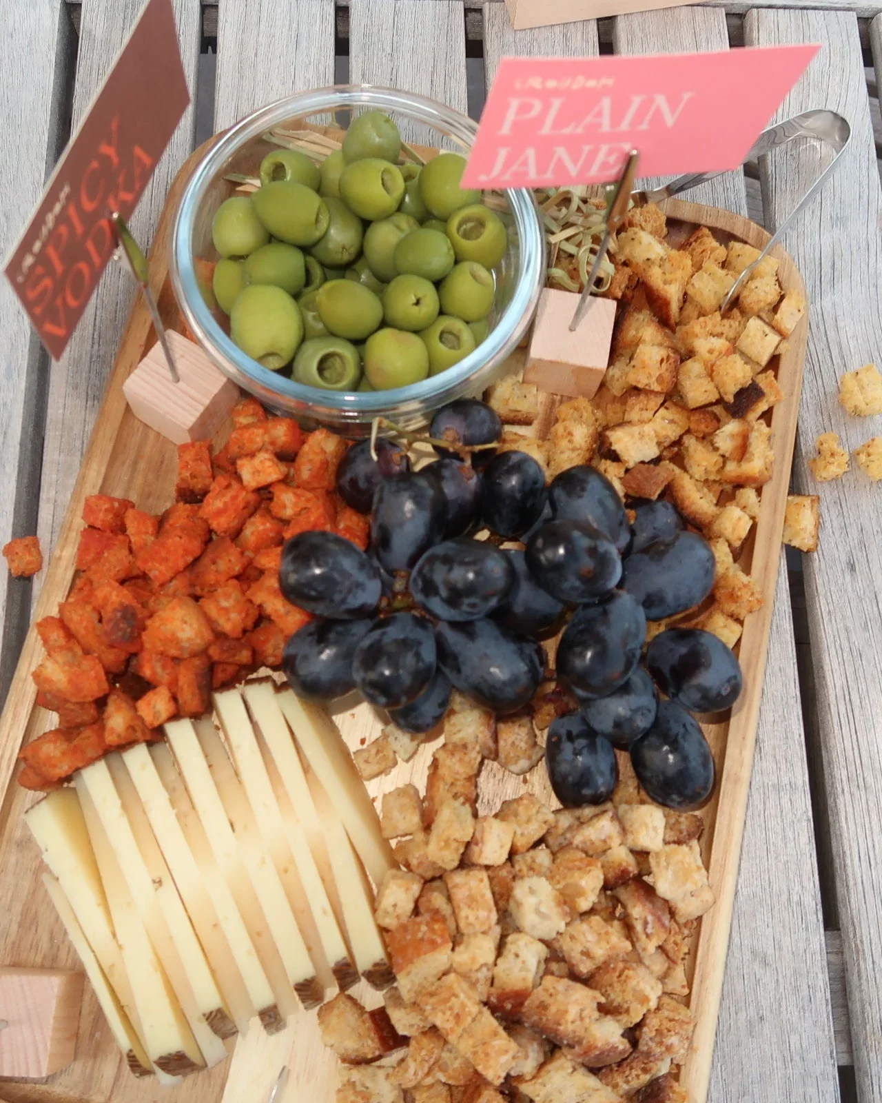
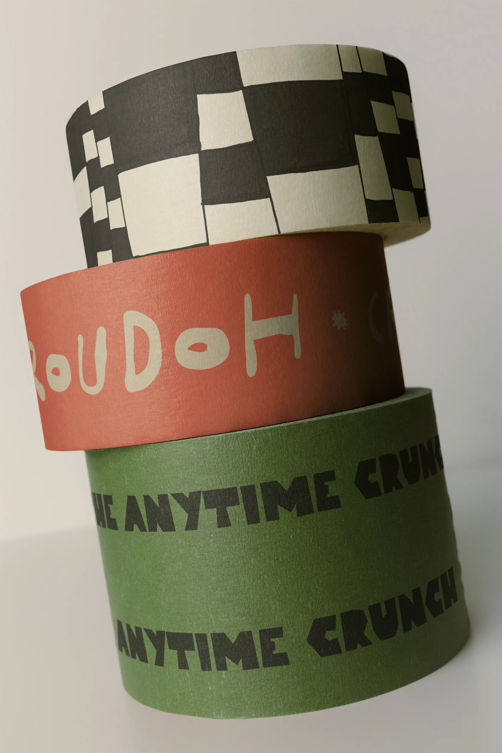
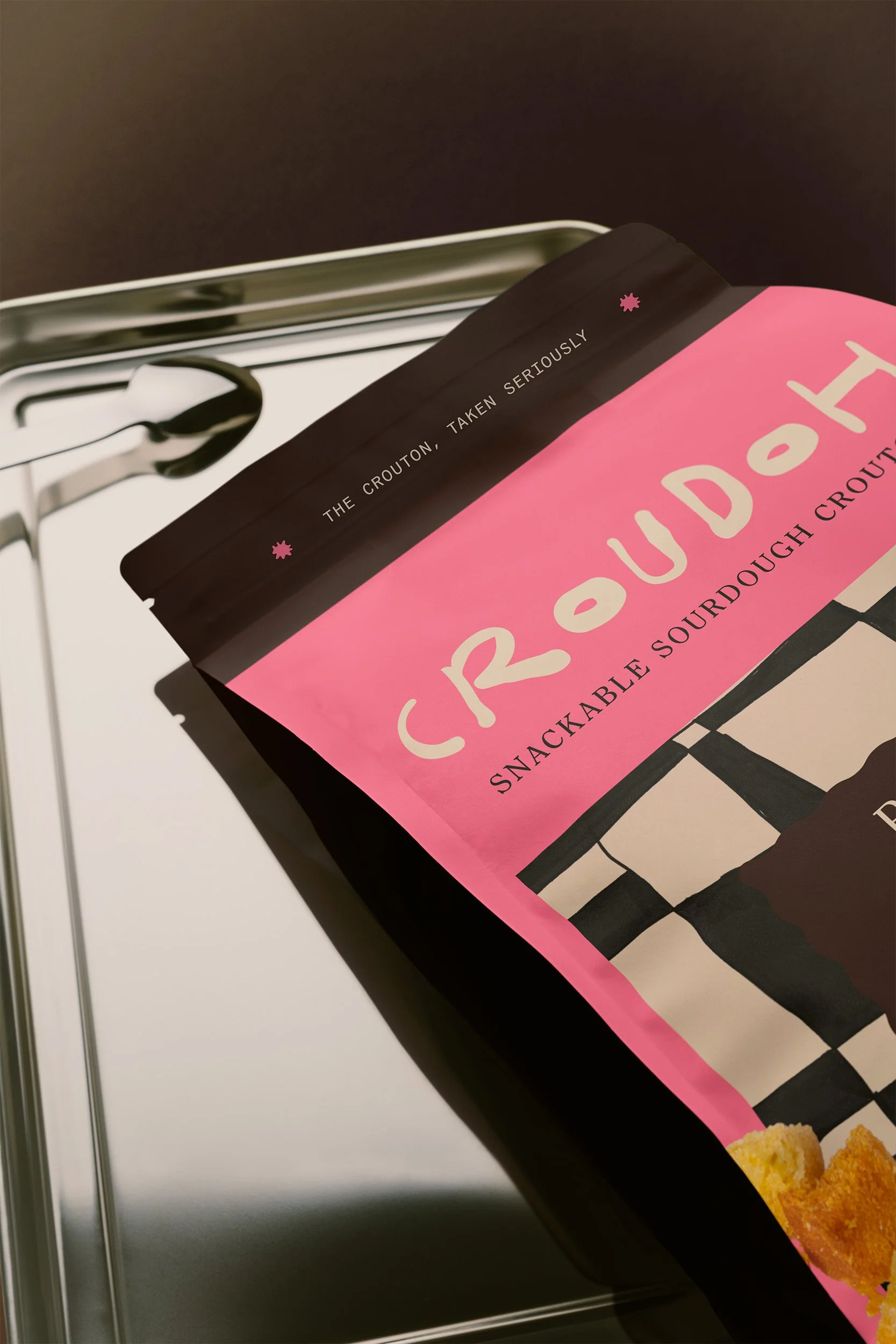
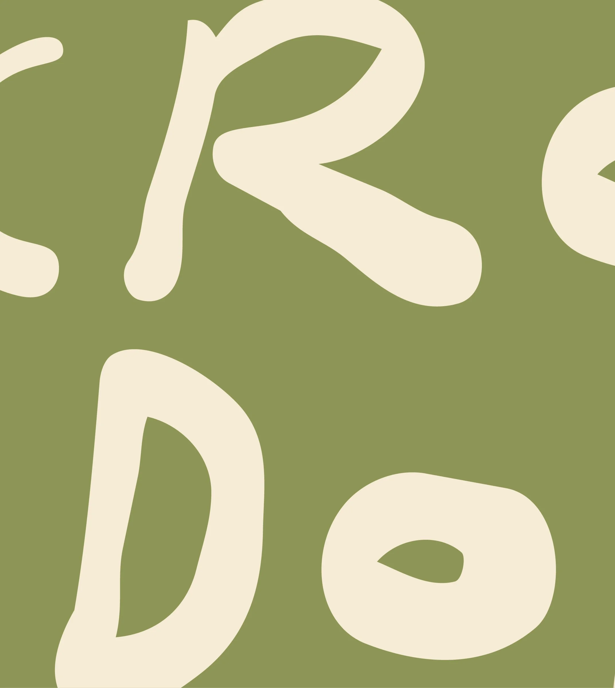
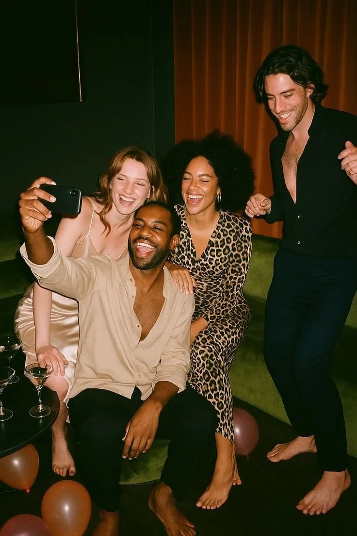
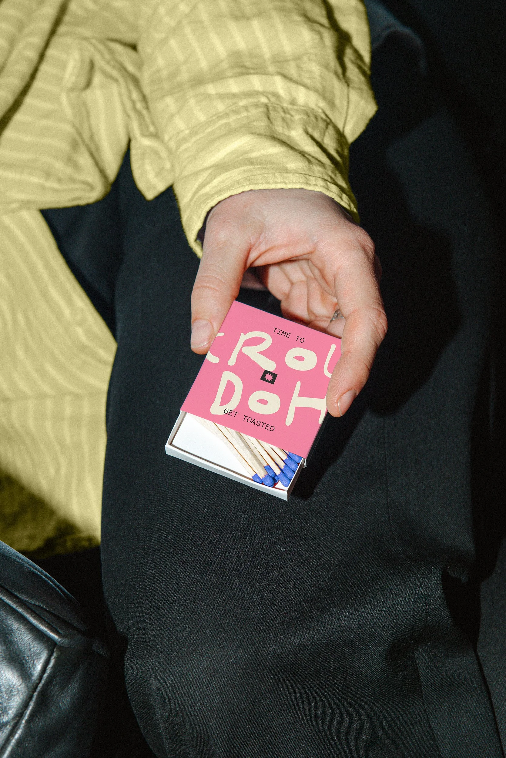
Michelle made her first batch of croutons from the last of a sourdough loaf ten minutes before guests arrived, and they became the most talked-about thing on the table. The category she was stepping into had barely moved since the 1970s. On one side were wellness brands selling croutons on what they left out, and on the other were snack brands arguing croutons should leave the salad behind entirely. We put Croudoh in the wide-open middle, as a flavor-first pantry staple with no opinion about where you eat it. To earn a spot on the open shelf next to the good olive oil, the identity had to feel made by a person, so we drew all of it by hand: a custom wordmark and display font, a C monogram, four pattern illustrations that give each flavor its own personality without breaking the family resemblance, and a little crouton man who waves from the corner of the bag. The palette borrows from the dinner table, with colors named Balsamic, Split Pea, Pasta Sauce, and Cab Sav, and the voice guidelines include one rule worth keeping: if a line would sound strange out loud at a dinner party, rewrite it.
RESULTS
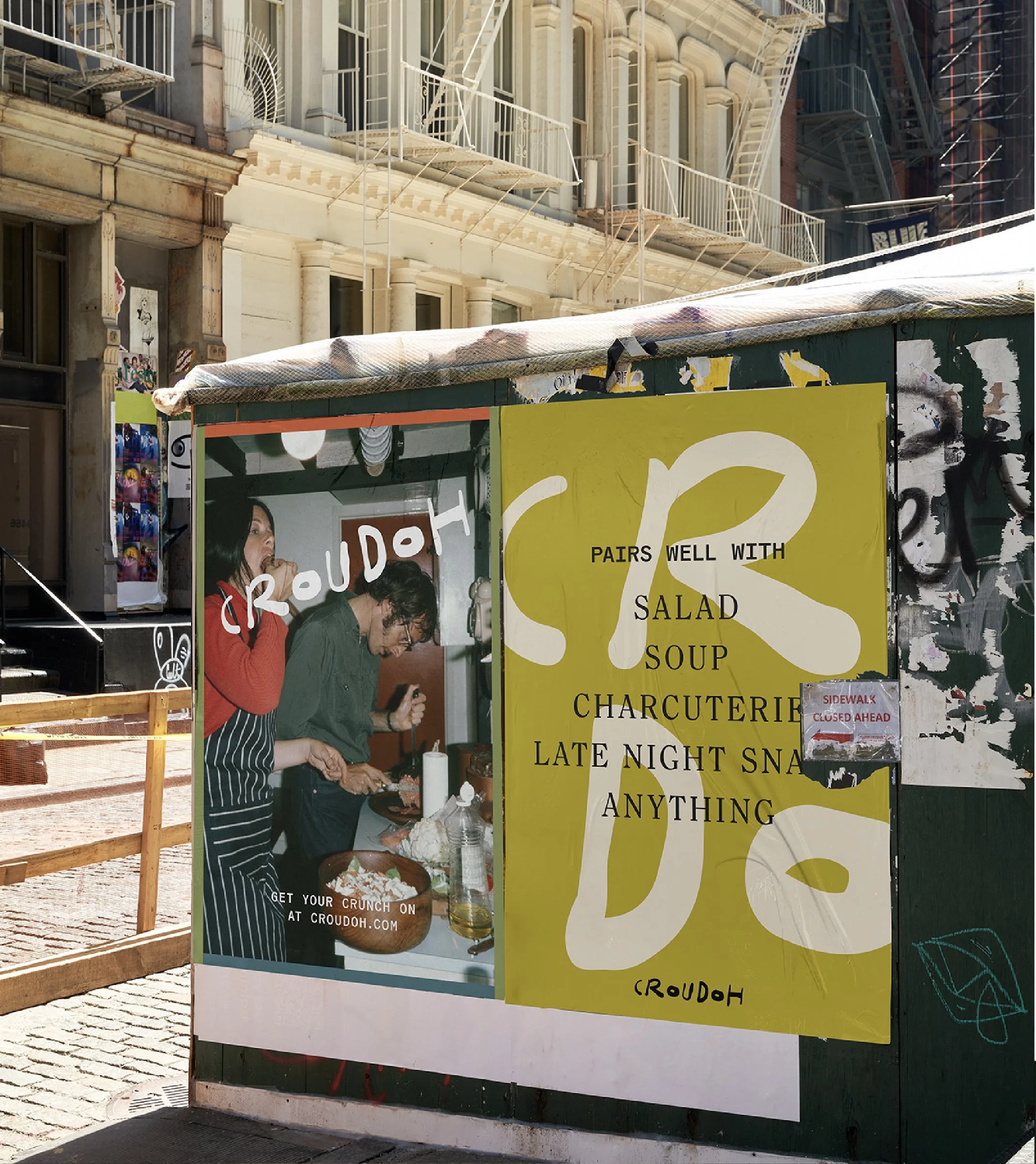
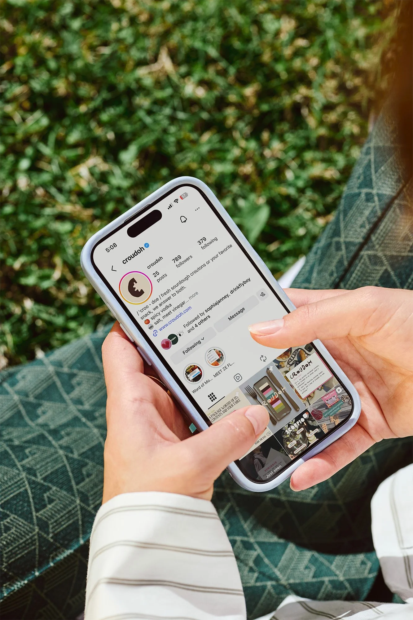
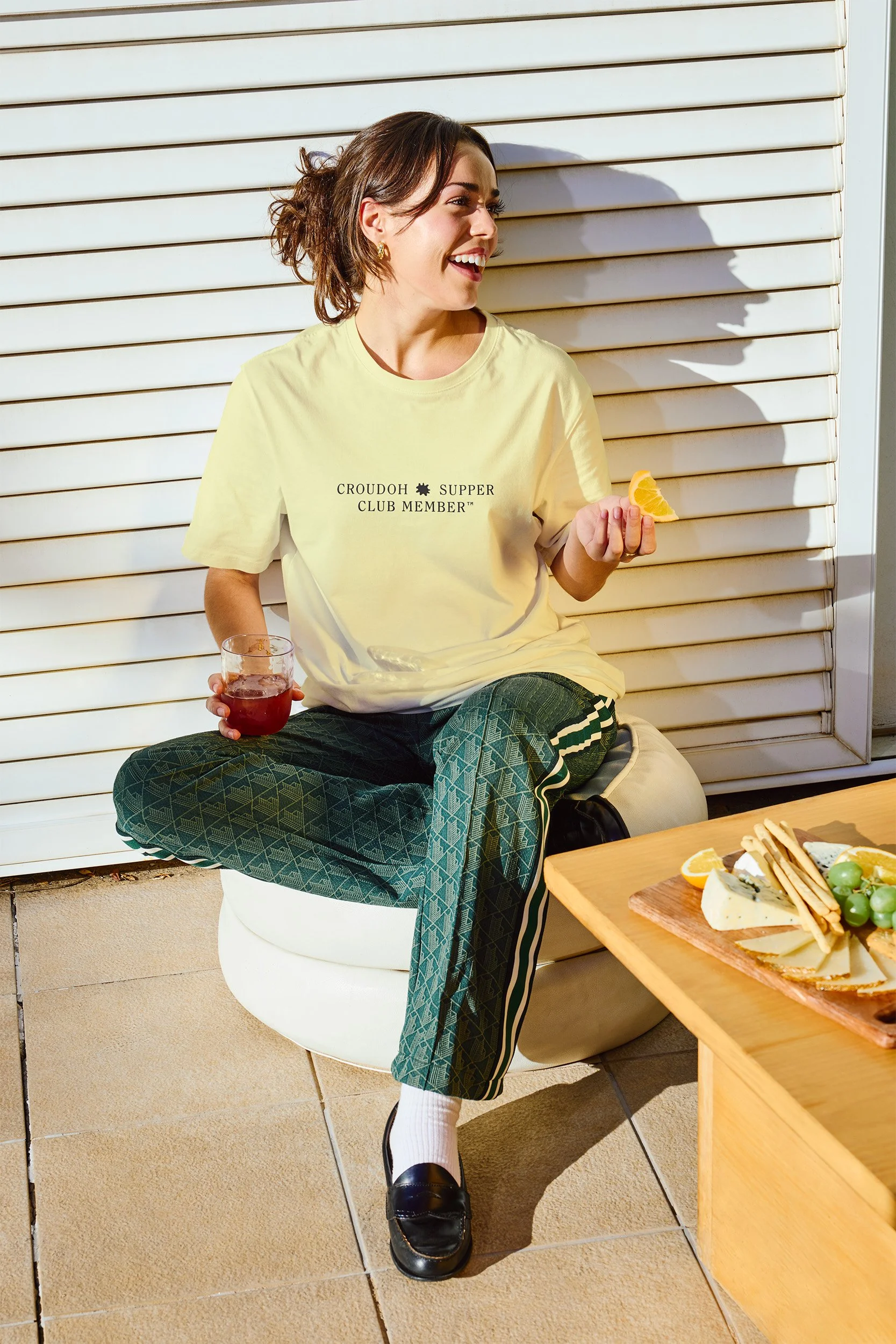
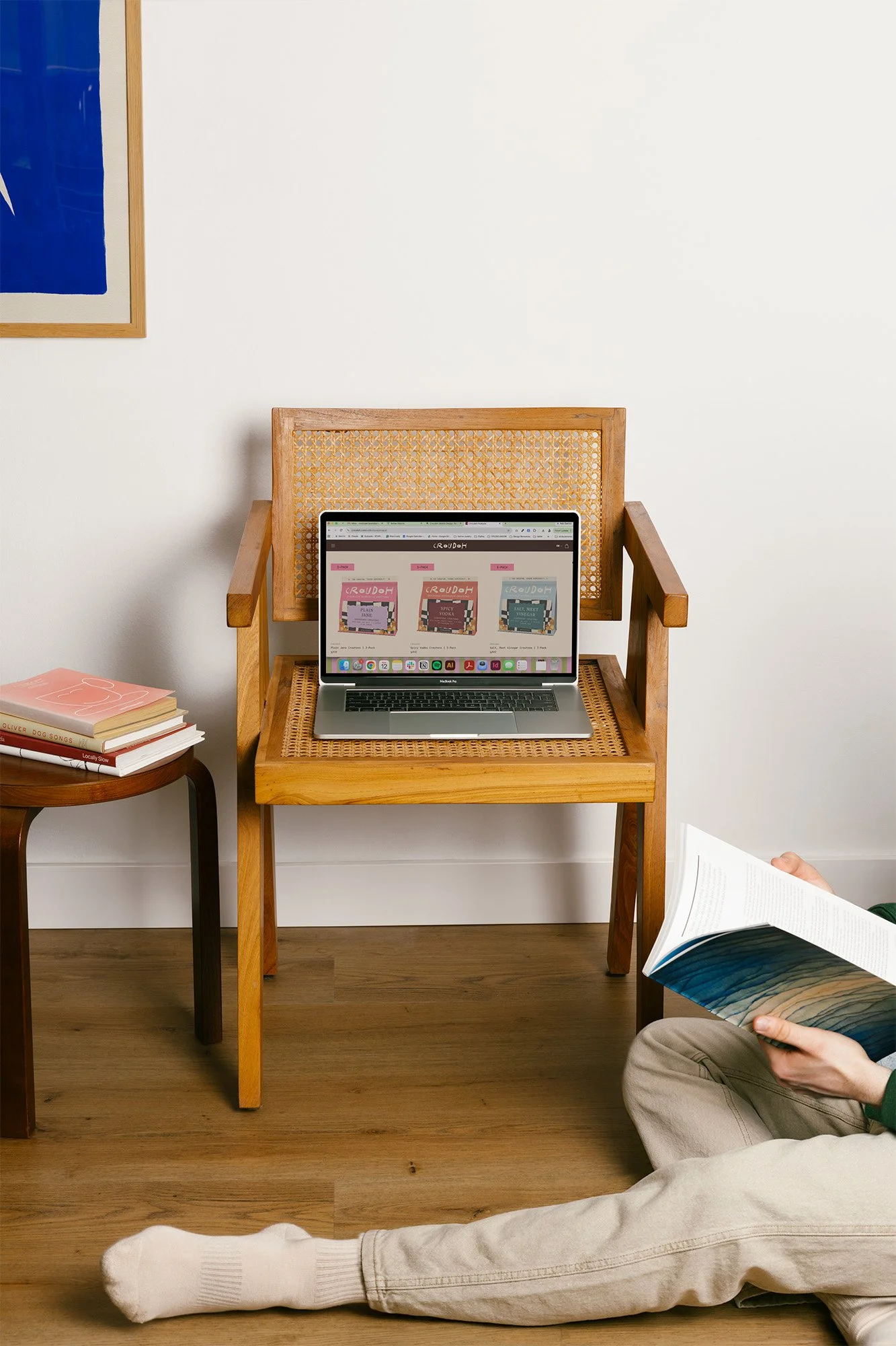
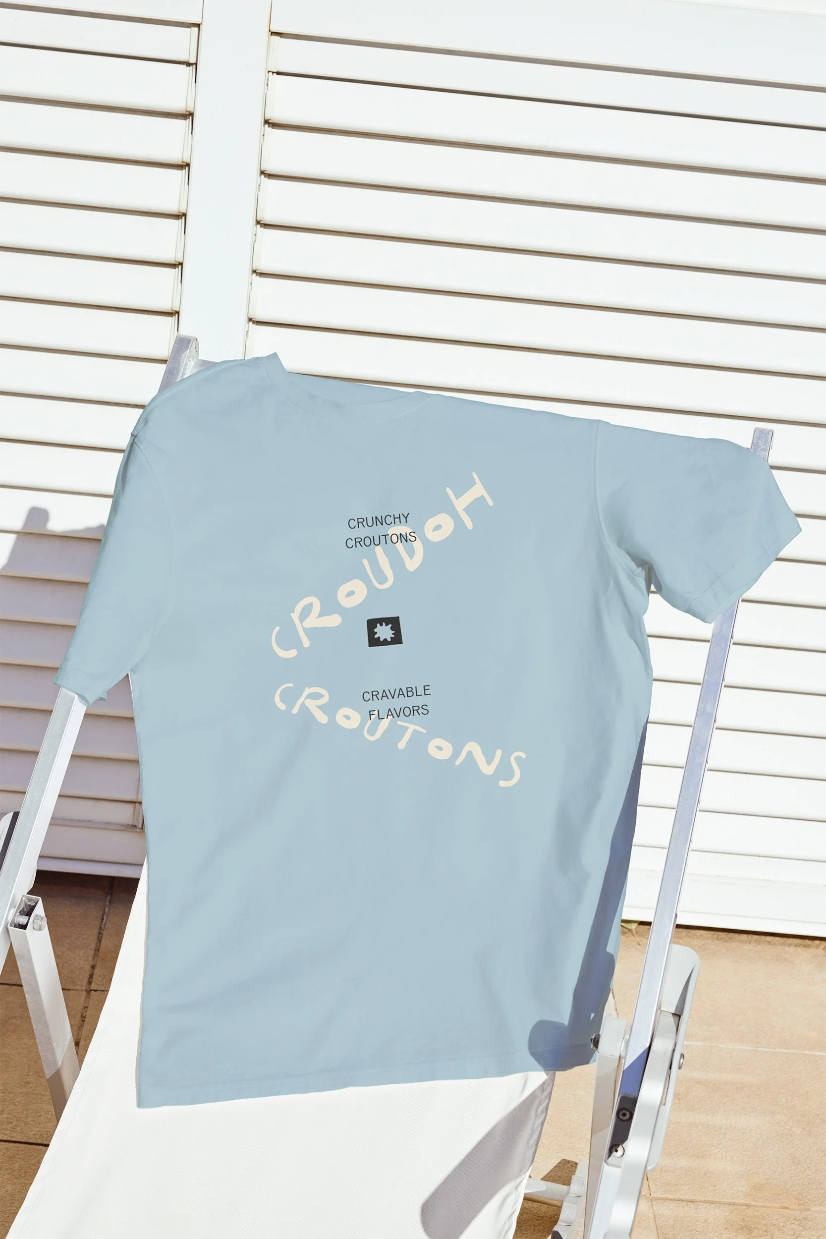
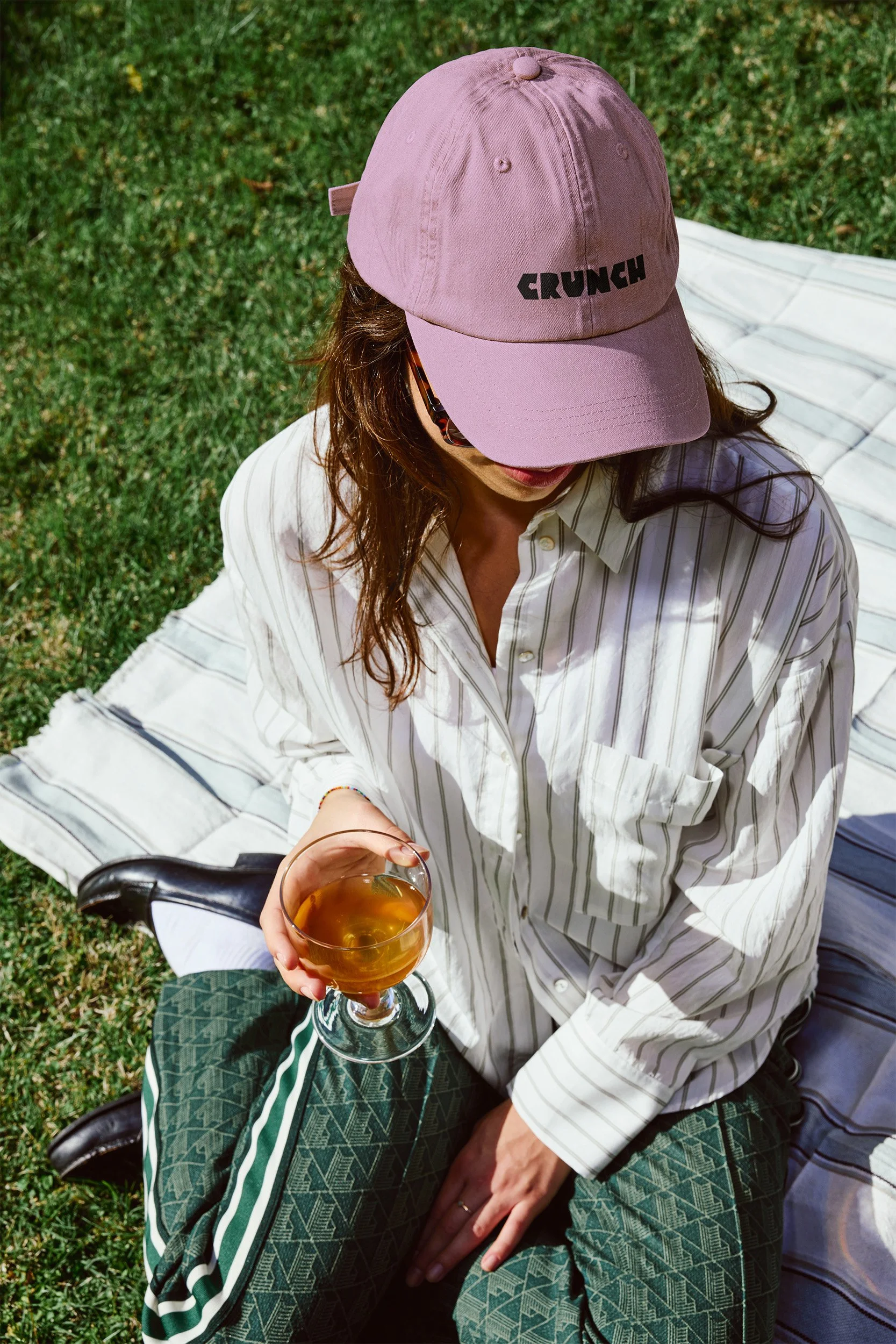
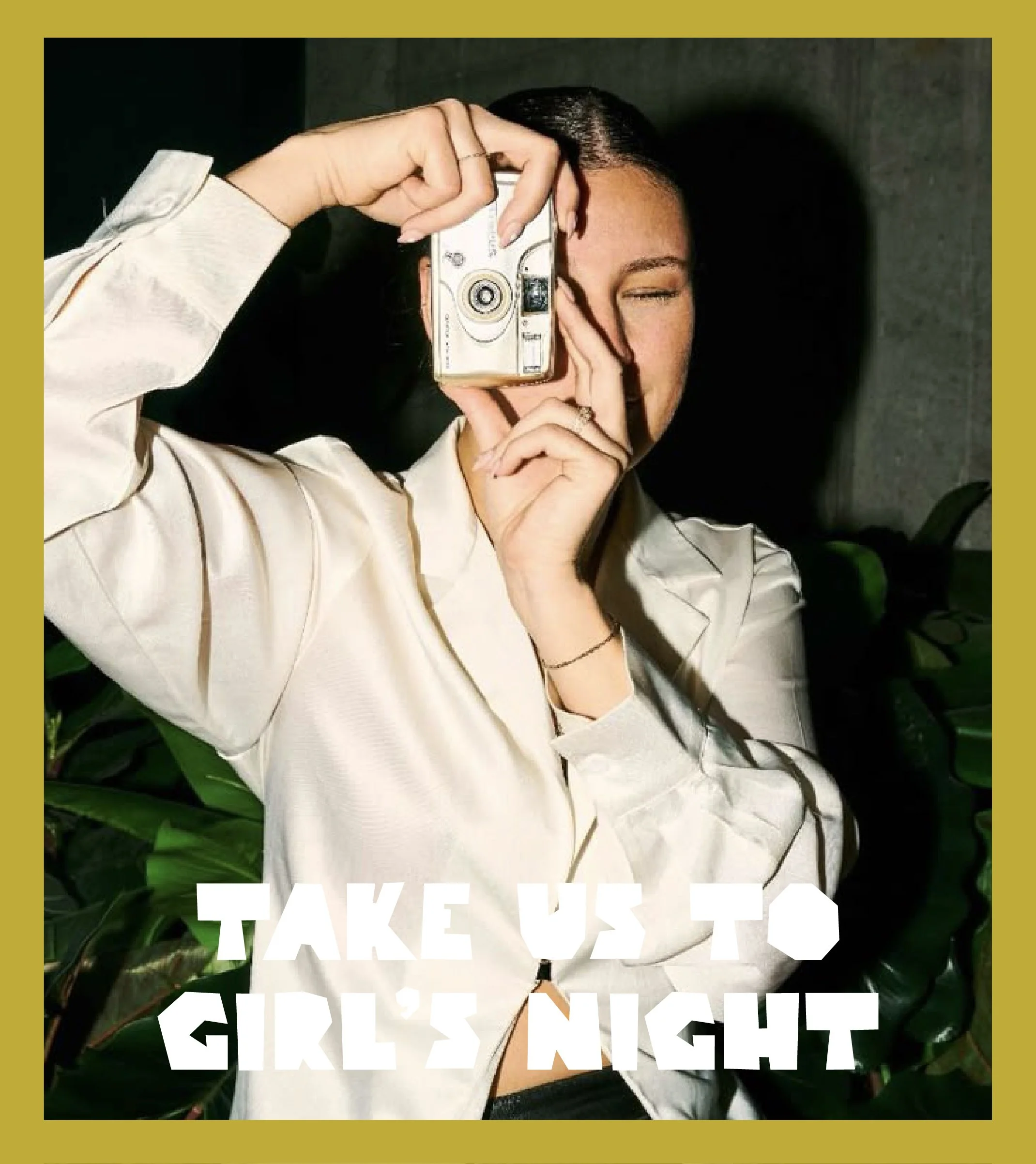
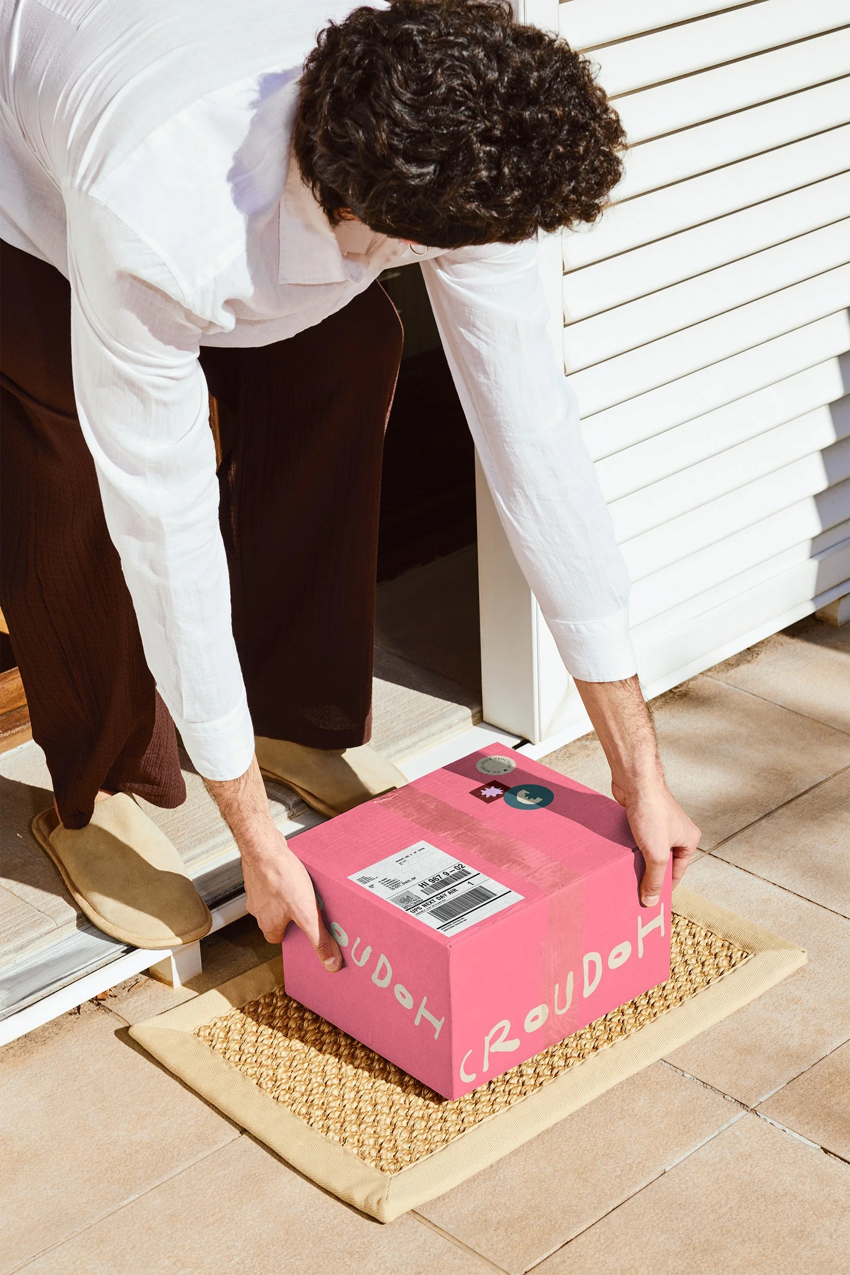
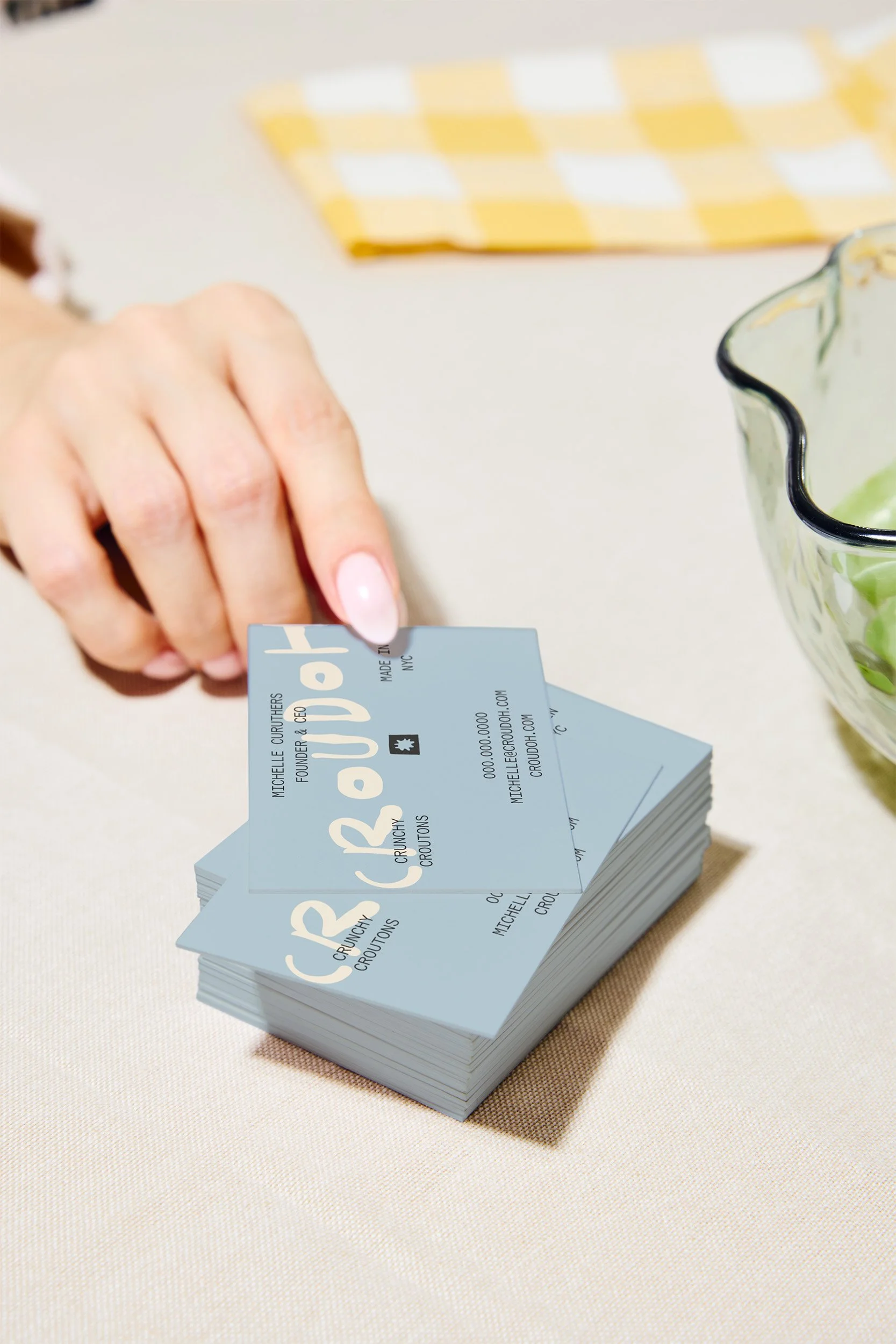
The final system spans positioning, flavor naming, a full identity suite, SKU packaging, brand voice, and launch collateral that runs from wheat-paste posters to business cards to a Supper Club member tee. Croudoh launched direct-to-consumer at croudoh.com with Plain Jane, Salt, Meet Vinegar, and Spicy Vodka, and the early reviews read like texts from friends, which is roughly what the brand was built to sound like. One customer admitted to eating them on the couch like chips, something she had never once considered doing with a crouton. They’ve already sold out of their first run, are currently restocking, and just announced placement at Pop Up Grocer. The crouton just got elevated from the bottom shelf to the countertop.
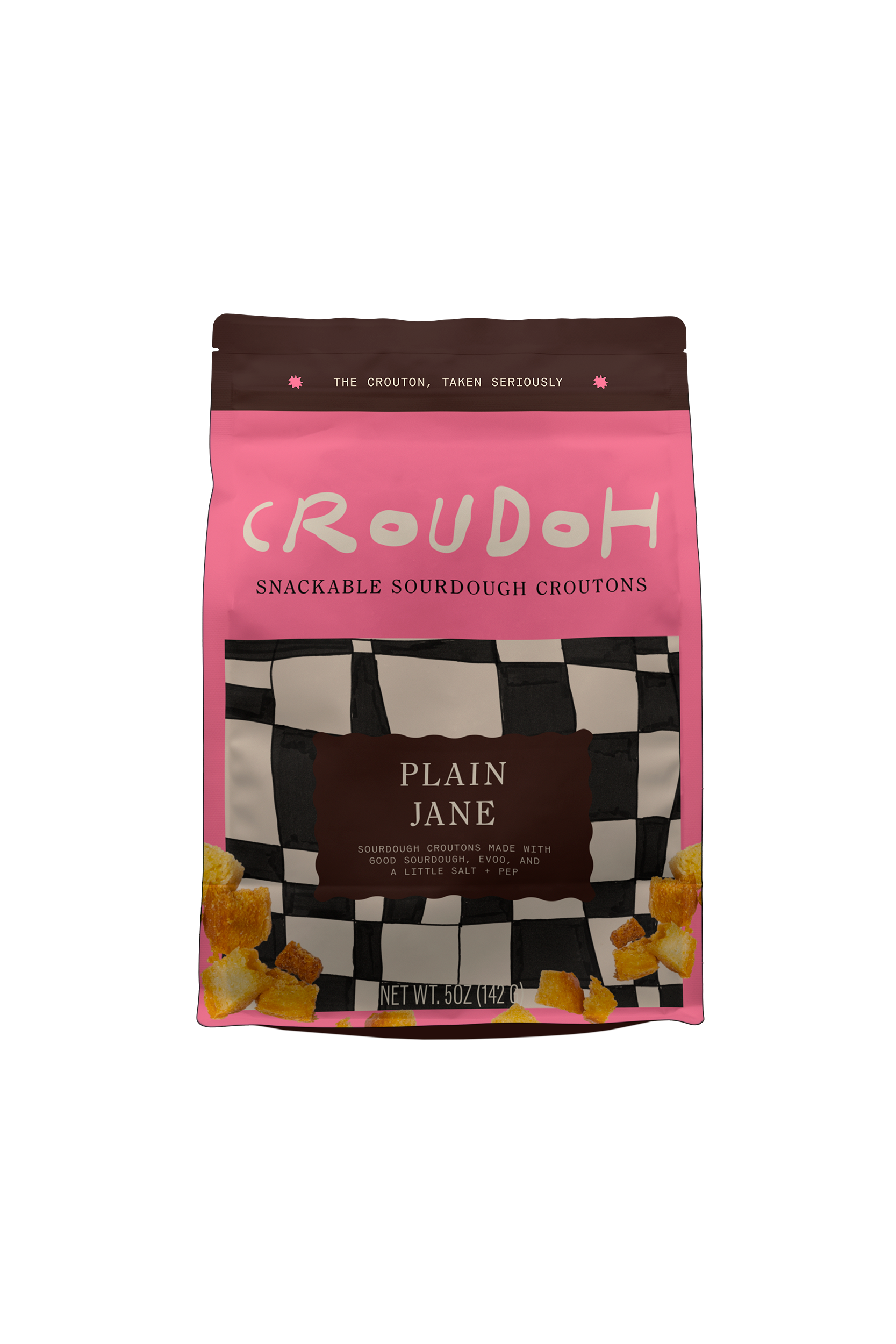
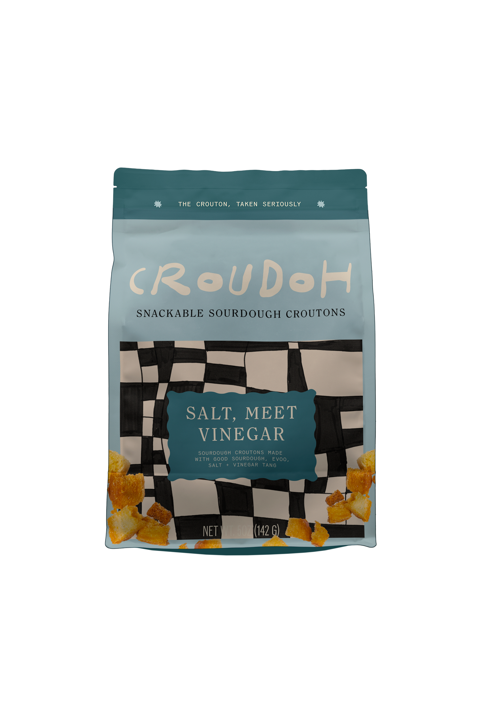


Custom Hand-drawn Patterns



OTHER PROJECTS
-
![Outdoor sign with "OMIKA" on a round, decorative background attached to a building.]()
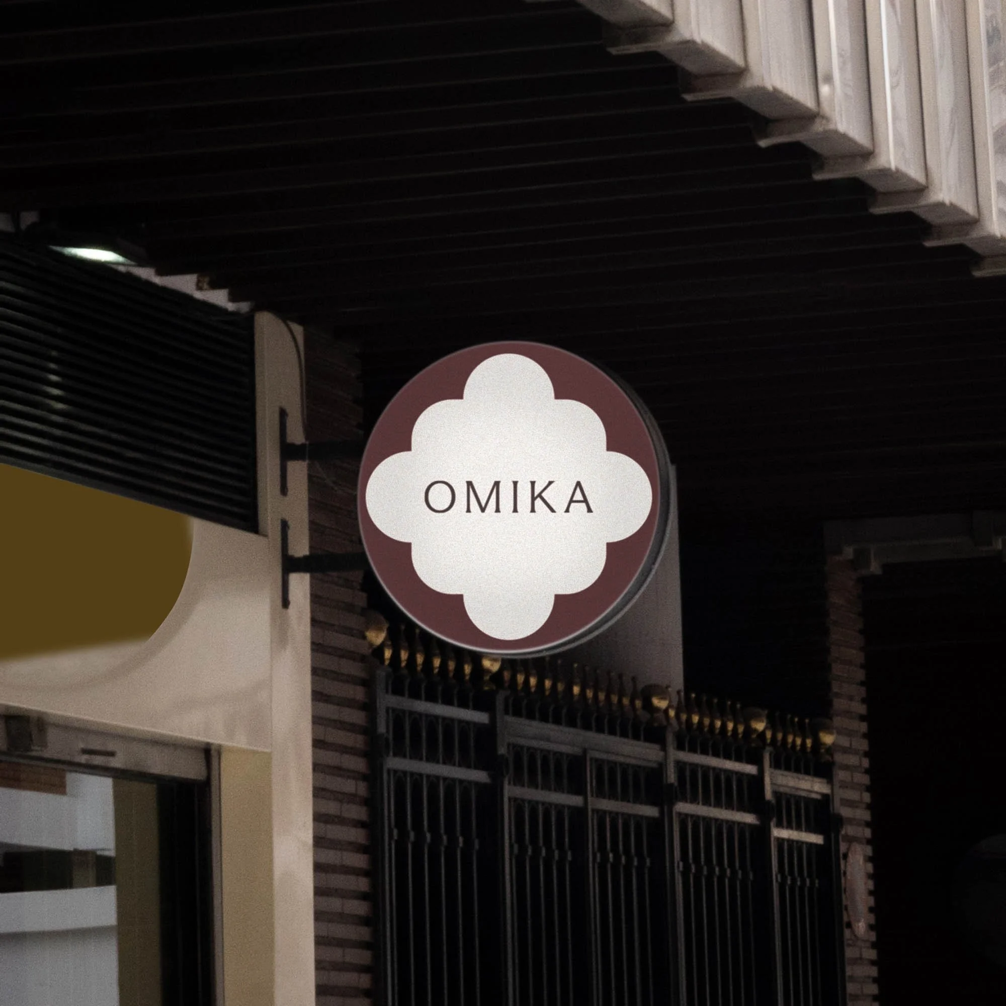
OMIKA
Brand Identity, Packaging, and Marketing for a women’s clothing brand inspired by the vibrant prints of India.
-
![Black and white image of a person lying face down on a chair outdoors with text "UNSORTED."]()
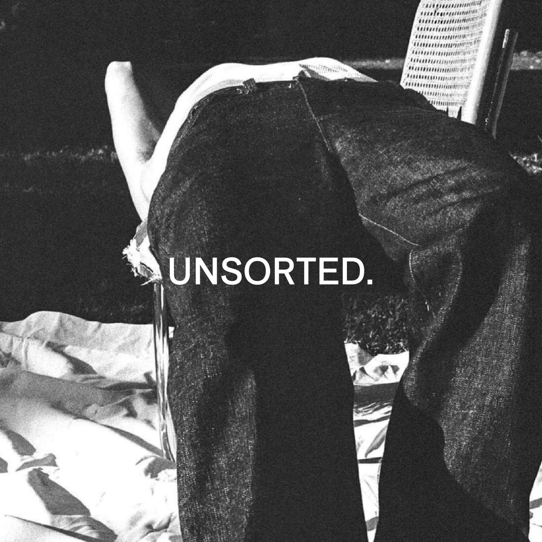
UNSORTED.
An independent label by Hunter Hardee inspired by technique and voracious curiosity. A line of clothes that challenges the notion of what clothes can be.
-
![Person holding a smartphone displaying a menu for 'Ethos' with options like Club Culture, Ethos News, Team, Schedule, Classes, Memberships, Gallery, Contact, and a 'Become a Member' button.]()
ETHOS ATHLETIC CLUB
A bold website to attract new members, host class signups, and digitally express the world of Ethos A.C.
-
![Person wearing a T-shirt with 'Roseline' text facing shelves of wine bottles and a table with wine glasses.]()
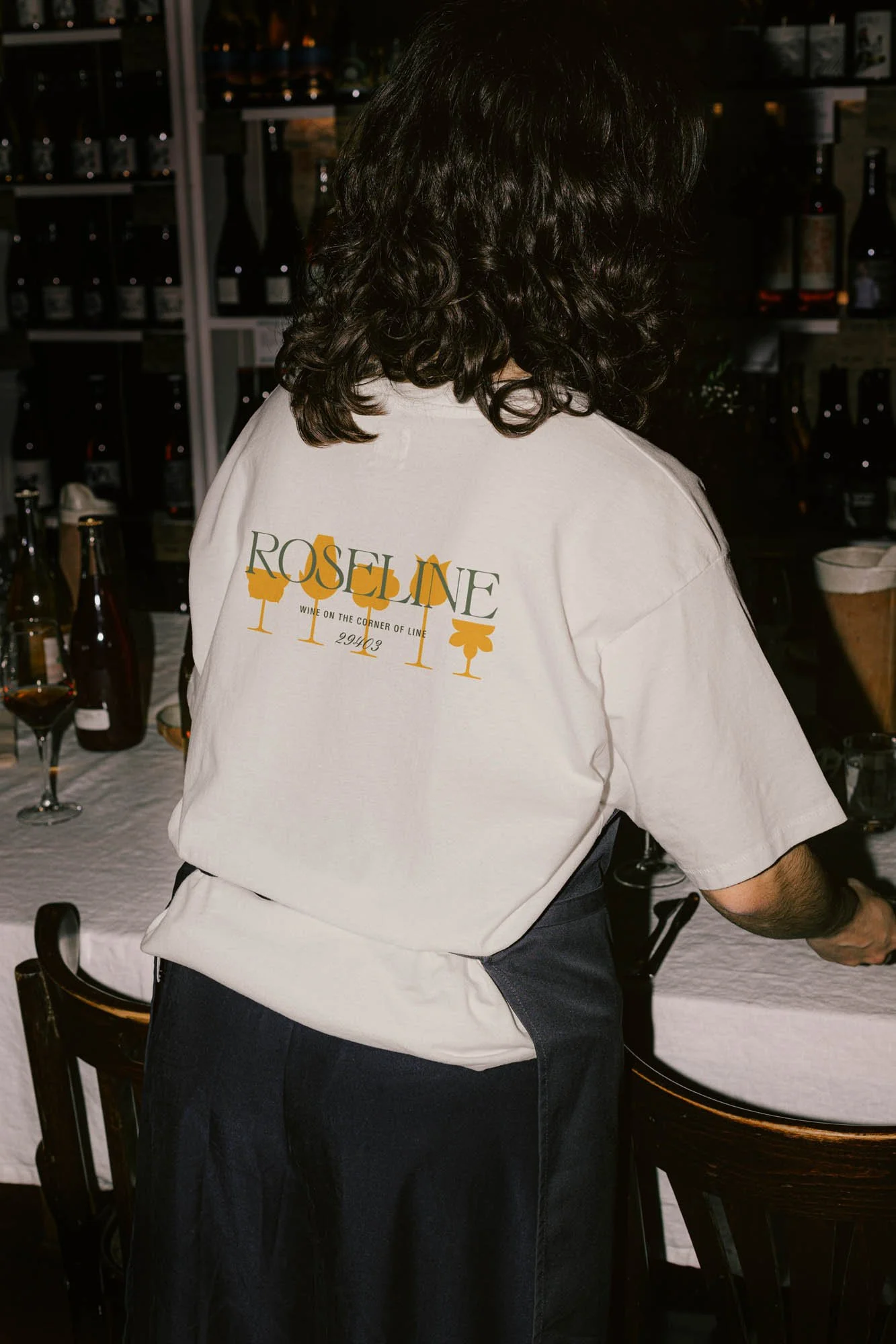
ROSELINE
Brand identity and collateral for an intimate wine bar that boasts fine wines with a side of funky vibes.