

How I Structure Every Project Folder (And Why It Saves Hours)
Full disclosure: this won't be the sexiest post I write. There’s no brand strategy, no muse exercise, no big reframe about identity. This is a post about folders. But if you’ve ever spent twenty minutes hunting for a final file before a client call, or watched a junior designer stare blankly at your desktop trying to find “the logo,” this one’s for you.
In college, my file naming looked something like this: Typography-Project-Stupid-HateMyself_FINAL_FINAL_FINAL. I am not exaggerating. I threw things onto my hard drive willy-nilly, nothing labeled consistently, nothing living where it should. Half my work sat on my desktop, cluttering the screen until I had to dig through a wall of icons, hoping I’d recognize the thumbnail of whatever I’d been working on an hour before.
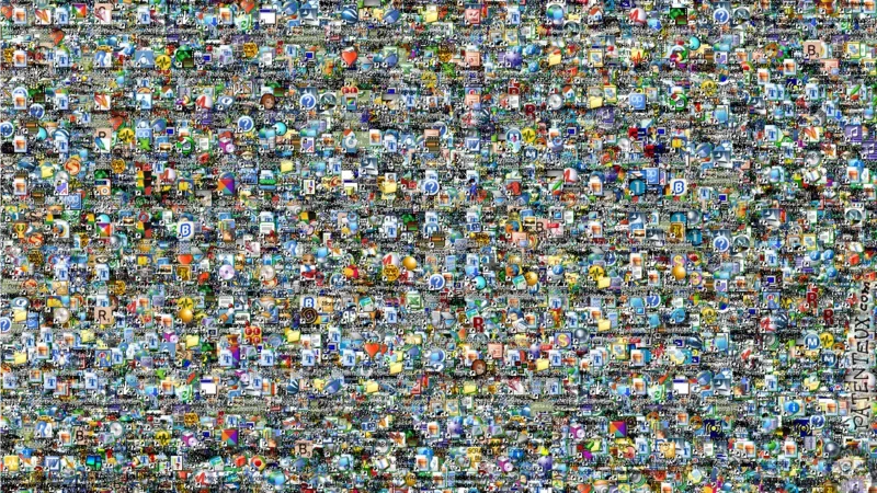
This feels more like a magic eye picture than a usable desktop
I kept to my chaotic ways for years until it cost me everything (technically this is a lesson in clumsiness, but still).
I was working at a restaurant, laptop open, hard drive plugged in beside me. It fell. Hit the tile floor and broke into pieces. Every year of college work, every personal asset, every font I’d collected, every mockup, everything I had ever made, lived on that drive. It was irrecoverable. I looked up at the stranger sitting next to me and meekly whispered, “My life’s work…”
After grieving the loss of accidentally wiping my design assets, I moved exclusively to Google Drive, paid for the extra terabytes (totally worth the expense!!), and built a system so I would never, under any circumstances, lose anything again.
Here’s what that system actually looks like. Get ready to see a lot of screenshots.
The top level: [Year] Design
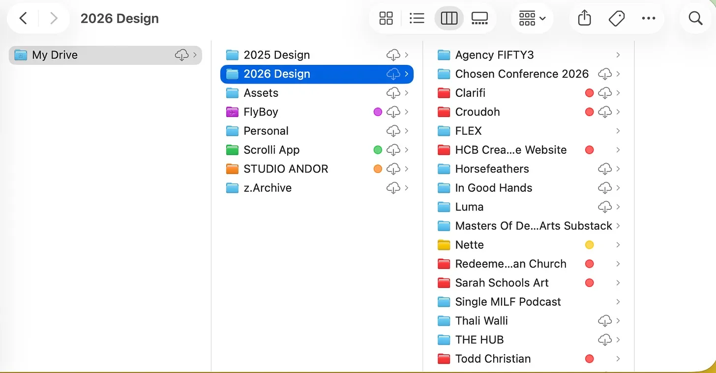
Every year gets its own folder. Inside that, every project gets its own folder. And inside every single project folder, without exception, live the same five folders: Assets, Brand Materials, Business, Copy, Design.
I picked up ABCD from my very first internship. The second B, Brand Materials, used to live inside Assets, but I found myself opening it so often that it earned its own top-level spot. Small change, but it’s saved me a hundred extra clicks since.
The goal with any of this isn’t to make it look organized. It’s to make it findable. Years from now, or if I hand a project to a junior designer and ask them to pull a file, it should be straightforward, not a scavenger hunt.
Assets
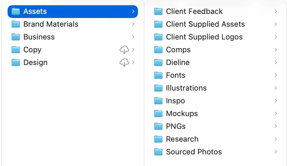
Everything needed to get the project off the ground lives here: inspiration, client-supplied fonts, imagery, moodboards, sourced photography, licensed or custom illustrations, textures. This is also where I keep every link I use in presentations or brand guideline documents, which means once something lands in this folder, it stays there. Move a file and you break the link….so I don’t move it.
Brand Materials
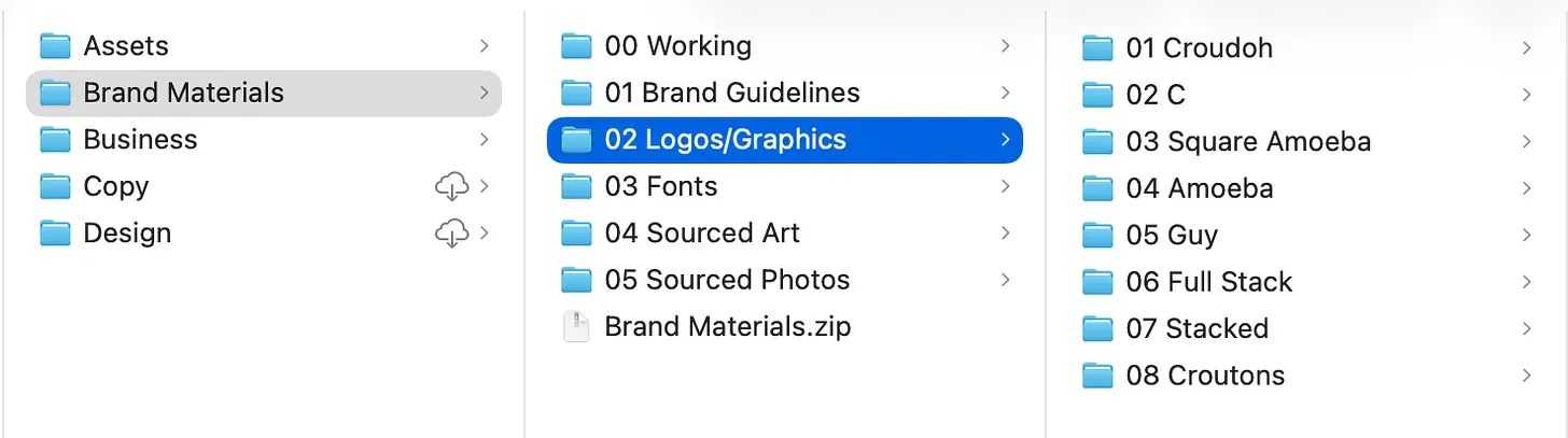
I borrowed this structure from another agency, and it’s the one I’m asked about most. It’s numbered:
00 Working holds the live files. Clients never see this folder. CMYK and RGB Illustrator files, separated by artboard, plus the working InDesign file for the brand guidelines document.
01 Brand Guidelines is the finished PDF, the single source of truth for the brand. Rules, colors, typefaces, application examples, all of it.
02 Logos contains every lockup, numbered from most to least prominent (the primary wordmark is almost always 01), each one exported in EPS, PNG, JPG, and SVG.
03 Fonts stays internal too. I send clients the links to license their own copies rather than the files themselves.
From there it depends on the project: sourced textures, an icon set, stock photography to hold the brand over until they hire a photographer.
Everything the client actually receives gets zipped and dropped at the bottom of this folder, so the working files and the delivered files never get confused.
Business
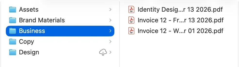
Copies of invoices, receipts, and contracts. I run client management through Dubsado, so I could technically find all of this there, but I like having a local backup I don’t have to log in to search.
Copy
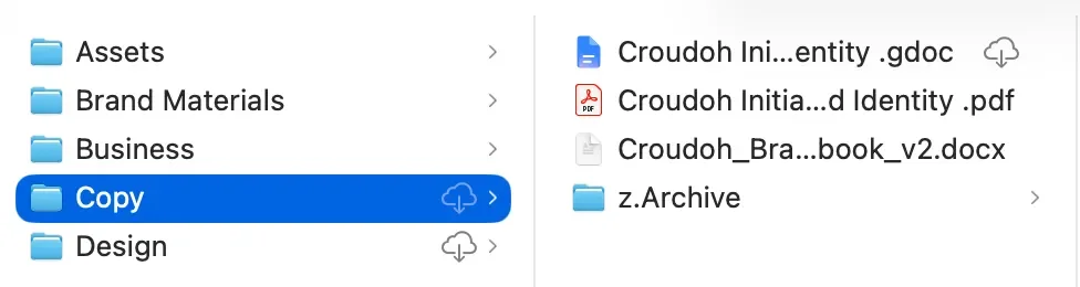
Client-supplied or written by me. Headlines, taglines, website copy, whatever the project needs. I also have all of my notes and meeting discussions in this folder. On a project like Croudoh, where copy shows up all over the packaging itself, or a website build, I use this folder constantly.
Design

This is where the actual files live and where my versioning system does most of its work.
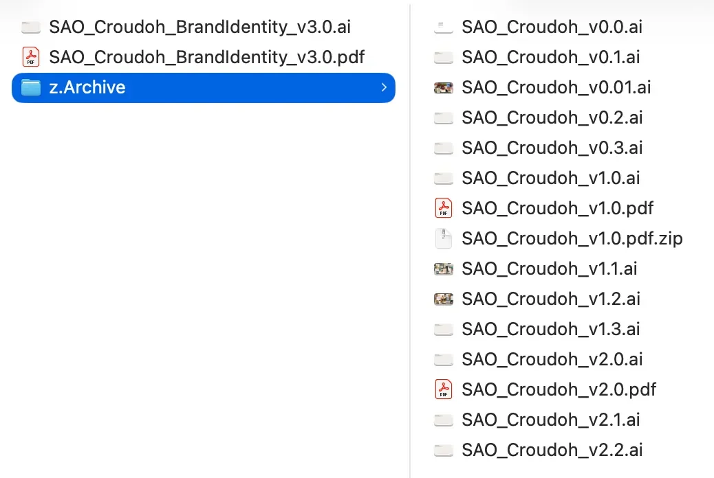
Every file follows the same naming convention: SAO_ClientName_ProjectType_v0.0.
SAO is shorthand for Studio Andor, followed by the client, the project type, and the version. It's consistent and professional, and it means I always know exactly what I’m looking at without opening the file.
The version numbers tell their own story. While I’m still designing, internally, it’s v0.1, then v0.2, v0.3, climbing as I make edits. The first file I actually send a client, always a PDF, never the working Illustrator file, becomes v1.0. That kicks off a second round of numbering: v1.1, v1.2, as I incorporate their feedback. If I’m ever presenting something past v3.0, that’s my signal that we’ve gone past scope, and it’s time to have the conversation about billing for additional rounds.
Anything no longer in use doesn’t get deleted. It moves to z.Archive. I never throw old concepts away, because you never know when you’ll need to go back to one mid-project.
The Test
If a junior designer opened this Drive and I asked them to find the current logo files for a client, could they do it in under five minutes without asking me a single question? That’s the whole point of the system. And I also feel way less mentally cluttered/stressed while working. I’m a big believer in fixing it once and spending the time to set future you up for success.
I built this the hard way, one lost hard drive and one desktop full of unlabeled icons at a time. You don’t have to. If this feels overwhelming, start with a consistent naming system.
Class Dismissed.
