

STUDIO ANDOR Brand Reveal
STUDIO ANDOR. Strategic Design. Lasting Impact.
In a crowded market, true distinction is not just seen; it commands attention. STUDIO ANDOR transforms your unique vision into an authoritative and unmistakable brand presence. We distill your essence into a cohesive and compelling identity that doesn’t just stand out but confidently leads, setting a new benchmark for prestige and recognition within your industry.
Follow along to see a bit of our process and the strategy behind the rebrand of STUDIO ANDOR
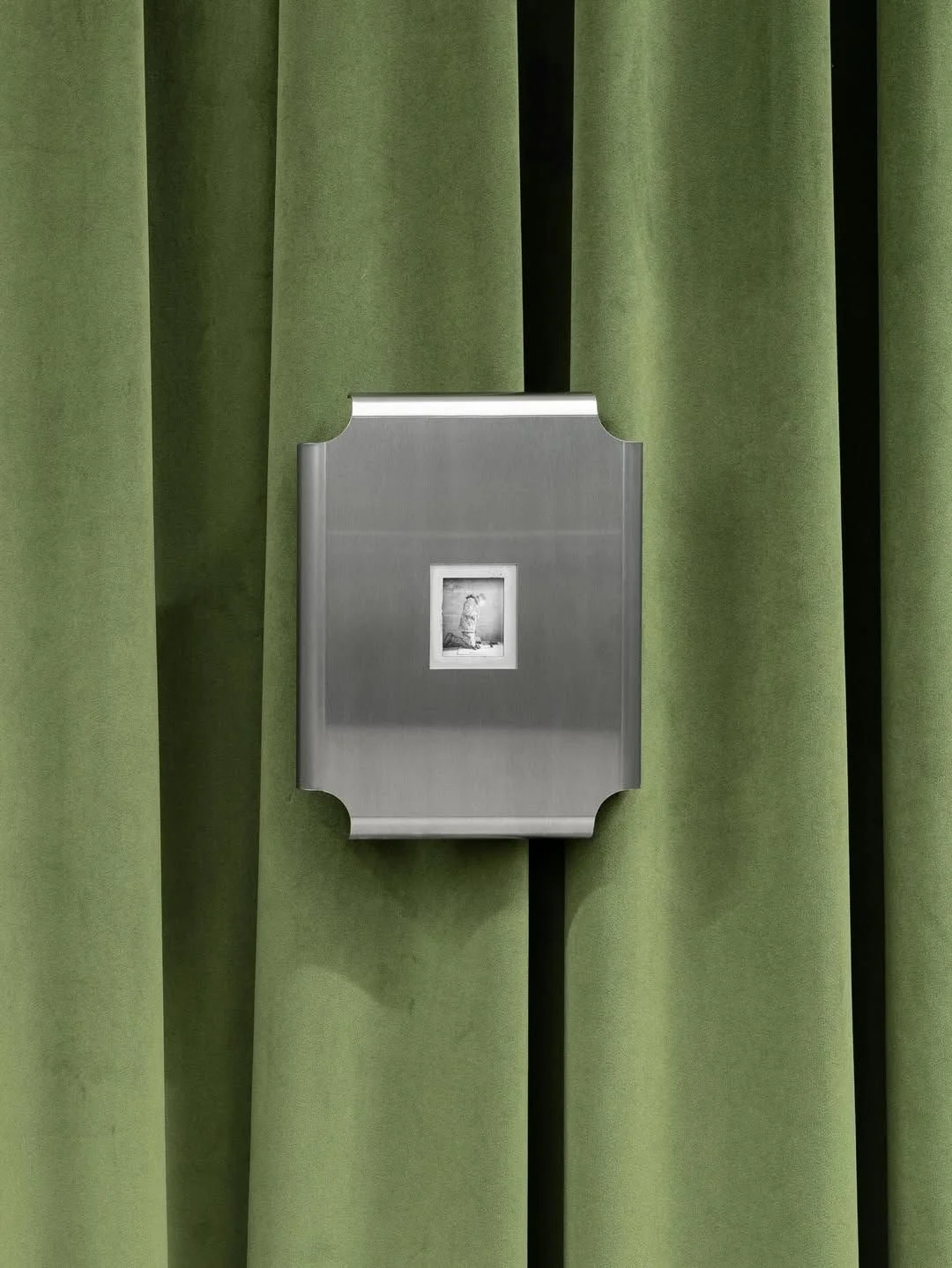
MOODBOARD


OUR VALUES


STRATEGIC EXCELLENCE
Every project we undertake is rooted in deep strategic thinking, ensuring that our design solutions are not just aesthetically pleasing but also purpose-driven and effective in achieving our clients’ business objectives.
ENDURING QUALITY
We are committed to delivering high-end, robust solutions—whether it’s a comprehensive brand system or a premium website—designed for longevity, scalability, and lasting impact in competitive markets.
HOLISTIC COHESION
We believe in the power of a unified brand experience. Our work ensures seamless integration and consistency across all touchpoints, creating a refined and cohesive presence that resonates powerfully with the ideal audience.
OUR BRAND
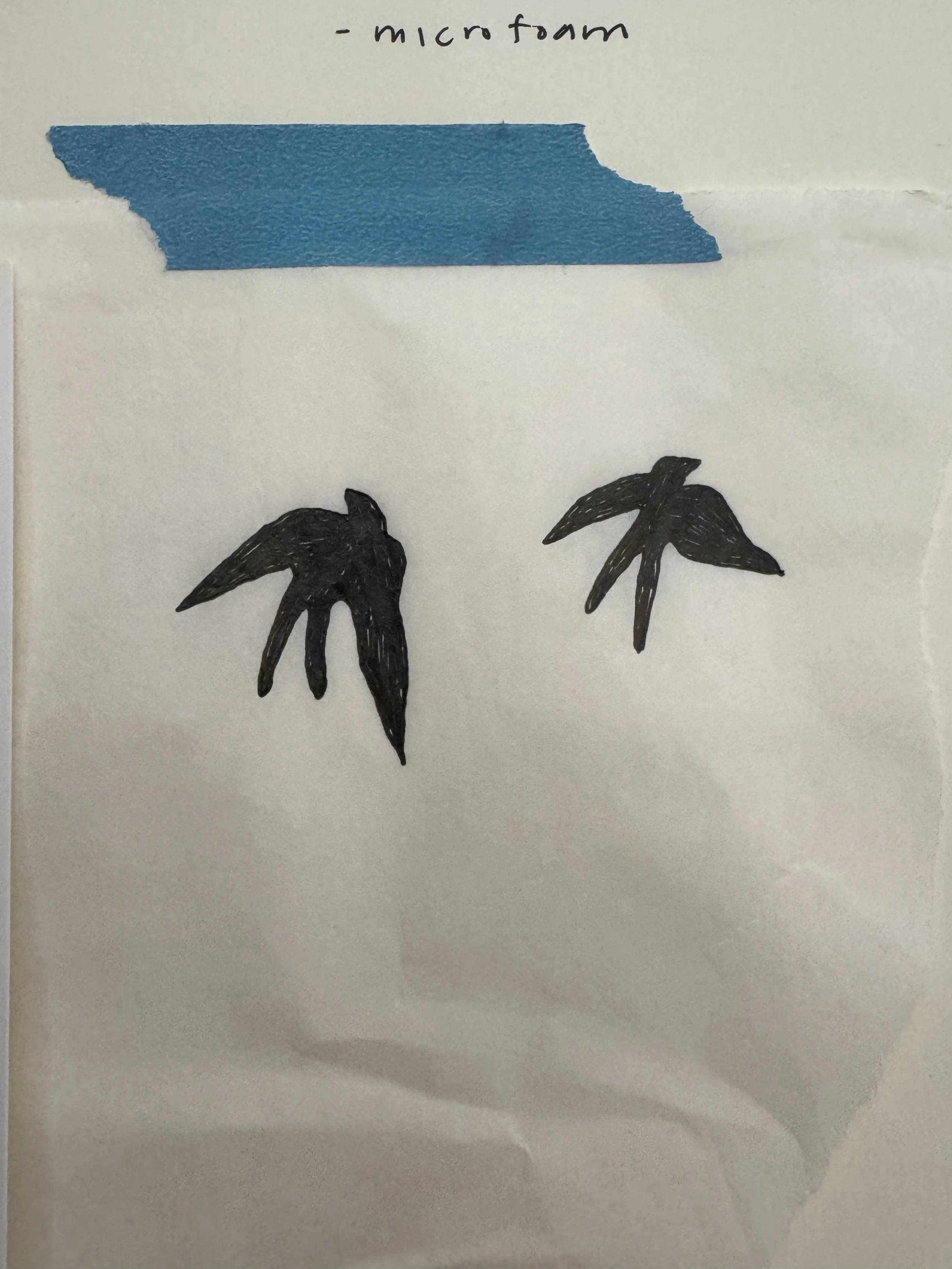
Early sketches of the andorinha icon
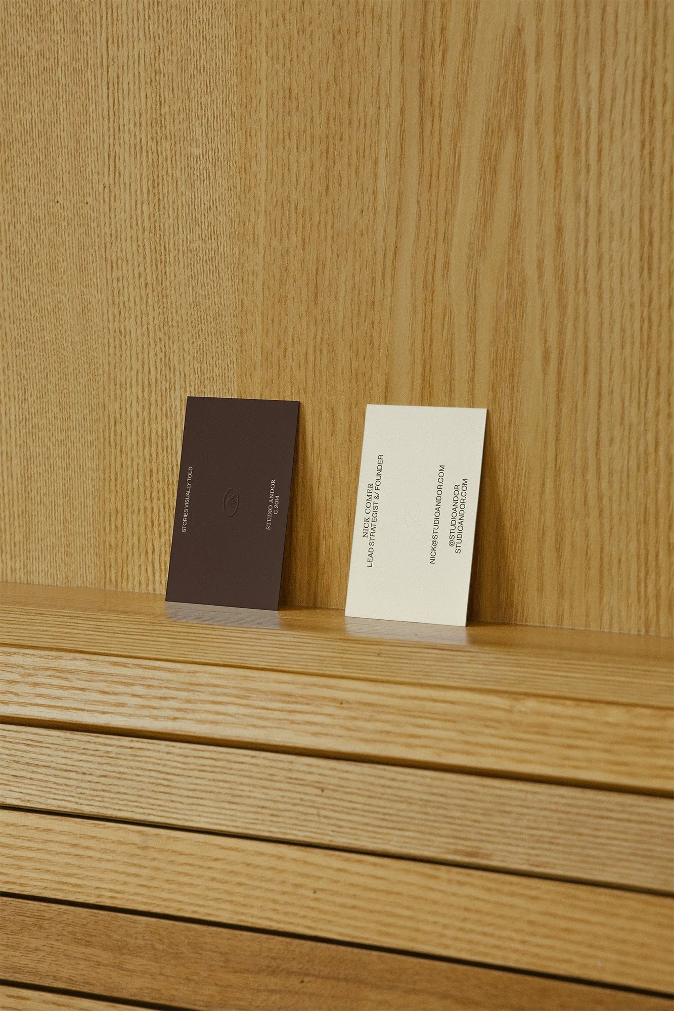
Our logo system is dynamic and layered. Our wordmark and primary logo are consisted of stable, antiquated looking letters with architectural lines closing open forms. This name can be broken apart to be “STUDIO” “ANDOR” or “AND” “OR”. The flexibility of this system is inclusive of the notion of and/or: it can’t be contained in a box and is ever in flux.
Additionally, the brand contains a signature, an icon of the andorinha (swallow), and a series of seals that represent the brand. These seals are inspired by the marks that ceramicists and jewelry makers use to stamp their work, a nod to the craftsmanship and timelessness that our brand stands on.


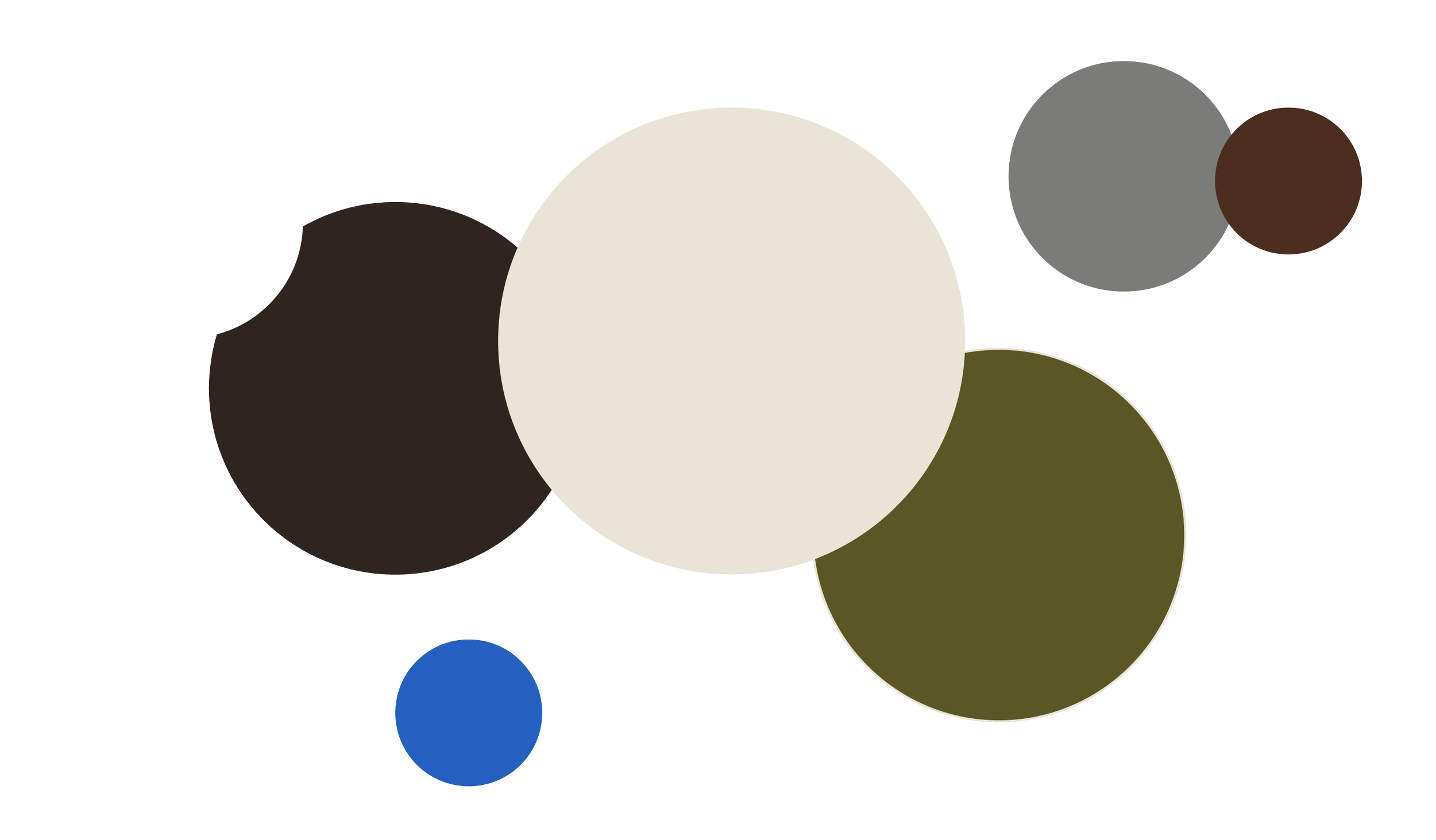
OUR COLOR PALETTE
This palette, inspired by the deep character of antique furniture, the soothing embrace of nature, and that surprising element of vibrancy, serves a strategic purpose. The deep, grounding tones like Moss, Walnut, and Midnight evoke a sense of heritage, stability, and understated luxury, much like a beautifully preserved antique piece. They communicate gravitas and an established presence. The lighter shades of Creme, White, and Sterling provide a clean, modern canvas, reflecting the minimalist and curated aesthetic we champion. Finally, the strategic inclusion of Cornflower blue acts as that “unexpected vibrancy” – a thoughtful accent that provides energy, distinctiveness, and a modern edge, preventing the palette from feeling overly traditional.
Together, these colors create a refined, moody, and exclusive feel, radiating power and allure, and highlighting the exquisite lifestyle our work enables for our high-end clients. It’s a palette that speaks to our Enduring Quality and Holistic Cohesion, ensuring every visual touchpoint is both sophisticated and impactful.


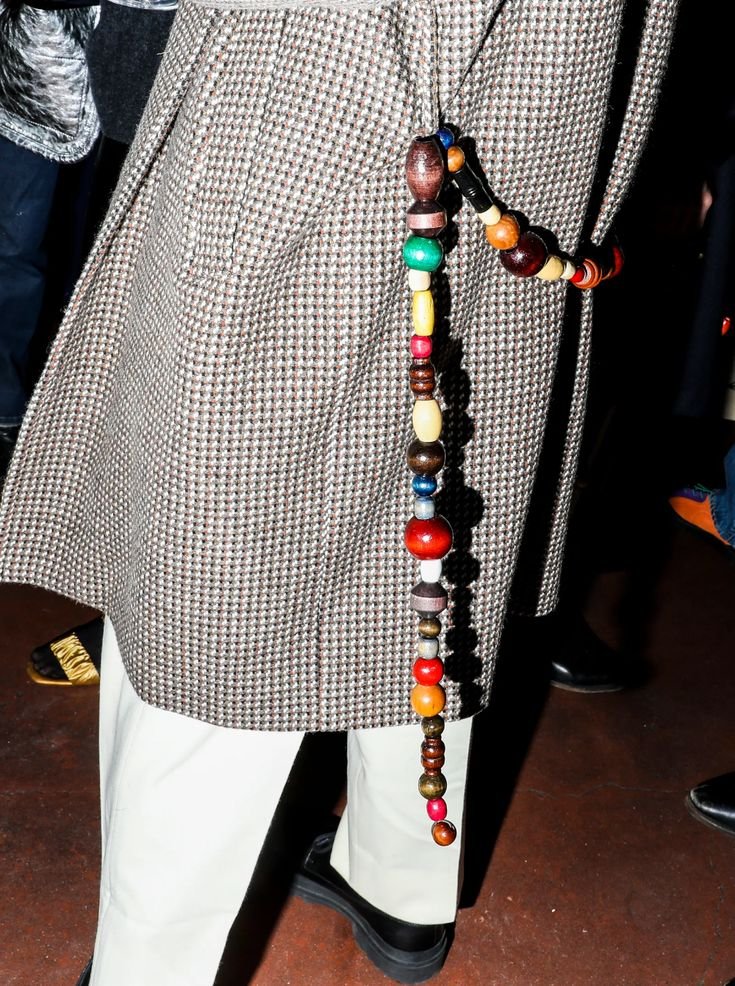
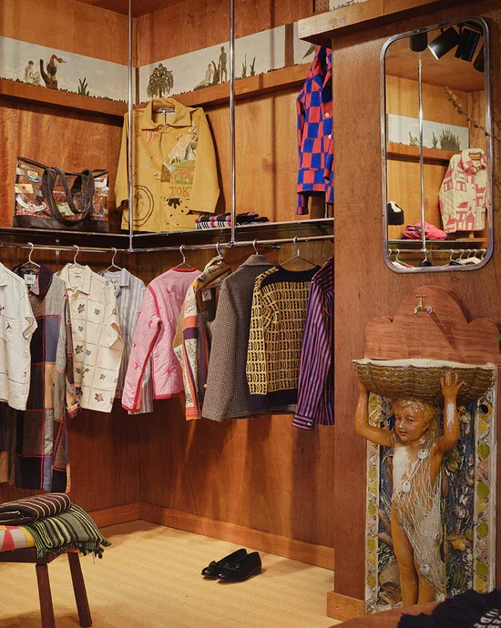
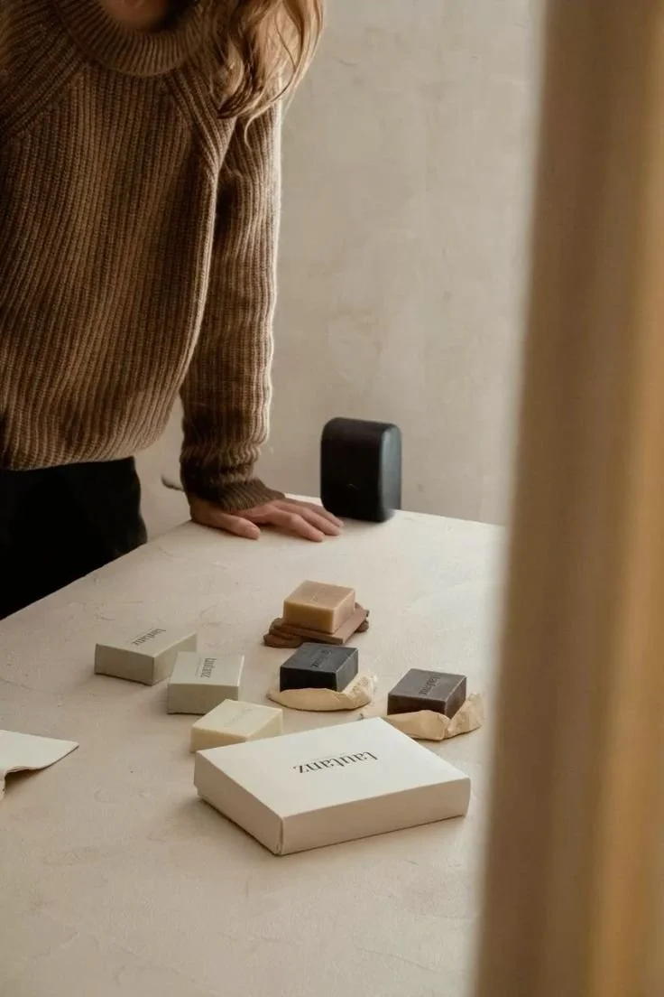
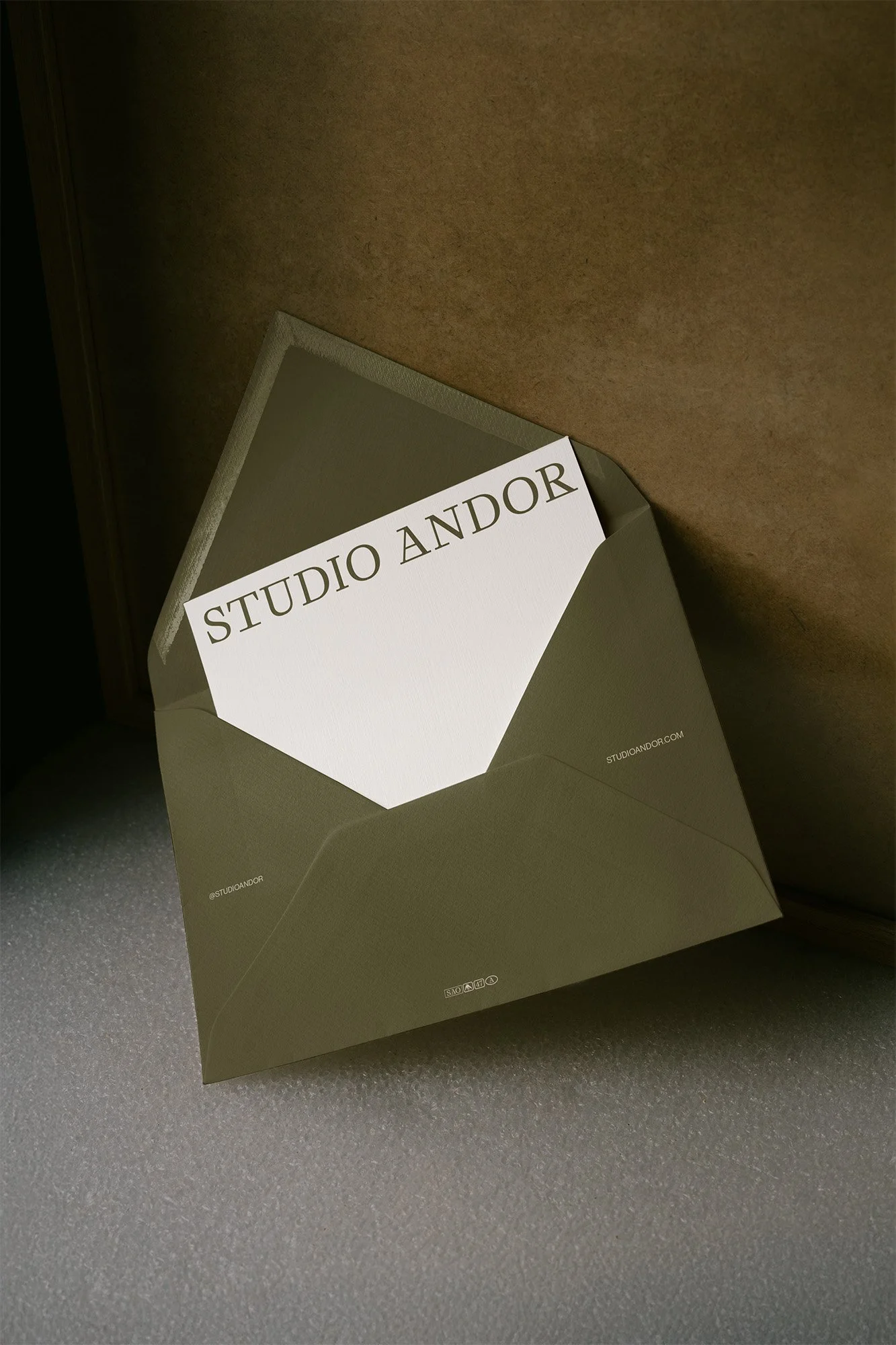
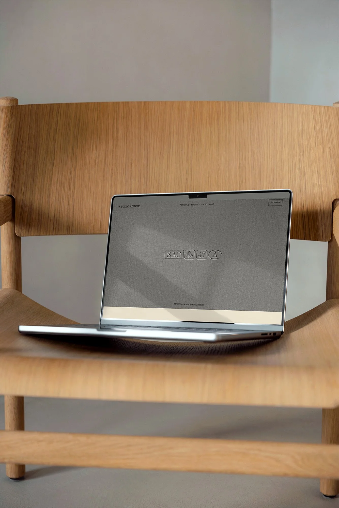
IN APPLICATION


STRATEGIC PARTNERSHIPS. UNRIVALED RESULTS.
Our approach is founded on genuine collaboration, forming strategic partnerships with our discerning clients. We immerse ourselves in your vision, combining our expertise with your unique insights to co-create solutions. This synergy ensures that every project culminates in unrivaled results: a brand identity or digital presence that not only meets but consistently exceeds the highest standards of luxury and effectiveness.