BREAD AND WINE
BRAND IDENTITY
BRAND STRATEGY
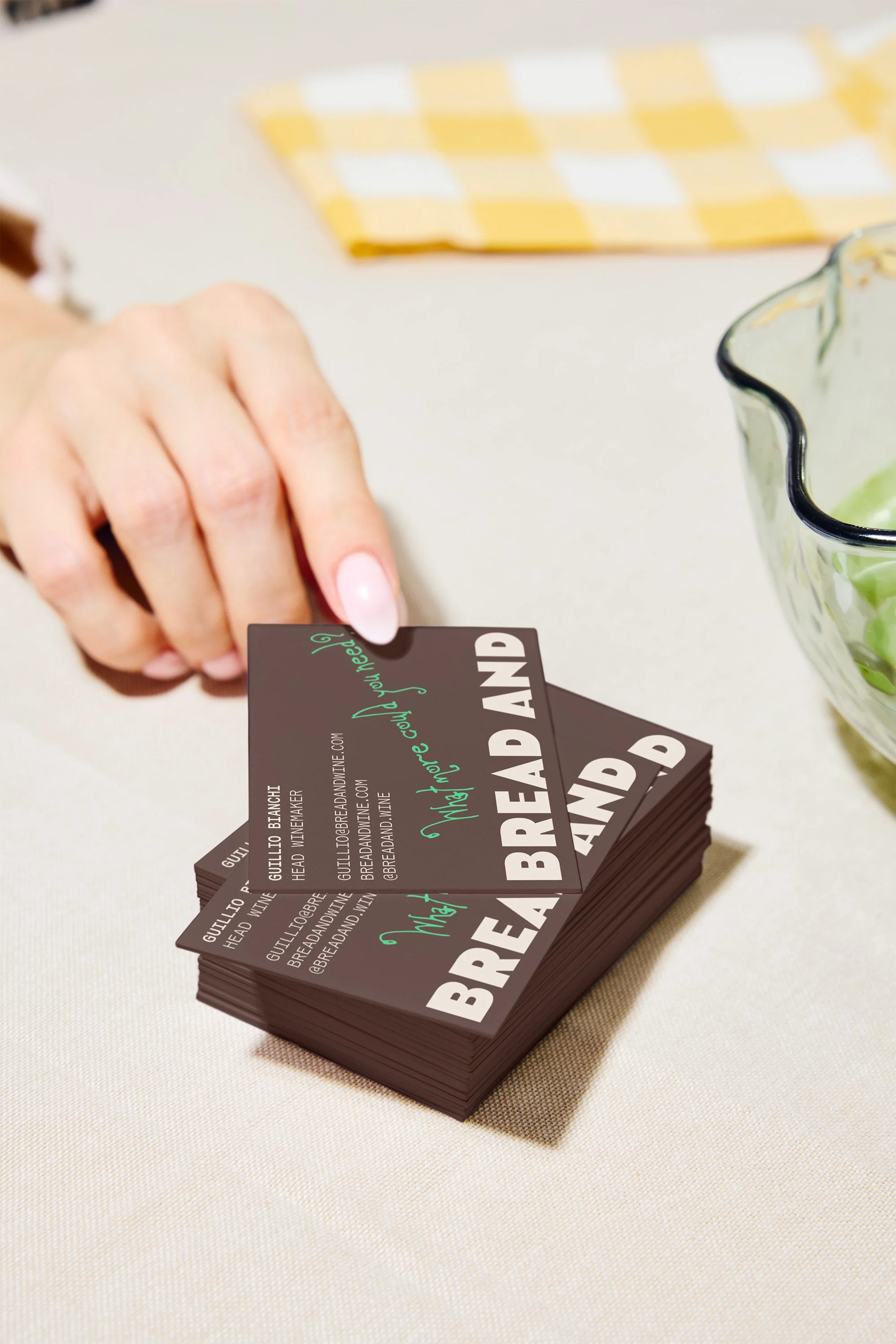
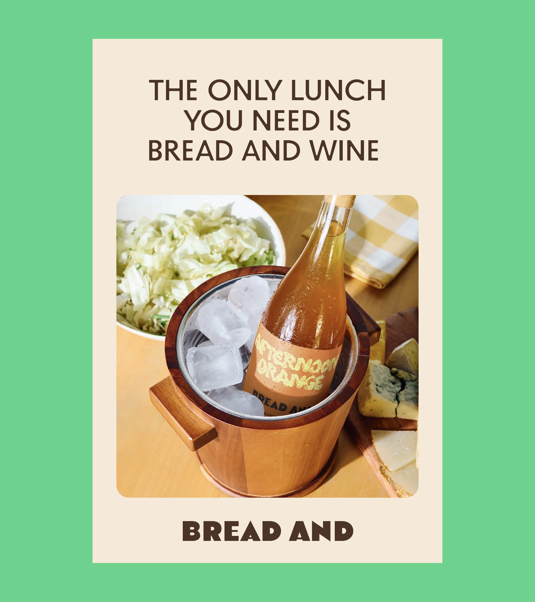
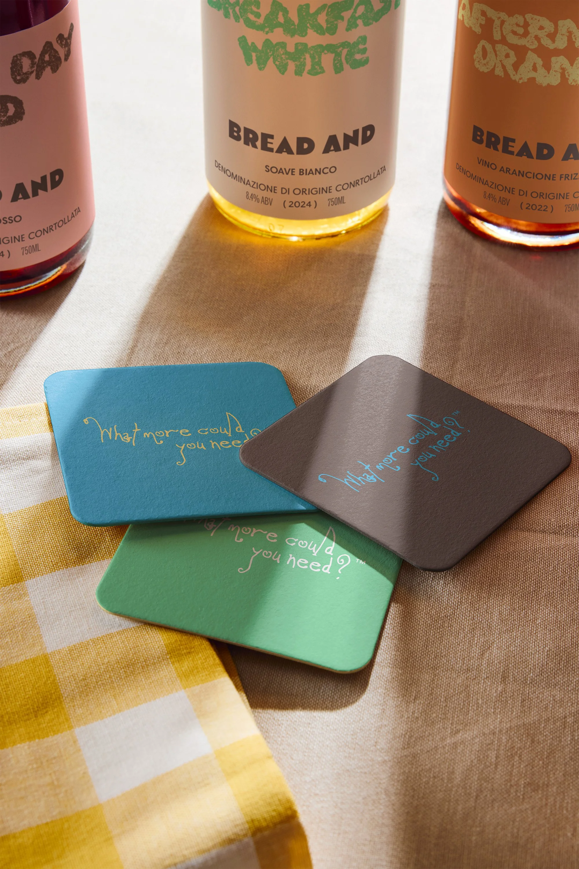
PACKAGING
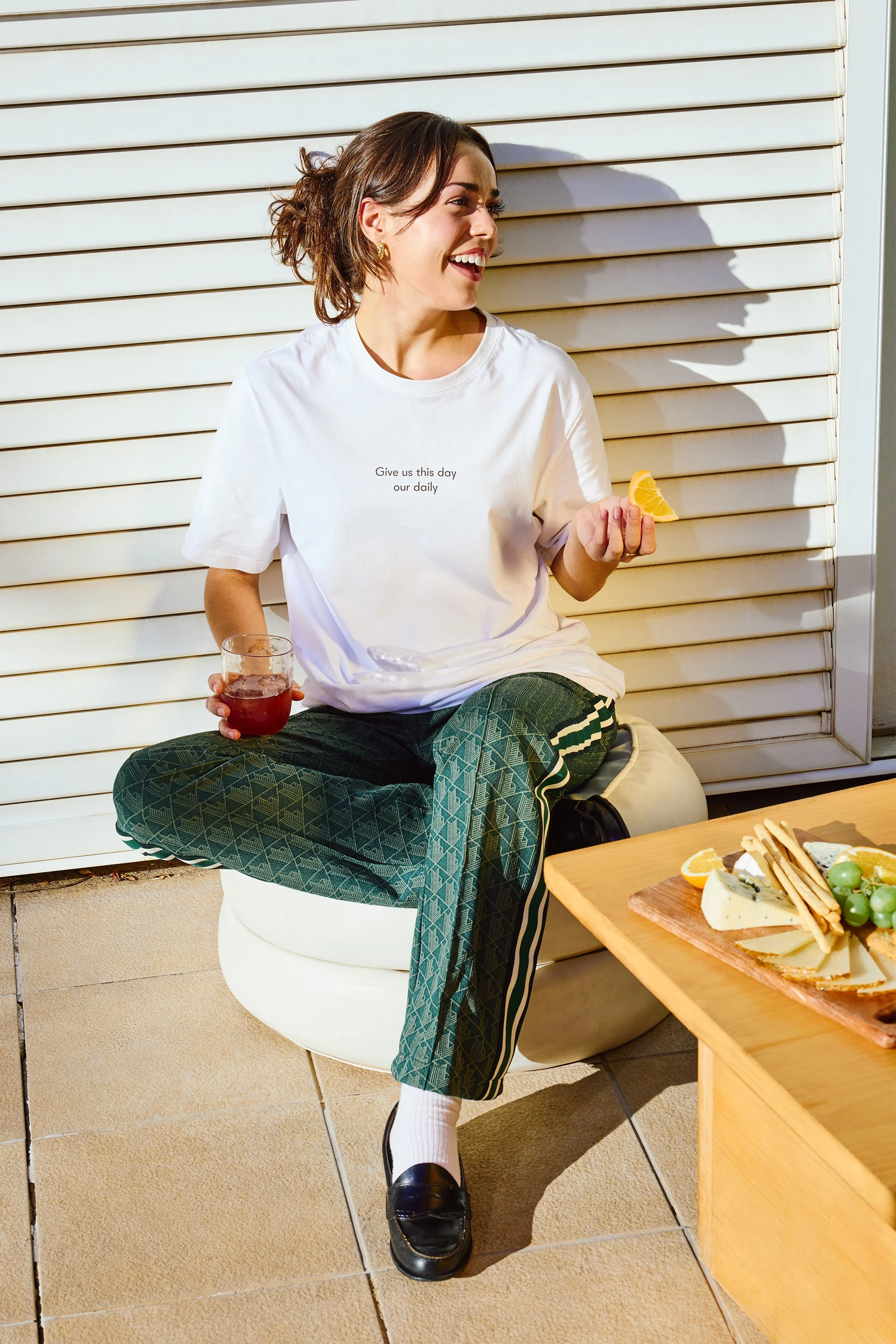
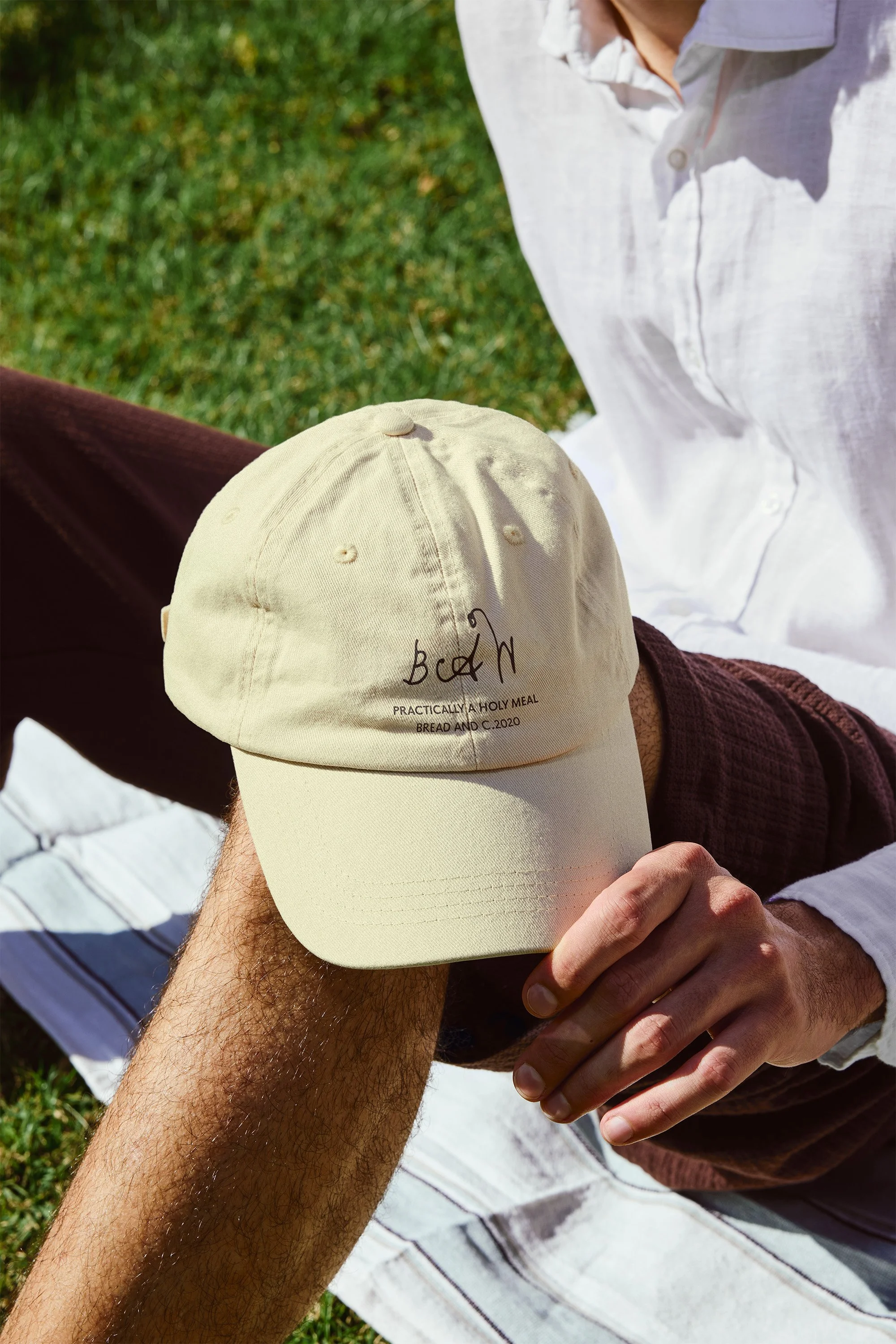
COLLATERAL

STRATEGY
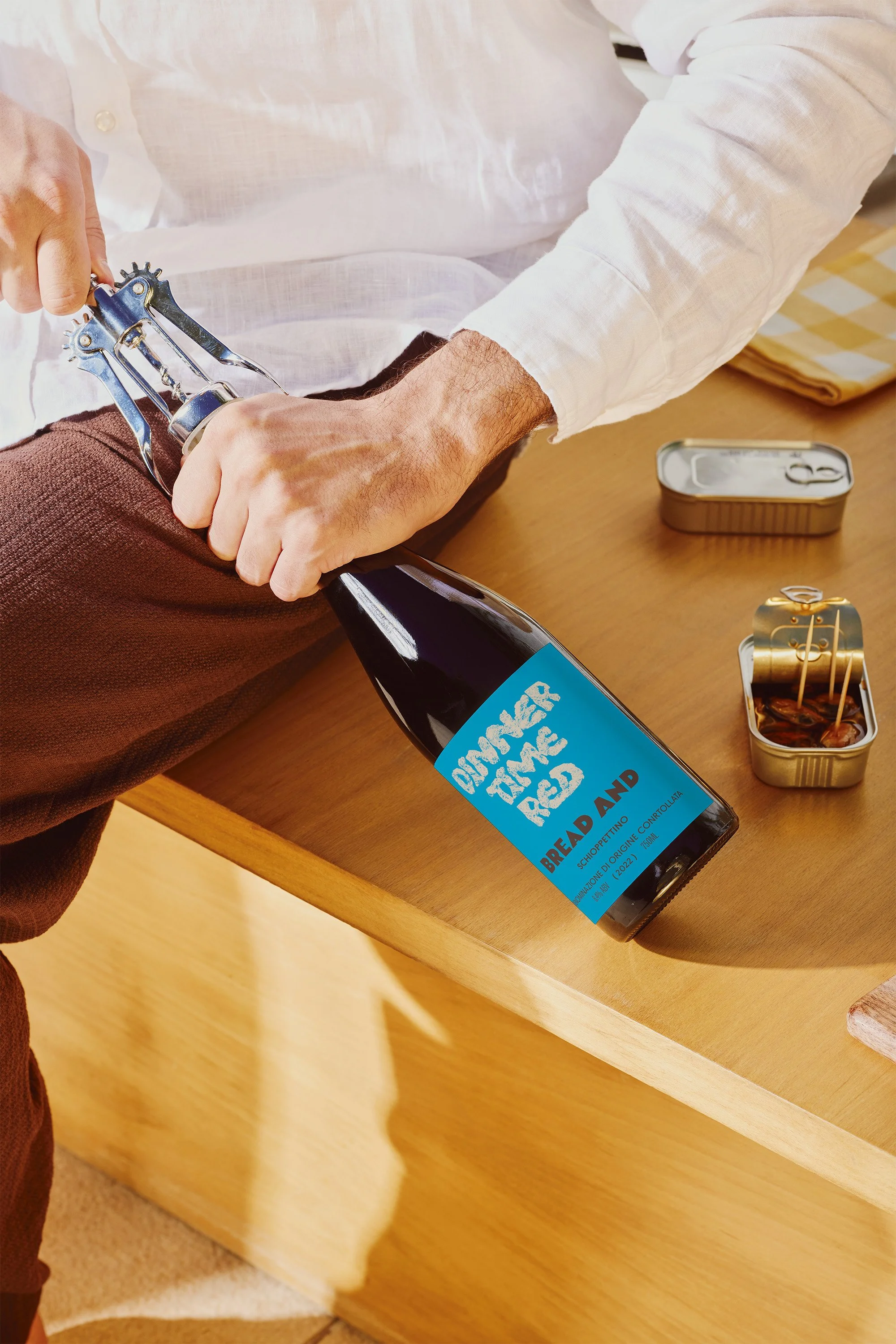
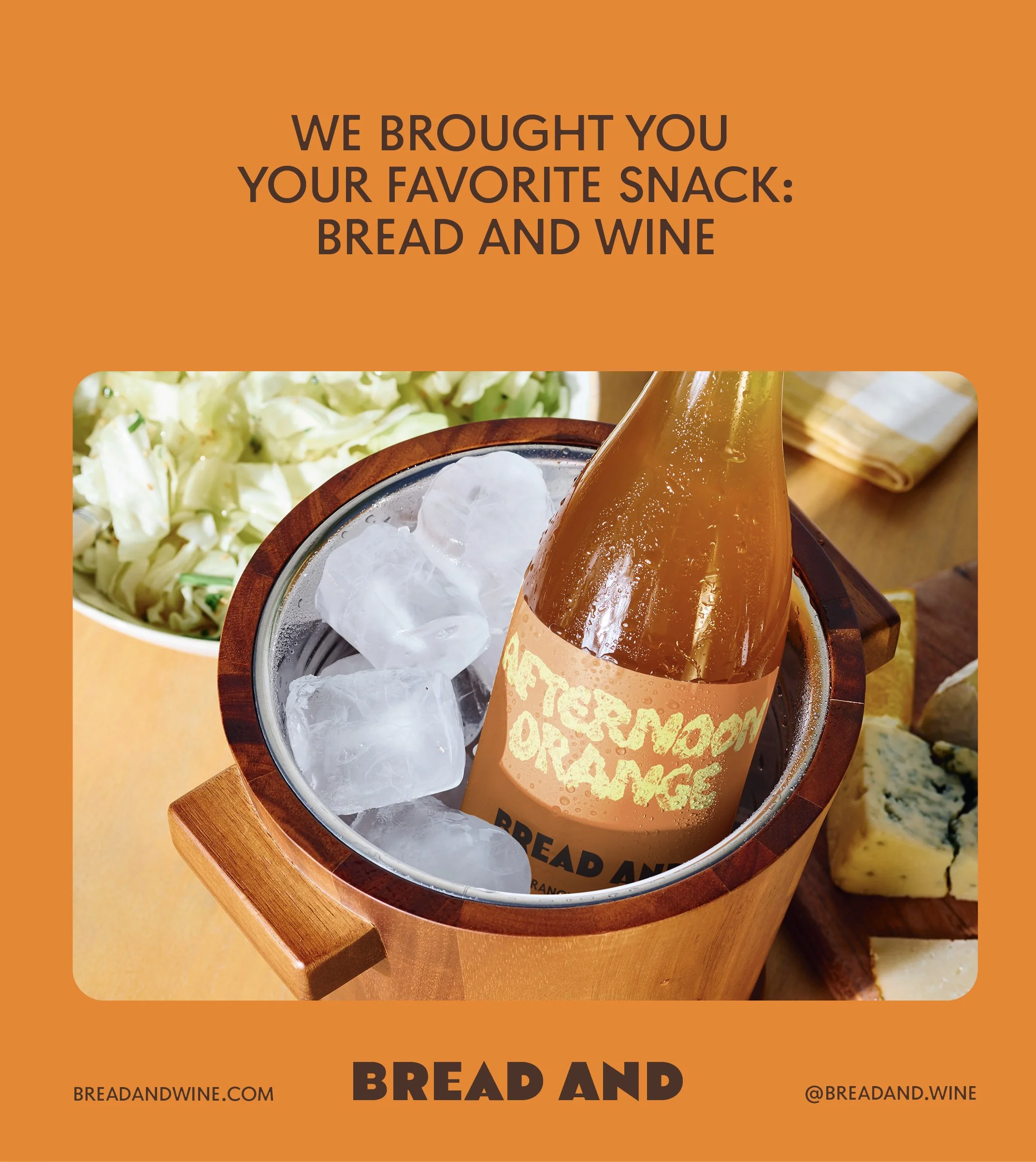
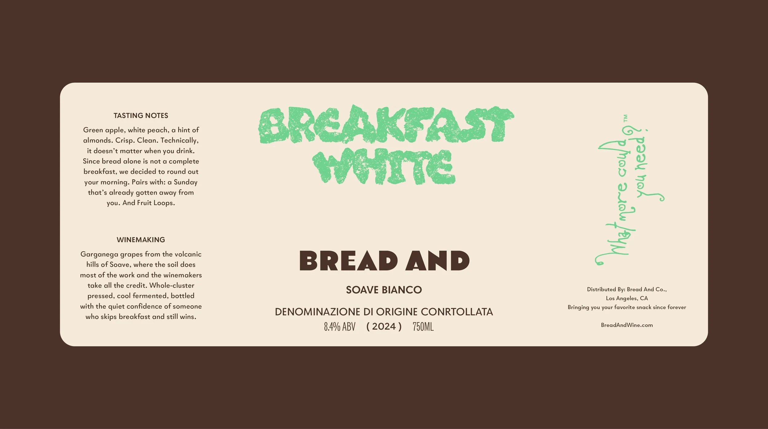
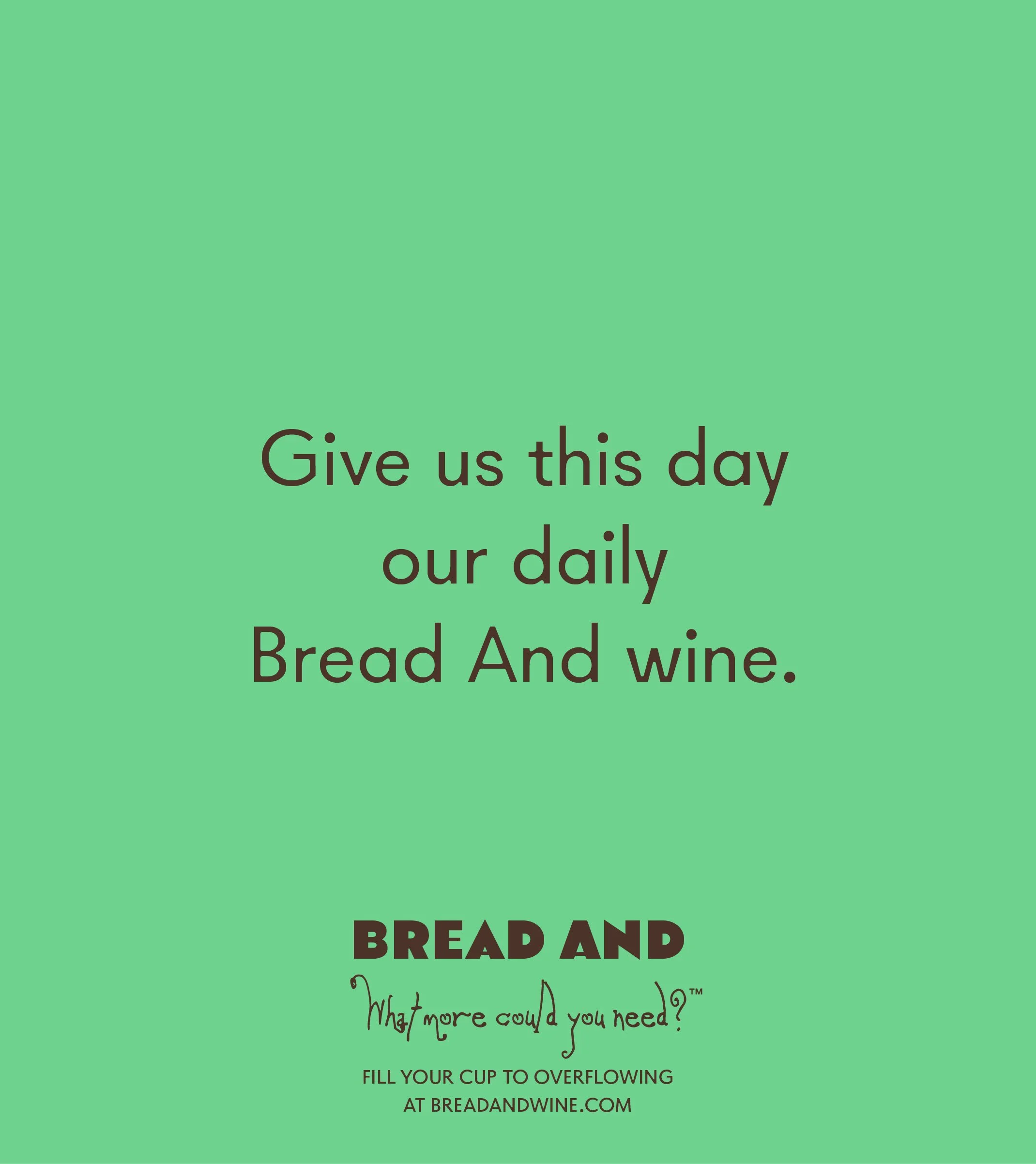
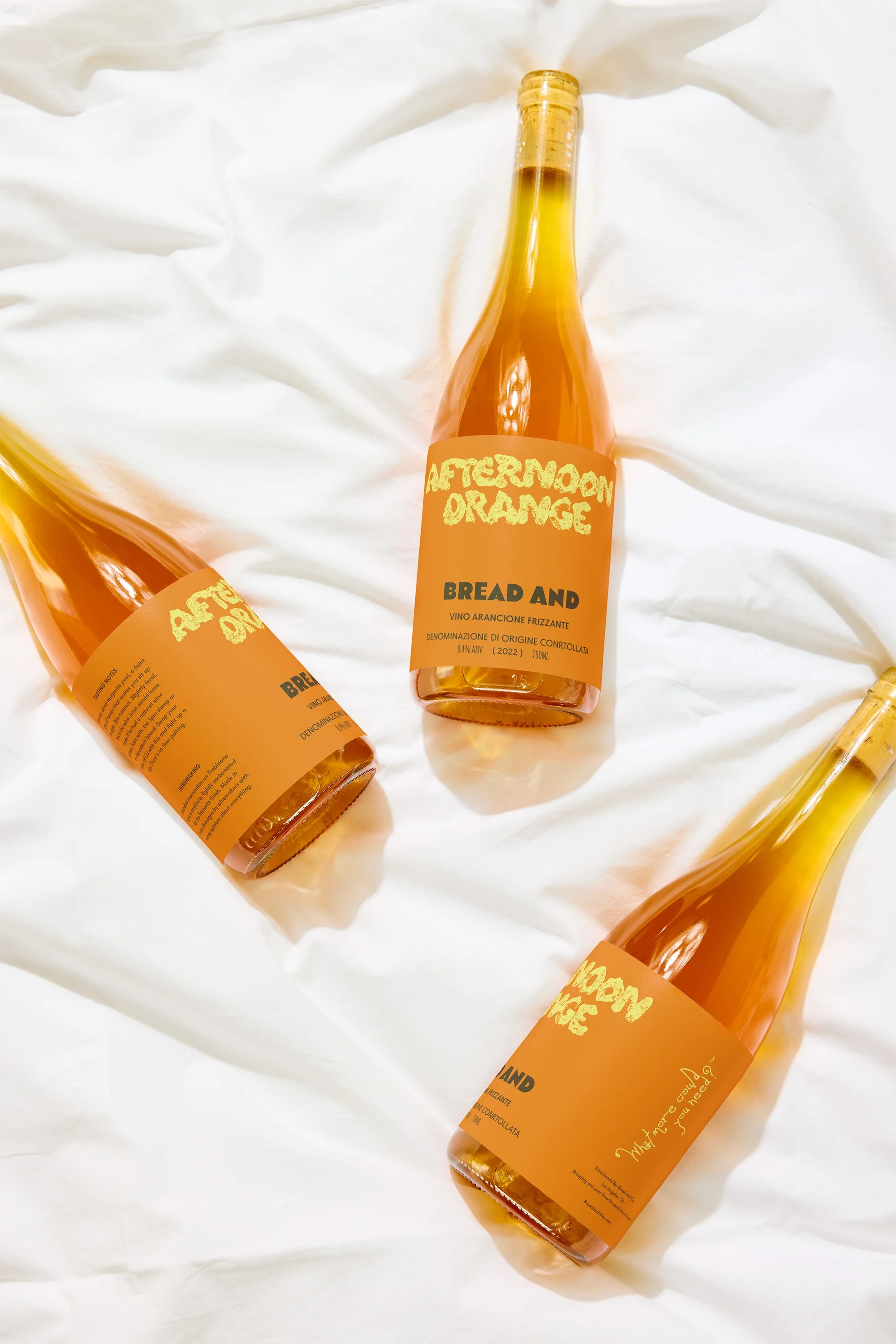
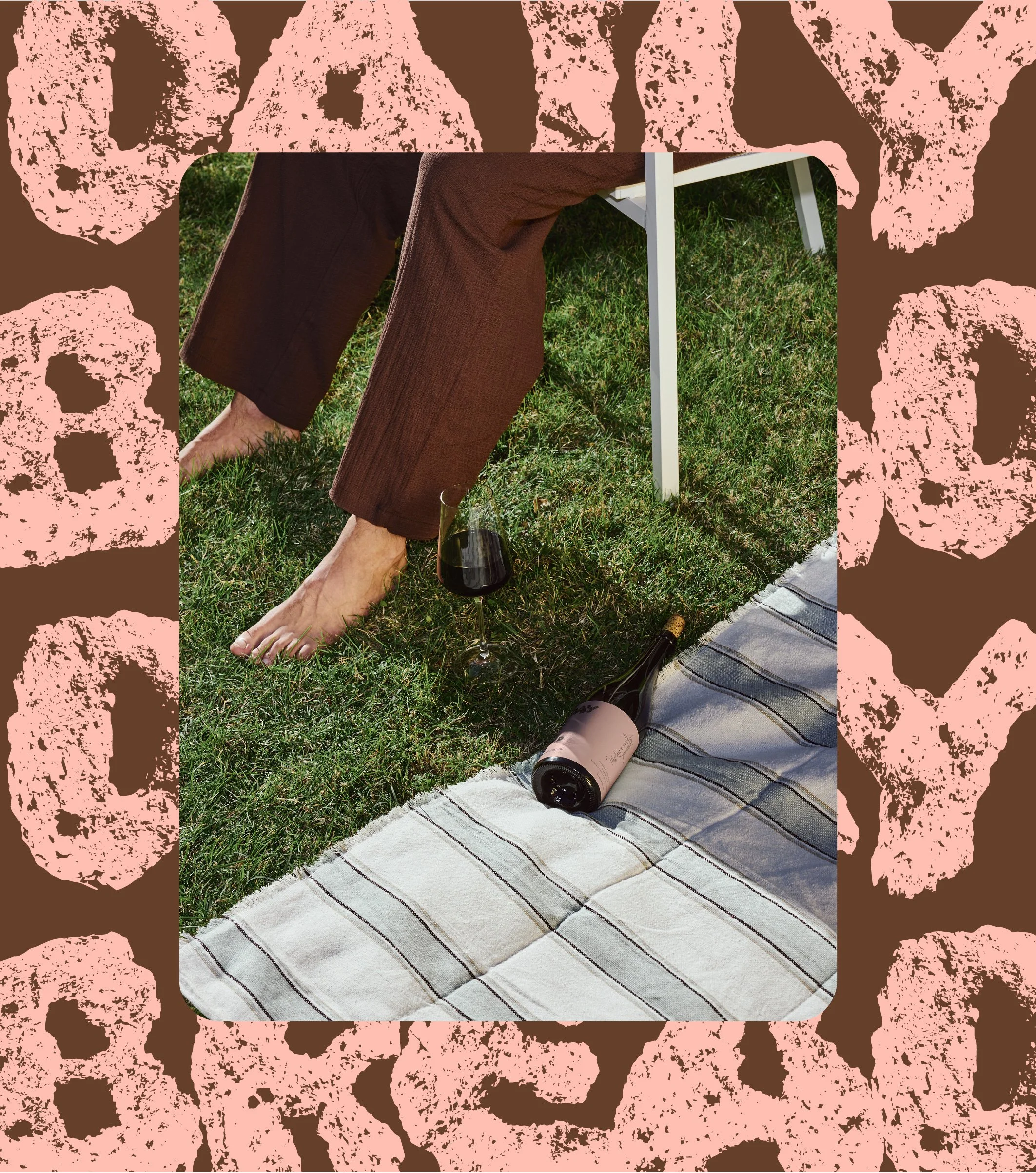
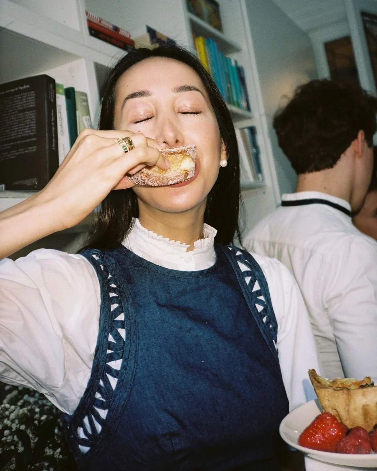
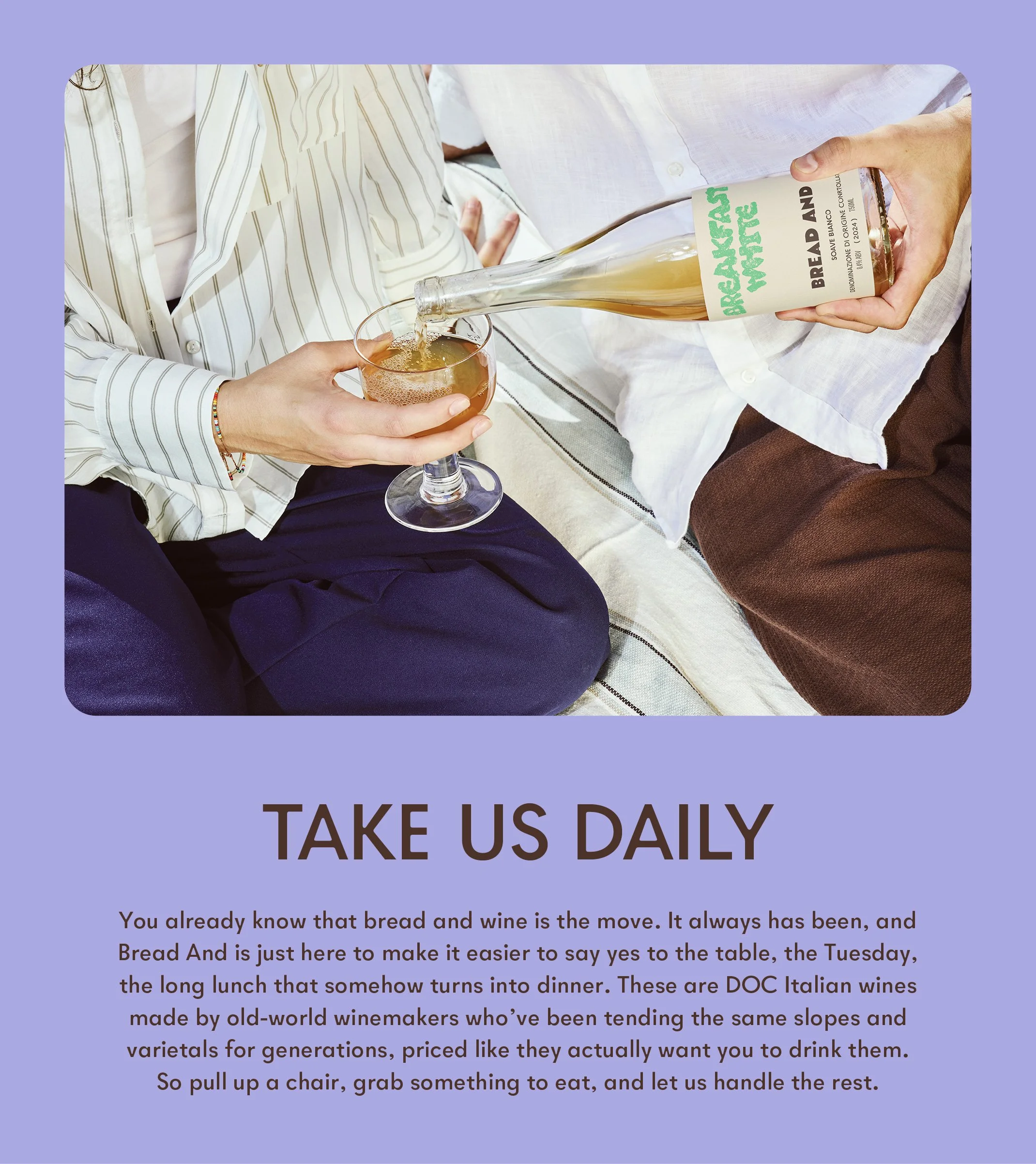
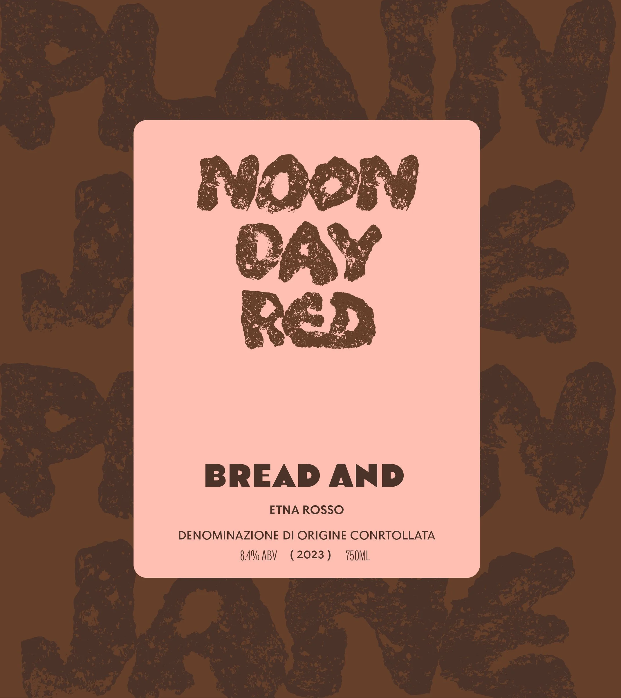
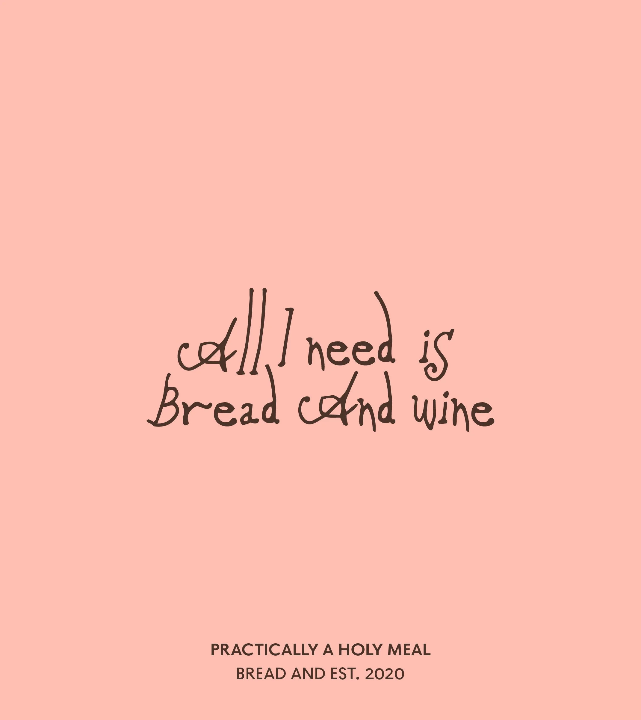
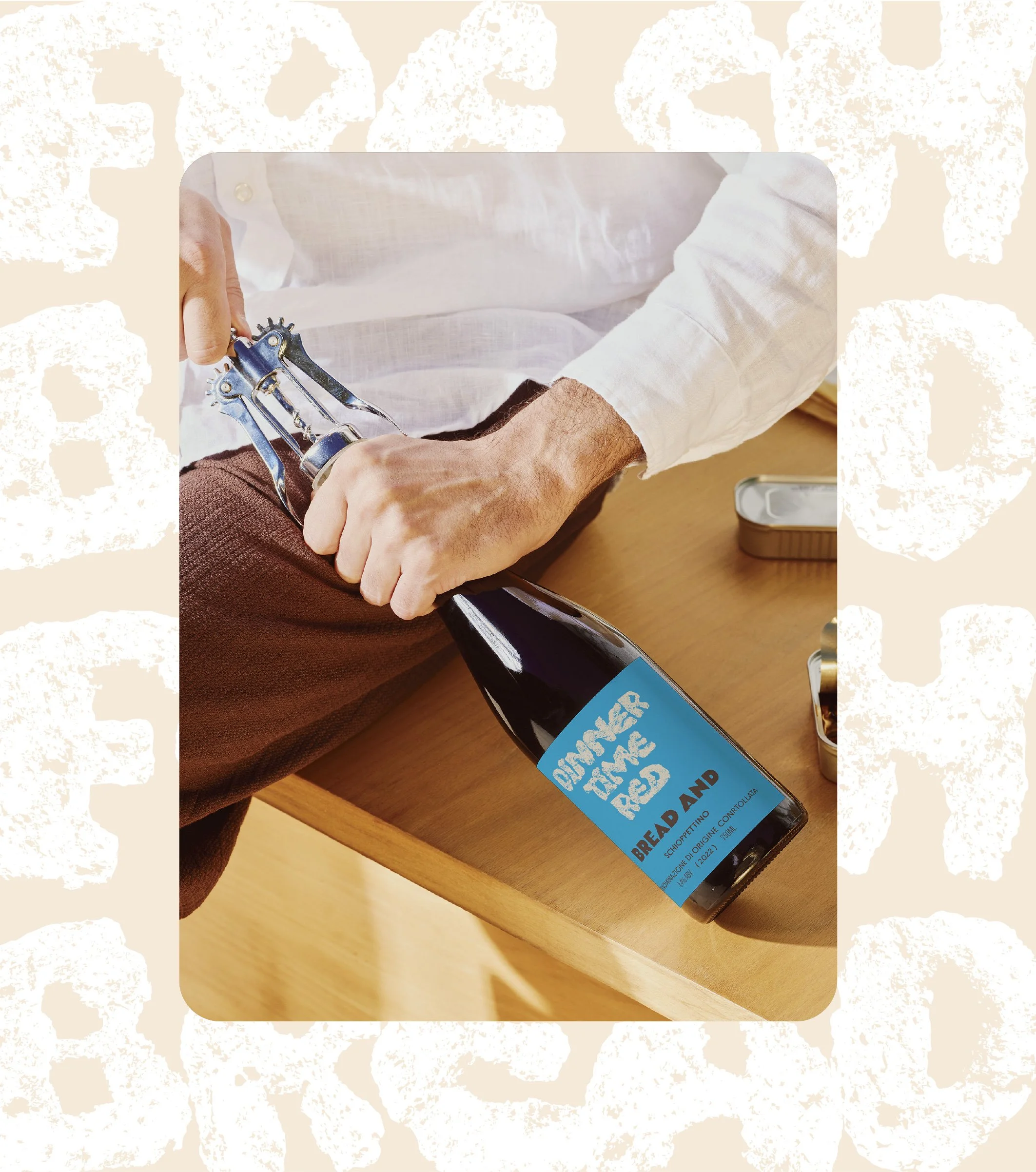
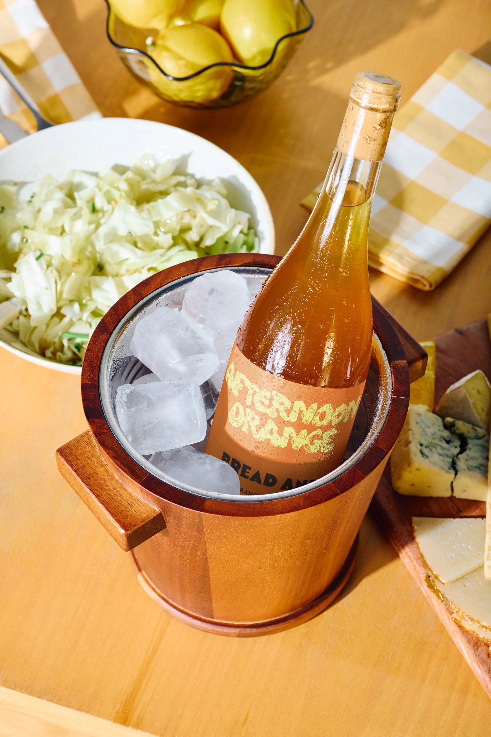
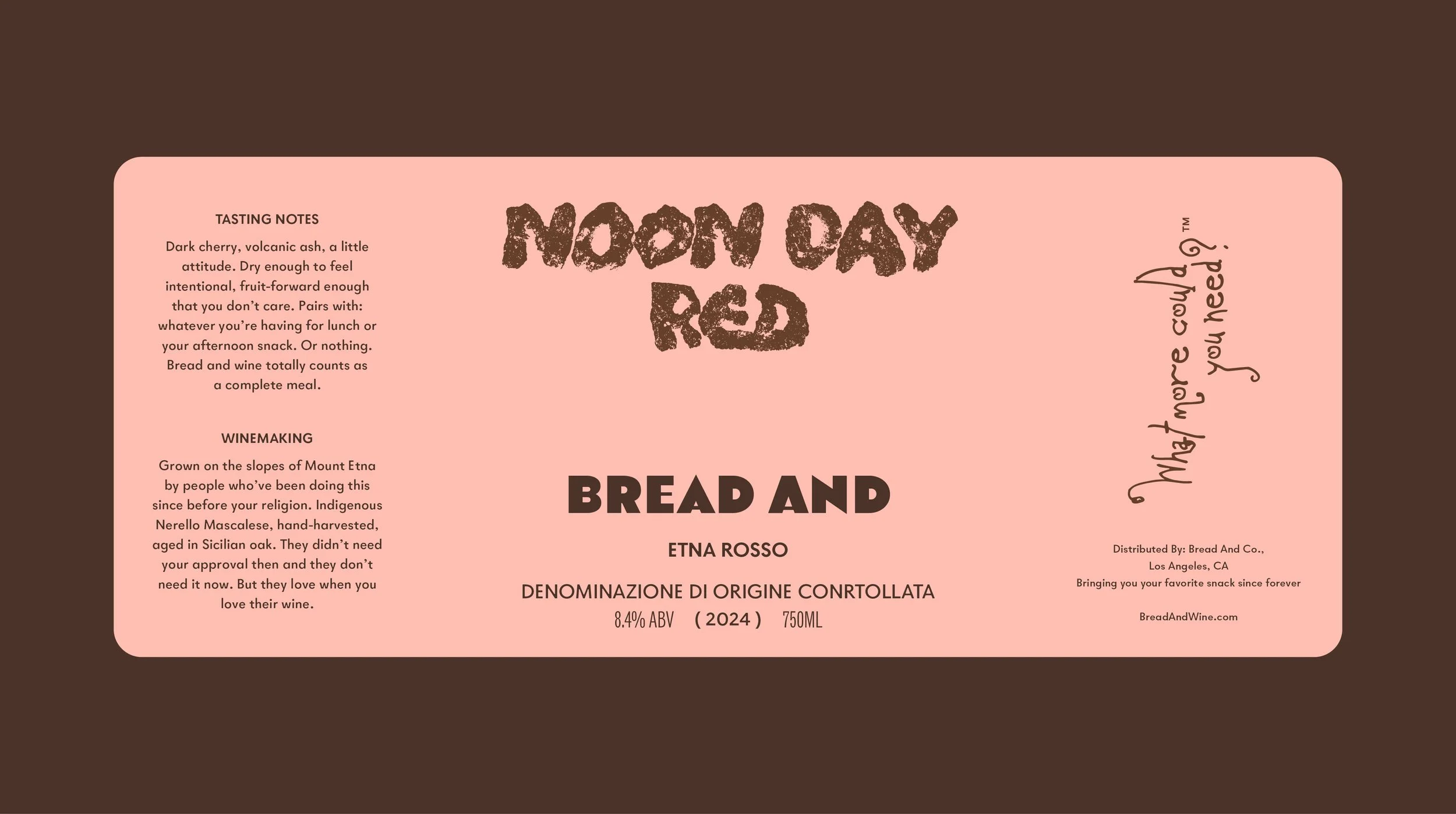
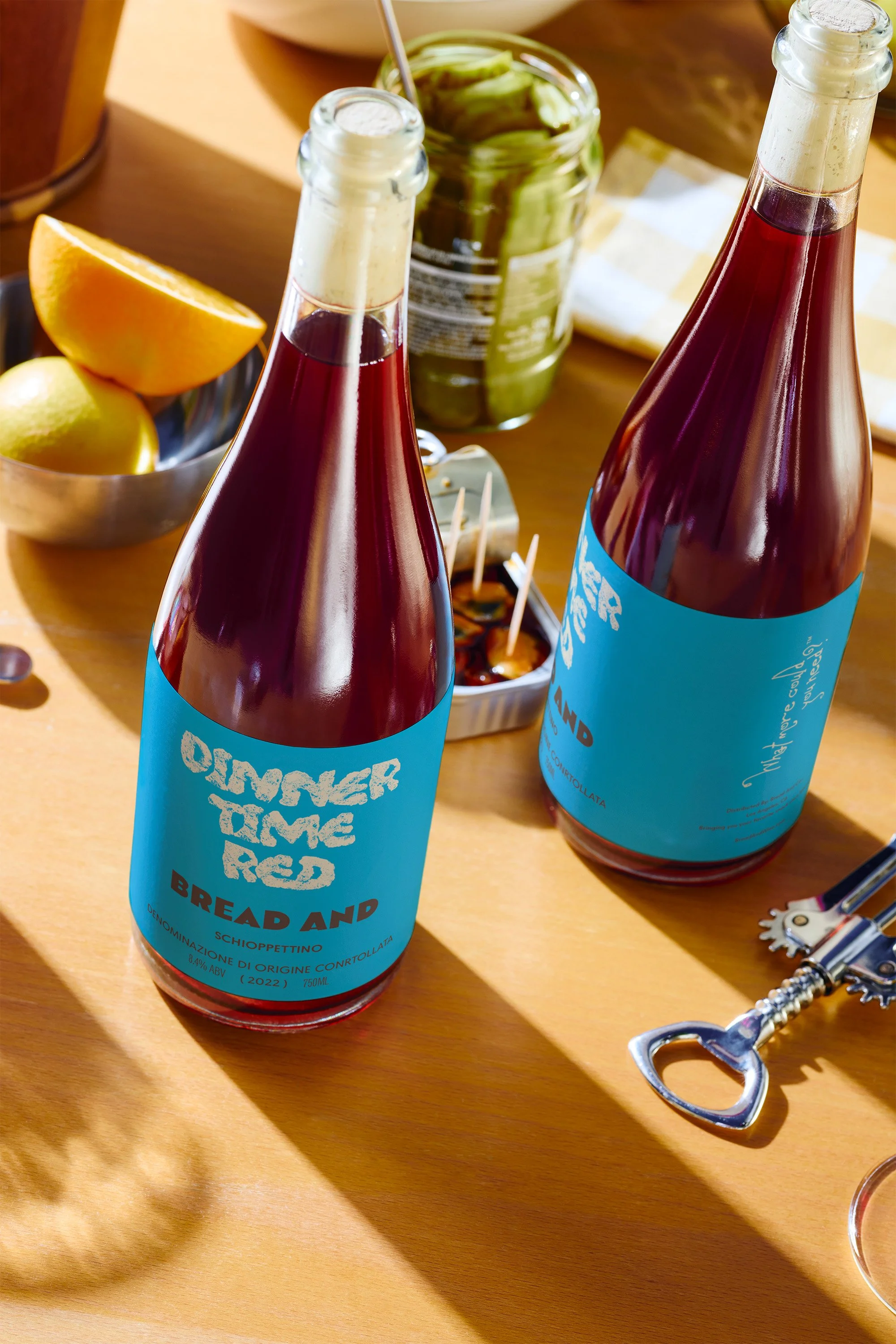
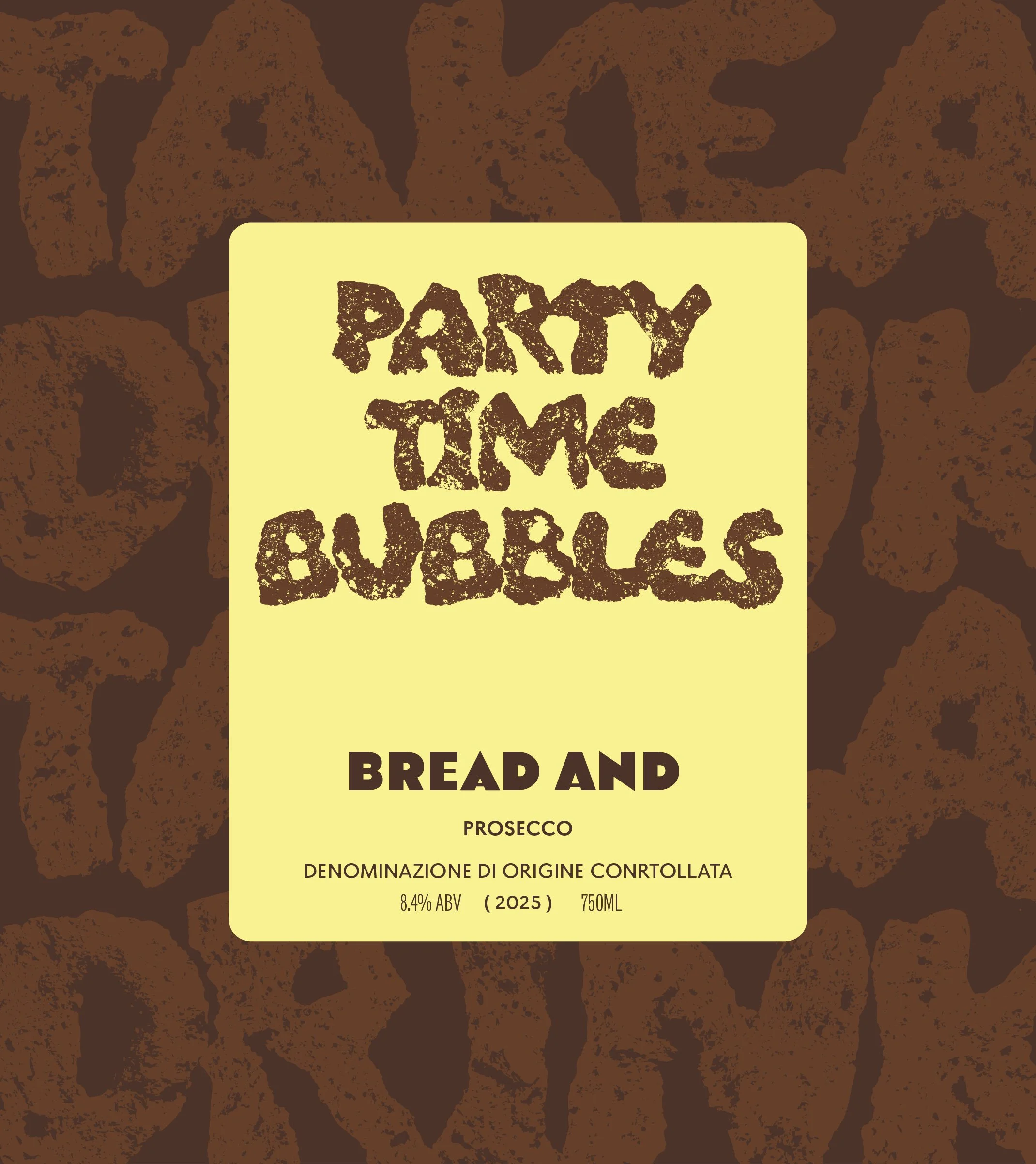
Giulio had a bit that was also a business plan: what if the oldest pairing in human history got a label that matched the energy of actually drinking it at noon on a Tuesday? The challenge wasn't explaining the concept; it was making sure the brand felt as confident and irreverent on the shelf as it did in conversation. Every decision, from the aggressive color palette to the DOC appellations printed in small caps beneath the absurdist SKU names, set in a font created with literal bread prints, was designed to hold that tension without tipping too far in either direction. These are real wines made by real Italian winemakers, and Bread And wanted you to know that while also not taking itself remotely seriously.
RESULTS
The final system spans label design, brand strategy, tone of voice, and a suite of collateral that carries the same energy whether it's on a bottle neck tag or a paper bag at a dinner party. Within three months of soft launch, Bread And had secured placement in two Los Angeles wine shops and was fielding inquiries from restaurant buyers who kept describing the label as "the one people keep asking about." Giulio has since expanded the line to seven SKUs and is in early conversations with a Veneto importer about a private-label partnership. The brand started as a bit and turned into a business, which feels about right for a label named after the oldest meal there is.


OTHER PROJECTS
-
![Outdoor sign with "OMIKA" on a round, decorative background attached to a building.]()
OMIKA
Brand Identity, Packaging, and Marketing for a women’s clothing brand inspired by the vibrant prints of India.
-
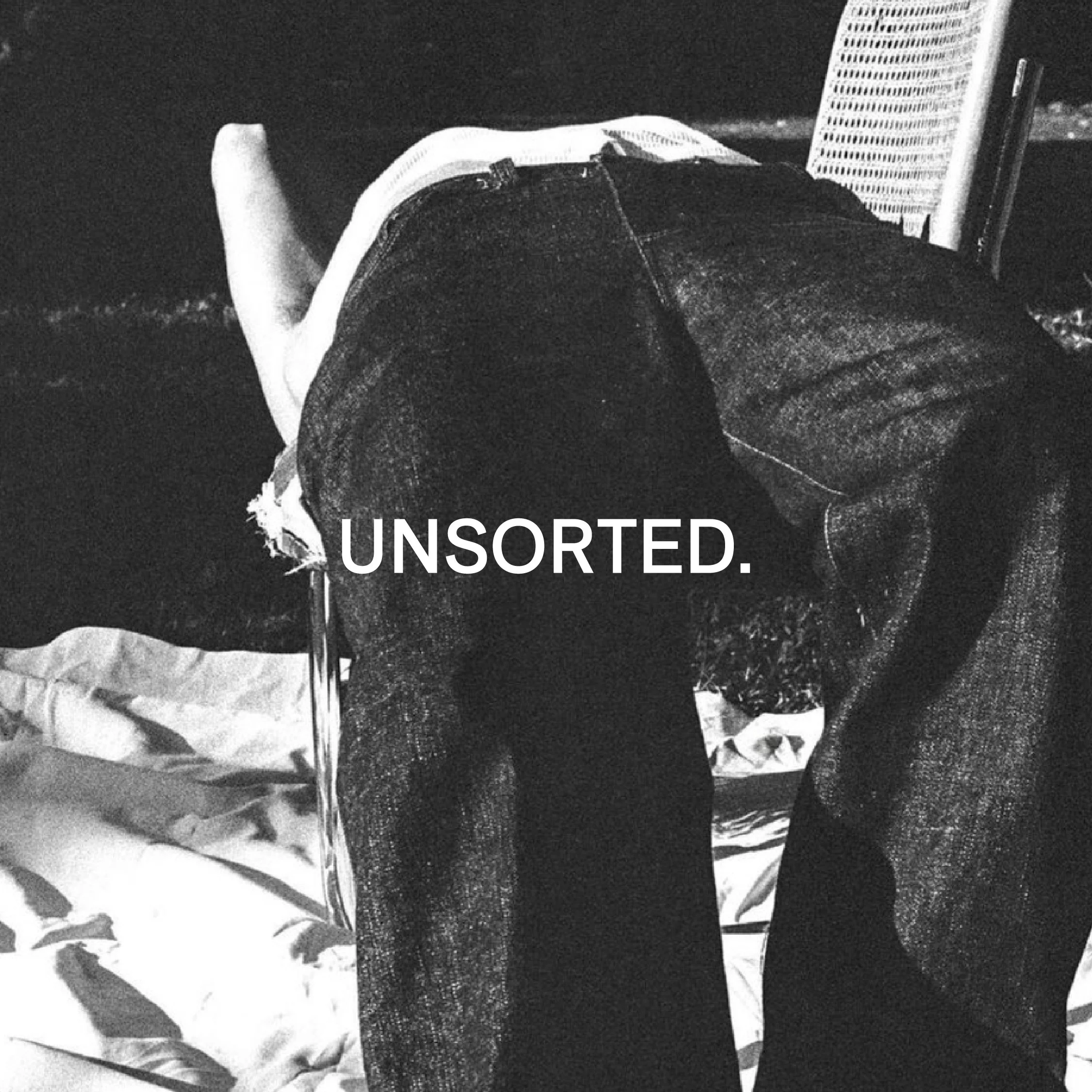
![Black and white image of a person lying face down on a chair outdoors with text "UNSORTED."]()
UNSORTED.
An independent label by Hunter Hardee inspired by technique and voracious curiosity. A line of clothes that challenges the notion of what clothes can be.
-
![Person holding a smartphone displaying a menu for 'Ethos' with options like Club Culture, Ethos News, Team, Schedule, Classes, Memberships, Gallery, Contact, and a 'Become a Member' button.]()
ETHOS ATHLETIC CLUB
A bold website to attract new members, host class signups, and digitally express the world of Ethos A.C.
-
![Person wearing a T-shirt with 'Roseline' text facing shelves of wine bottles and a table with wine glasses.]()
ROSELINE
Brand identity and collateral for an intimate wine bar that boasts fine wines with a side of funky vibes.