CHELSEY ESTATES
BRAND IDENTITY
BRAND STRATEGY
COLLATERAL
MARKETING
SOCIAL STRATEGY

STRATEGY
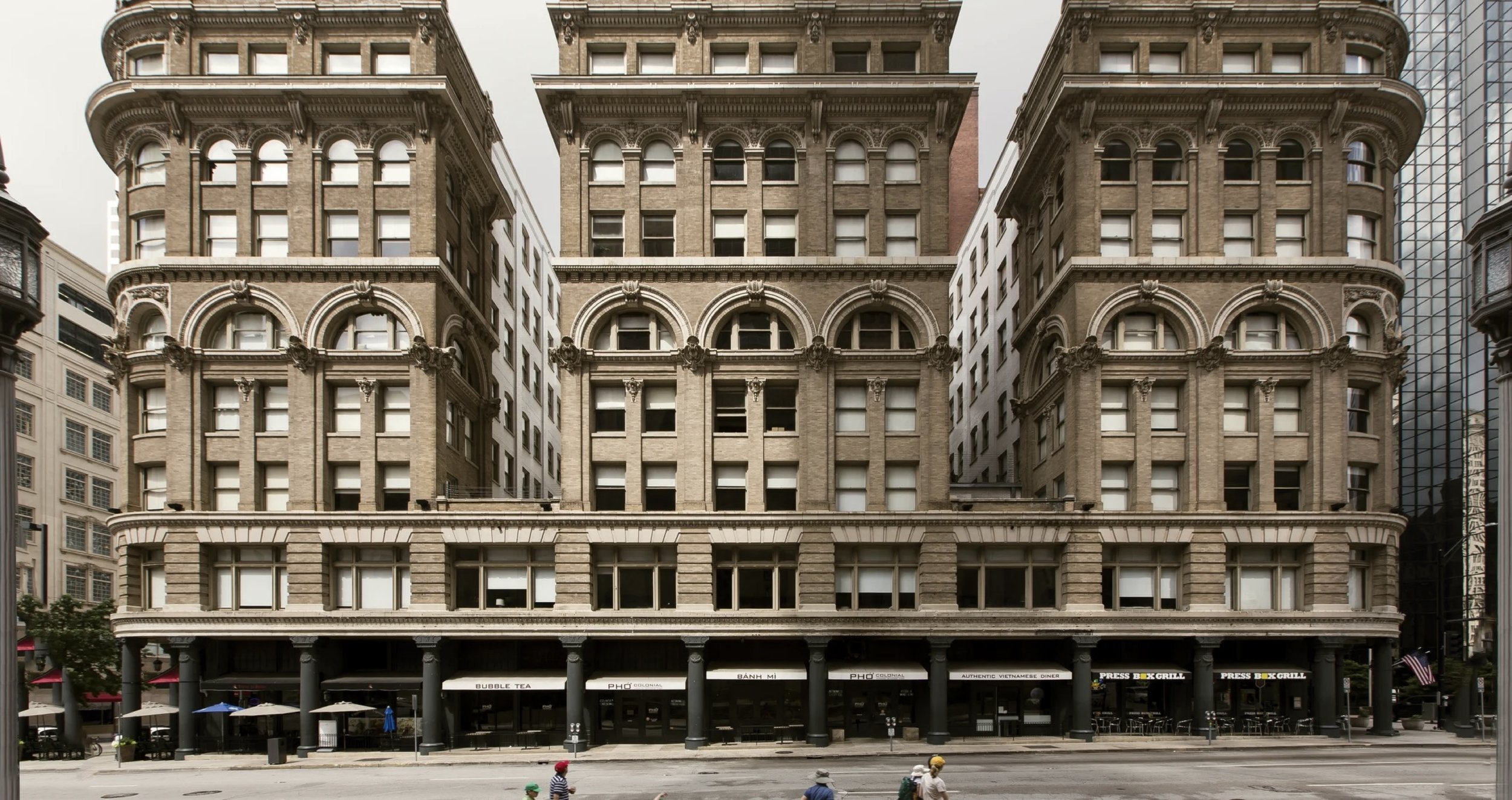
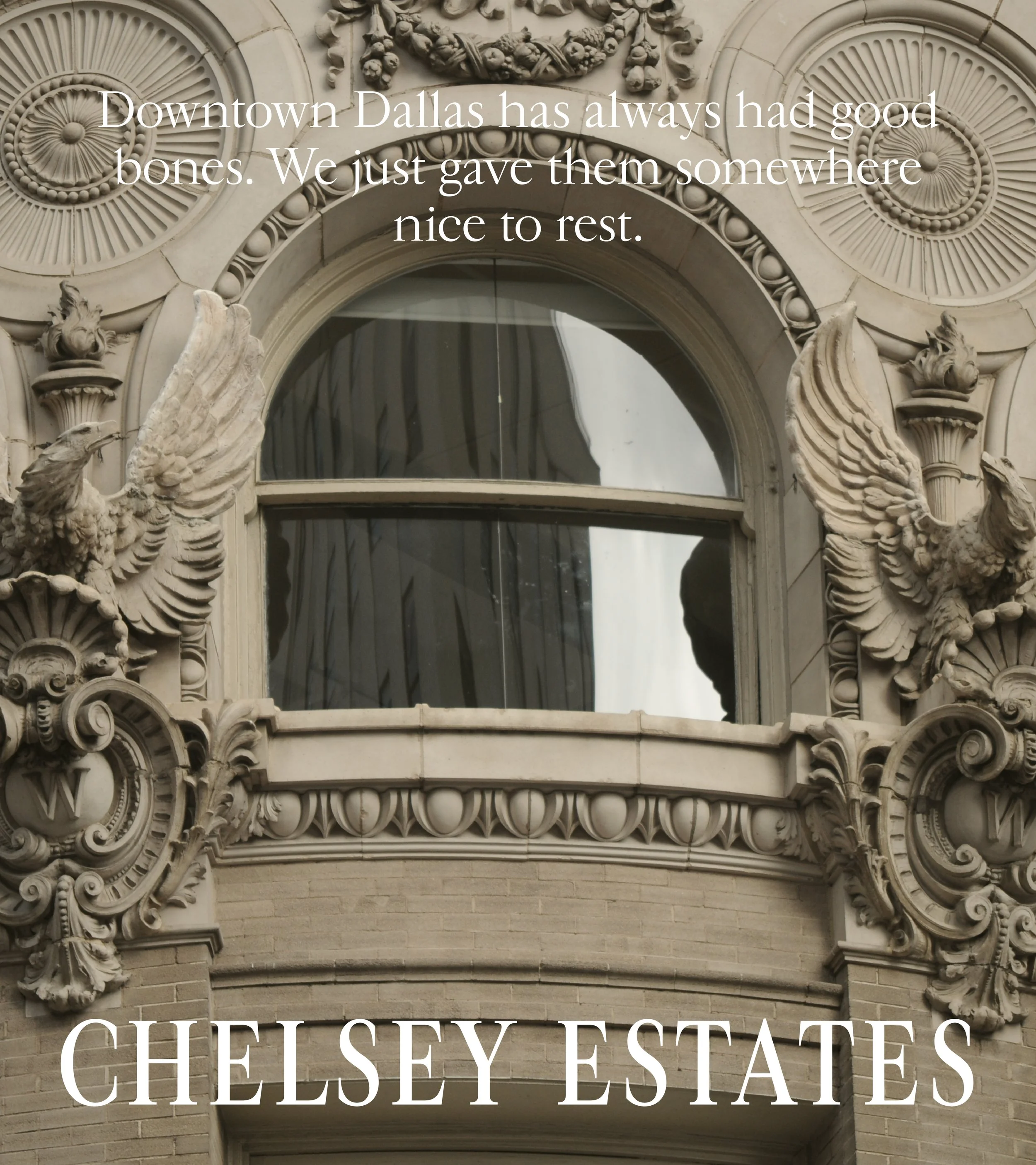
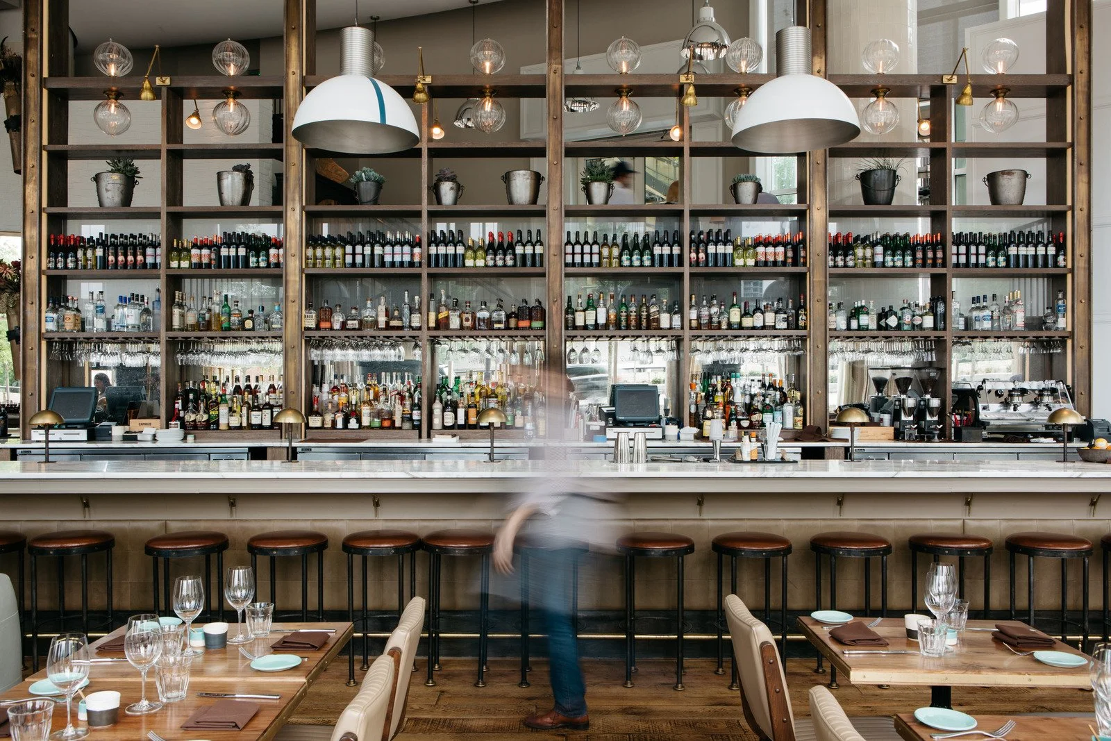
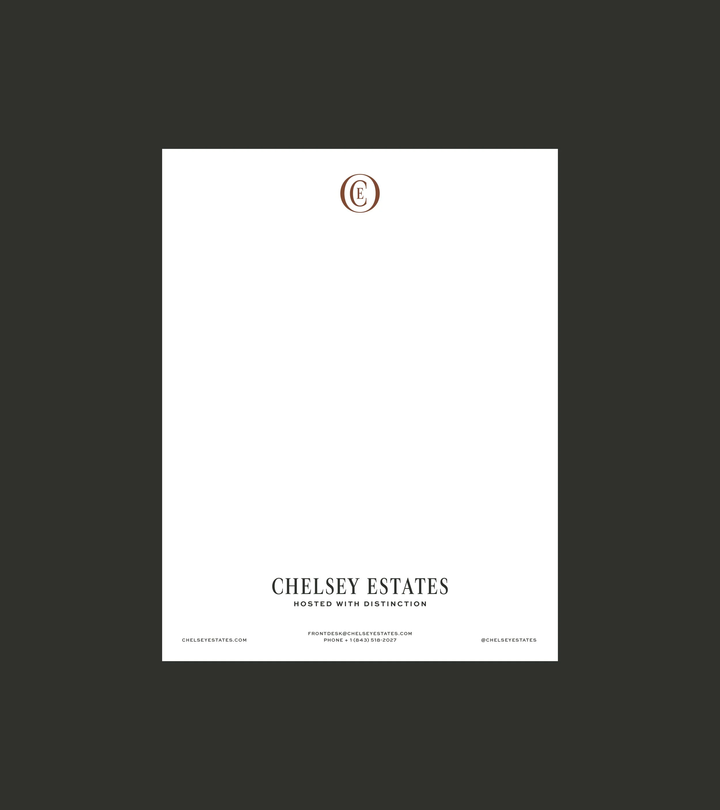
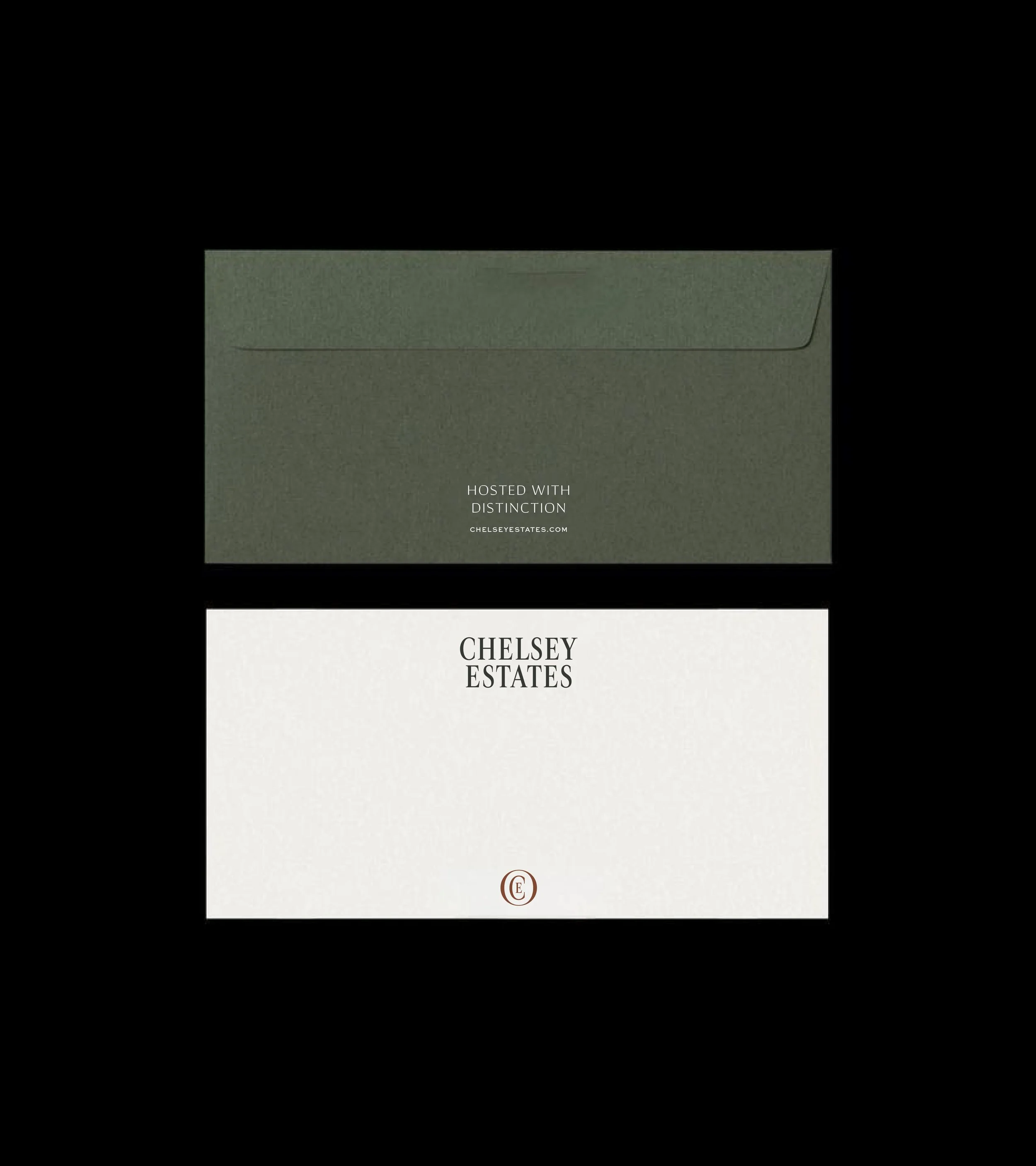
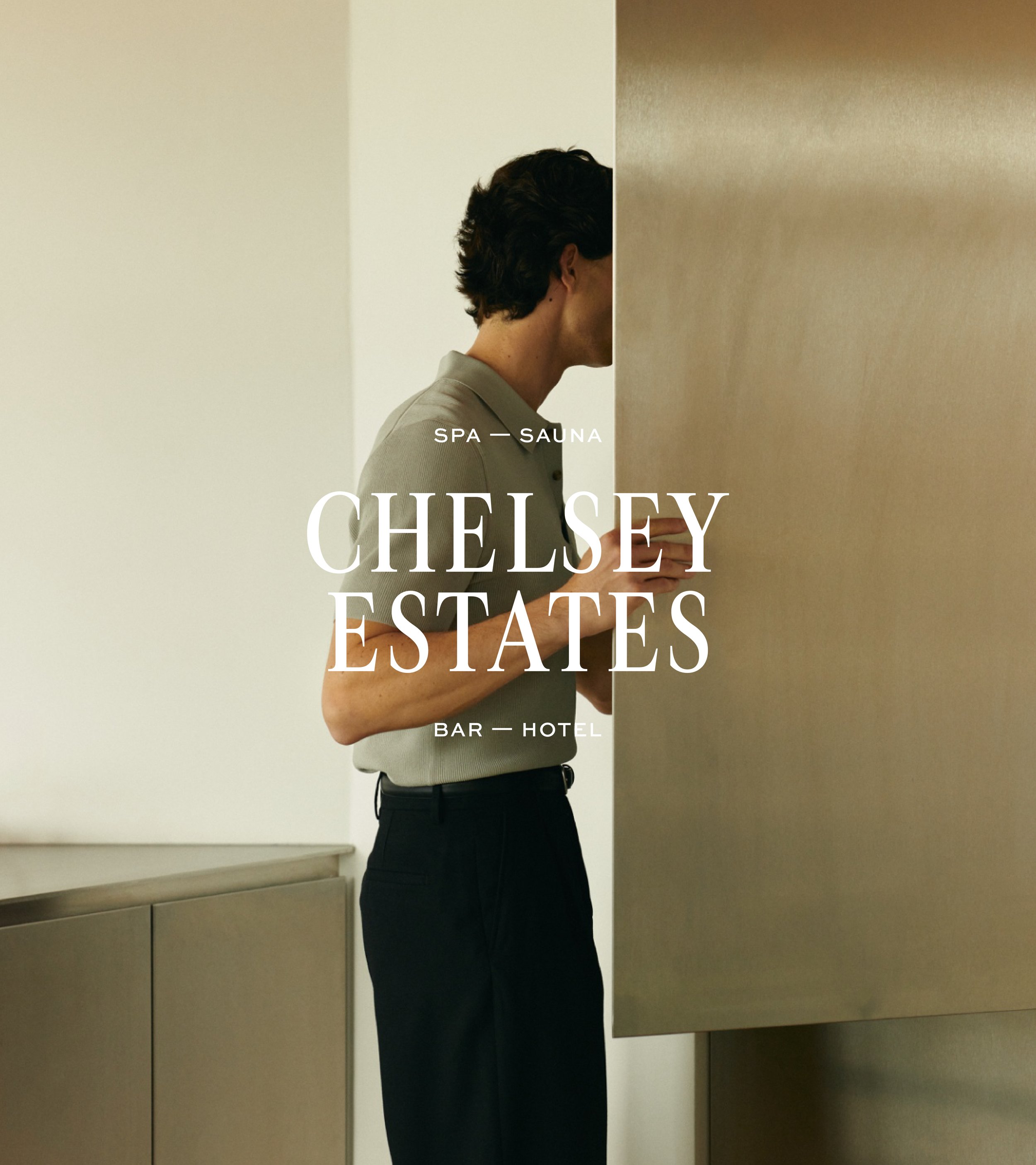
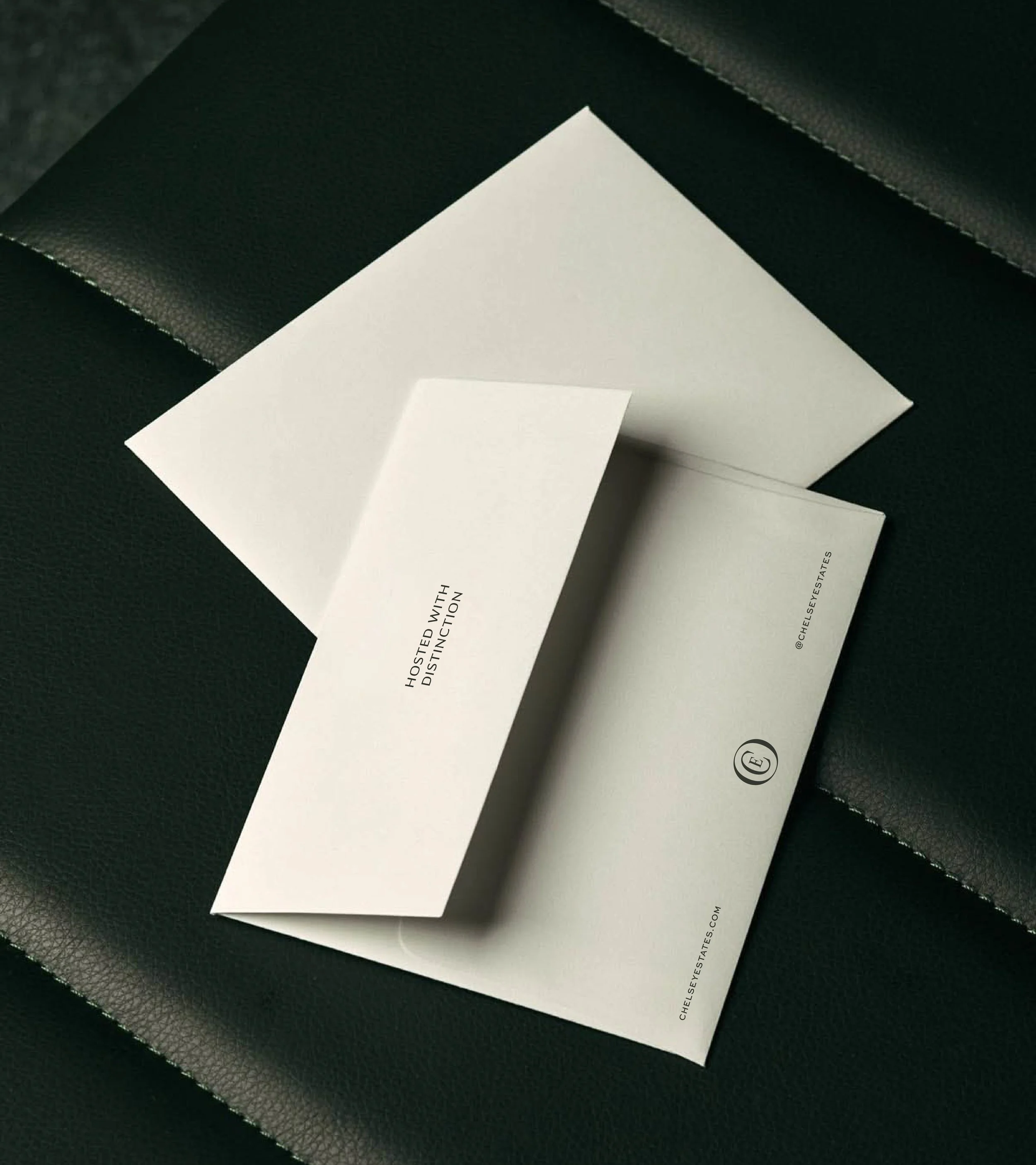
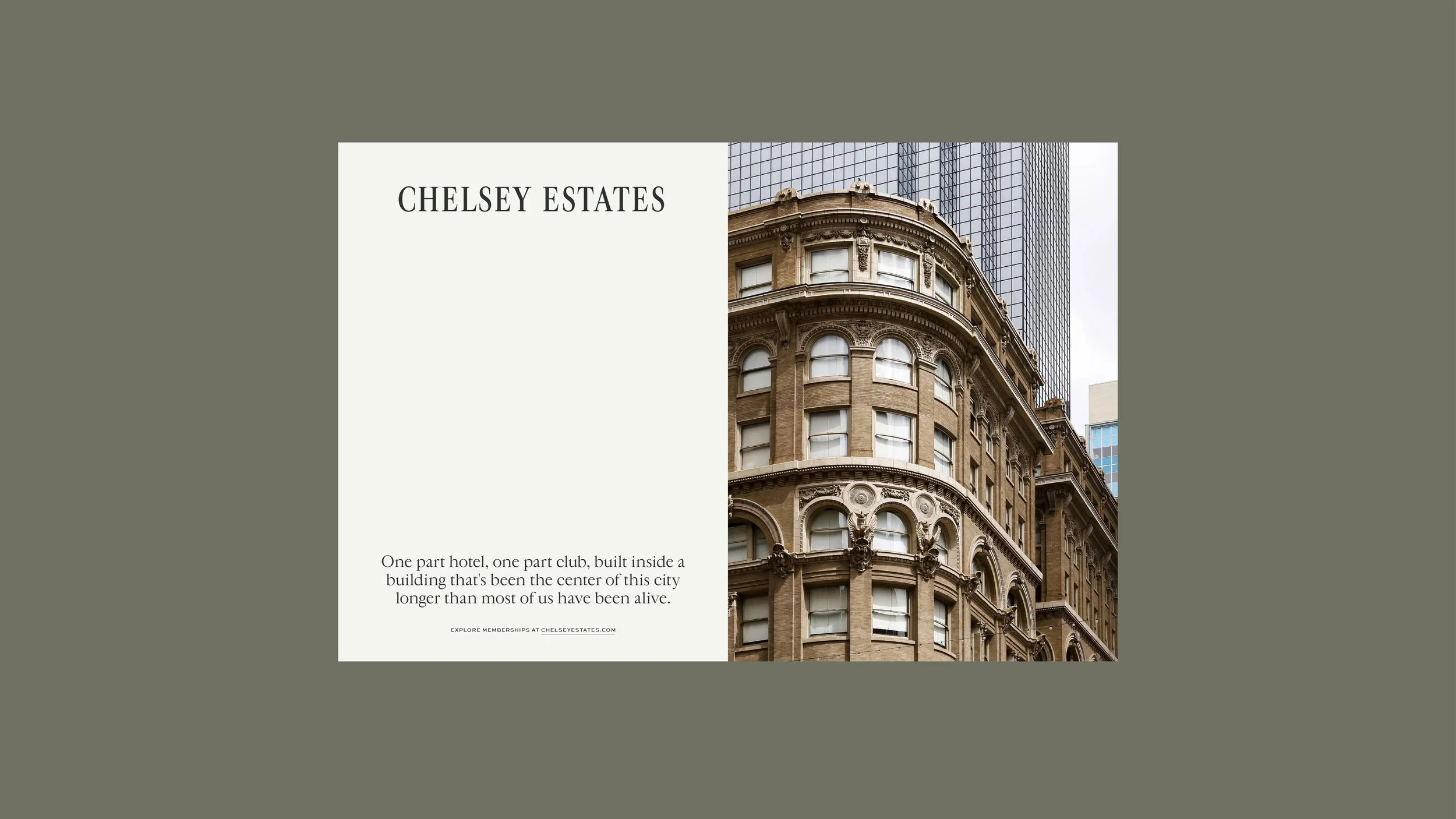
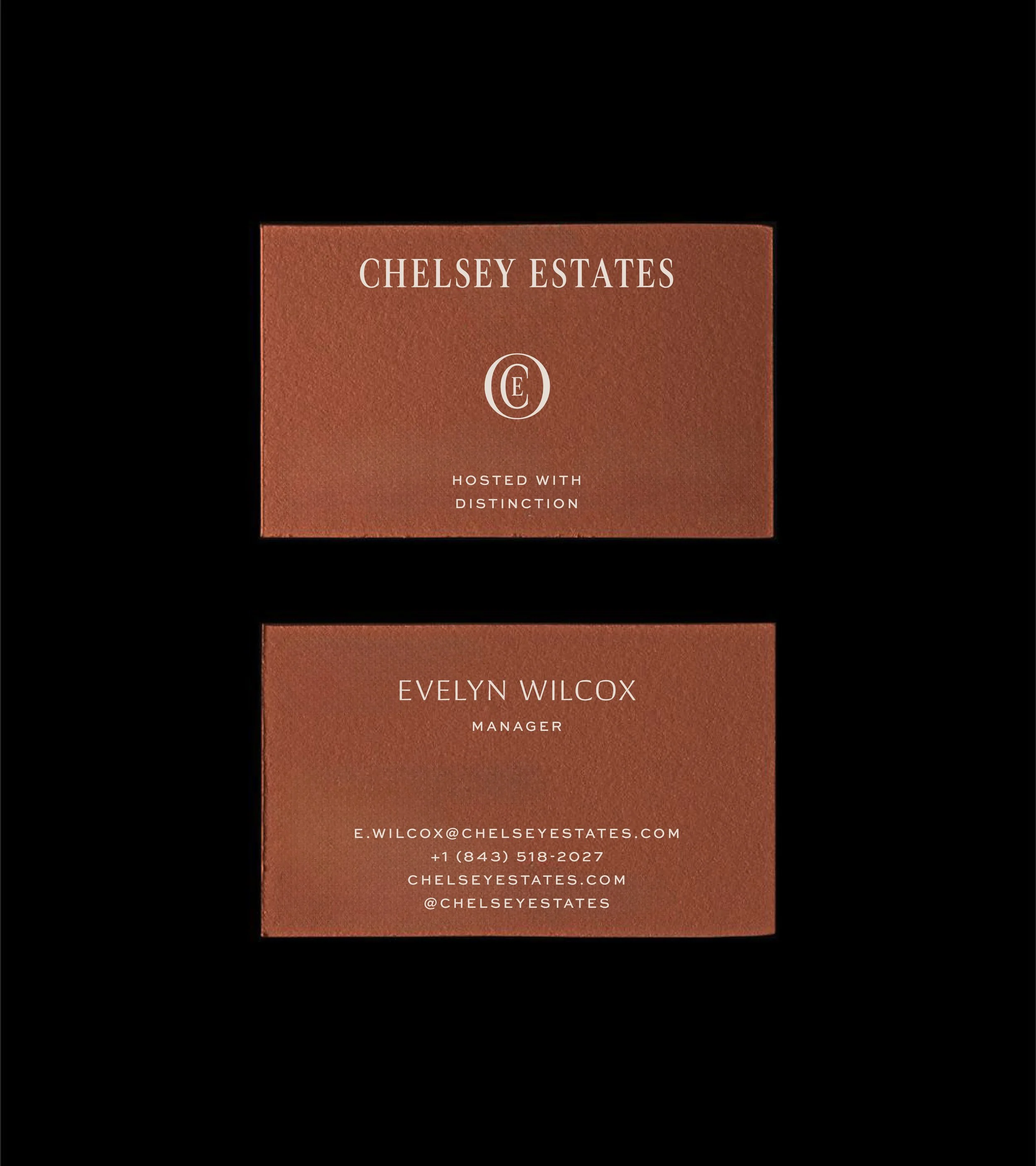
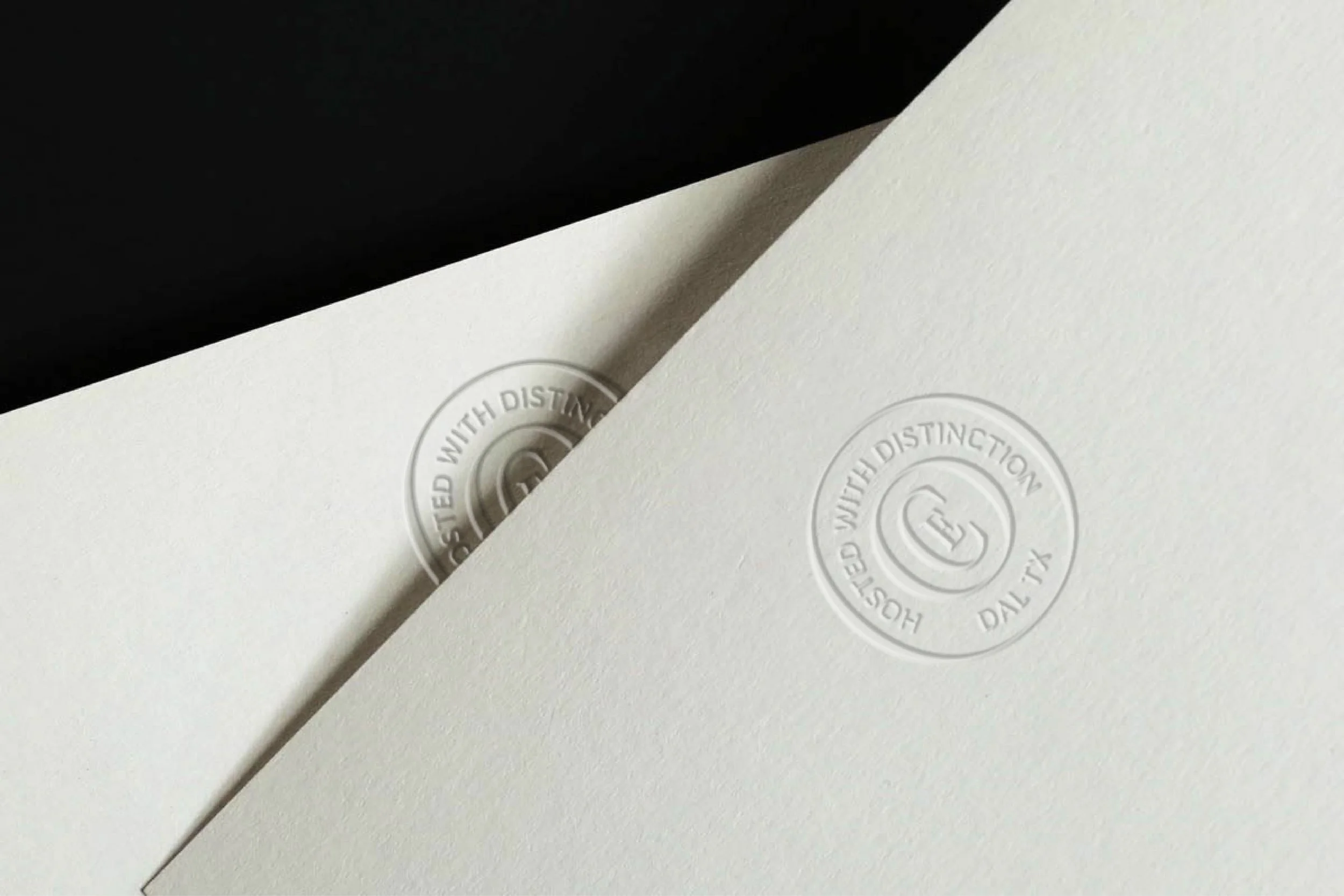
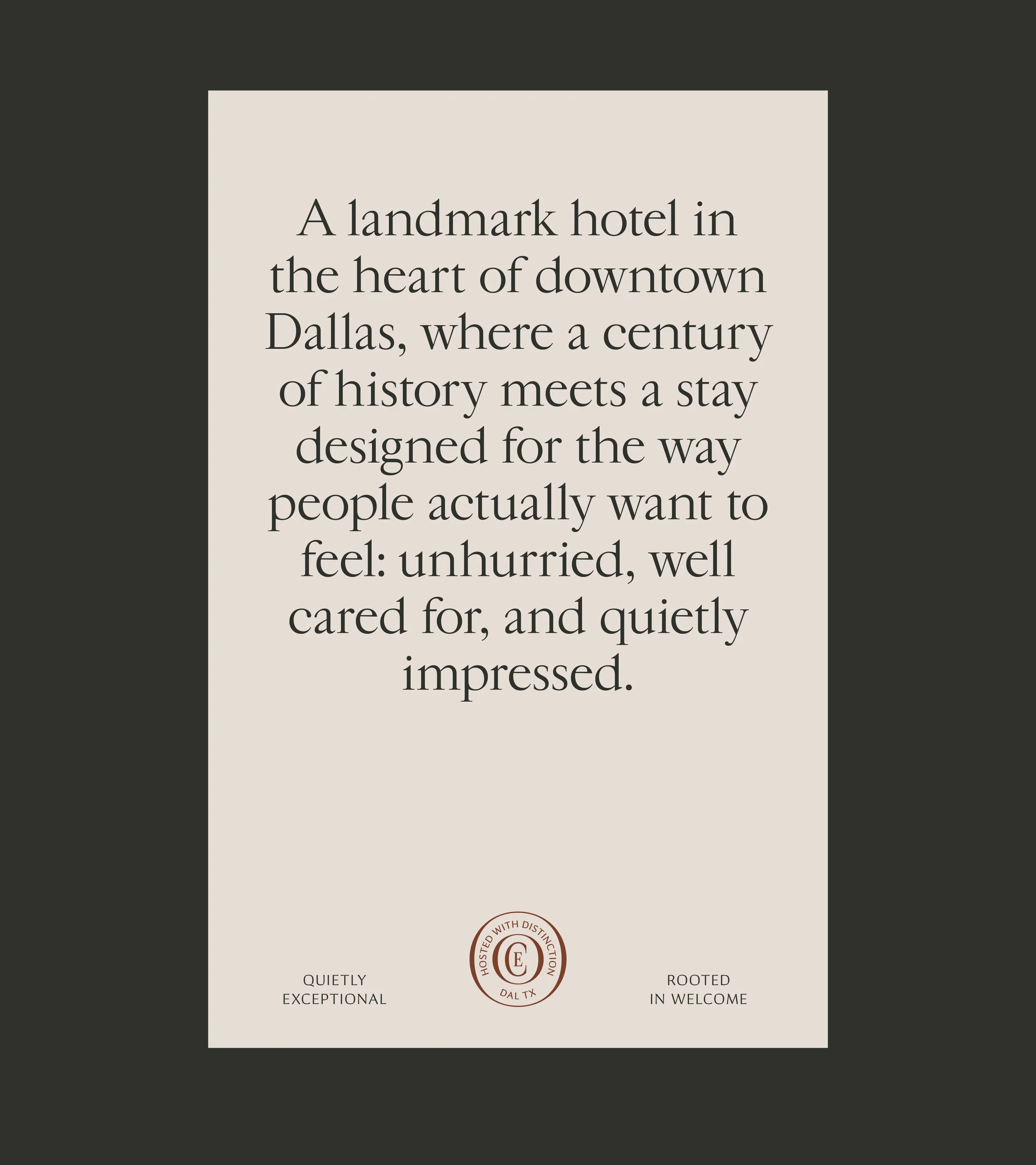
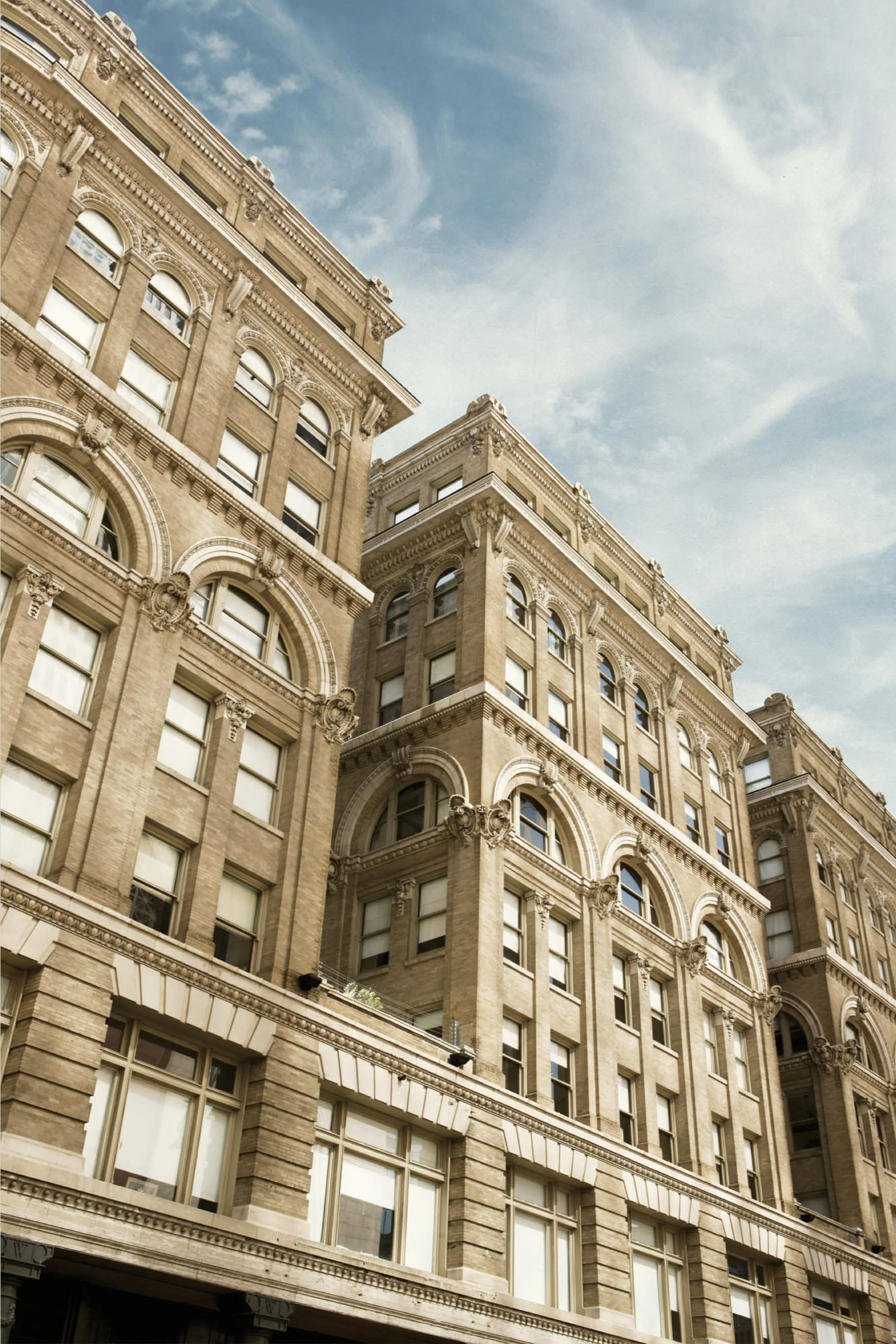
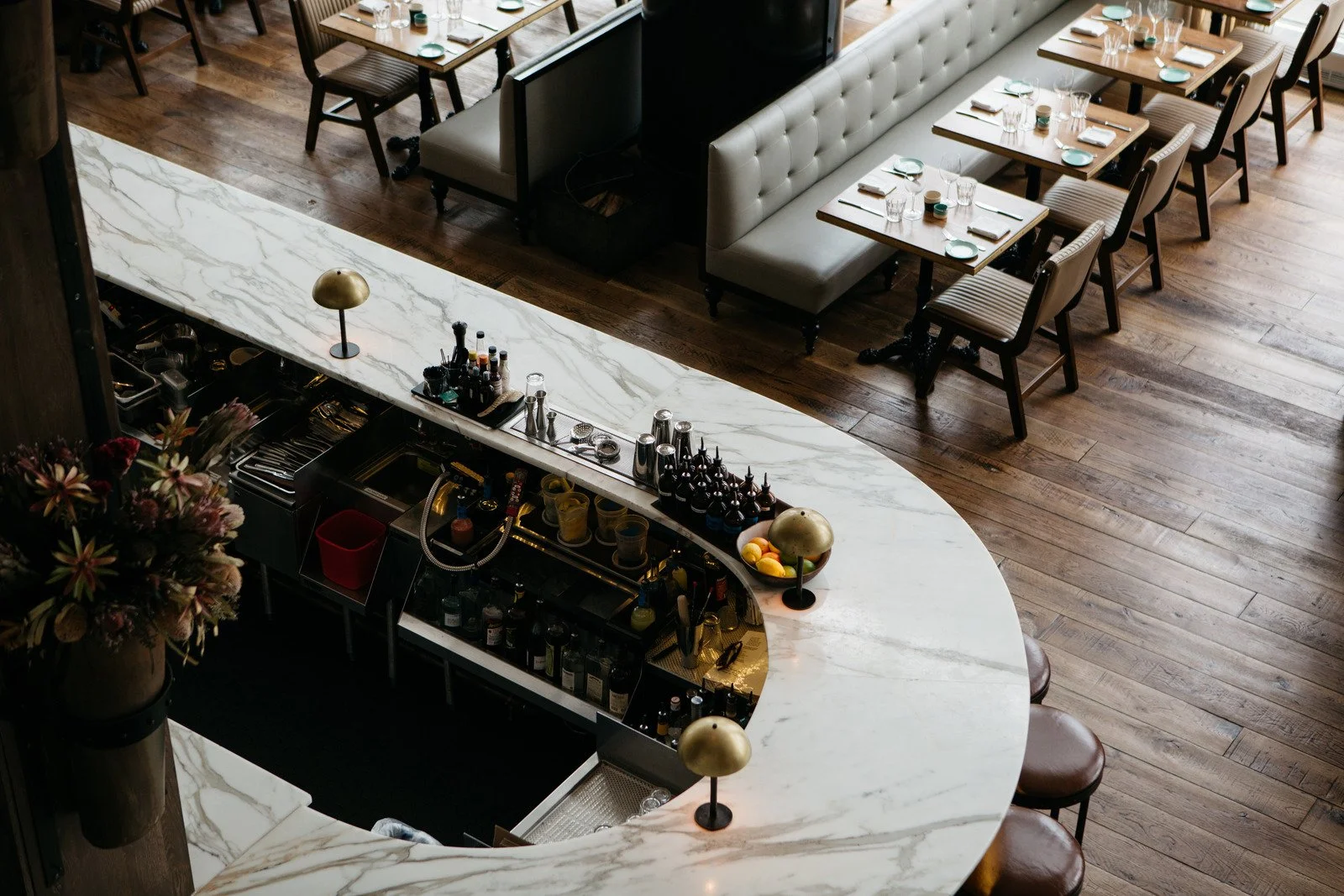
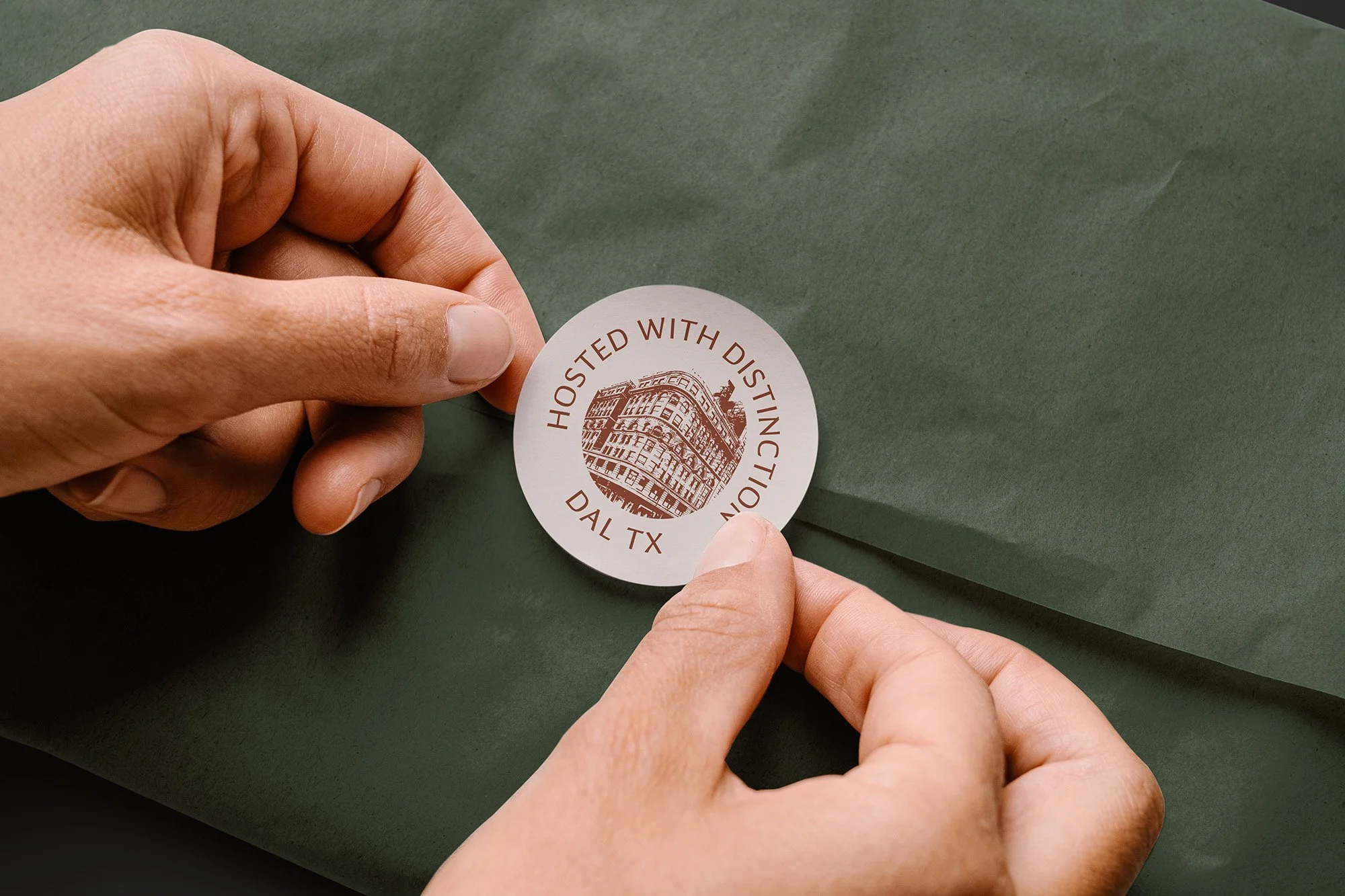
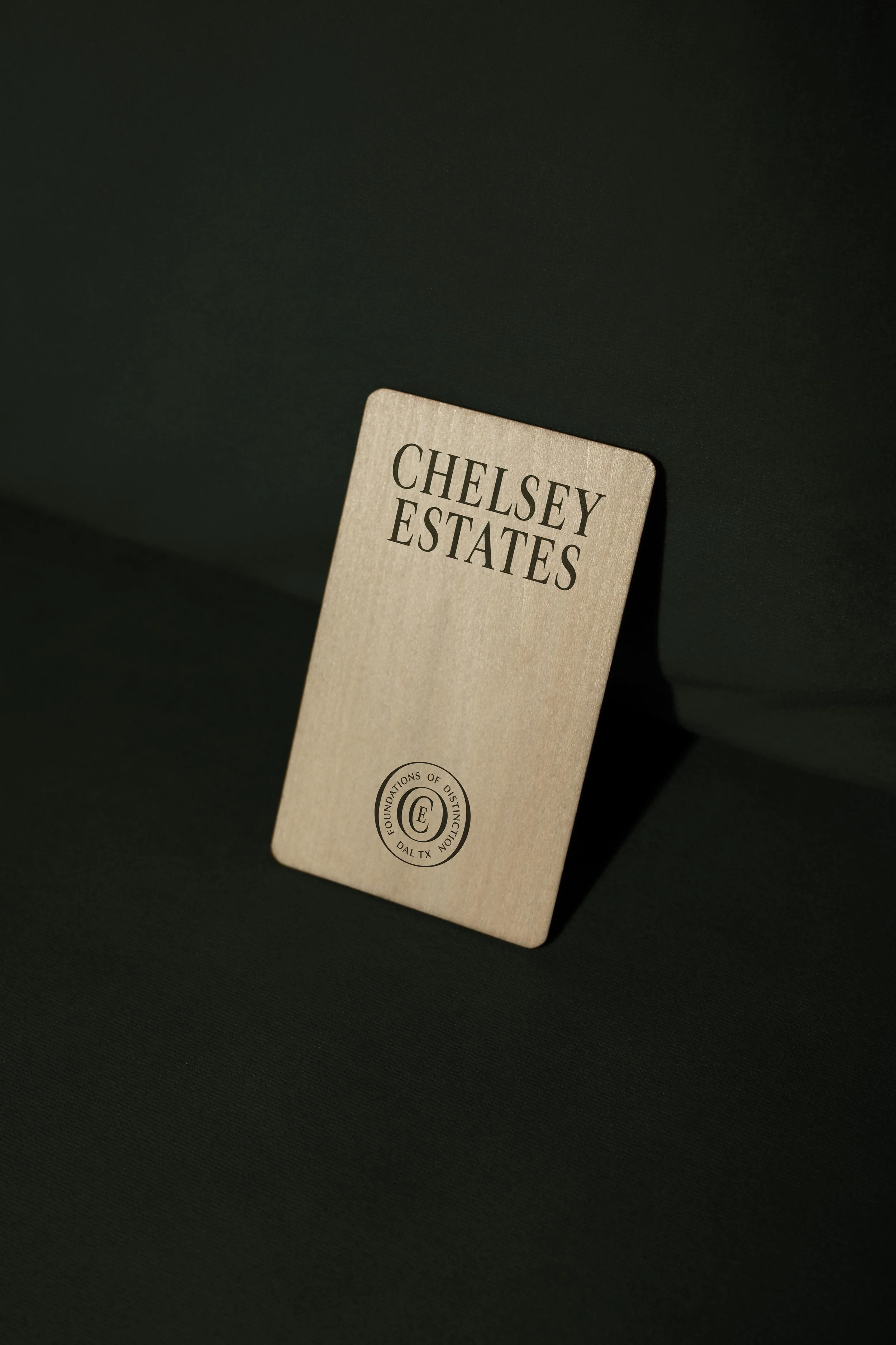
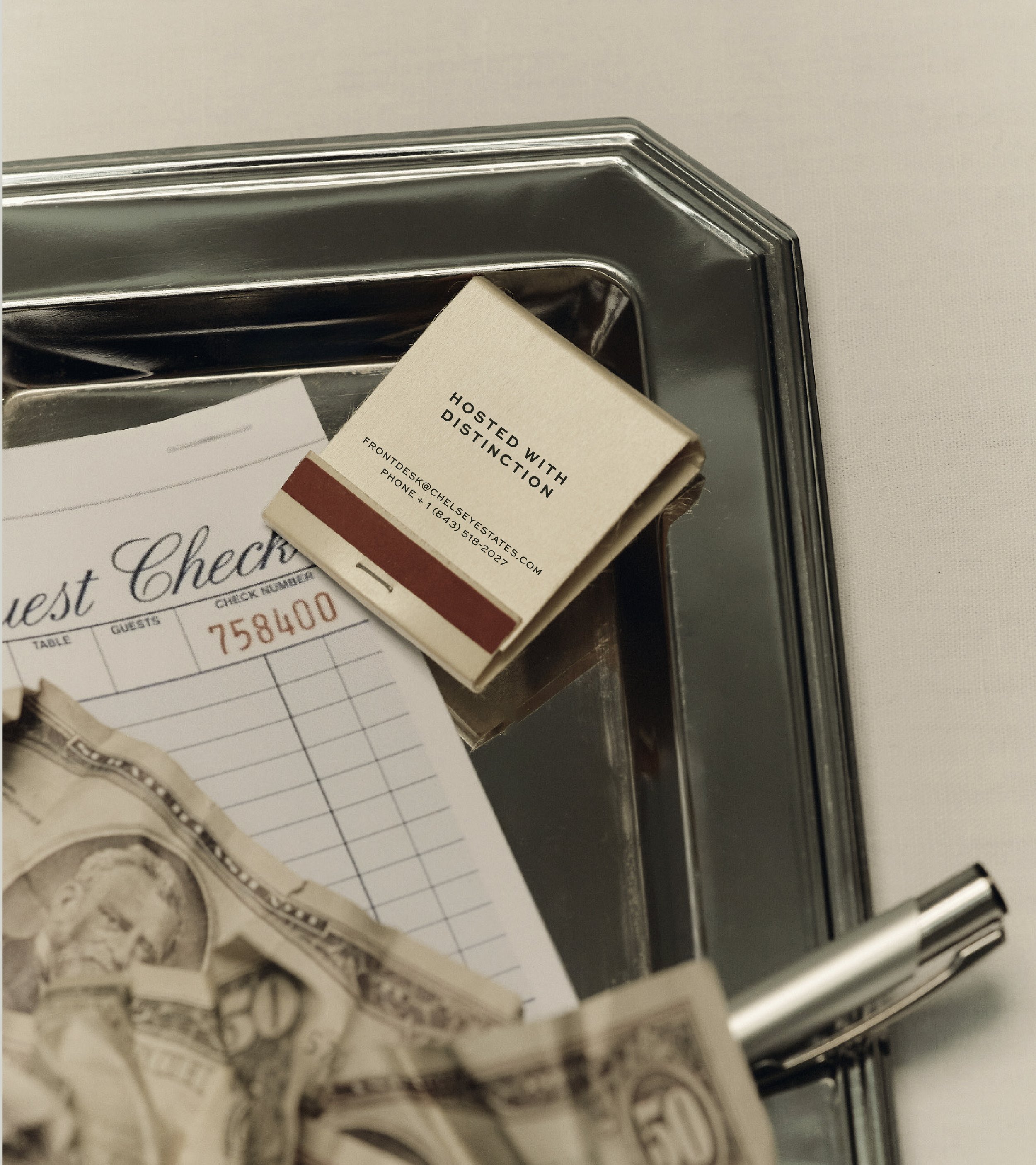
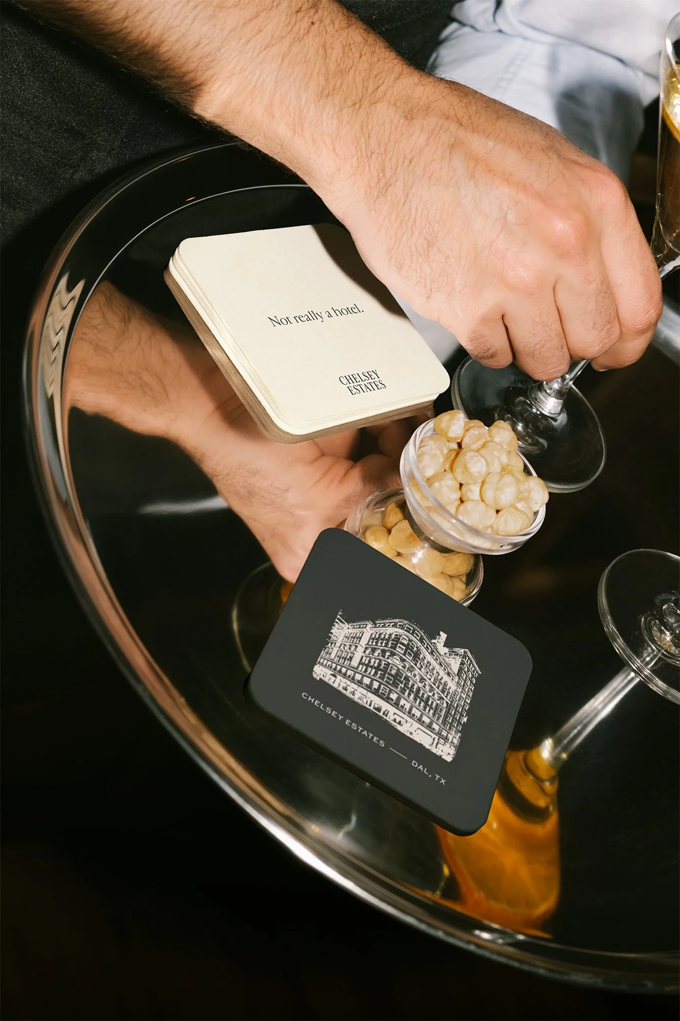
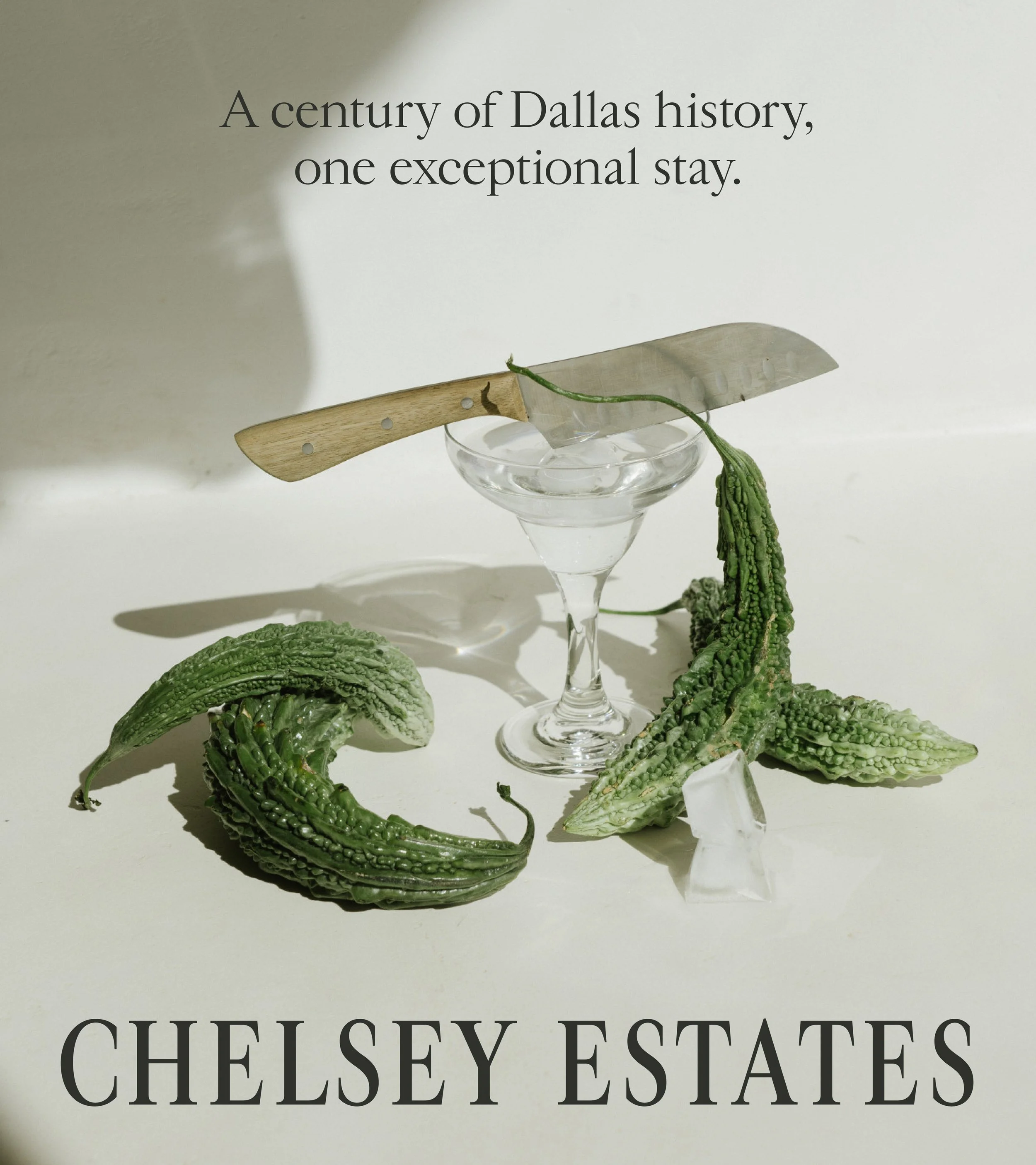
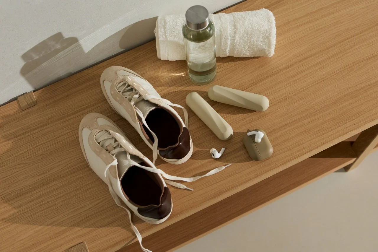
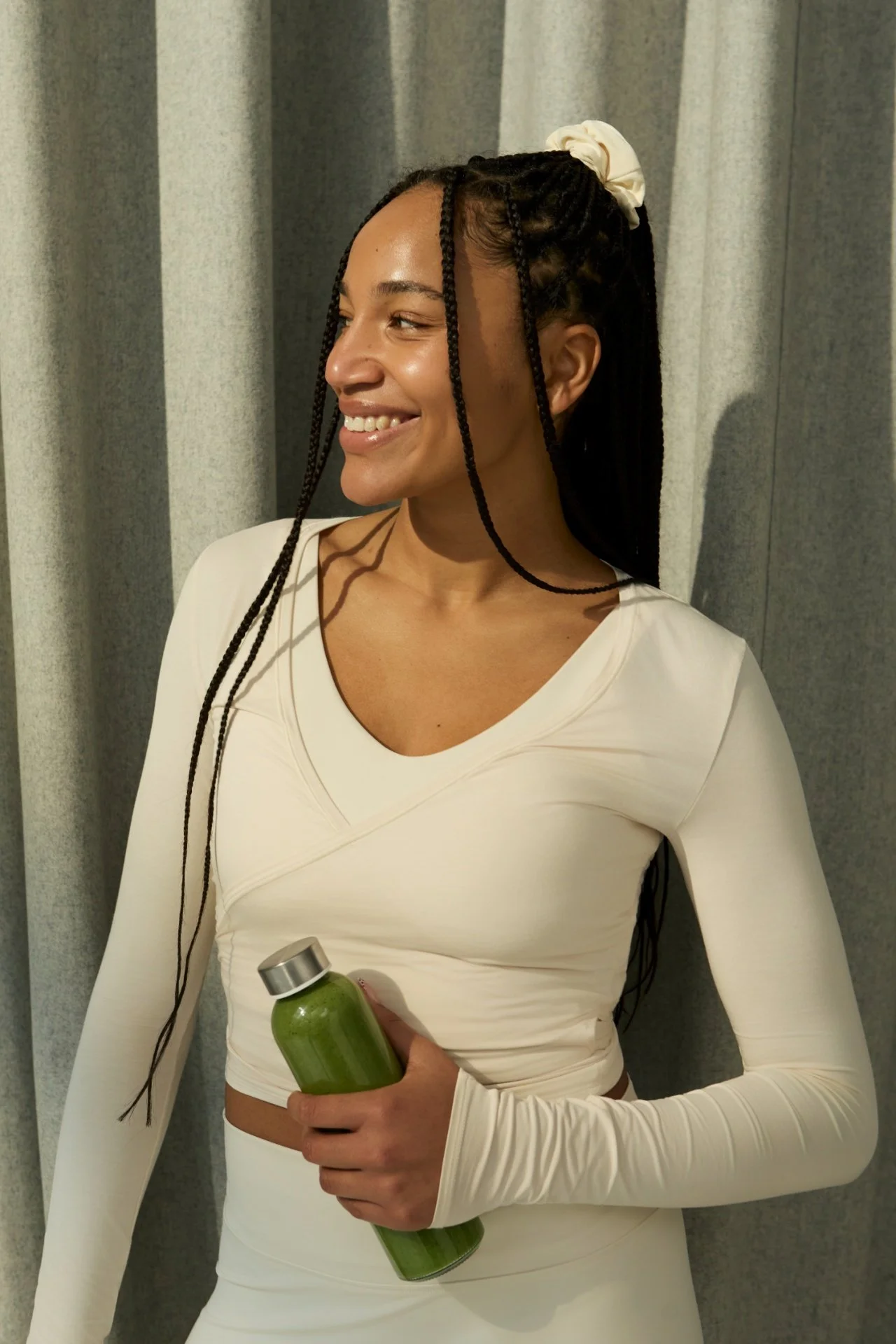
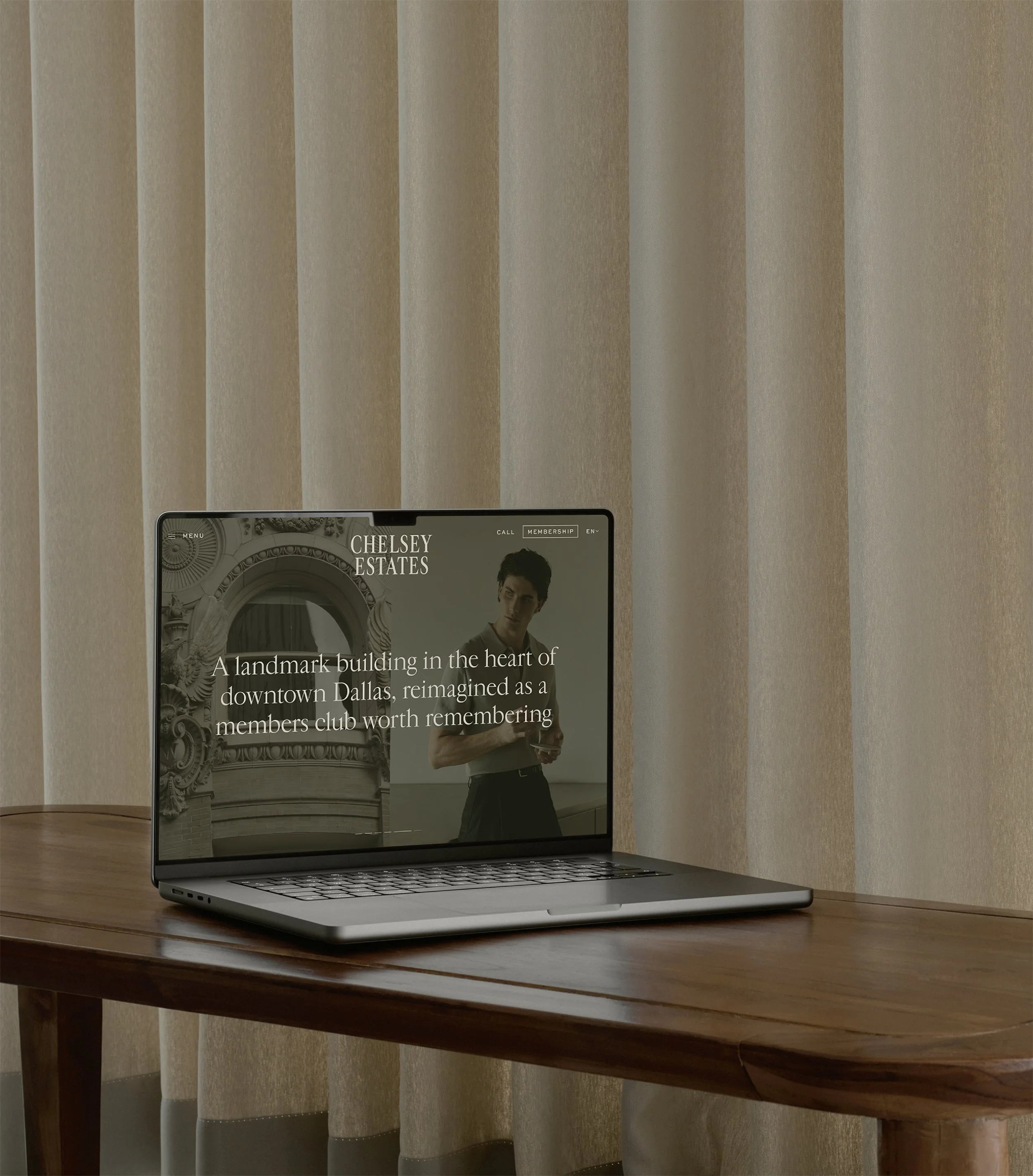
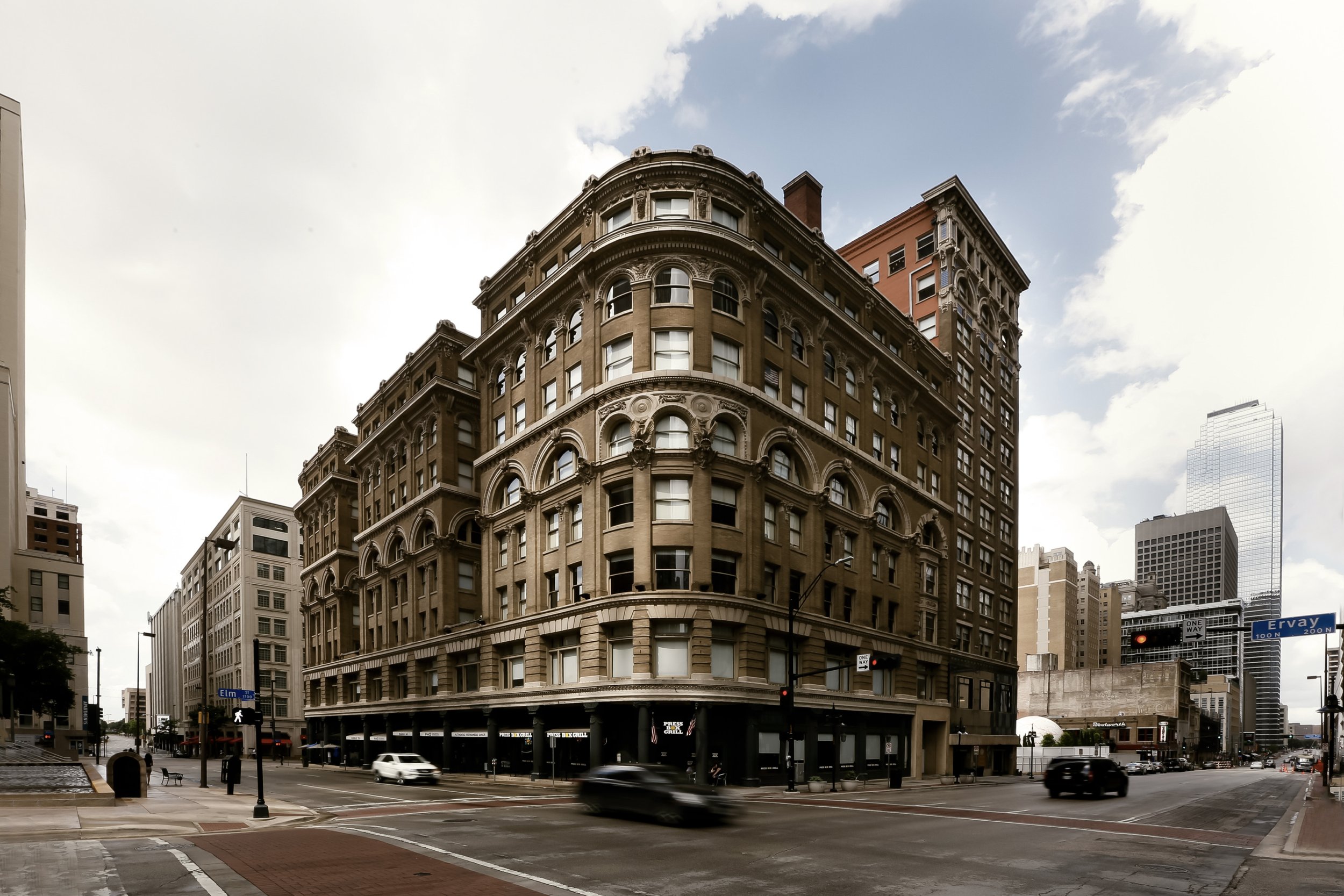
Chelsey Estates occupies a specific space in downtown Dallas: old enough in feeling to carry real weight, but built for a guest who wants more than a room for the night. The identity draws from old money and o-ld world reference points, deep greens, warm creams, and accents of patchouli and leather that read as lived-in rather than decorated. Typography takes a modern hand to historic forms, and seals and monograms throughout the system nod directly to the building’s own history, giving the brand a sense of provenance rather than invention. The bigger shift was conceptual. Rather than positioning Chelsey Estates as a hotel with amenities, we built it as a club with rooms: a place downtown Dallas can work from, meet in, and return to, closer in spirit to Soho House than to a traditional stay. The sauna, gym, spa, and bar aren’t hotel add-ons here. They’re the reason someone becomes a regular.
RESULTS
The palette and typographic system carried the building’s history through every touchpoint without ever feeling costumed or overly referential. Positioning Chelsey Estates as a members’ club first and a hotel second reframed the entire guest relationship: visitors weren’t just booking a stay; they were buying into a downtown Dallas institution they could use daily, whether for a morning in the sauna, an afternoon meeting, or an evening at the bar. That shift also widened the addressable audience considerably, from overnight guests to local members using the space for work and networking, turning what could have been a seasonal hospitality product into a daily habit with year-round relevance.




OTHER PROJECTS
-
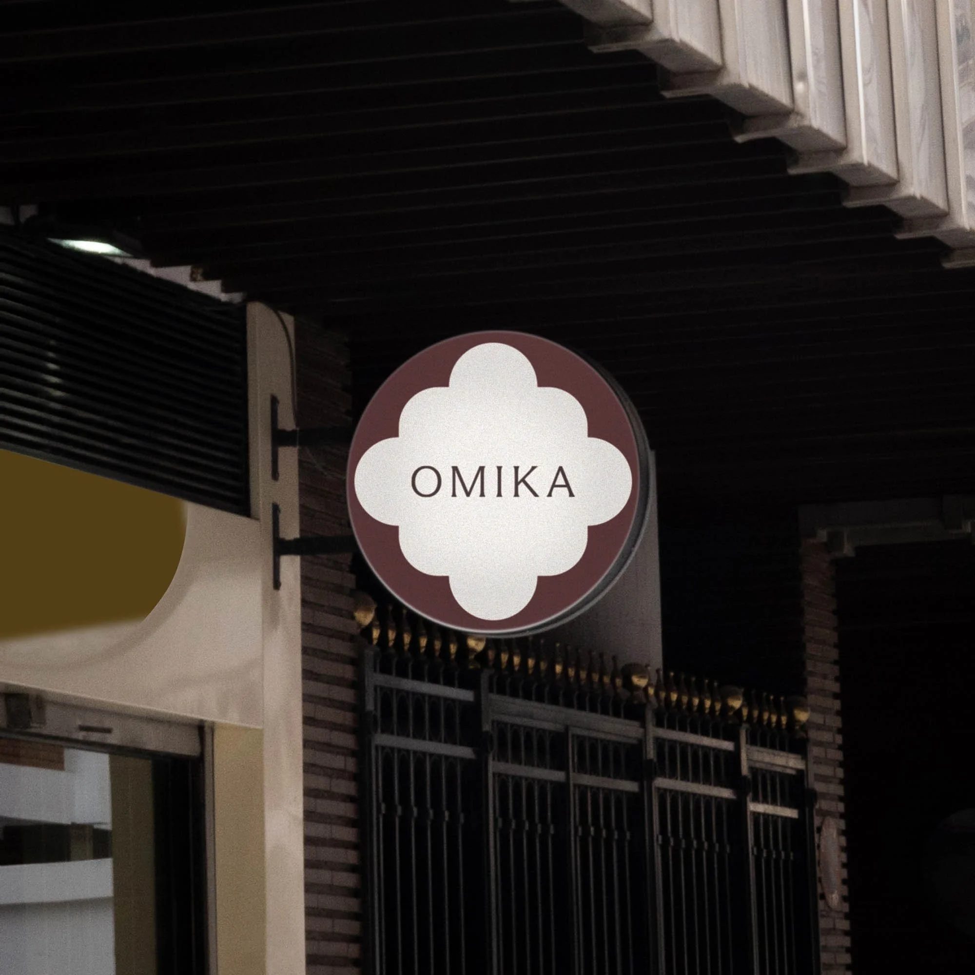
![Outdoor sign with "OMIKA" on a round, decorative background attached to a building.]()
OMIKA
Brand Identity, Packaging, and Marketing for a women’s clothing brand inspired by the vibrant prints of India.
-
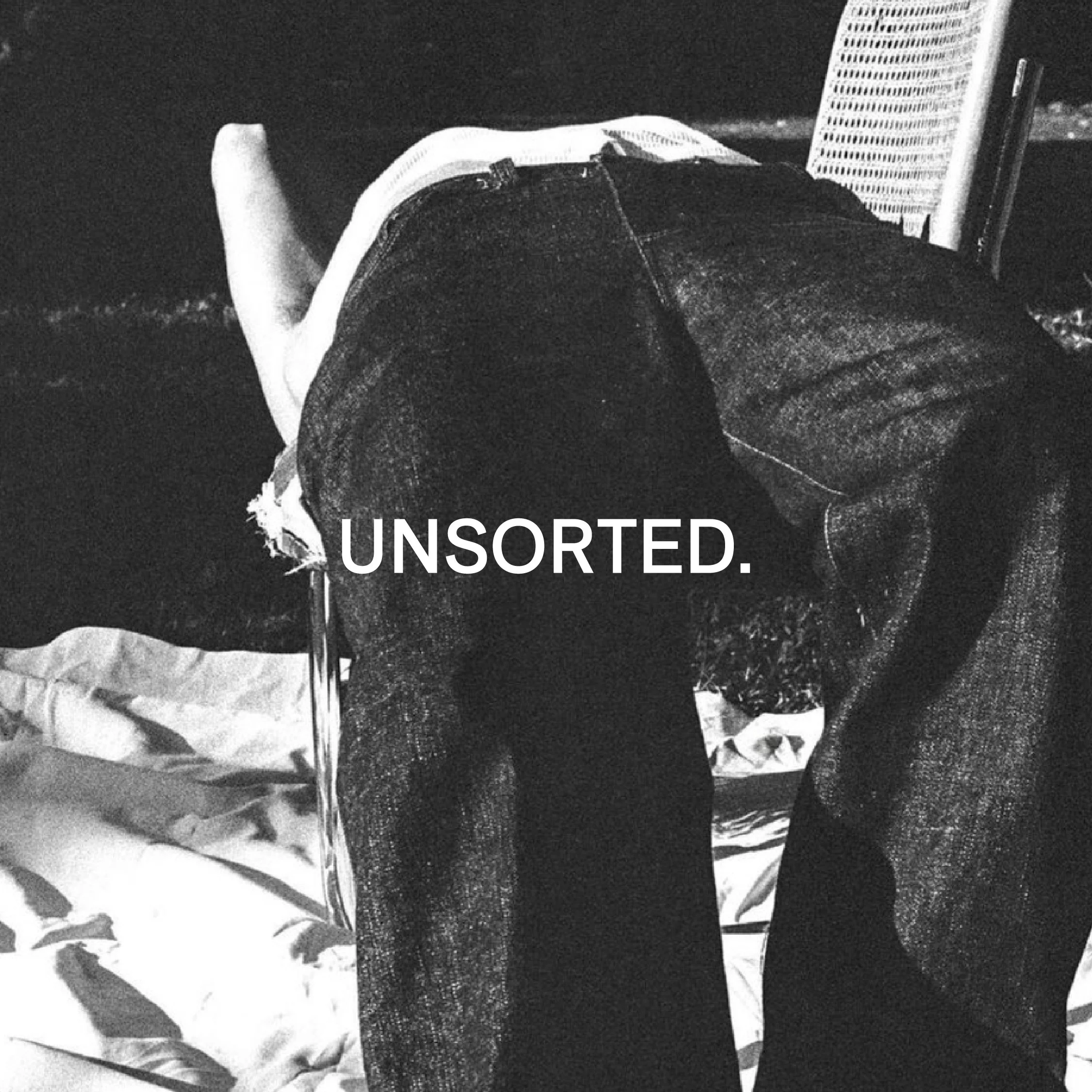
![Black and white image of a person lying face down on a chair outdoors with text "UNSORTED."]()
UNSORTED.
An independent label by Hunter Hardee inspired by technique and voracious curiosity. A line of clothes that challenges the notion of what clothes can be.
-
![Person holding a smartphone displaying a menu for 'Ethos' with options like Club Culture, Ethos News, Team, Schedule, Classes, Memberships, Gallery, Contact, and a 'Become a Member' button.]()
ETHOS ATHLETIC CLUB
A bold website to attract new members, host class signups, and digitally express the world of Ethos A.C.
-
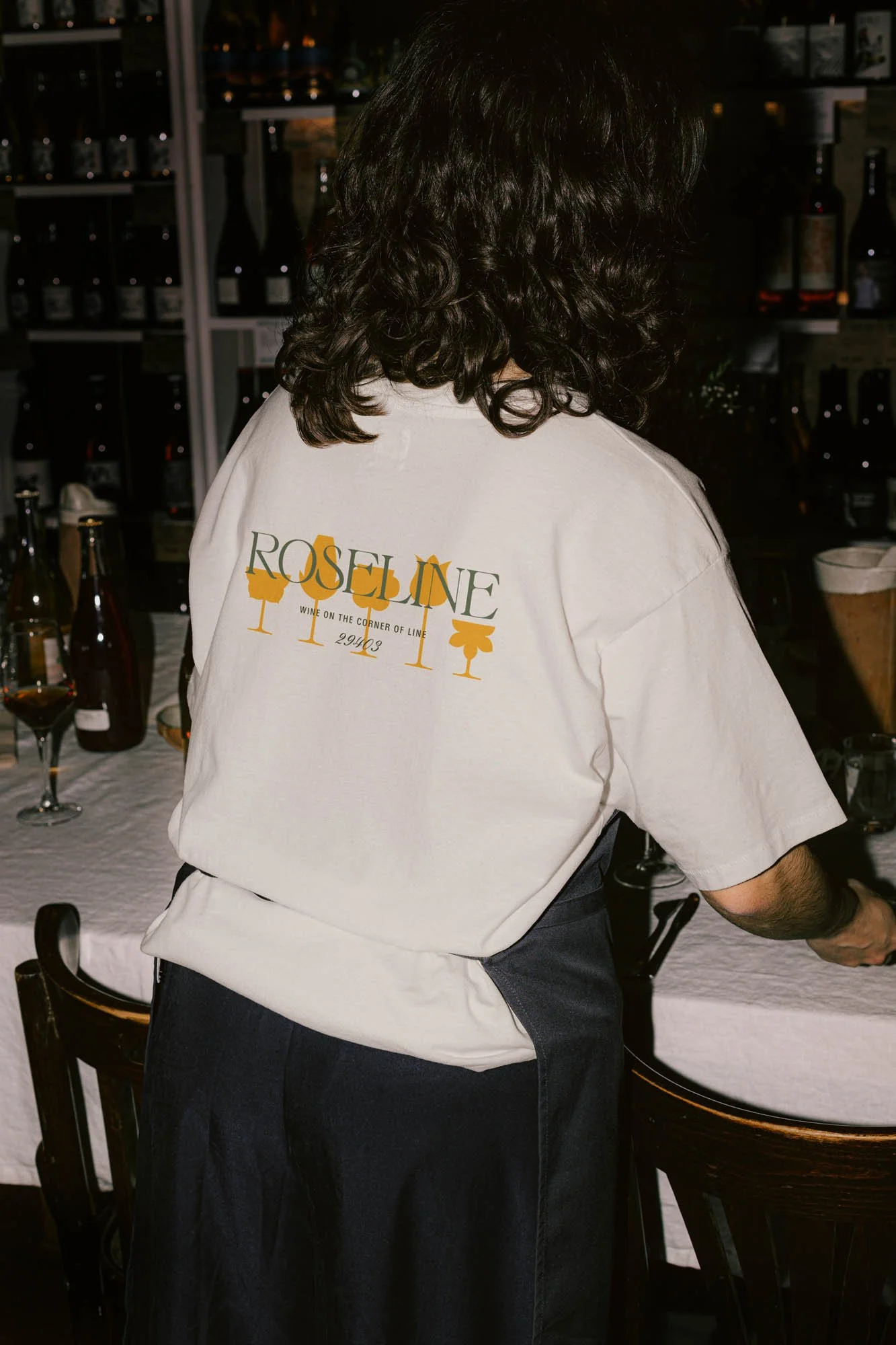
![Person wearing a T-shirt with 'Roseline' text facing shelves of wine bottles and a table with wine glasses.]()
ROSELINE
Brand identity and collateral for an intimate wine bar that boasts fine wines with a side of funky vibes.