CHESNUT DEVELOPMENT
BRAND IDENTITY
BRAND STRATEGY
PACKAGING DESIGN
COLLATERAL
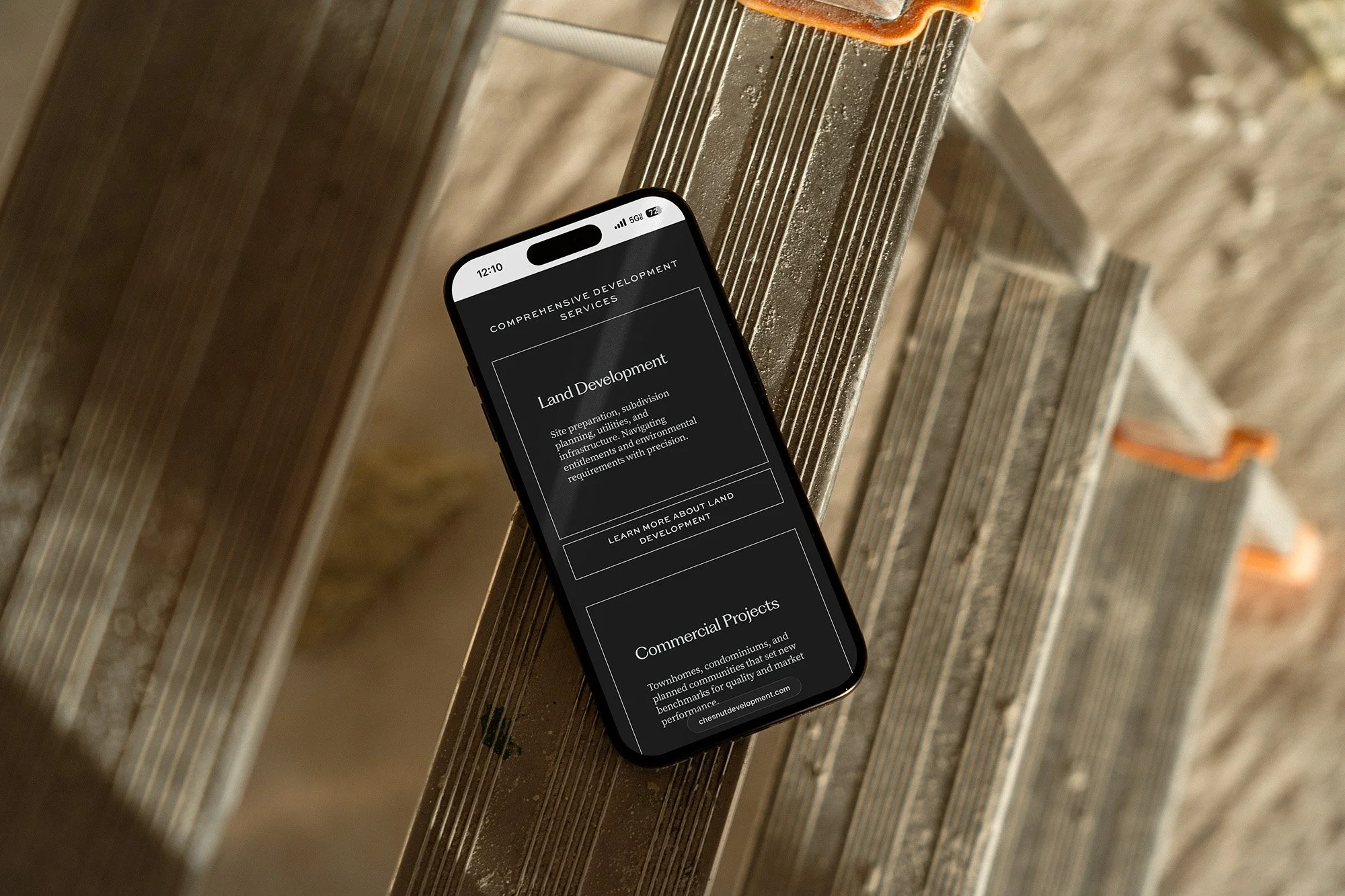
WEBSITE
STRATEGY
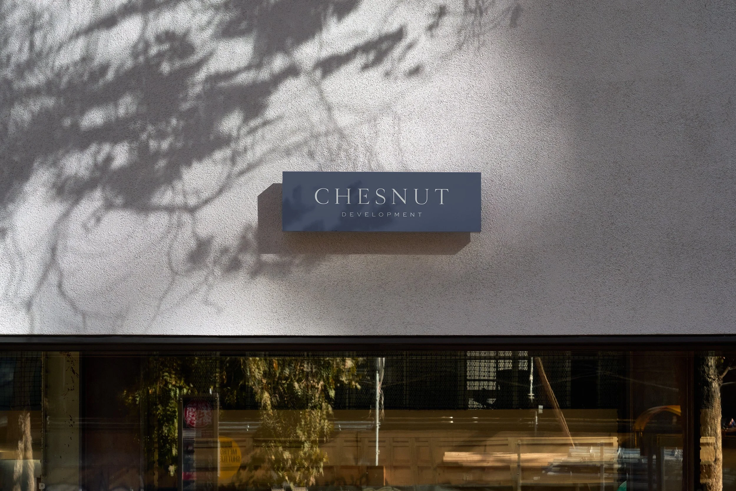
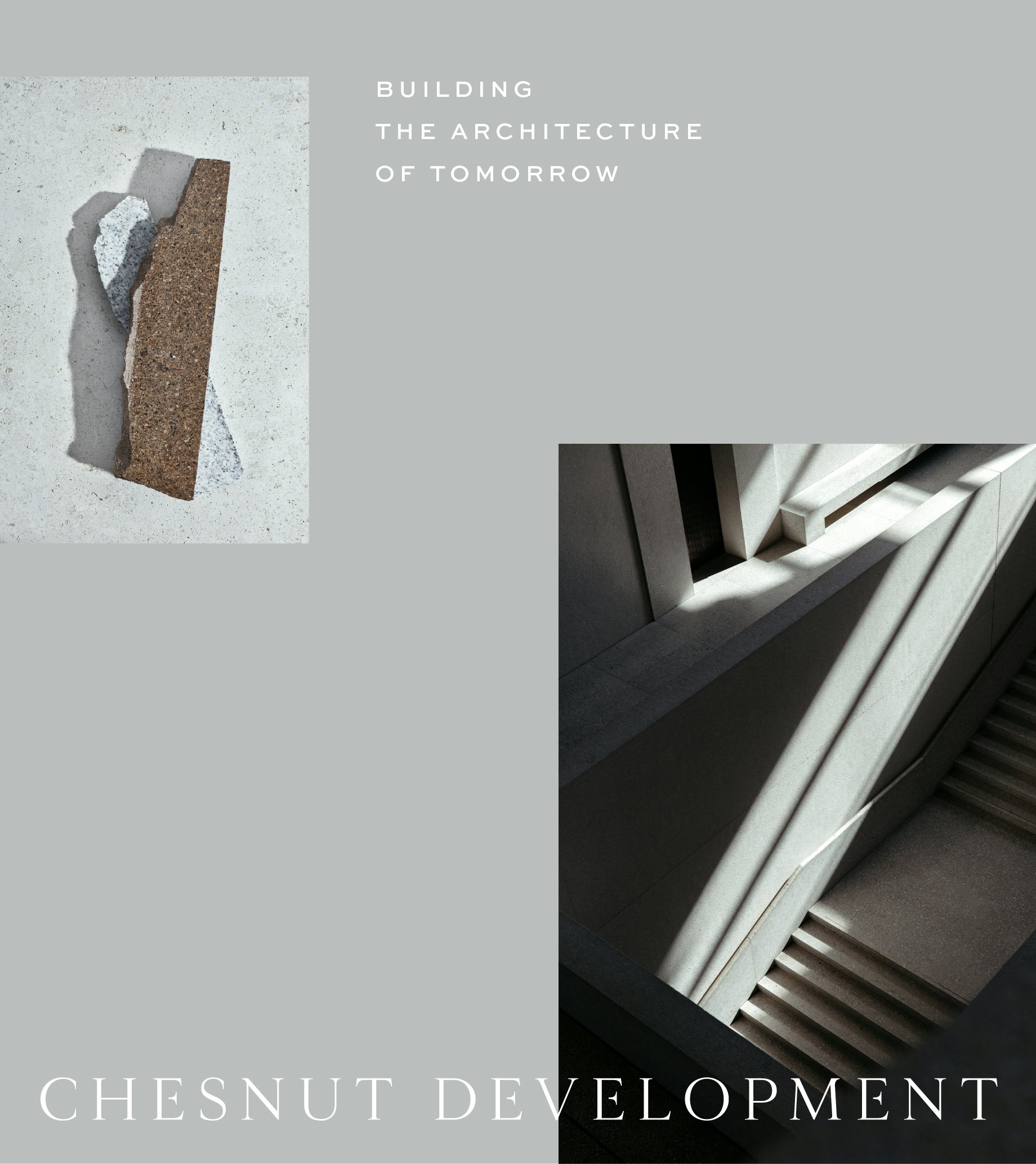
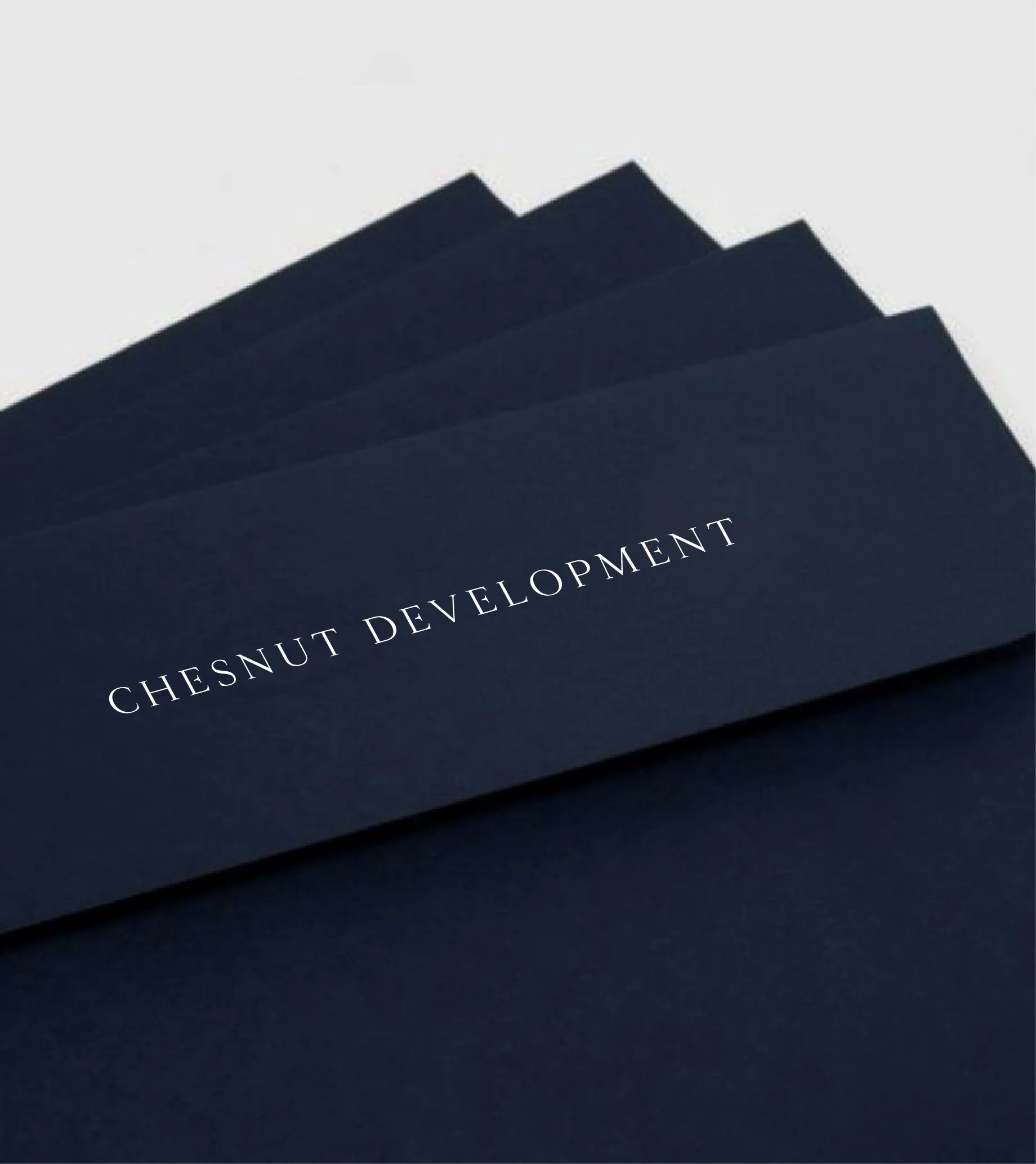
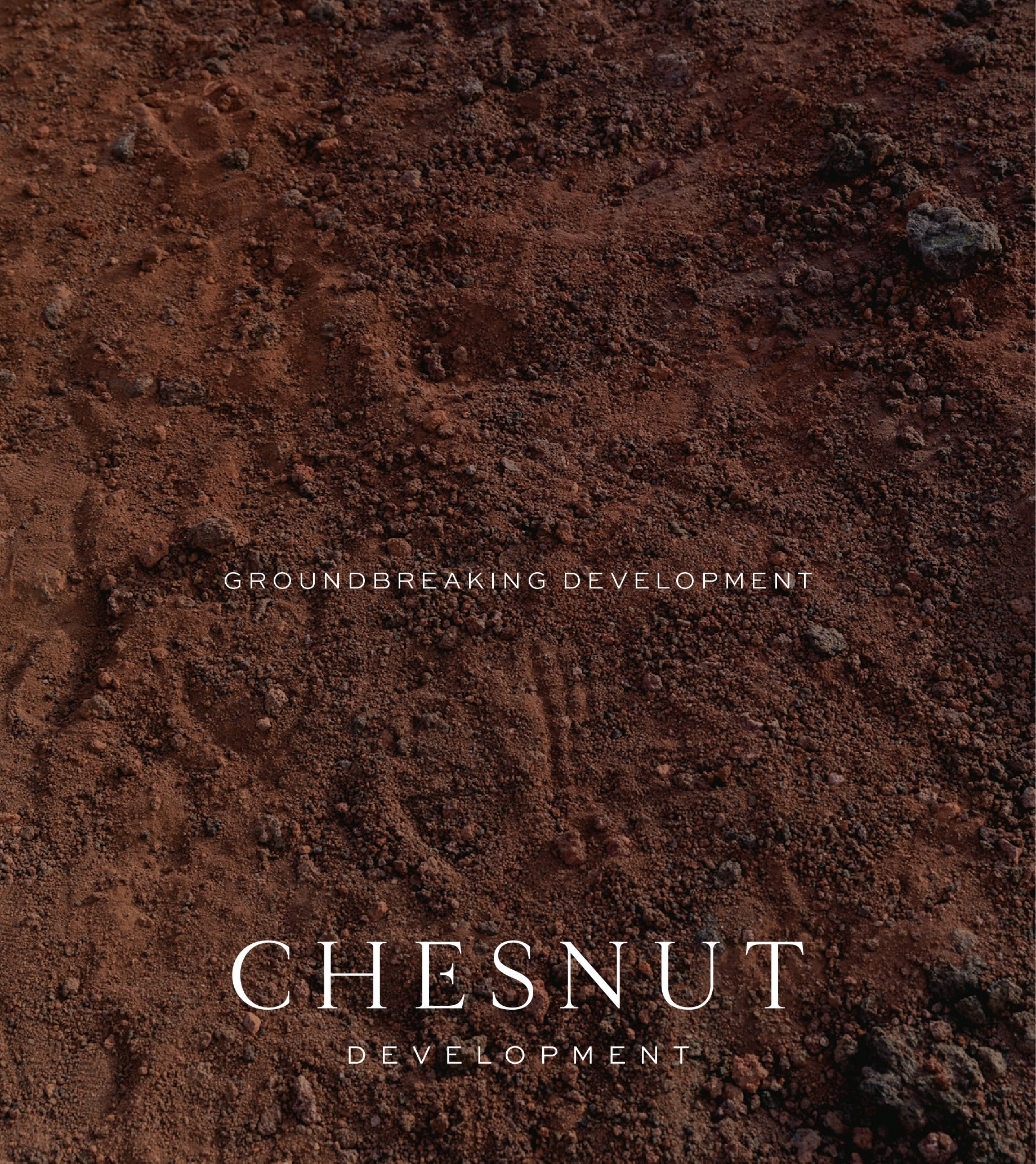
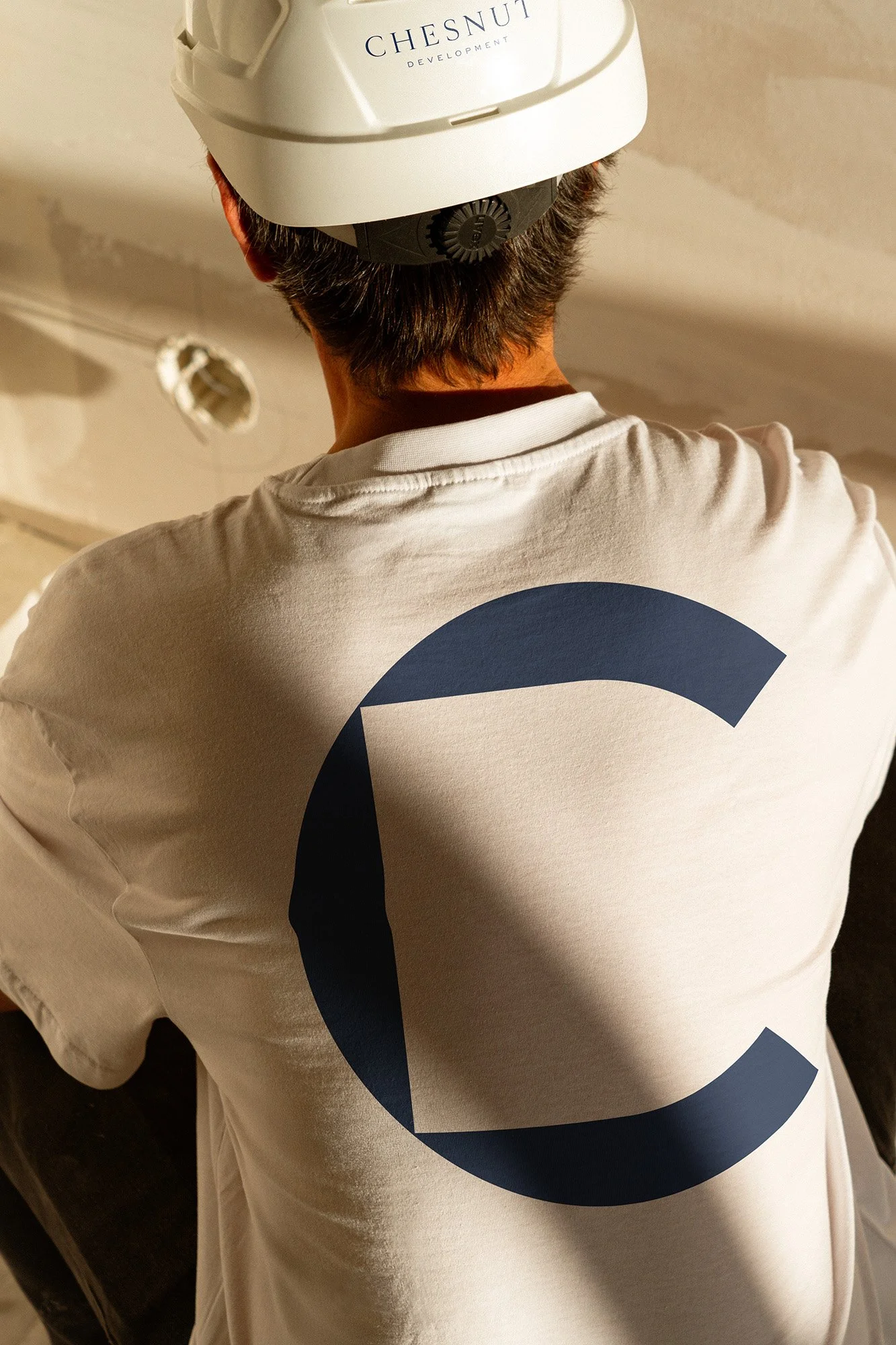
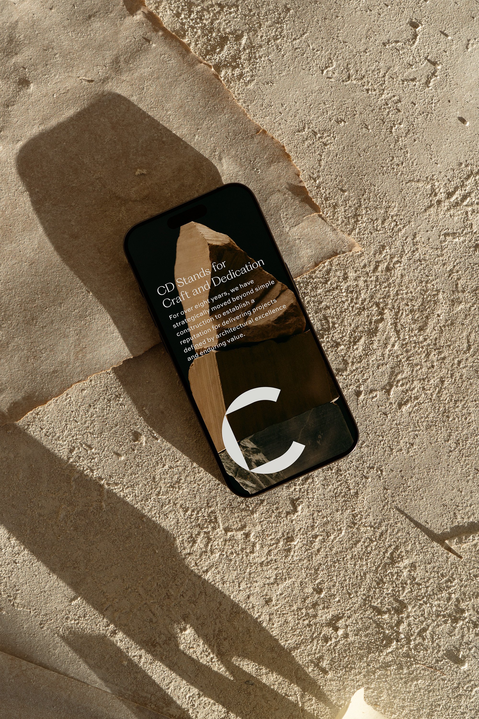
Chesnut Development came to STUDIO ANDOR with a clear ambition: to build an identity that carried the authority of a seasoned firm while feeling elevated enough to attract discerning buyers and landowners, not just contractors and investors. The solution was a brand system built on restraint and precision. A deep navy and slate ground the palette with the weight of something established, while white and warm concrete tones keep the brand from tipping into corporate. The wordmark, a riff on his old logo, does the heavy lifting, projecting quiet confidence without ornamentation. The "CD" monogram (a perfect circle C with a perfect square in the counter, creating a secret D in the negative space) functions as an architectural element in its own right: a mark meant to be seen from across a job site or stitched across the back of a shirt. Every decision pointed toward the same idea: that the best developers don't shout, they build.
RESULTS
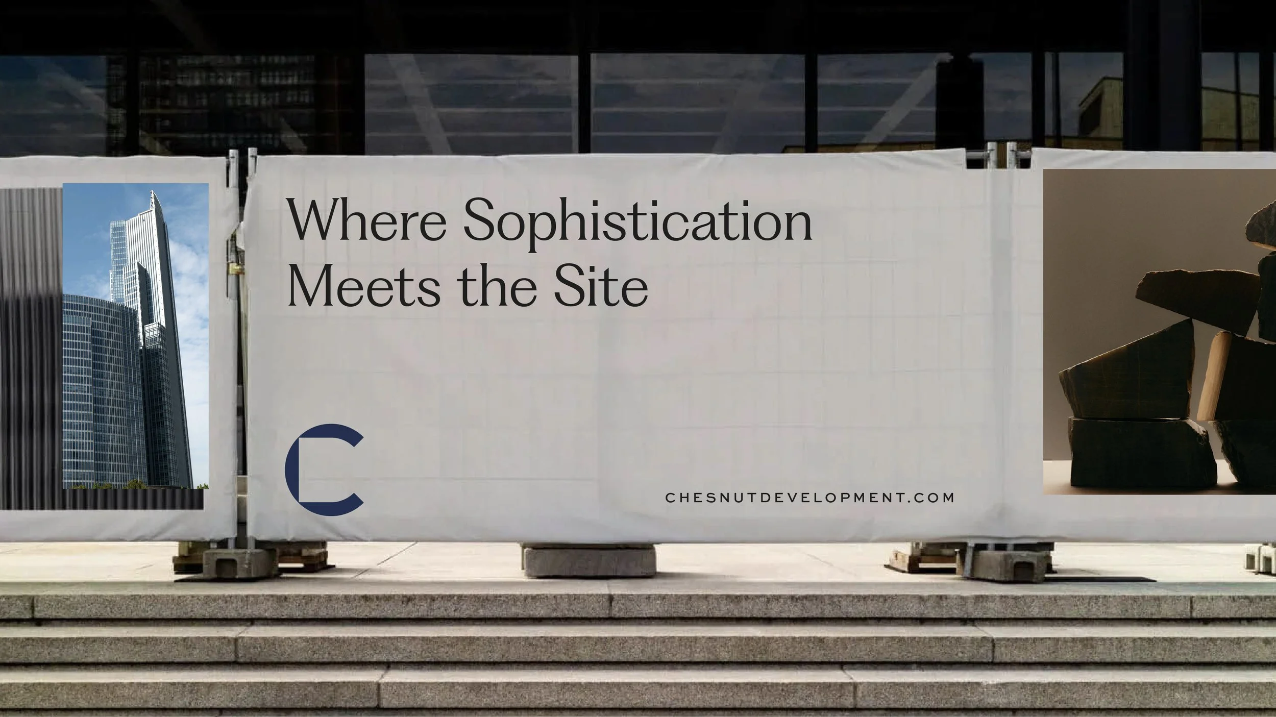
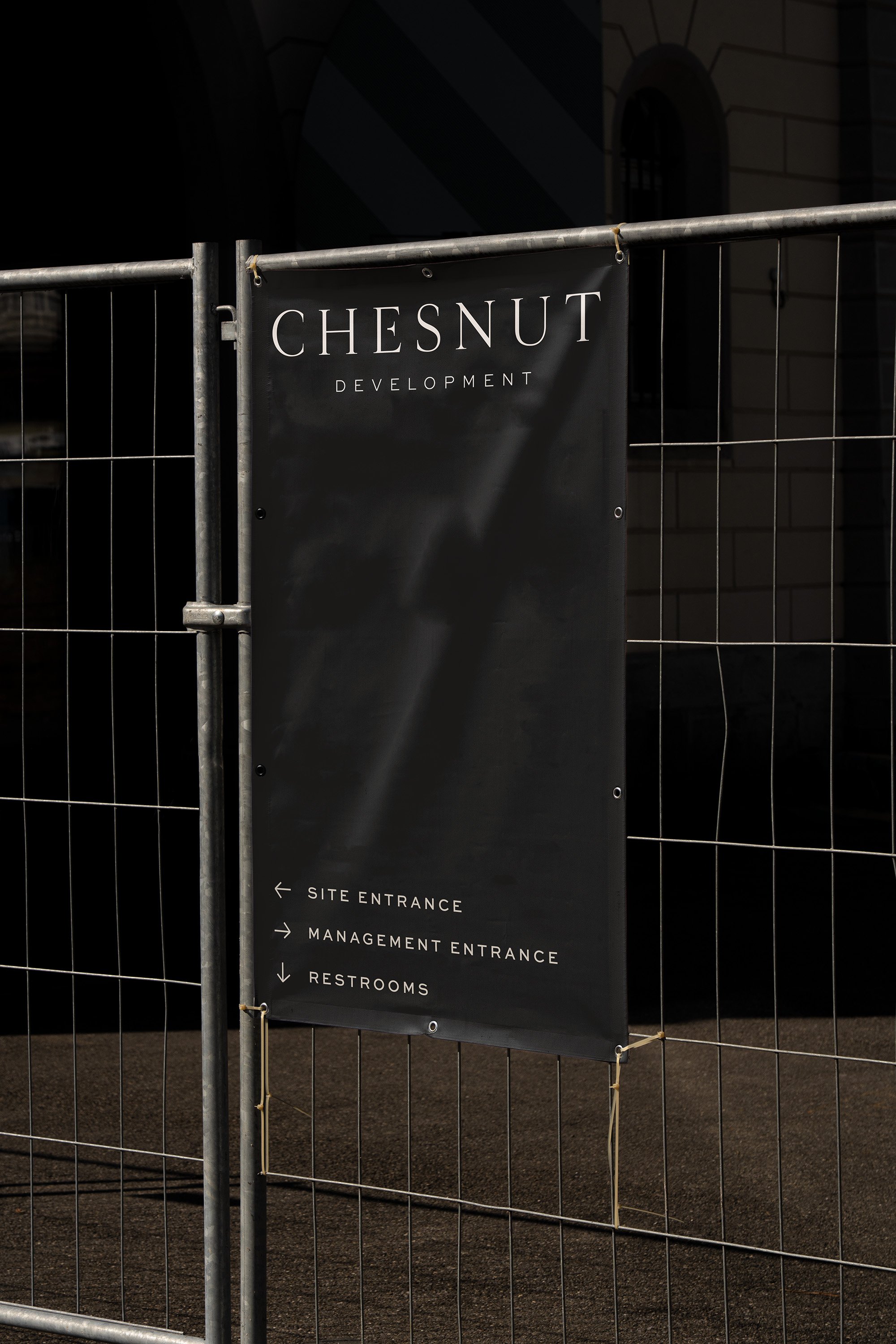
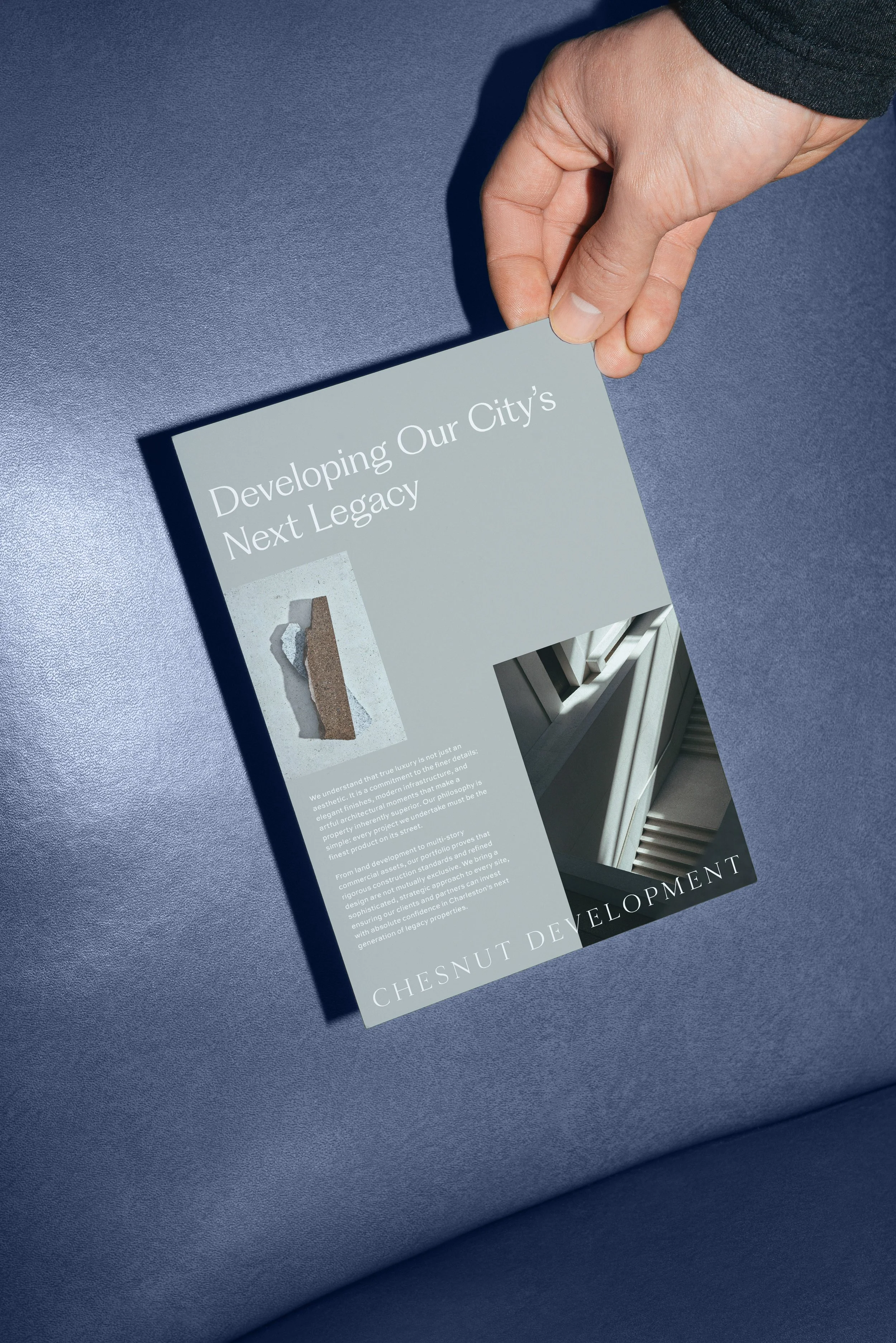
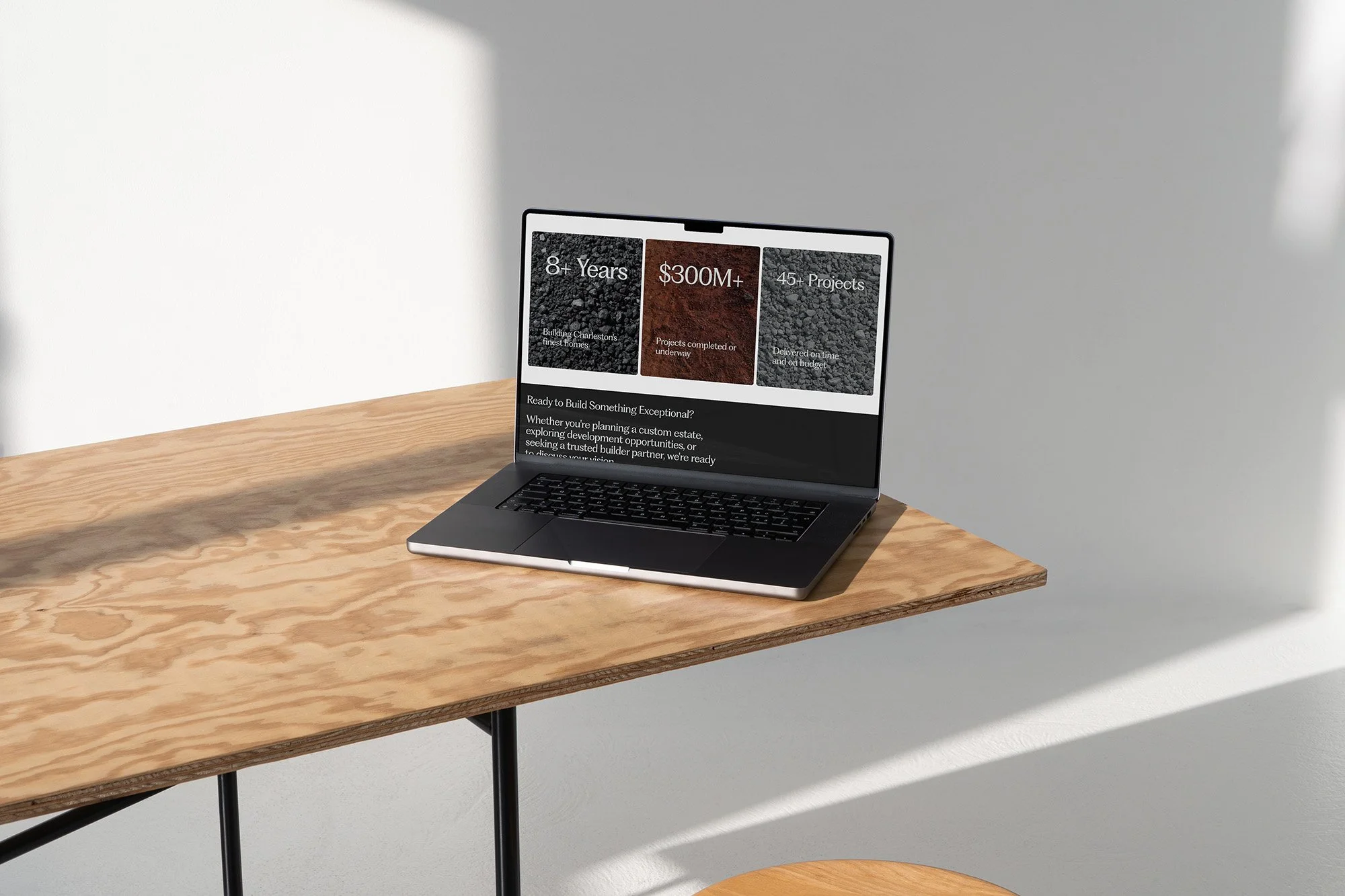
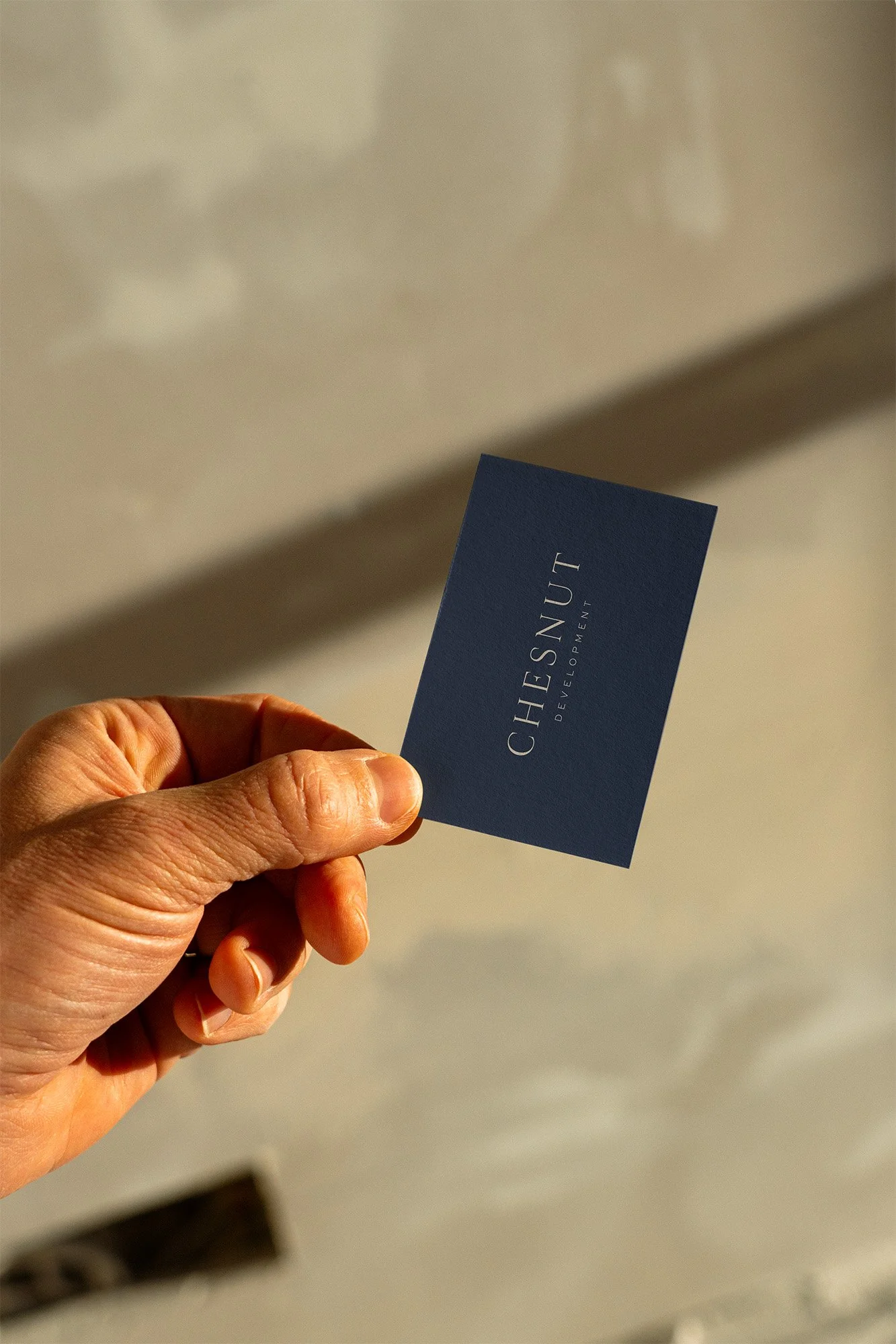
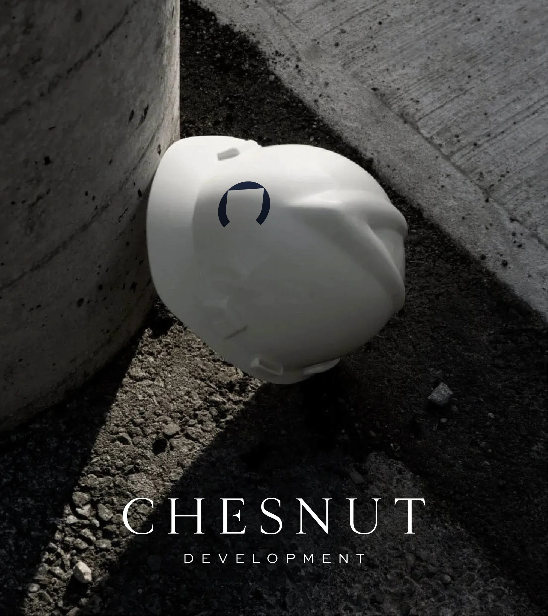
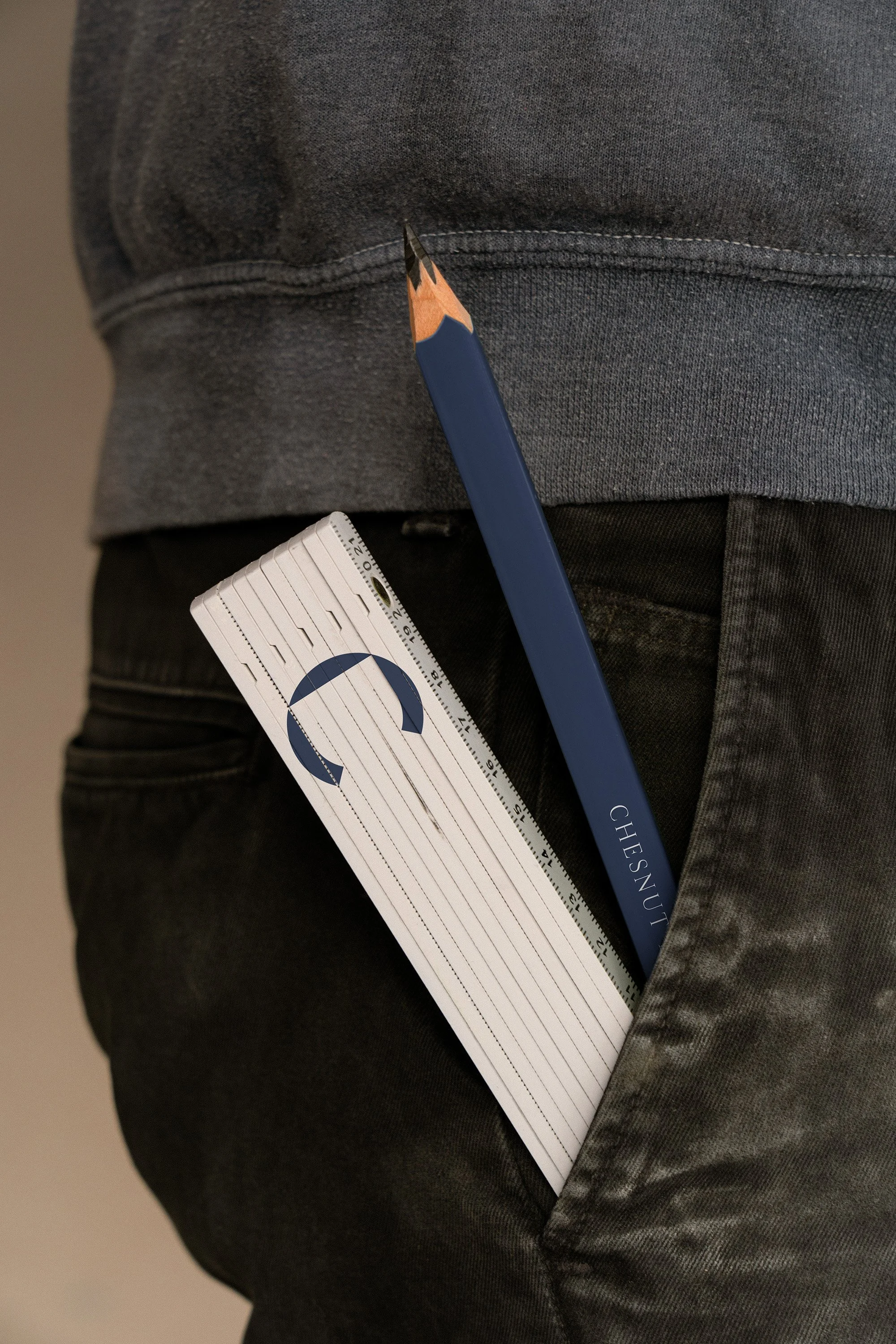
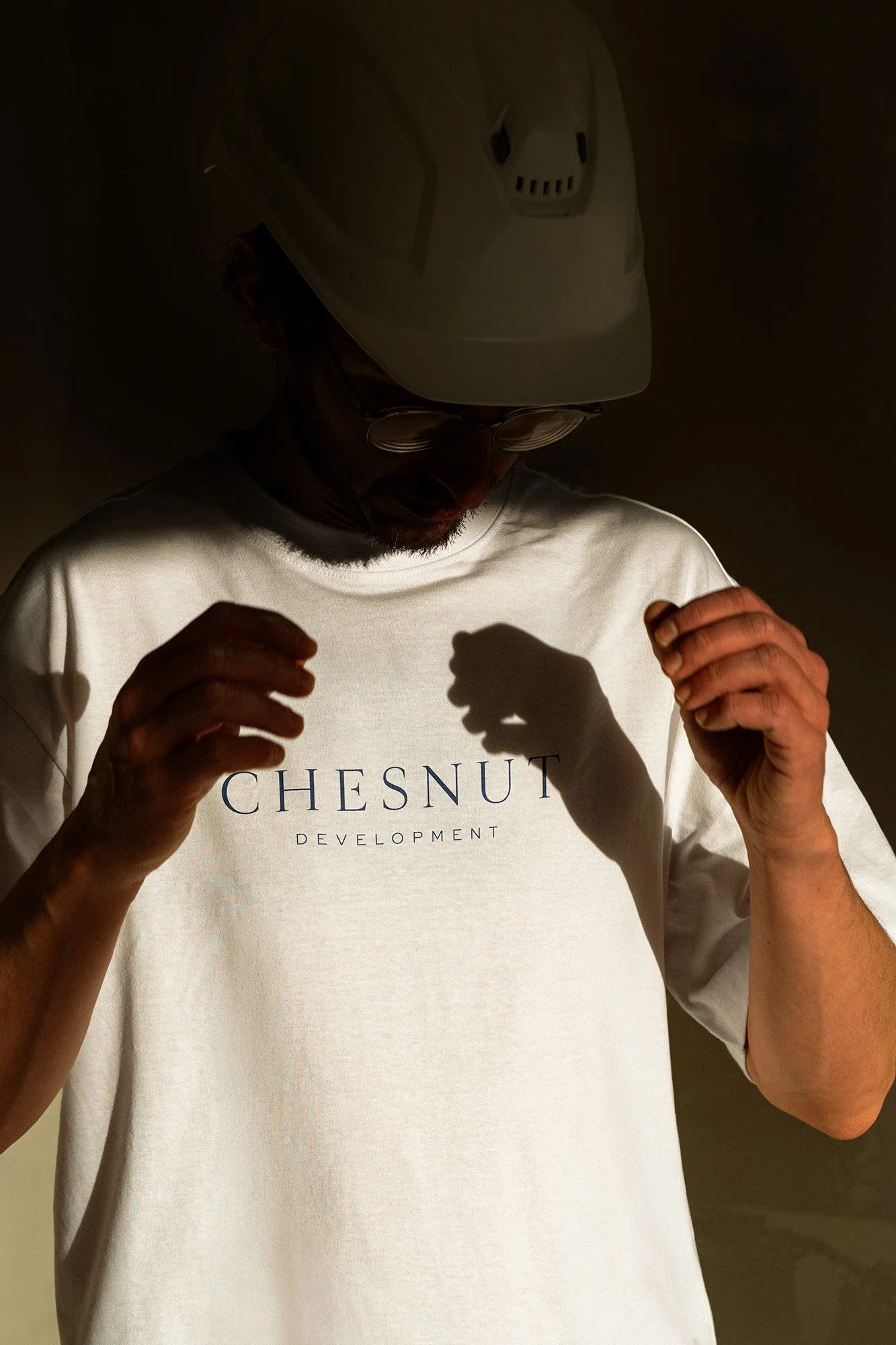
The final brand system for Chesnut Development extends across every point of the project lifecycle, from the first handshake to the last walk-through. Branded hard hats, crew tees, folding rules, and navy pencils make the job site itself a brand moment. This is the kind of brand consistency that signals a company running a serious operation. The site-facing banner keeps wayfinding functional without sacrificing the aesthetic. Business cards, navy with silver letterpress on the front, white with rotated type on the back, are the kind of card that gets kept. The website carries the same measured confidence into the digital space, anchoring credibility with concrete proof: 8+ years, $300M+, 45+ projects. The result is an identity built like the homes it represents: intention, precision, and something worth pointing to.


OTHER PROJECTS
-
![Outdoor sign with "OMIKA" on a round, decorative background attached to a building.]()
OMIKA
Brand Identity, Packaging, and Marketing for a women’s clothing brand inspired by the vibrant prints of India.
-
![Black and white image of a person lying face down on a chair outdoors with text "UNSORTED."]()
UNSORTED.
An independent label by Hunter Hardee inspired by technique and voracious curiosity. A line of clothes that challenges the notion of what clothes can be.
-
![Person holding a smartphone displaying a menu for 'Ethos' with options like Club Culture, Ethos News, Team, Schedule, Classes, Memberships, Gallery, Contact, and a 'Become a Member' button.]()
ETHOS ATHLETIC CLUB
A bold website to attract new members, host class signups, and digitally express the world of Ethos A.C.
-
![Person wearing a T-shirt with 'Roseline' text facing shelves of wine bottles and a table with wine glasses.]()
ROSELINE
Brand identity and collateral for an intimate wine bar that boasts fine wines with a side of funky vibes.