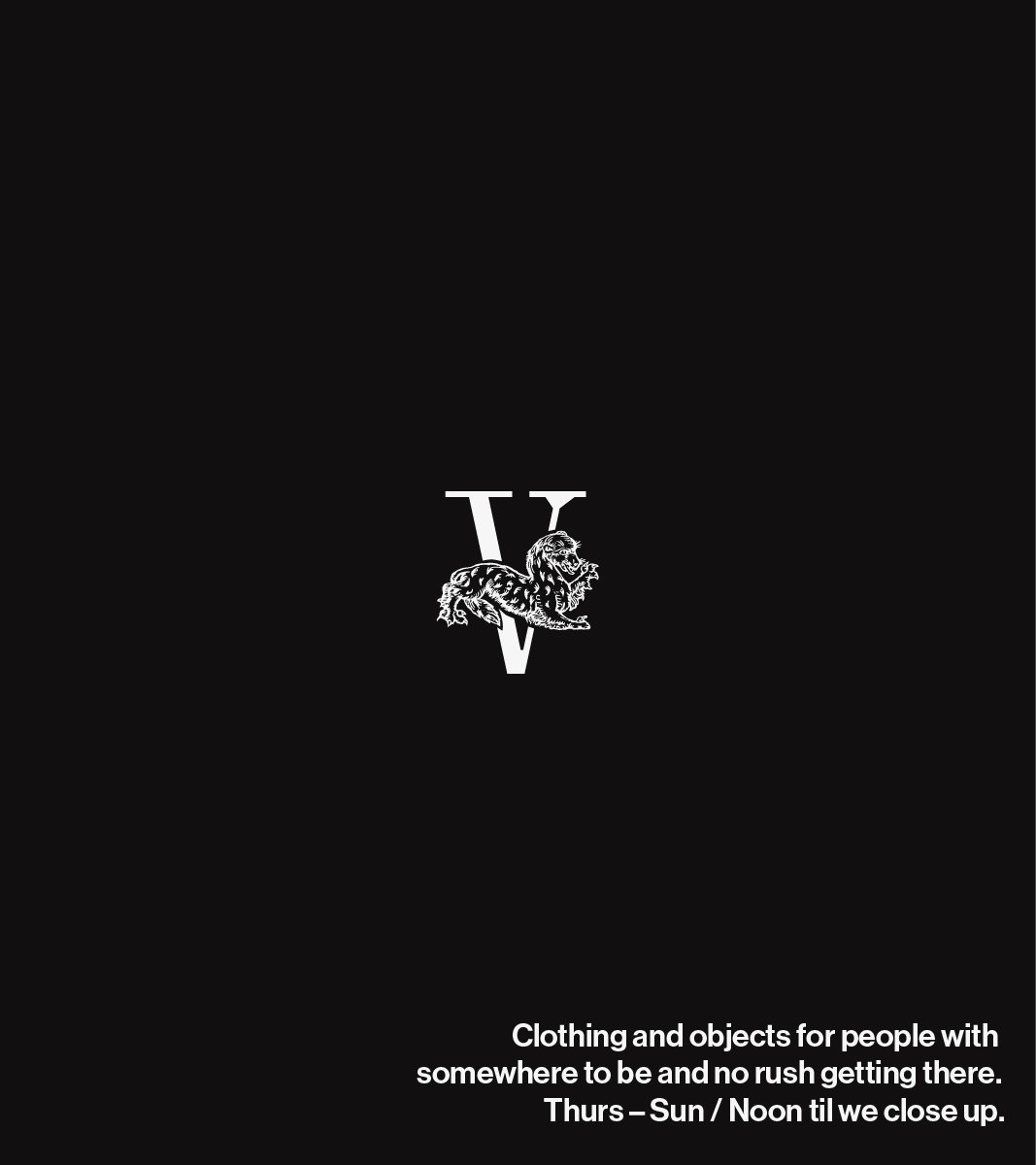
FIVE
BRAND IDENTITY
BRAND STRATEGY
PACKAGING
COLLATERAL

STRATEGY
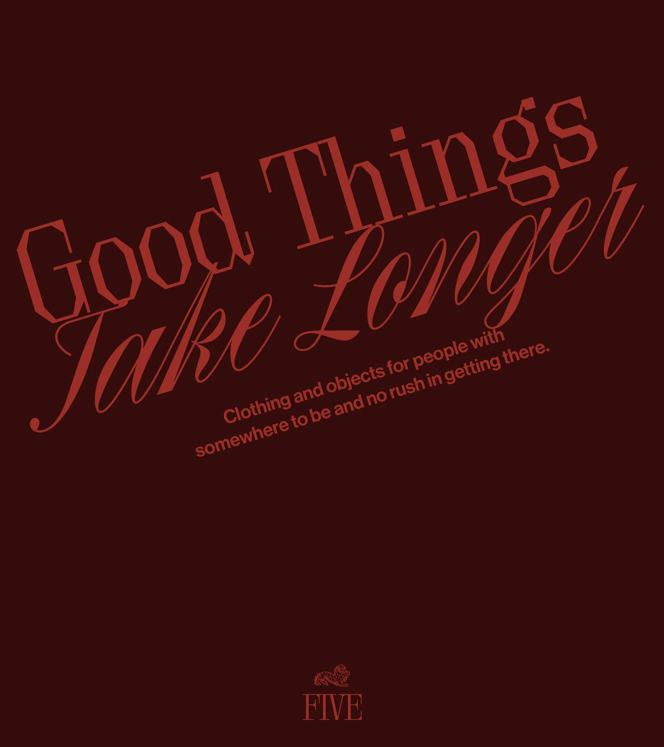
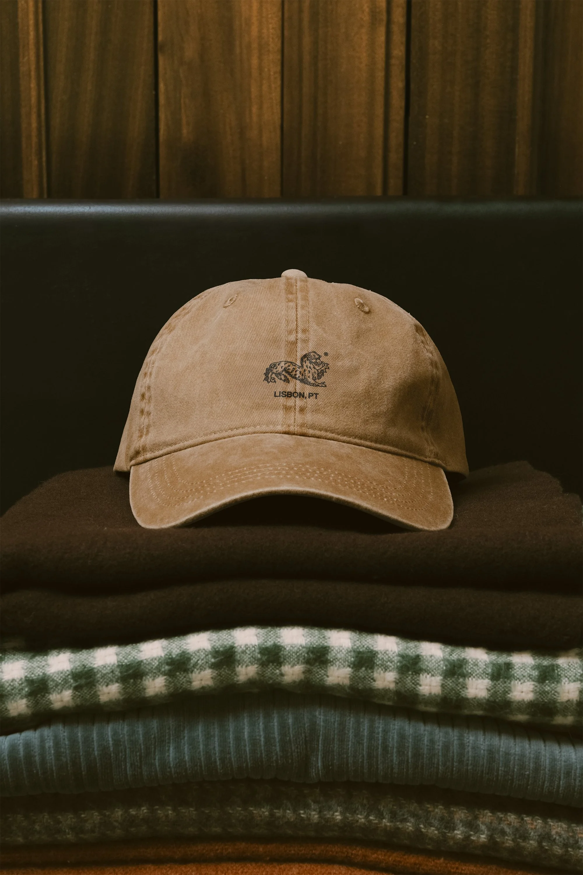
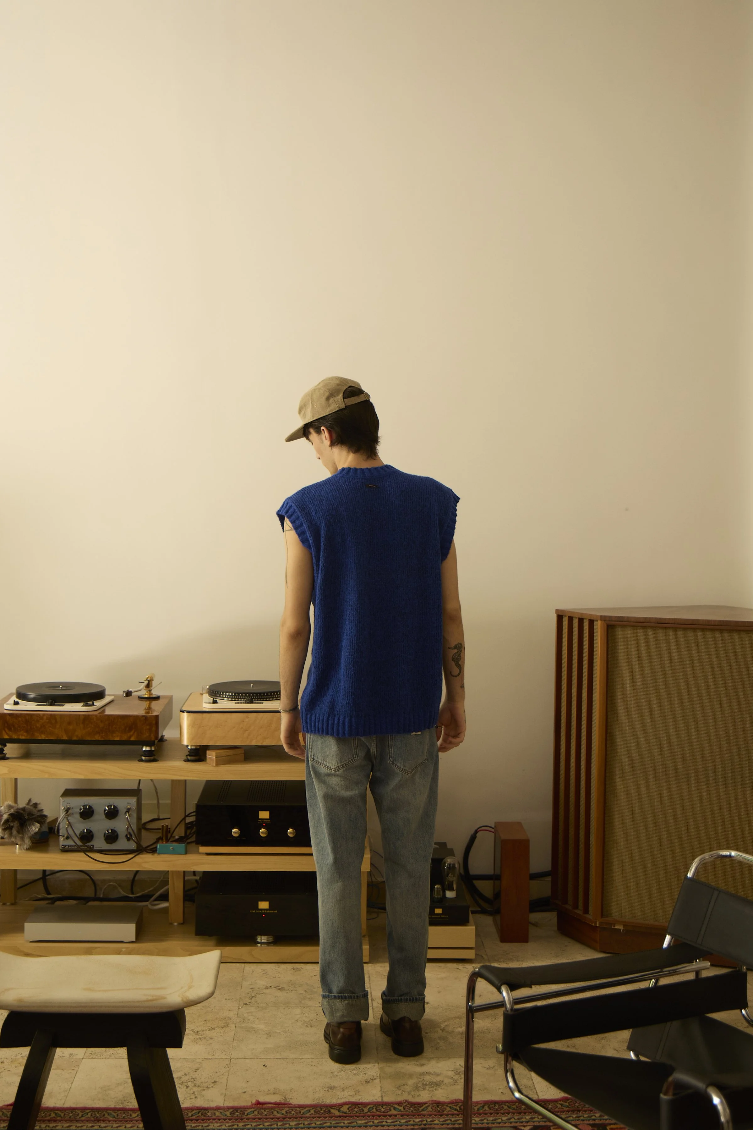
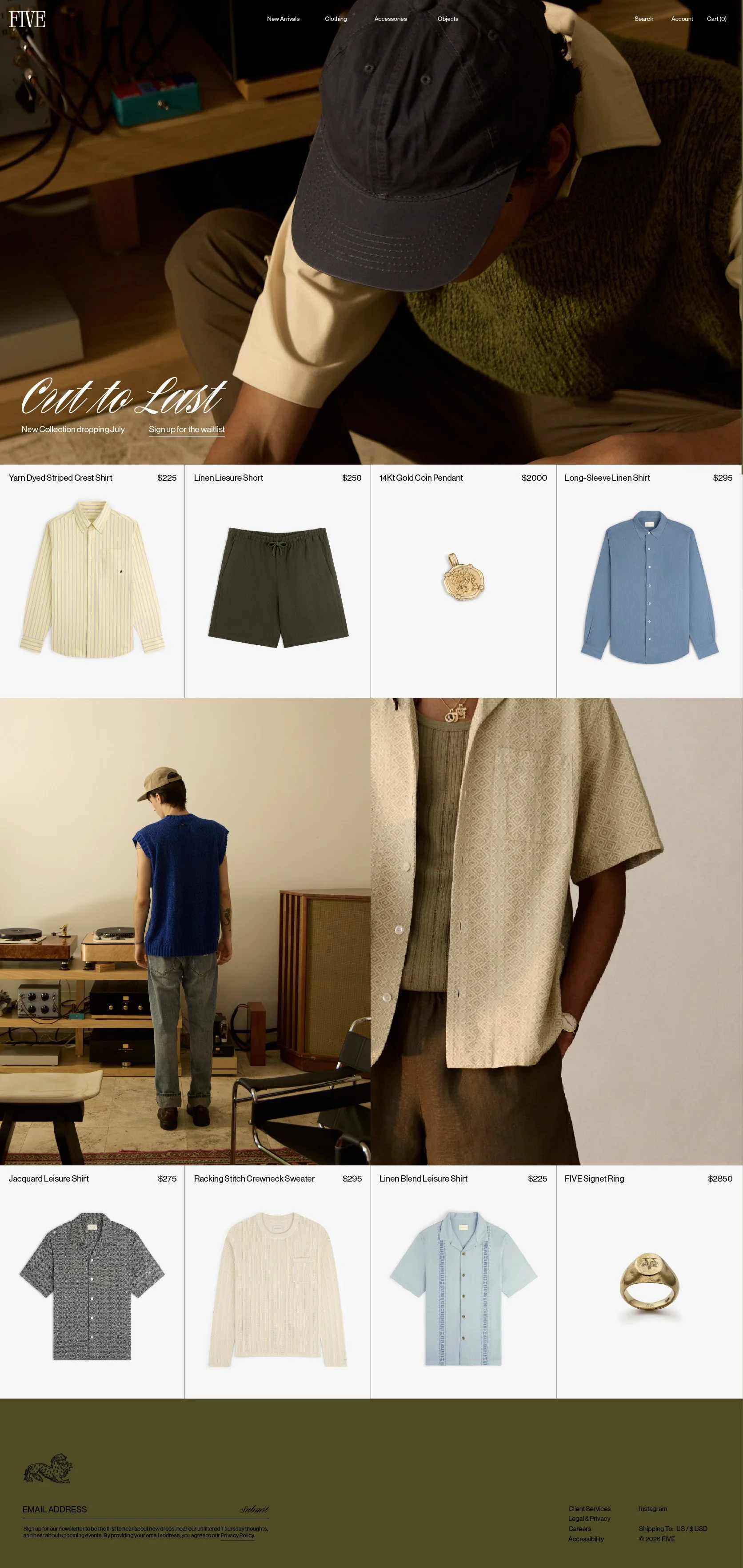
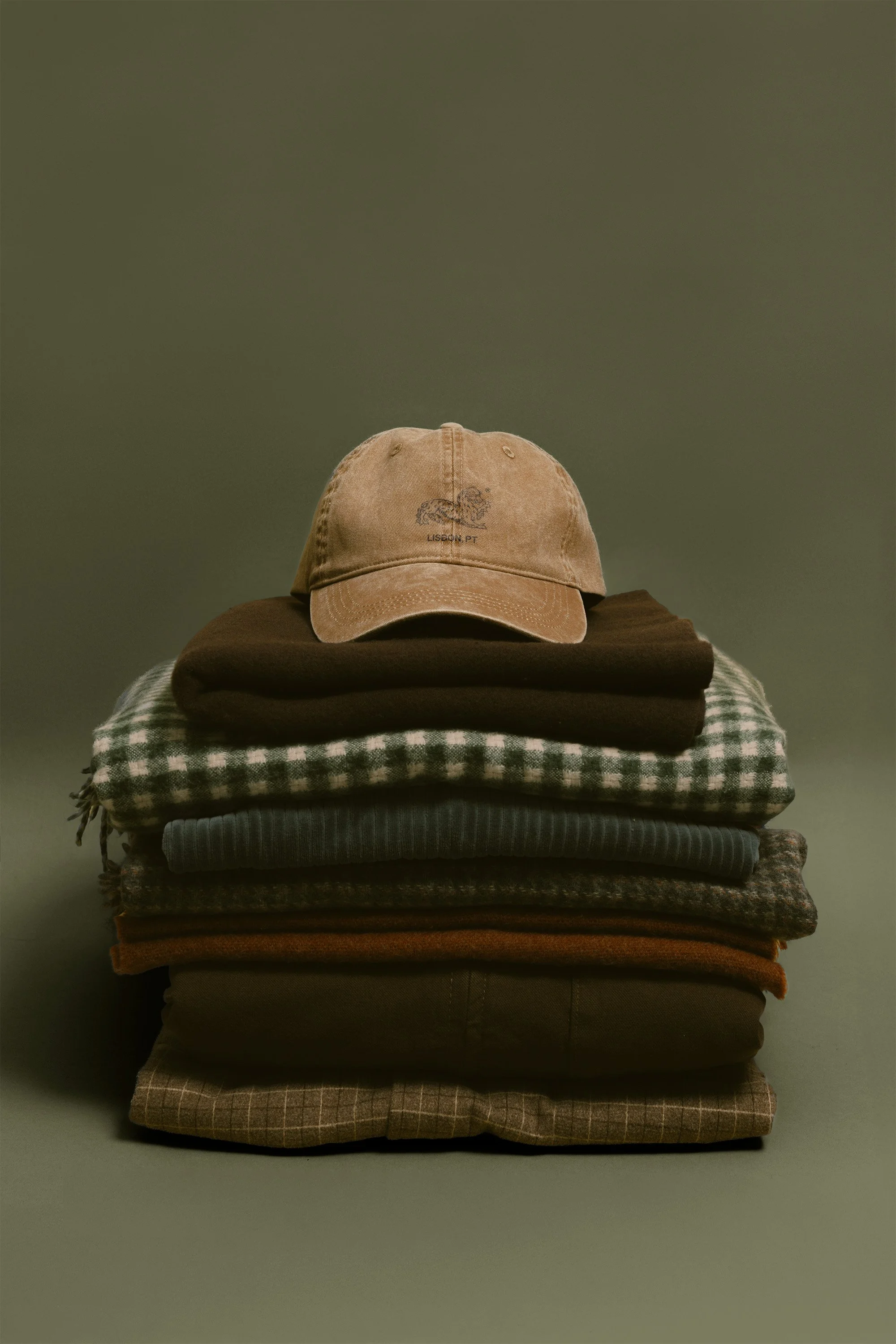
The brief for FIVE was a feeling: a Sunday that bleeds into Monday without apology, a needle dropping on a record you didn't pick on purpose, a cat that couldn't care less that you're watching it. The brand lives in that specific kind of unhurried. The deliberate slowness of the fashion oozes into its very customer. FIVE is not lazy, nor careless, but deliberately unbothered. Our job at STUDIO ANDOR was to make that legible without explaining it to death. We let the Roman numeral carry the history. We let the medieval-esque cat mascot carry the attitude. We kept the palette the color of things that age well: cream, olive, deep burgundy, the brown of good leather left in the sun. The copy says as little as possible so the clothes can do the talking.
RESULTS
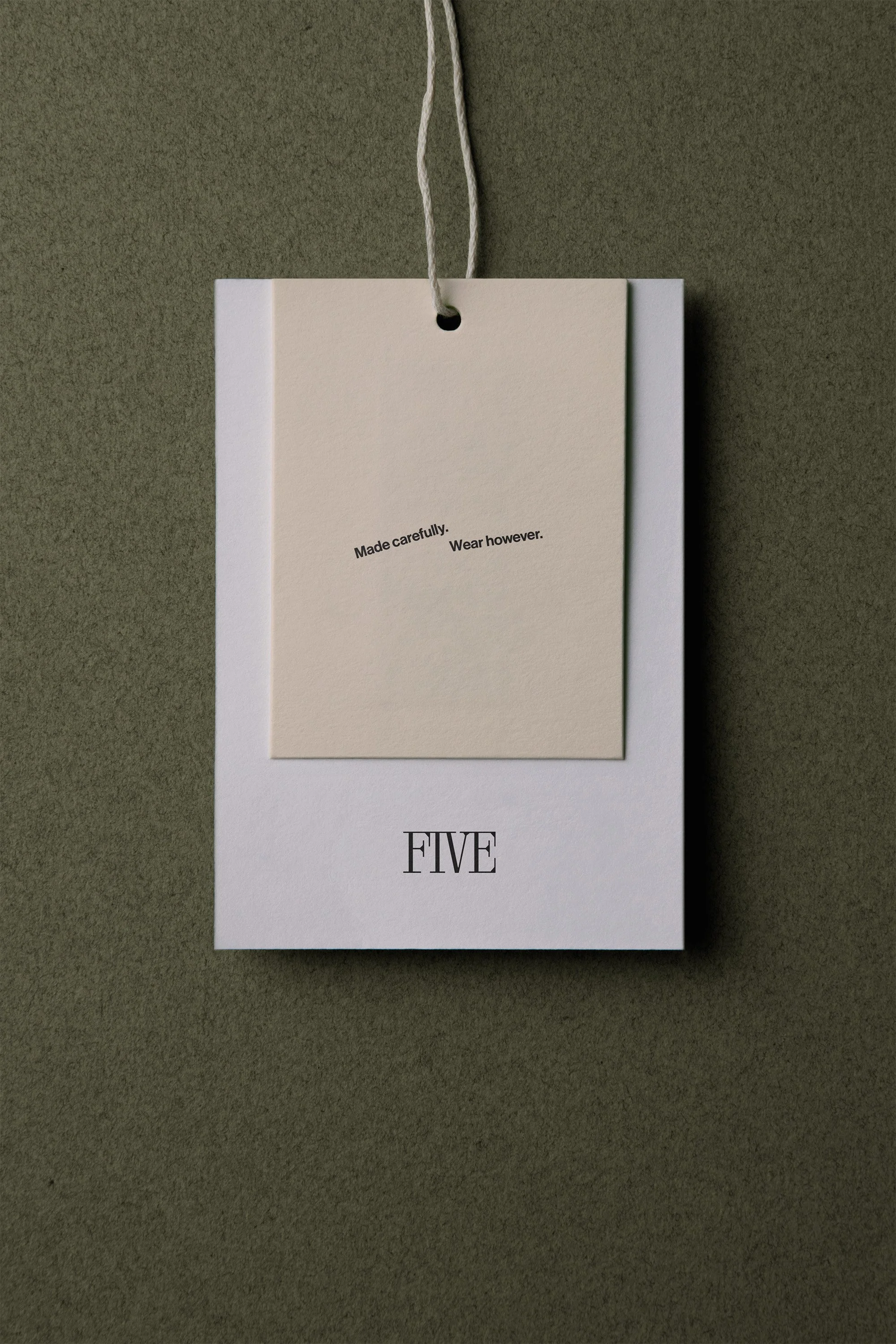
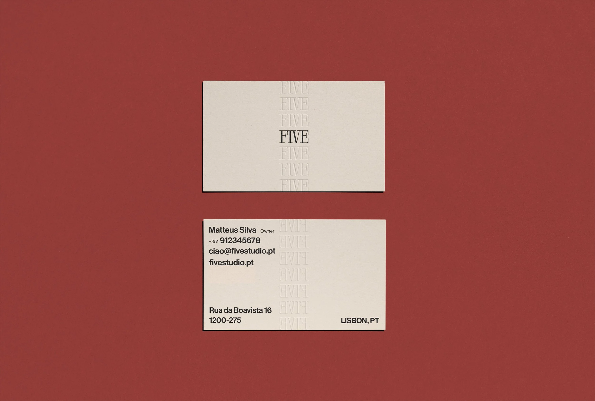
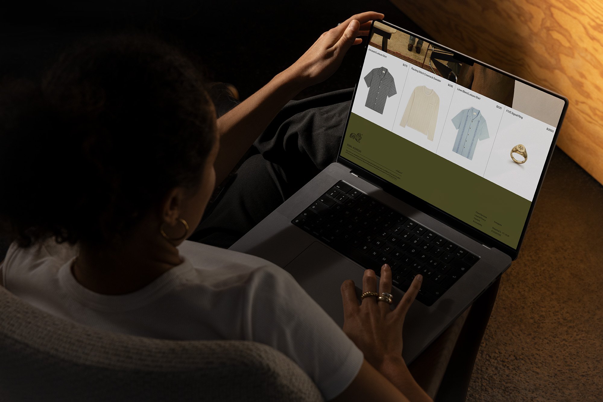
The FIVE identity launched across physical and digital touchpoints simultaneously: hang tags, tote bags, a washed cap, business cards with blind embossing, and a web presence built around the brand's slow-living ethos. The "Made carefully. Wear however." tagline became a quiet anchor across collateral, read less as a marketing line and more as a philosophy the customer could opt into. The cat crest and V monogram gave the brand immediate visual shorthand, something that could live at the center of a hang tag or be barely there on the front panel of a cap and communicate the same thing. Within the first season, FIVE established a clear cultural lane: not streetwear, not luxury, something more elusive and harder to copy. The kind of brand people ask about when they see it on someone else.


OTHER PROJECTS
-
![Outdoor sign with "OMIKA" on a round, decorative background attached to a building.]()
OMIKA
Brand Identity, Packaging, and Marketing for a women’s clothing brand inspired by the vibrant prints of India.
-
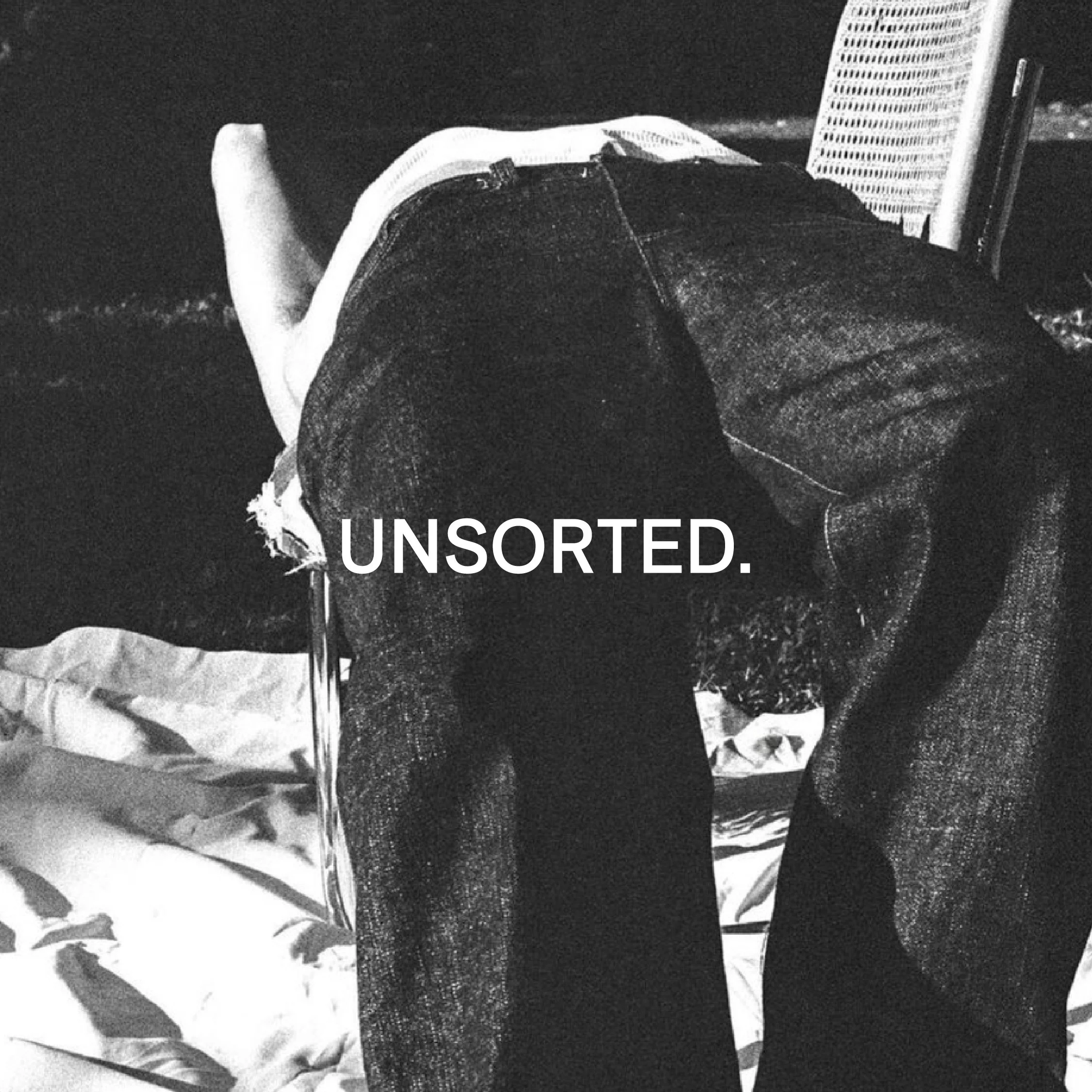
![Black and white image of a person lying face down on a chair outdoors with text "UNSORTED."]()
UNSORTED.
An independent label by Hunter Hardee inspired by technique and voracious curiosity. A line of clothes that challenges the notion of what clothes can be.
-
![Person holding a smartphone displaying a menu for 'Ethos' with options like Club Culture, Ethos News, Team, Schedule, Classes, Memberships, Gallery, Contact, and a 'Become a Member' button.]()
ETHOS ATHLETIC CLUB
A bold website to attract new members, host class signups, and digitally express the world of Ethos A.C.
-
![Person wearing a T-shirt with 'Roseline' text facing shelves of wine bottles and a table with wine glasses.]()
ROSELINE
Brand identity and collateral for an intimate wine bar that boasts fine wines with a side of funky vibes.