IN GOOD HANDS
BRAND IDENTITY
BRAND STRATEGY
PACKAGING DESIGN
COLLATERAL
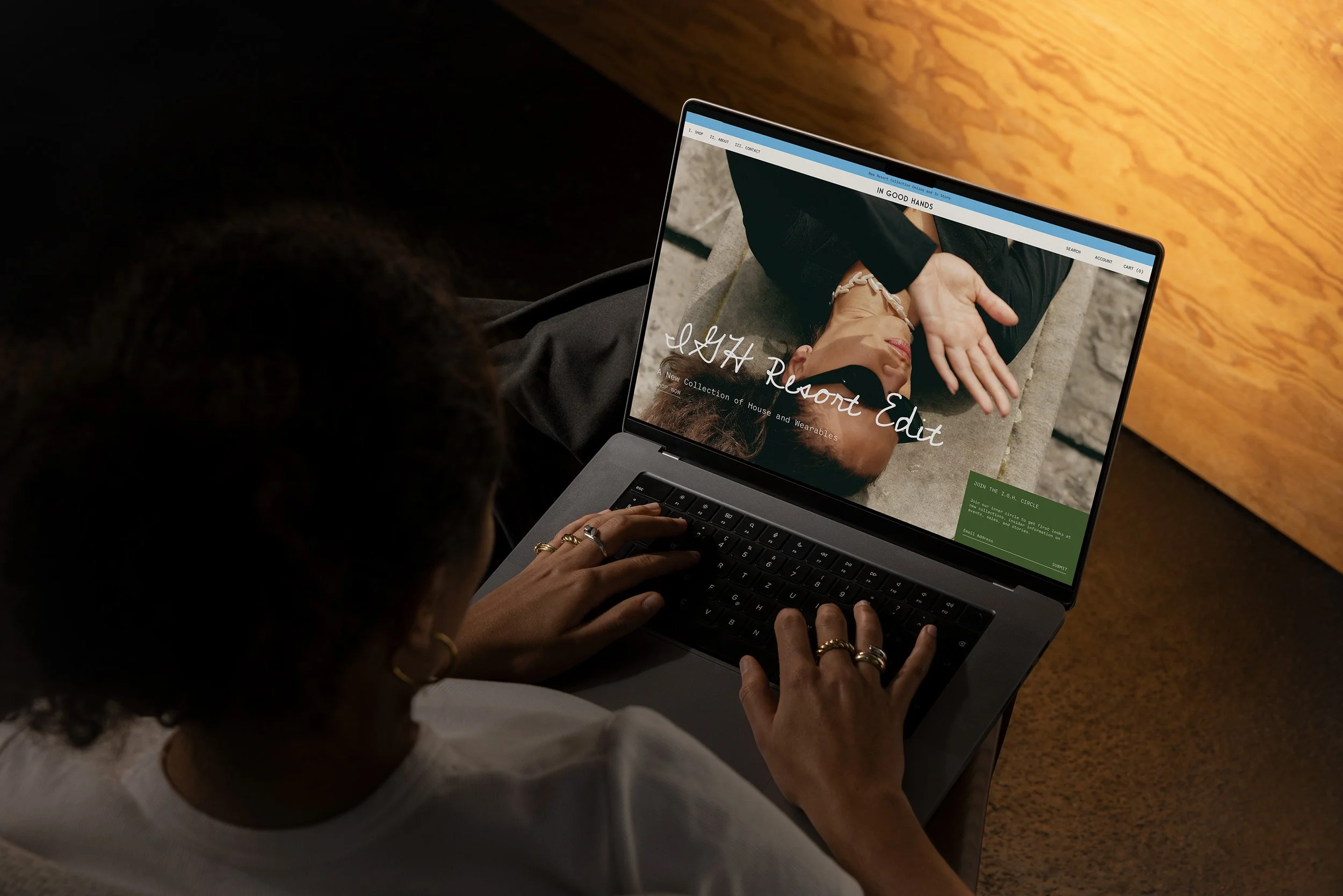
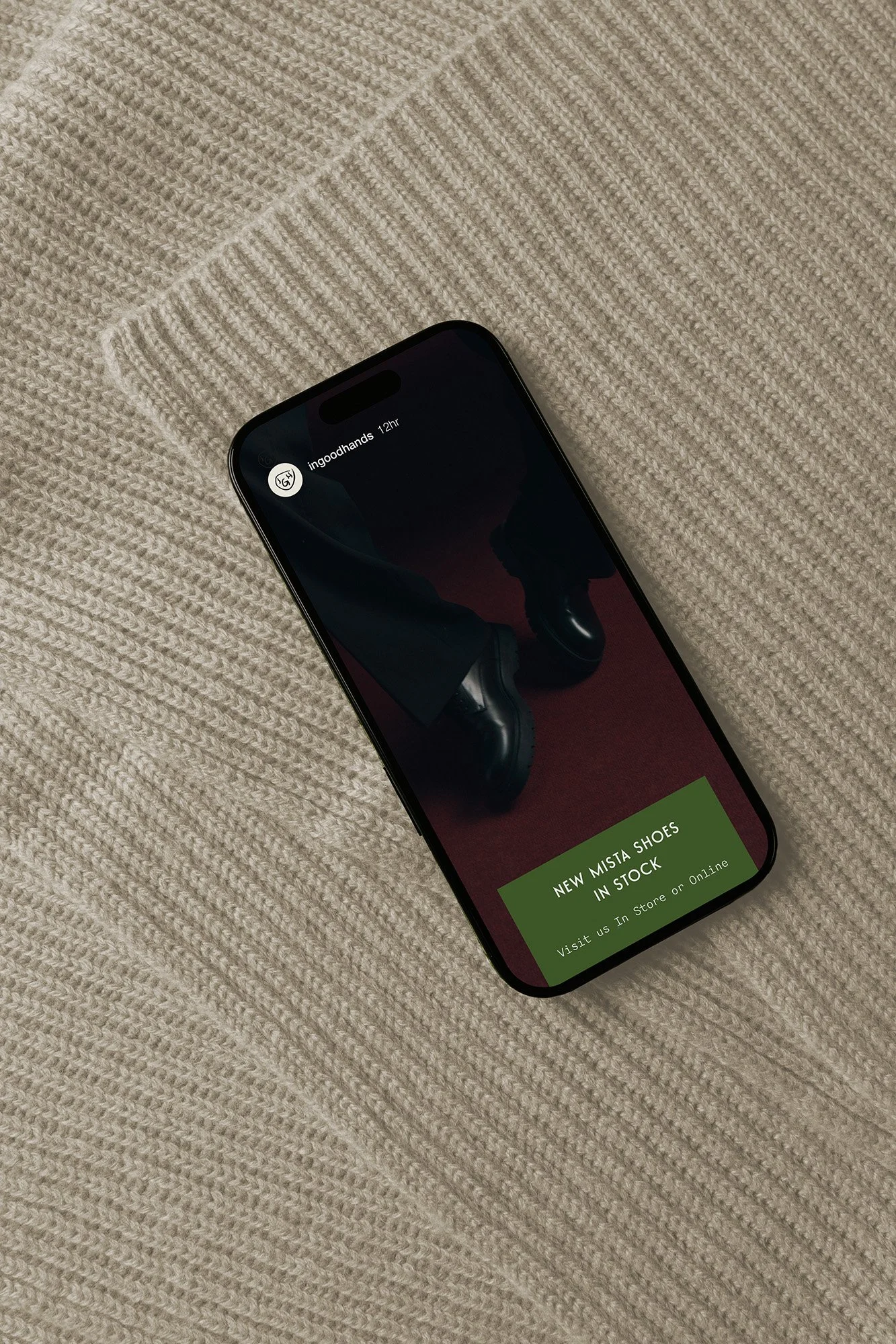
WEBSITE
STRATEGY
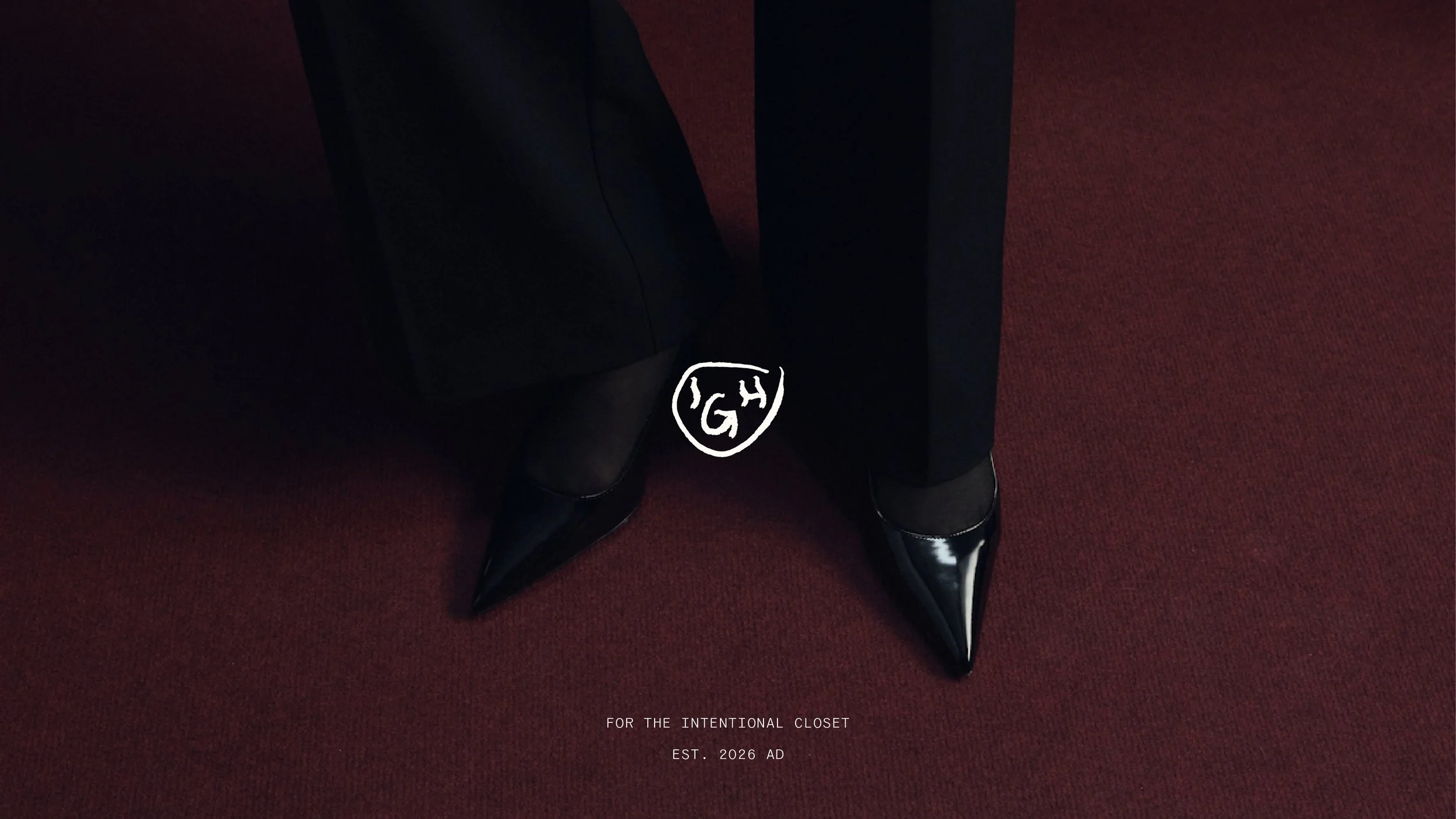
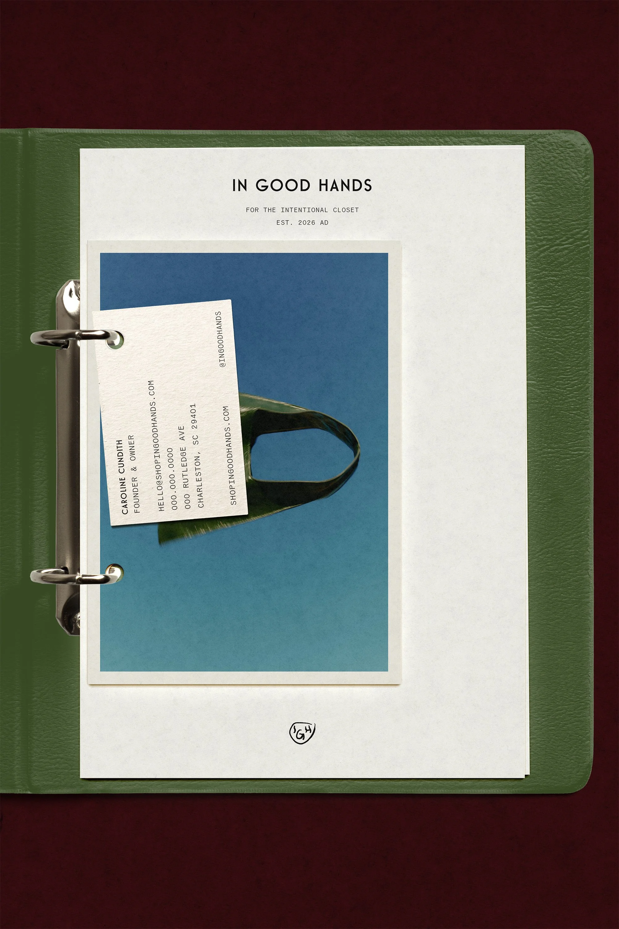
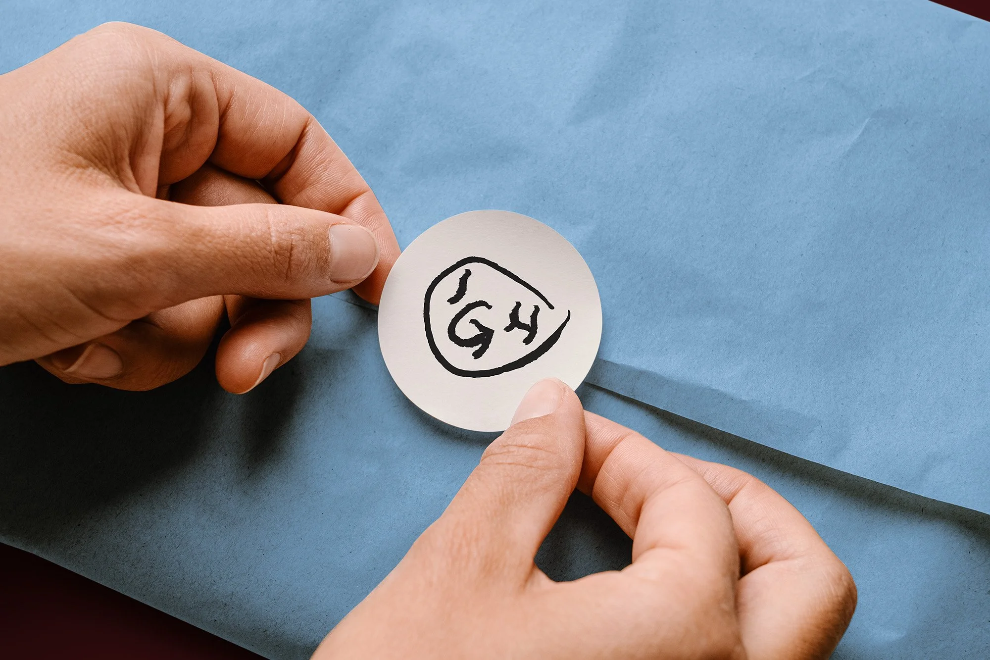
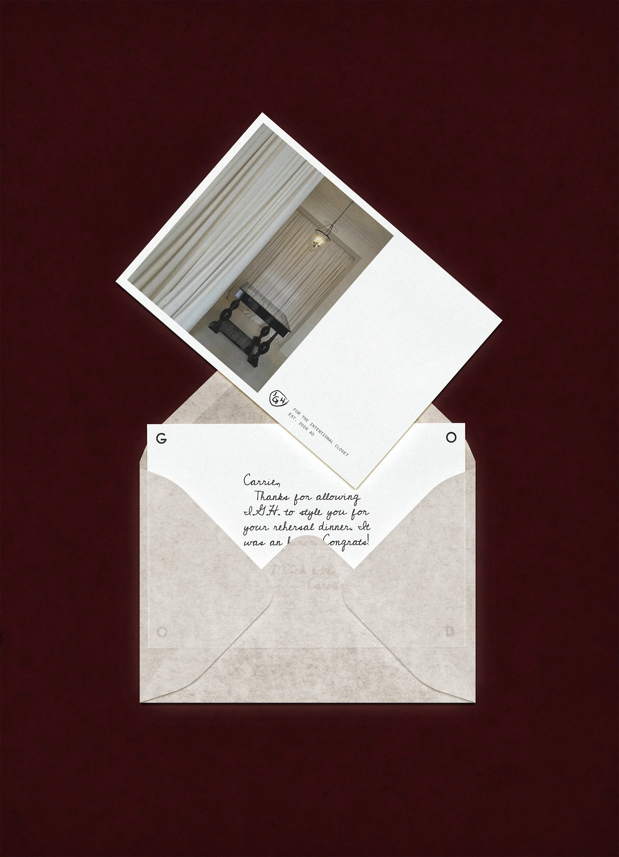
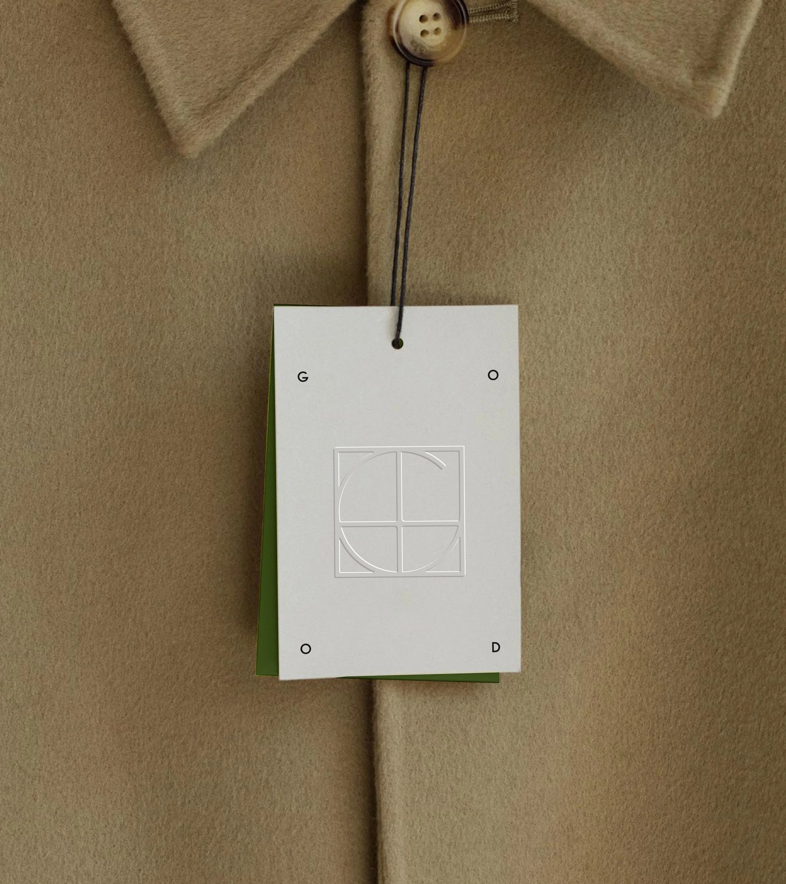
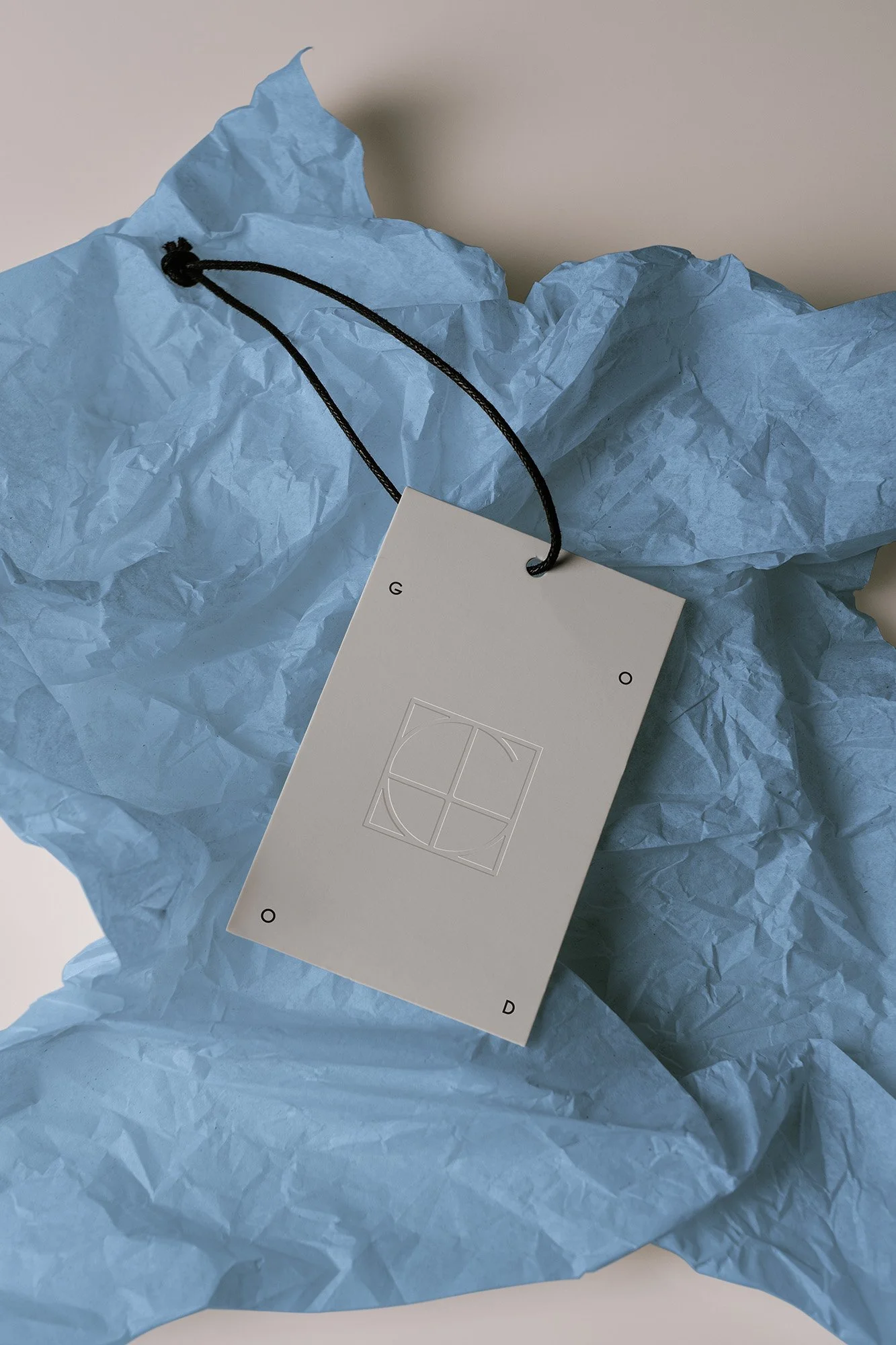
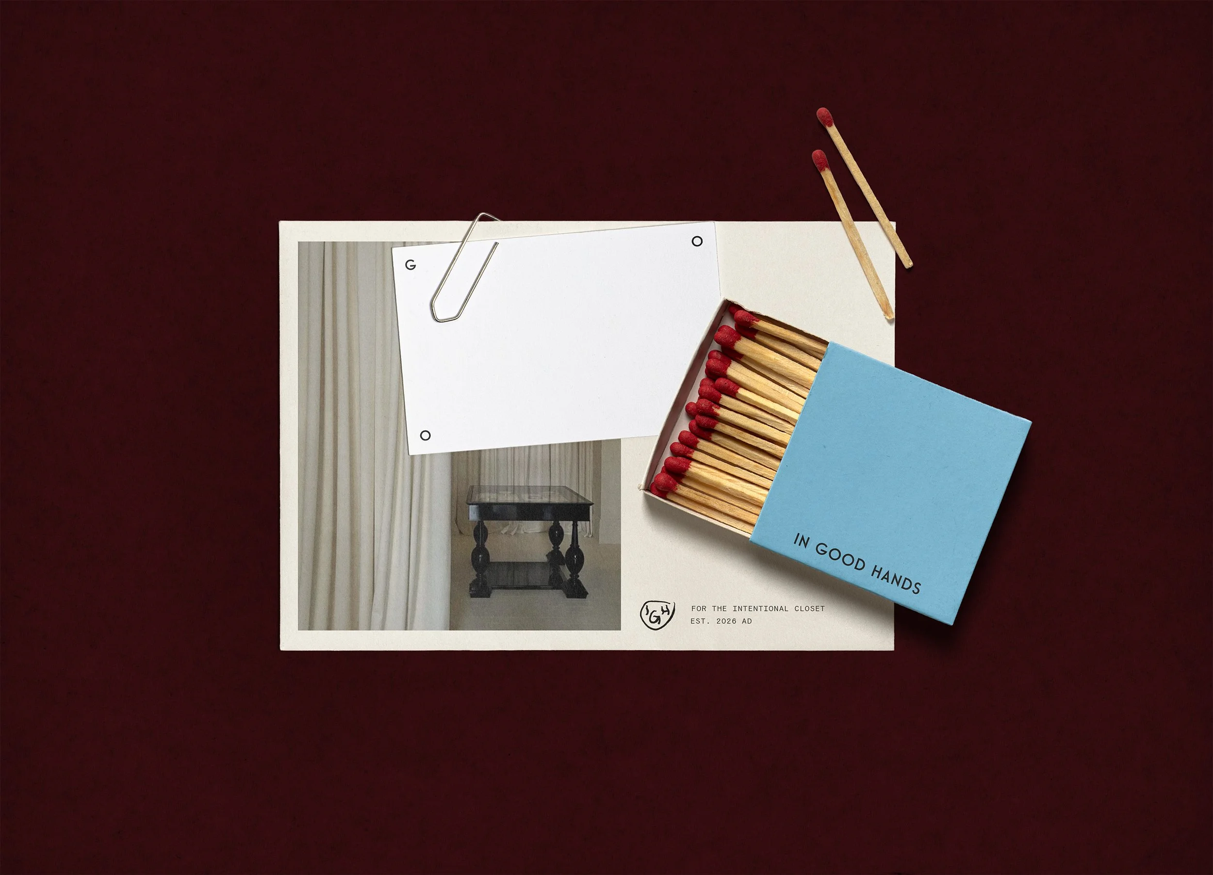
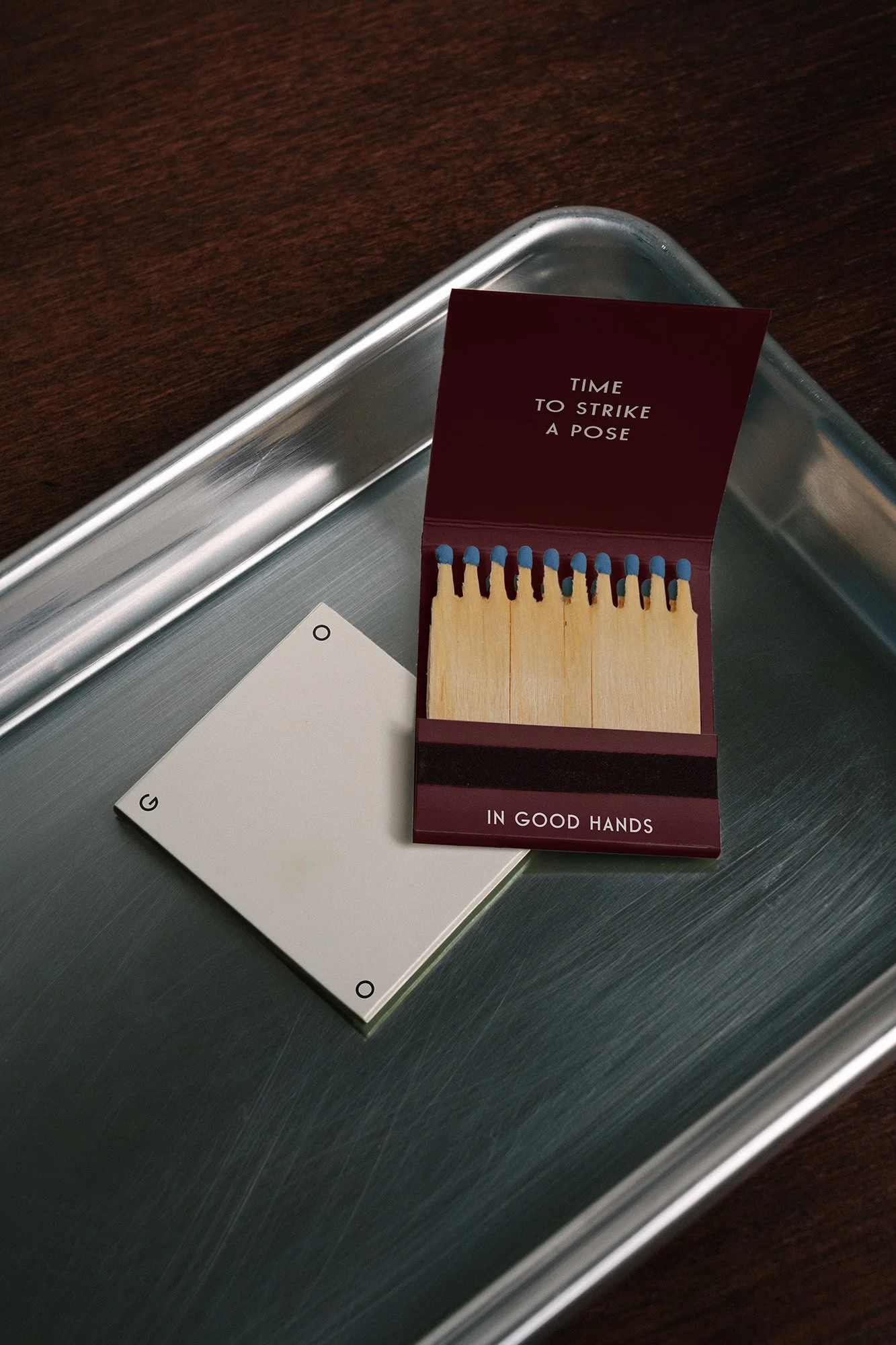
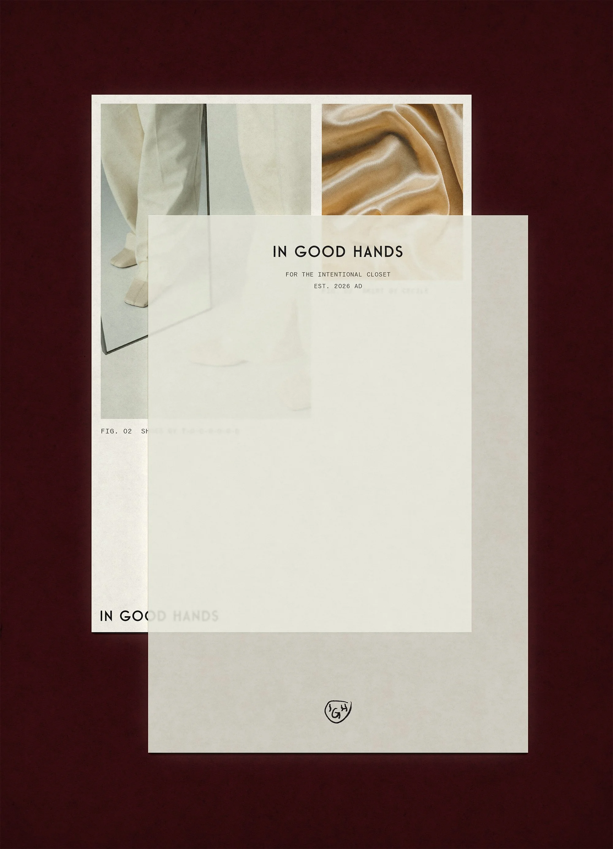
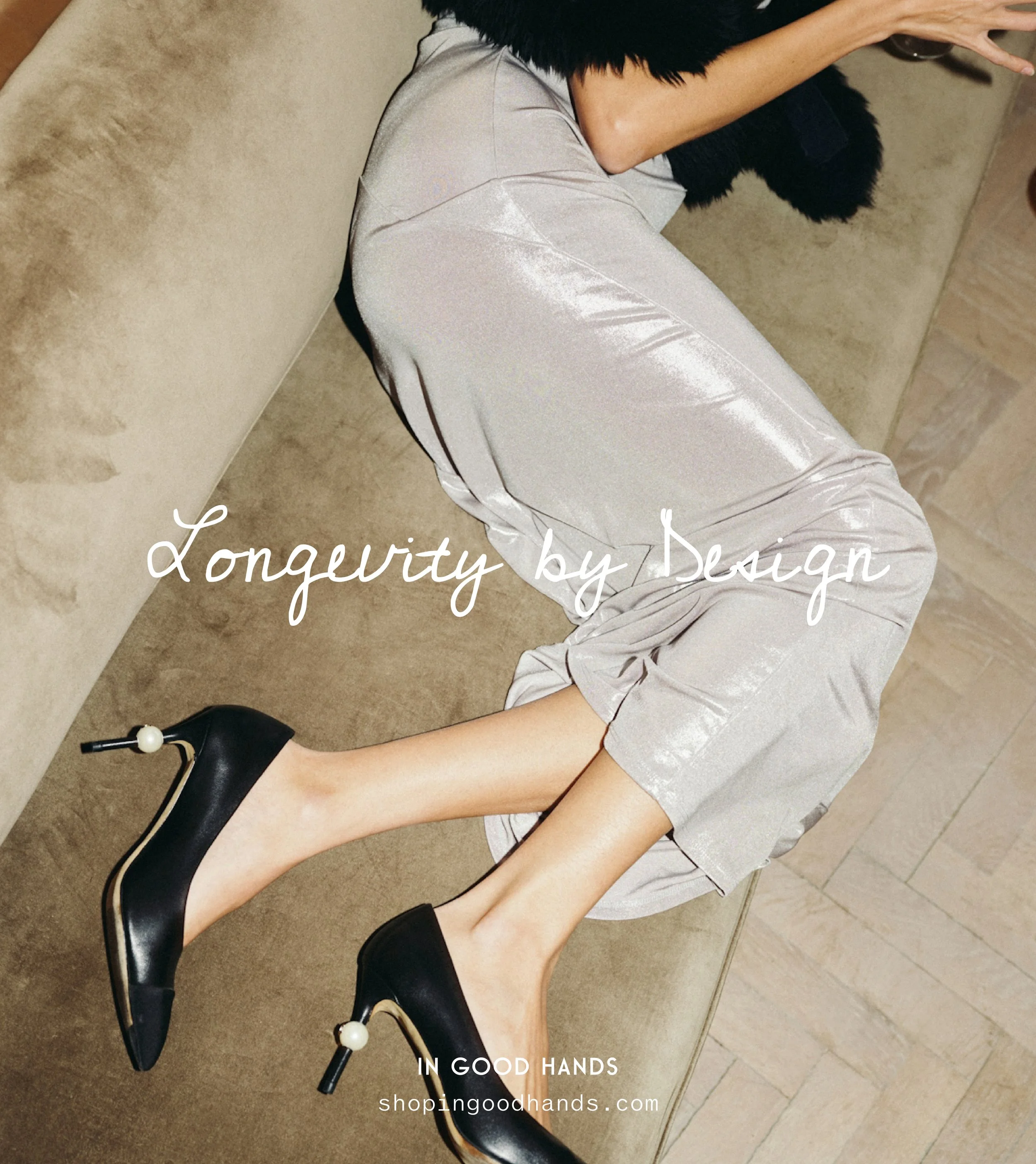
In Good Hands came to STUDIO ANDOR as a new boutique with a clear point of view: elevated, structural basics alongside expertly curated vintage and home goods. The challenge was to build an identity that could hold those two worlds together without flattening either one. The solution was a brand system rooted in restraint and quiet confidence. A deep burgundy anchors the palette with warmth and authority, paired against a soft grey that keeps everything from feeling heavy. Together, they create the feeling of a space that is considered without being cold. Typography was kept clean and precise, letting the product lead. The final layer was a hand-drawn IGH monogram seal, loose and gestural, offering the one moment of personality that keeps the brand from feeling too self-serious.
RESULTS
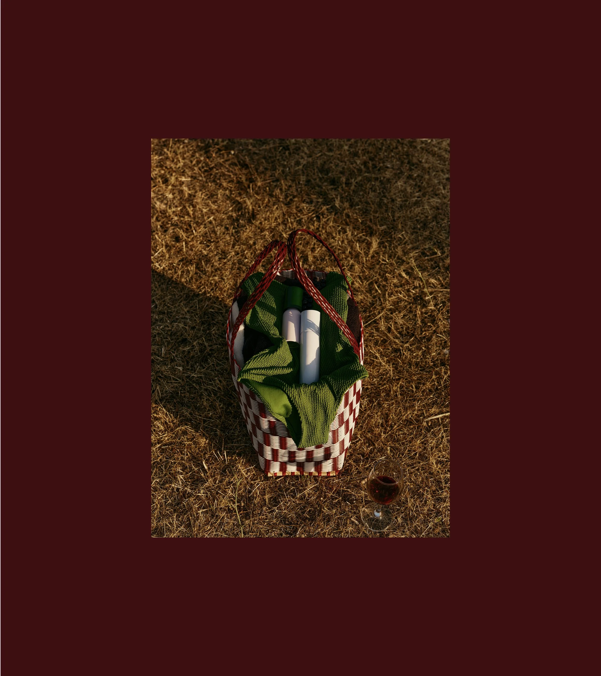
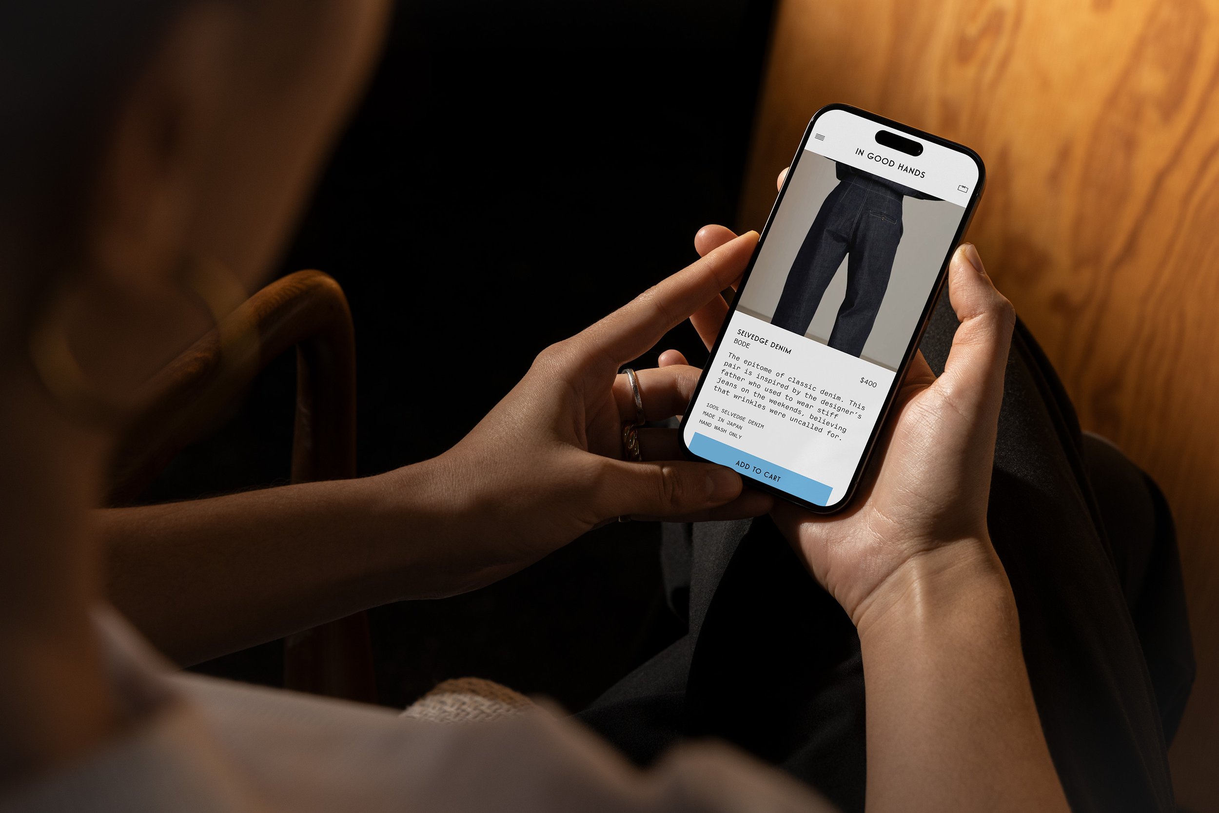
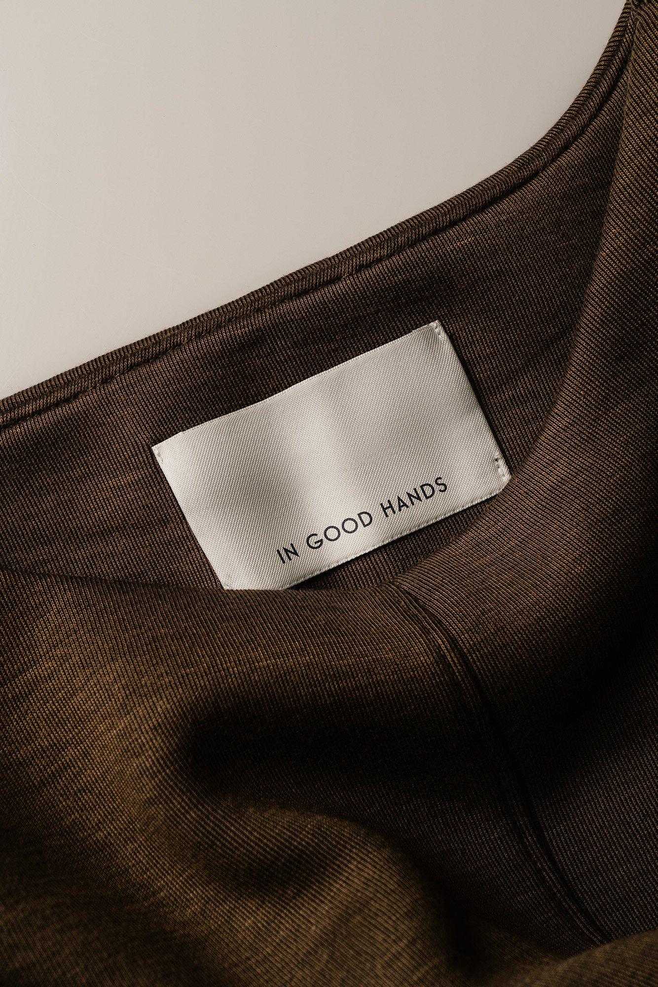
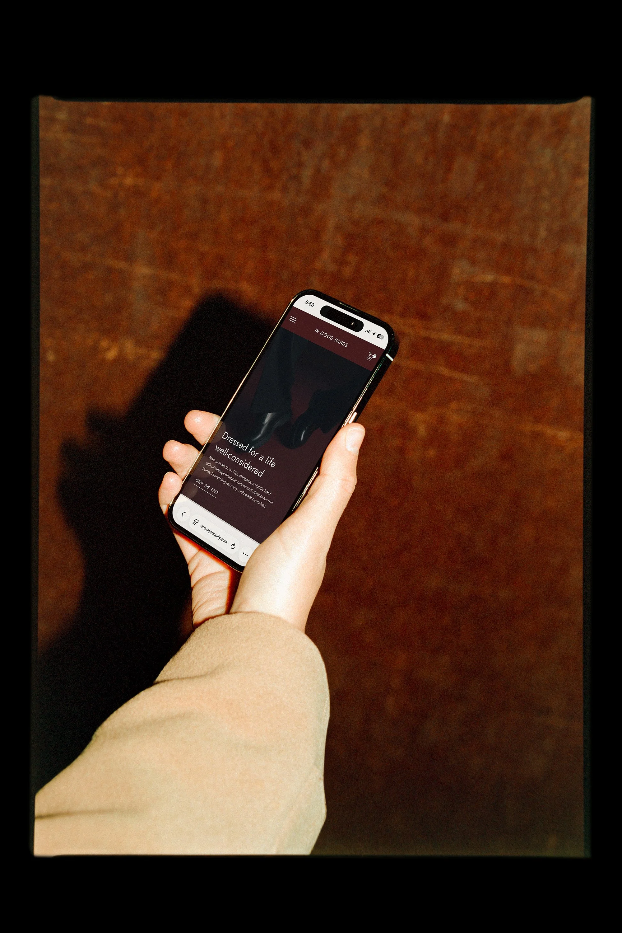
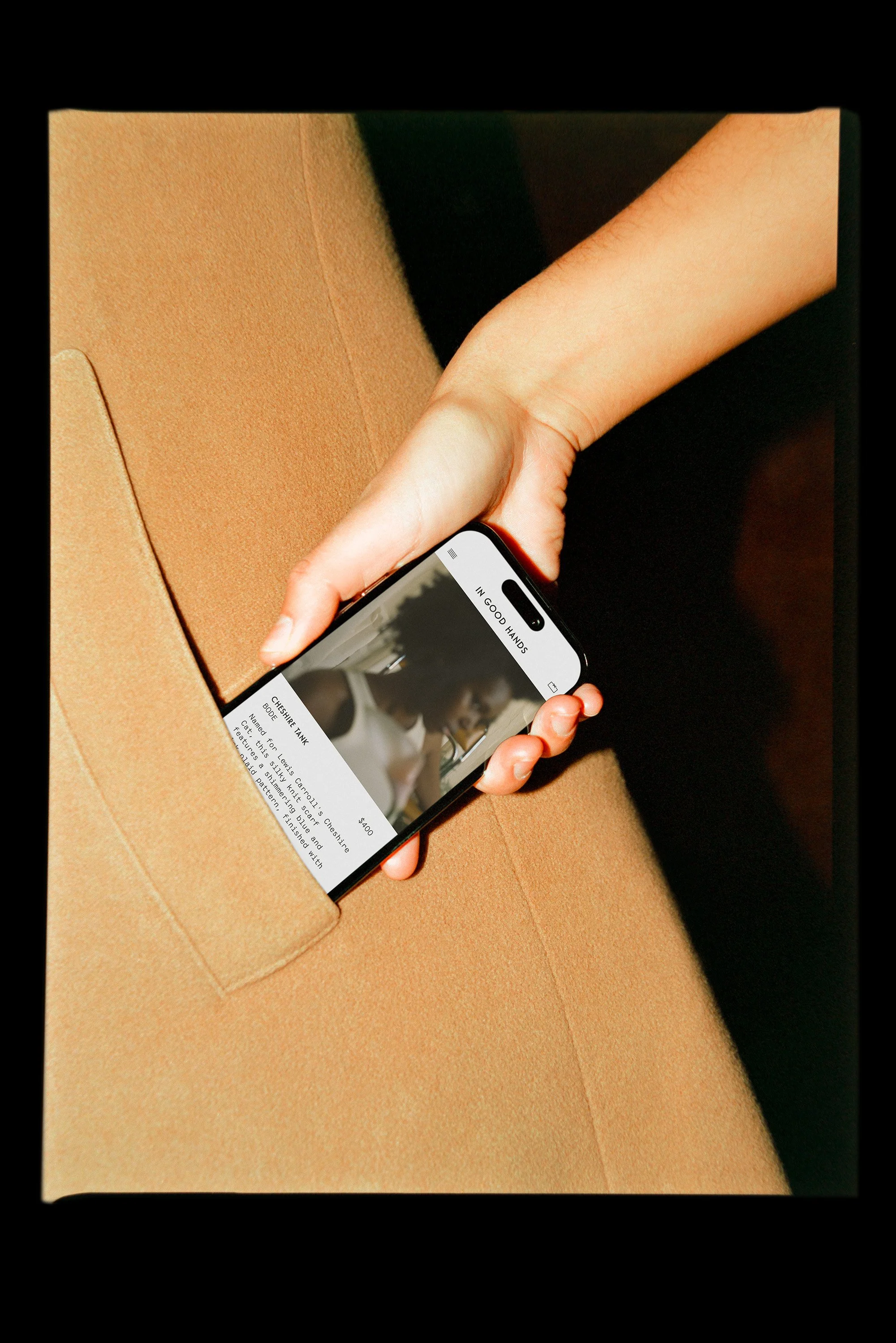
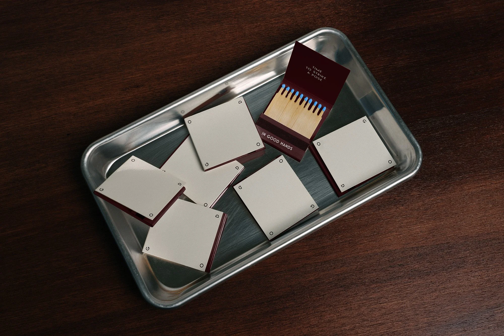
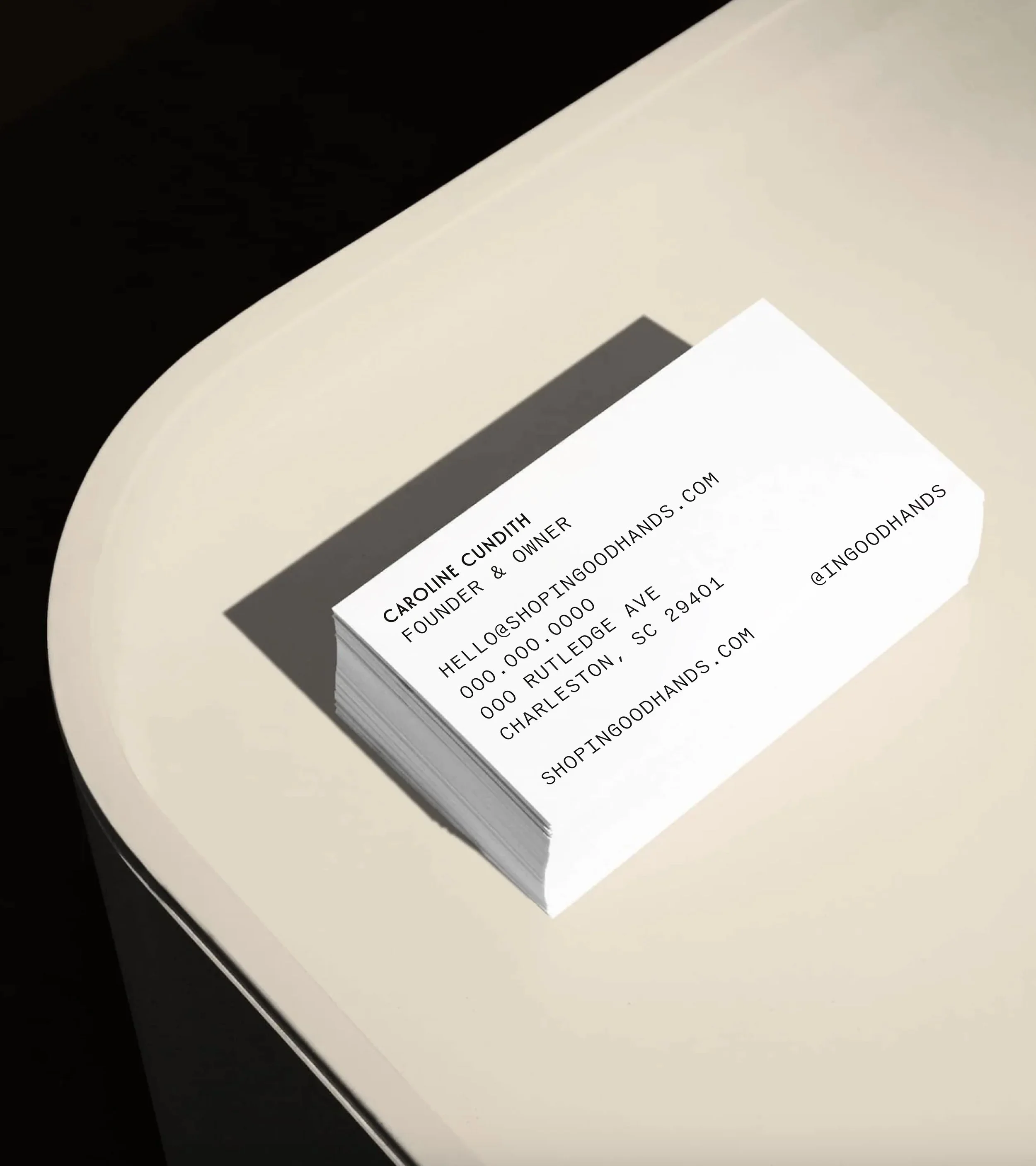
The final brand system for In Good Hands extends seamlessly from the physical to the digital. Hang tags, sew-in garment labels, tissue paper, and custom matchbooks all speak the same visual language, making every customer touchpoint feel intentional. The matchbook copy "Time to Strike a Pose" became a signature detail that customers remember. The mobile e-commerce experience carries the same considered aesthetic in-store, ensuring the brand holds up wherever a customer encounters it. The result is an identity that earns trust before a word is spoken. One that feels like it has been around long enough to know exactly what it is.
OTHER PROJECTS
-
![Outdoor sign with "OMIKA" on a round, decorative background attached to a building.]()
OMIKA
Brand Identity, Packaging, and Marketing for a women’s clothing brand inspired by the vibrant prints of India.
-
![Black and white image of a person lying face down on a chair outdoors with text "UNSORTED."]()
UNSORTED.
An independent label by Hunter Hardee inspired by technique and voracious curiosity. A line of clothes that challenges the notion of what clothes can be.
-
![Person holding a smartphone displaying a menu for 'Ethos' with options like Club Culture, Ethos News, Team, Schedule, Classes, Memberships, Gallery, Contact, and a 'Become a Member' button.]()
ETHOS ATHLETIC CLUB
A bold website to attract new members, host class signups, and digitally express the world of Ethos A.C.
-
![Person wearing a T-shirt with 'Roseline' text facing shelves of wine bottles and a table with wine glasses.]()
ROSELINE
Brand identity and collateral for an intimate wine bar that boasts fine wines with a side of funky vibes.