LUMA
BRAND IDENTITY
BRAND STRATEGY
PACKAGING DESIGN

STRATEGY
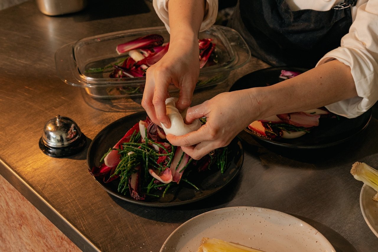
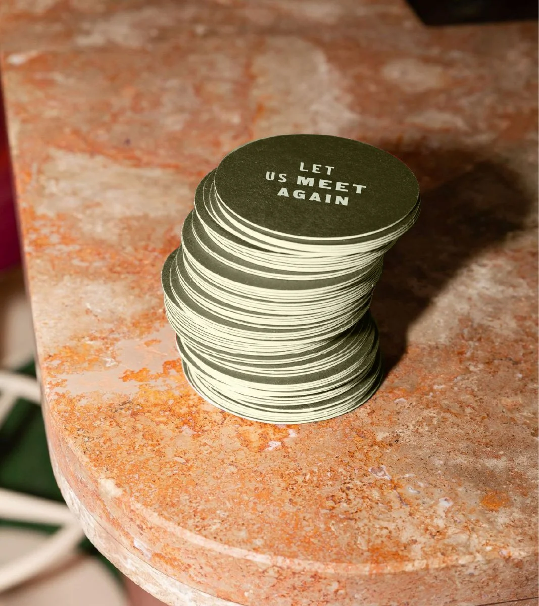
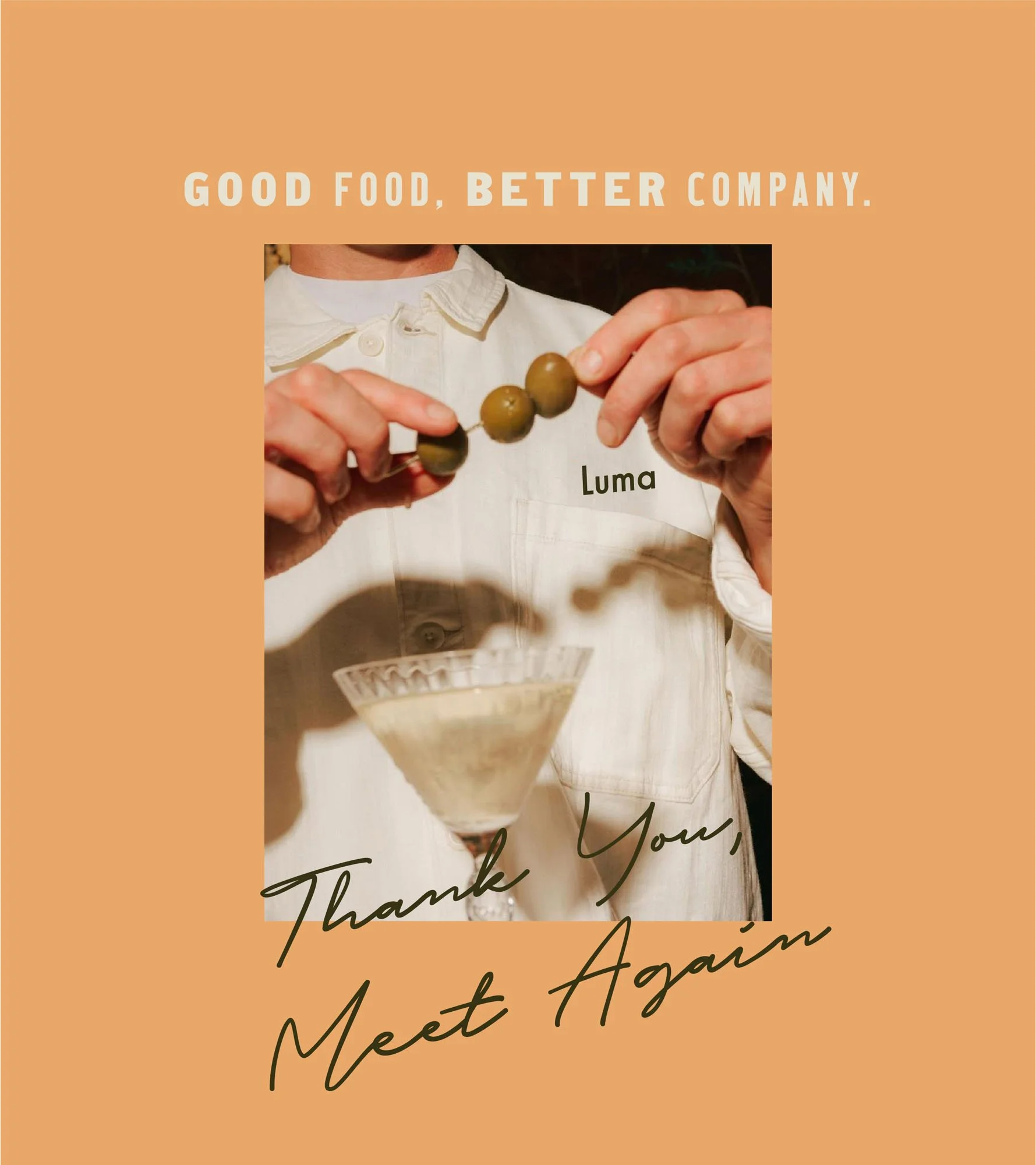
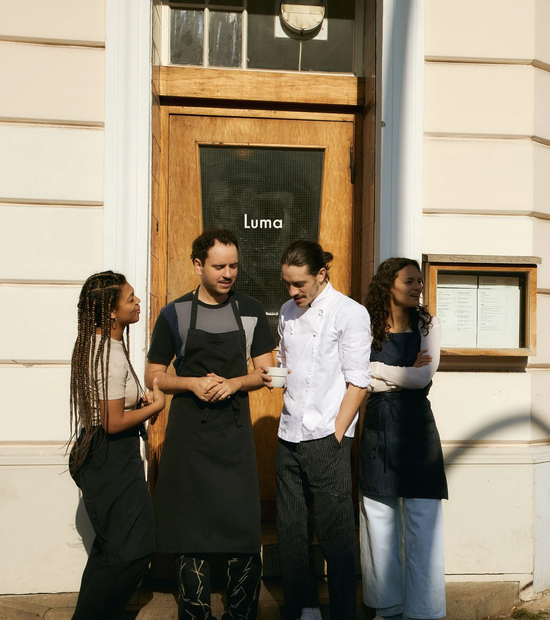
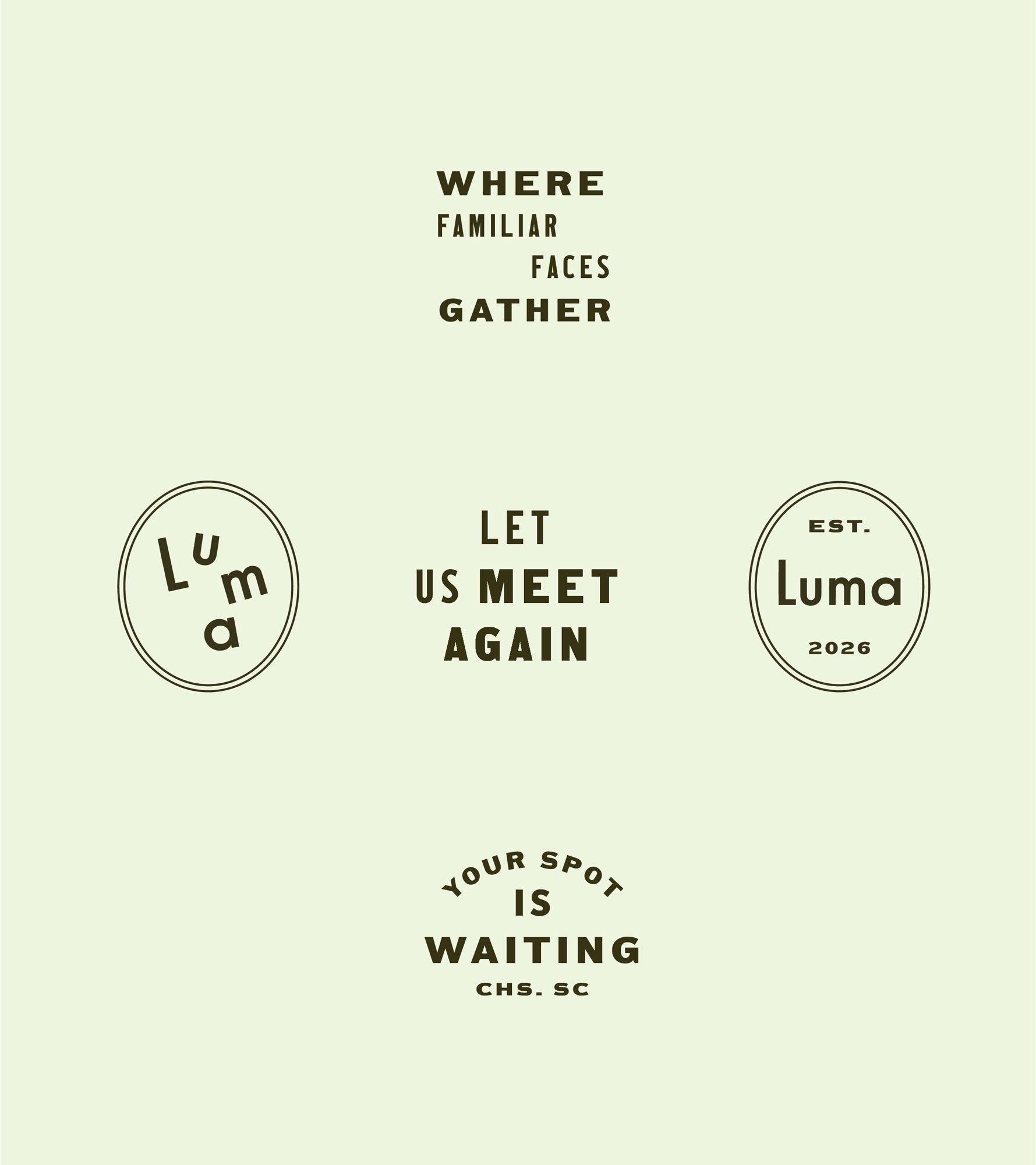
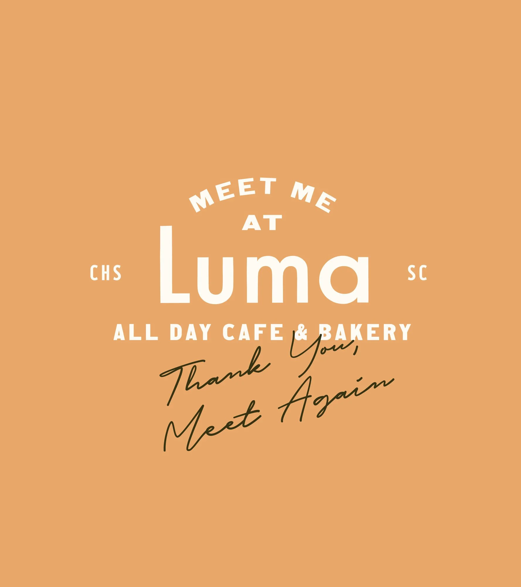
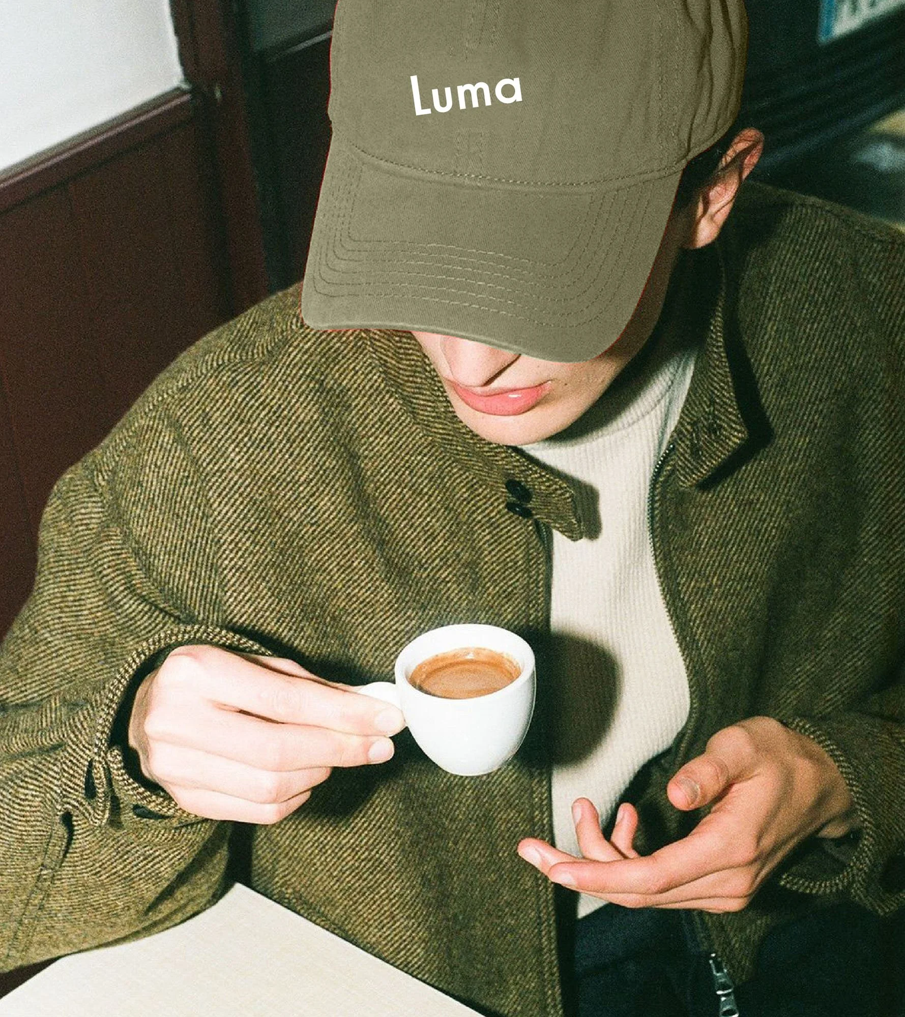
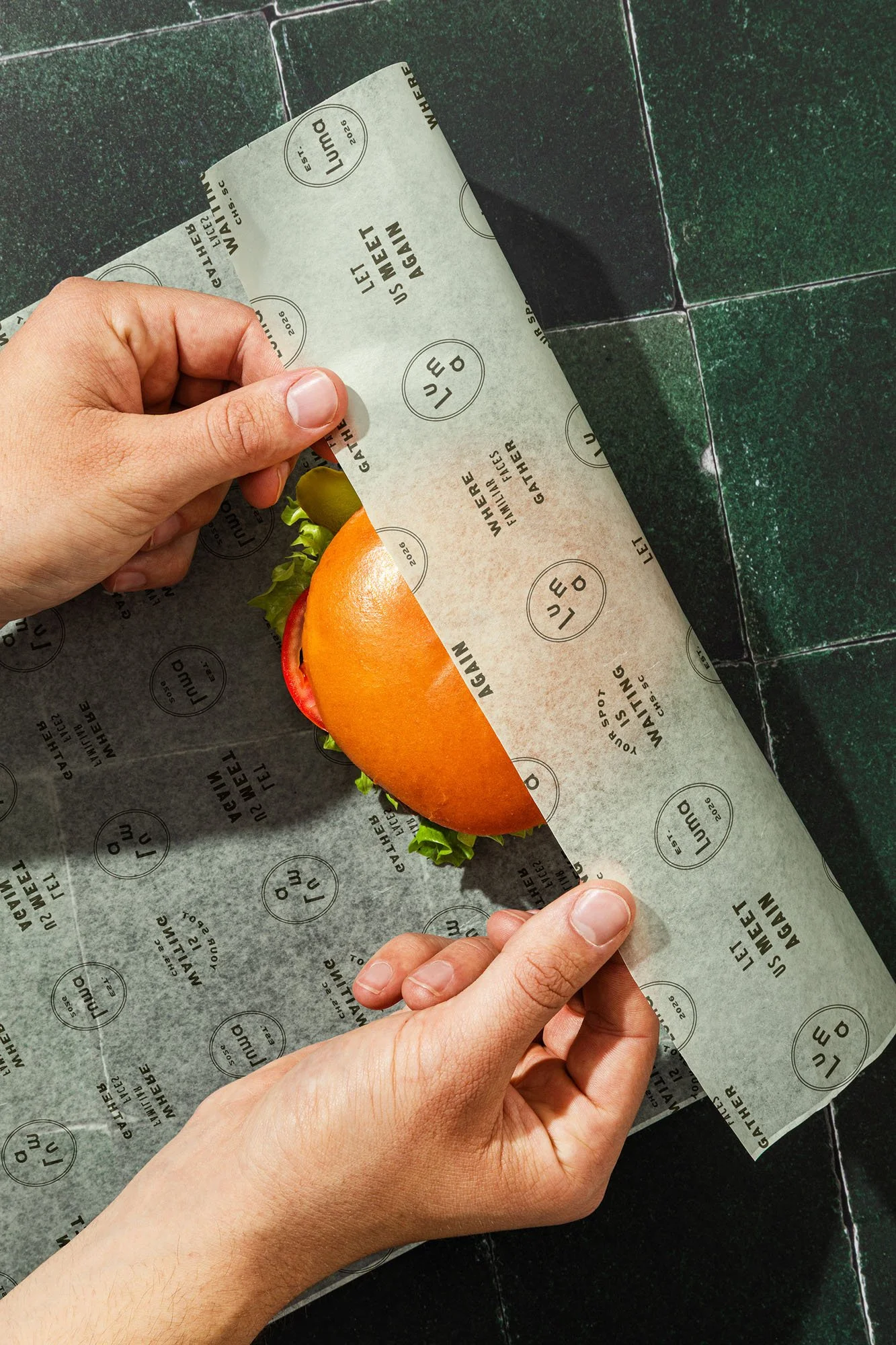
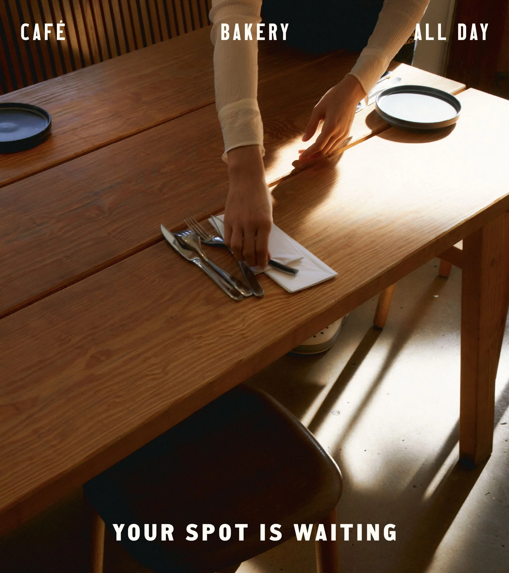
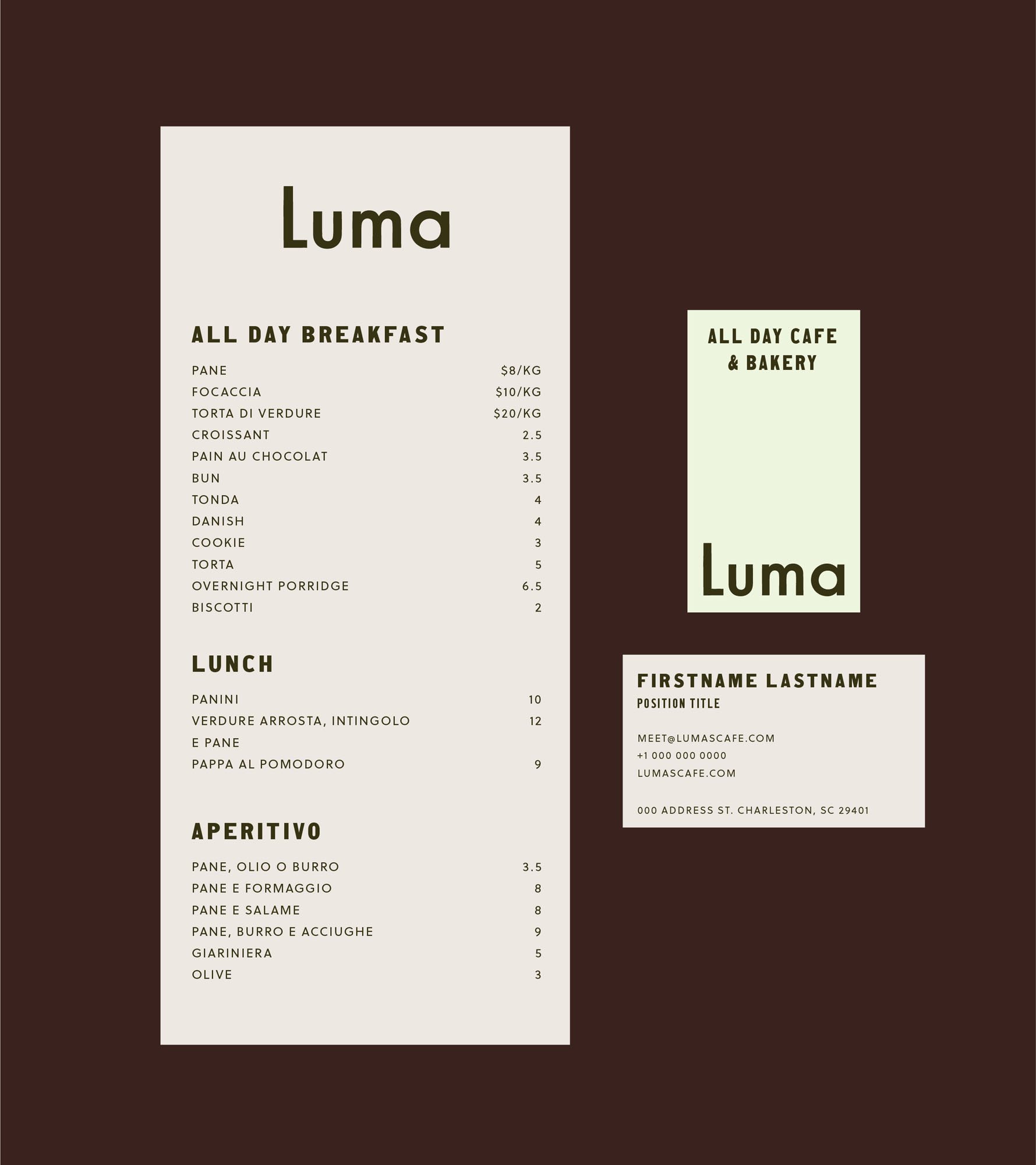
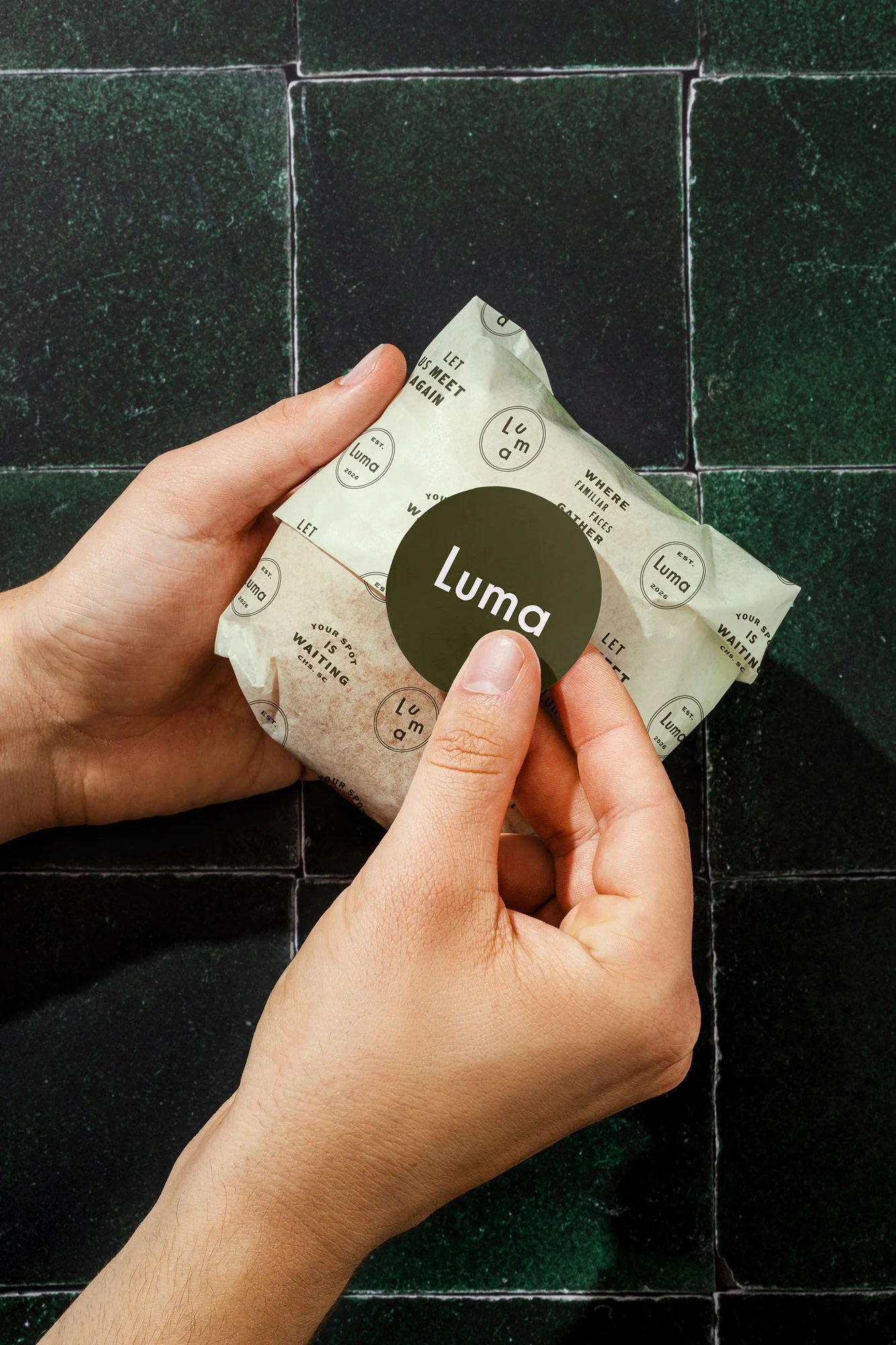
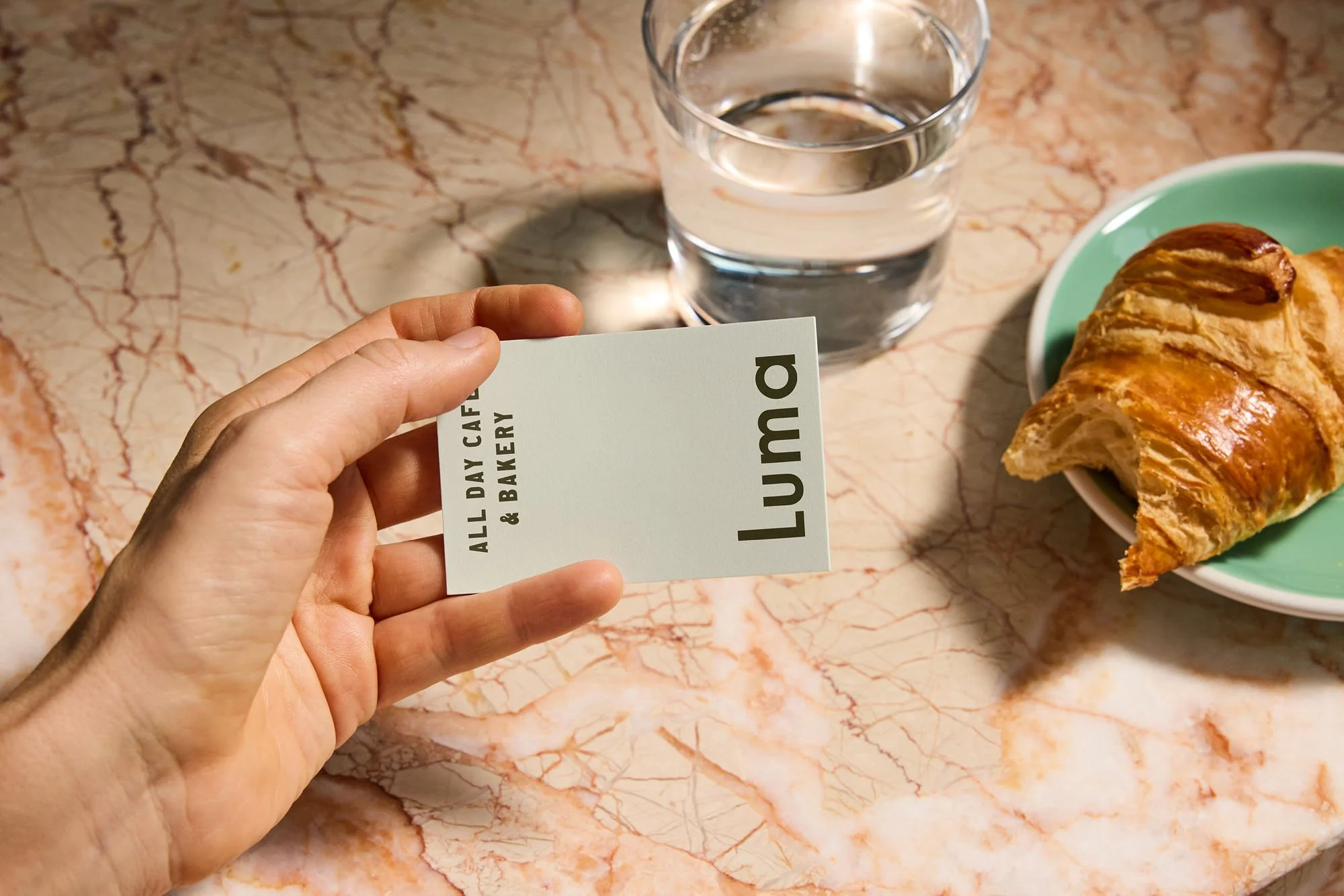
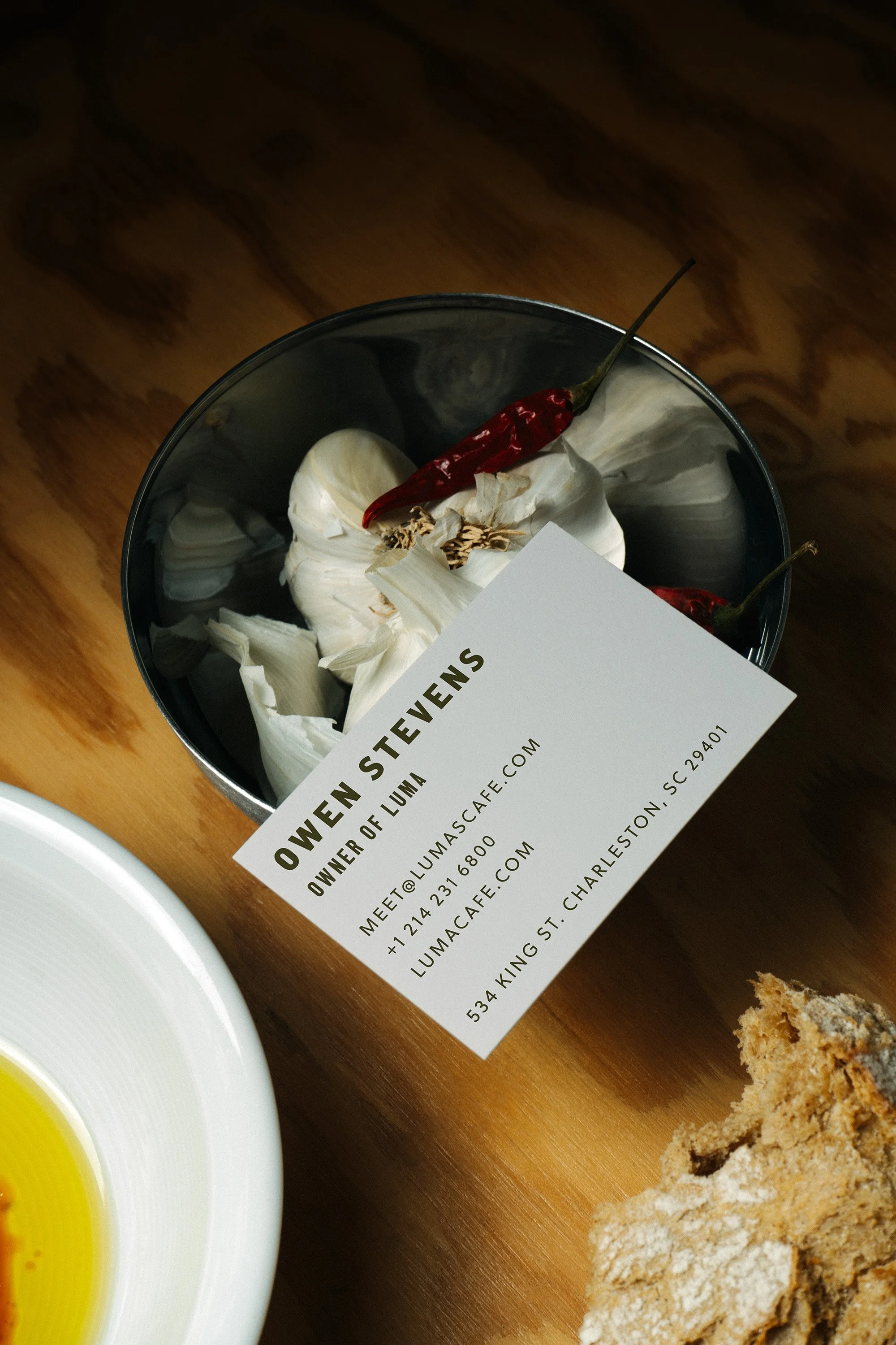
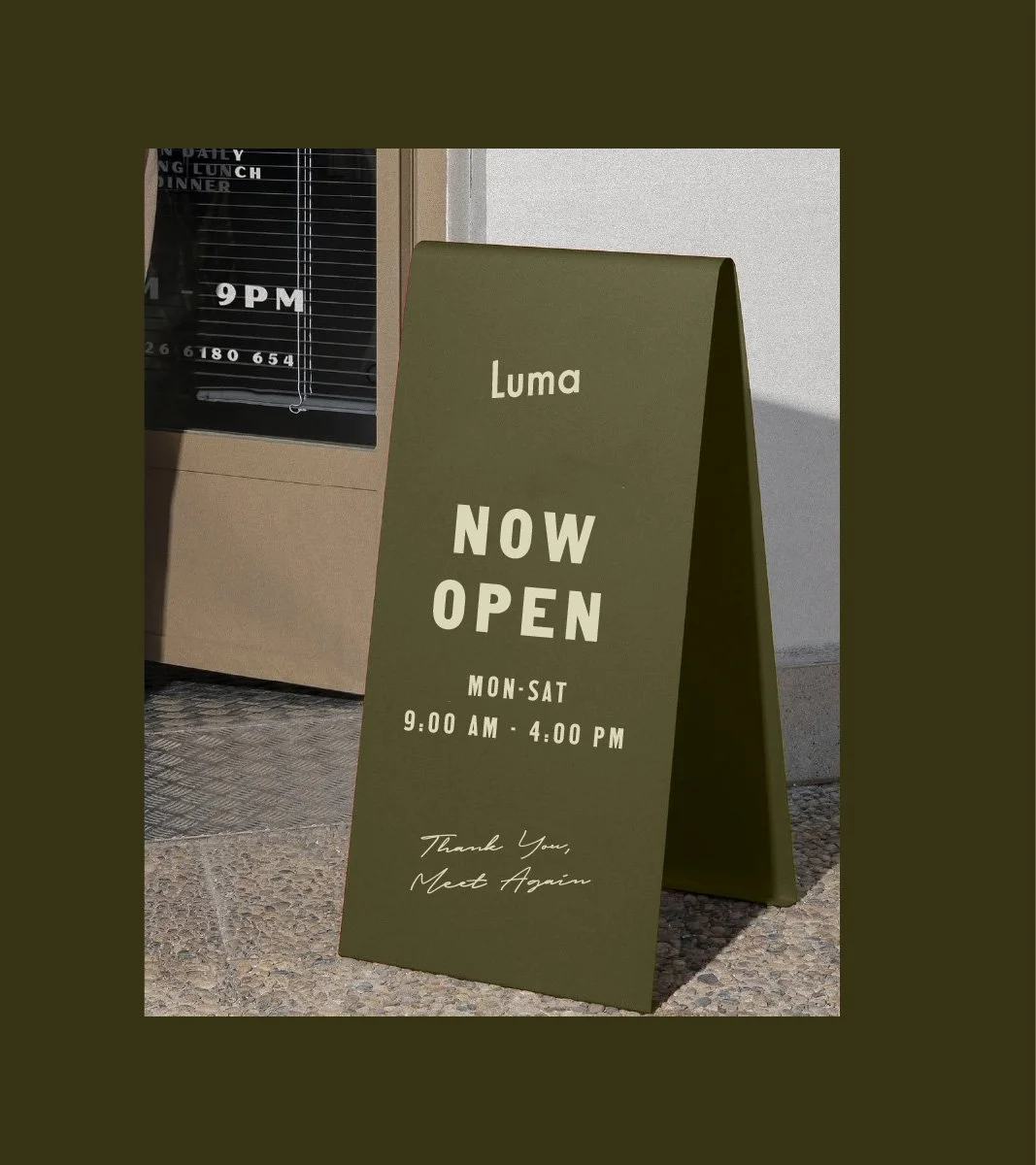
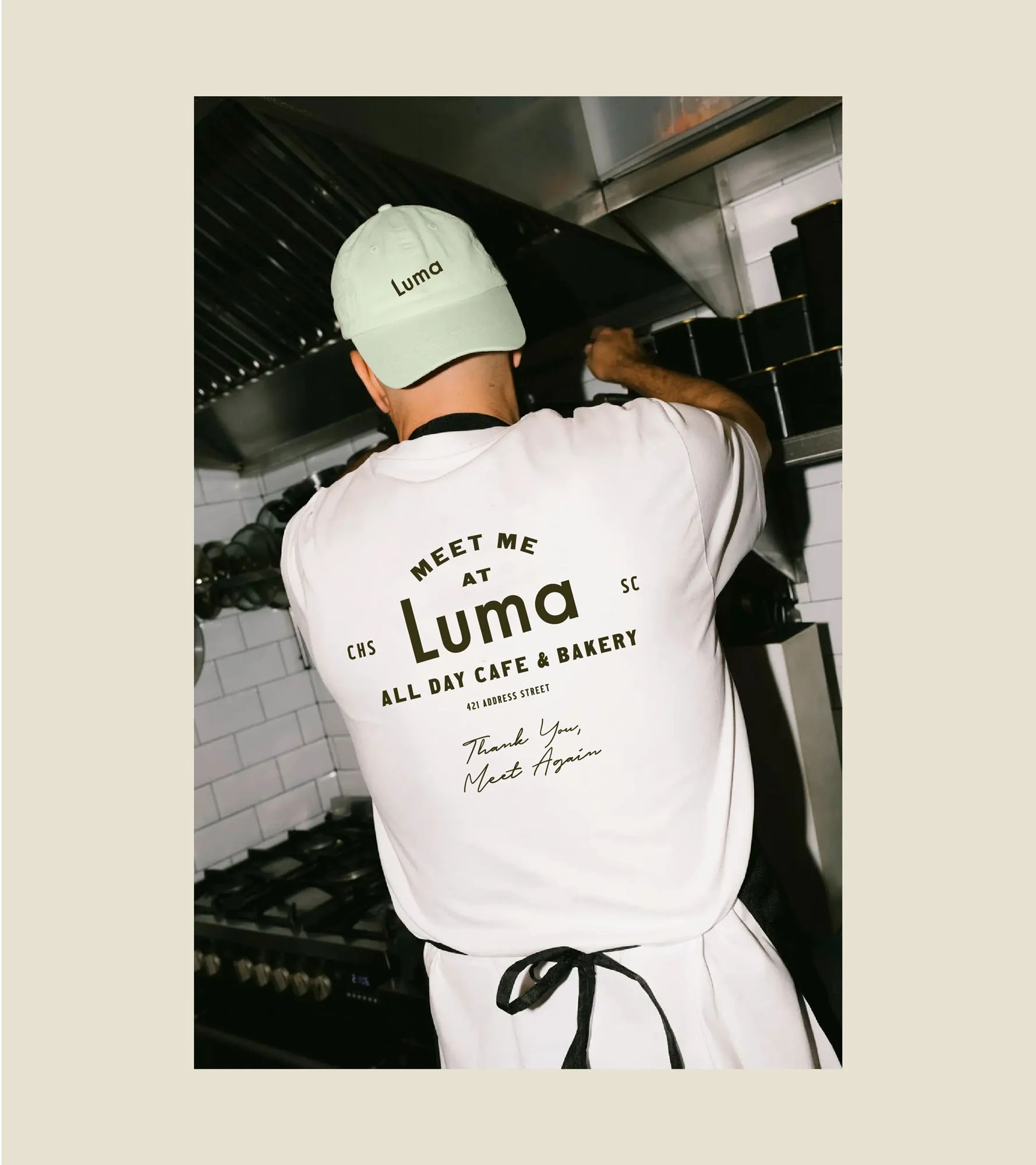
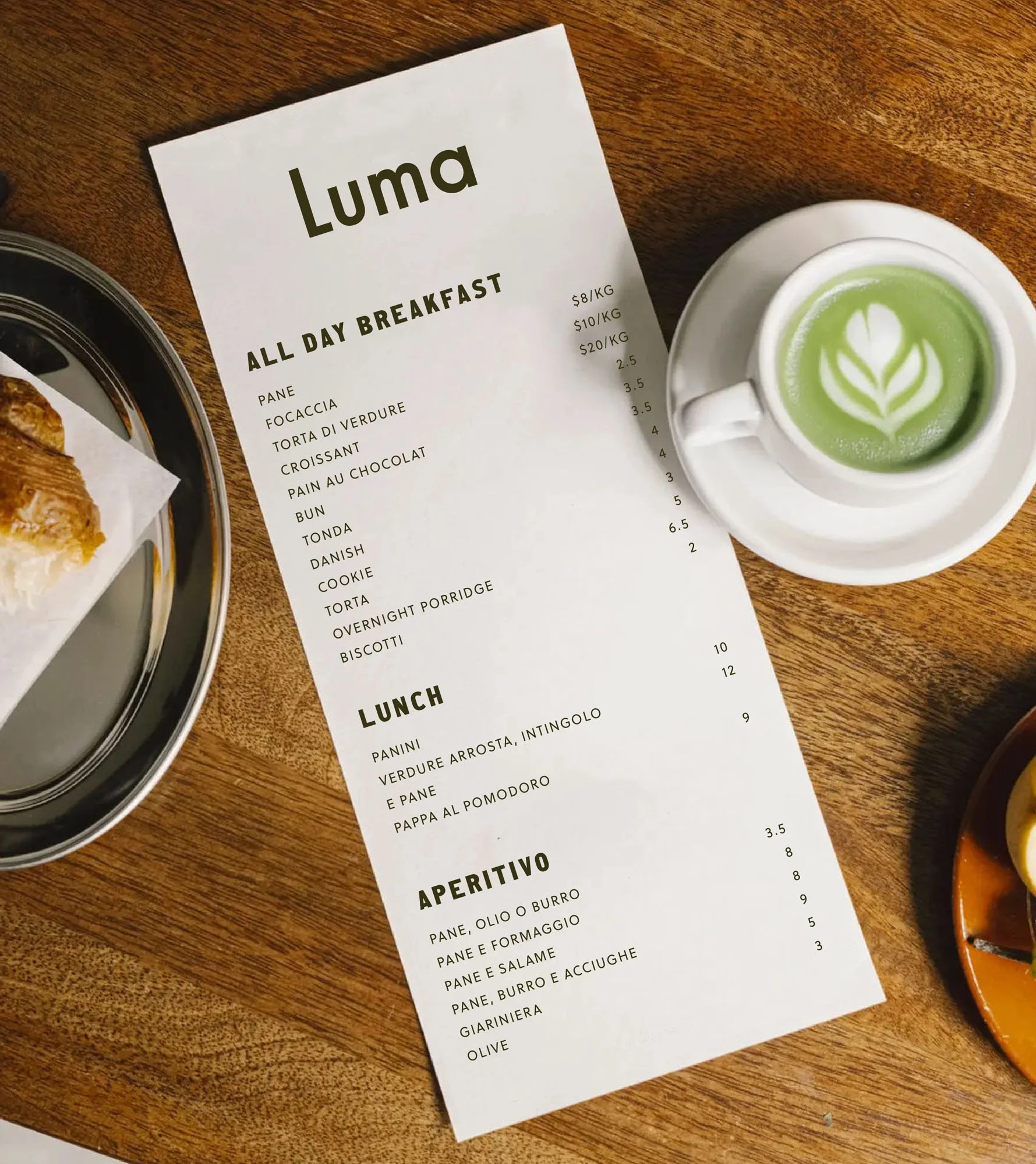
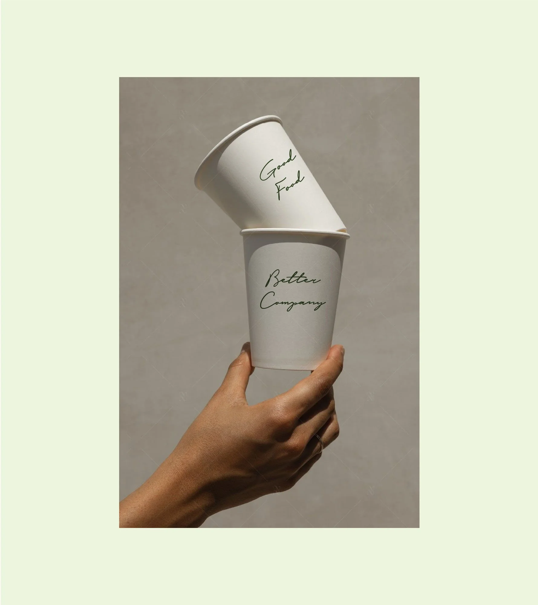
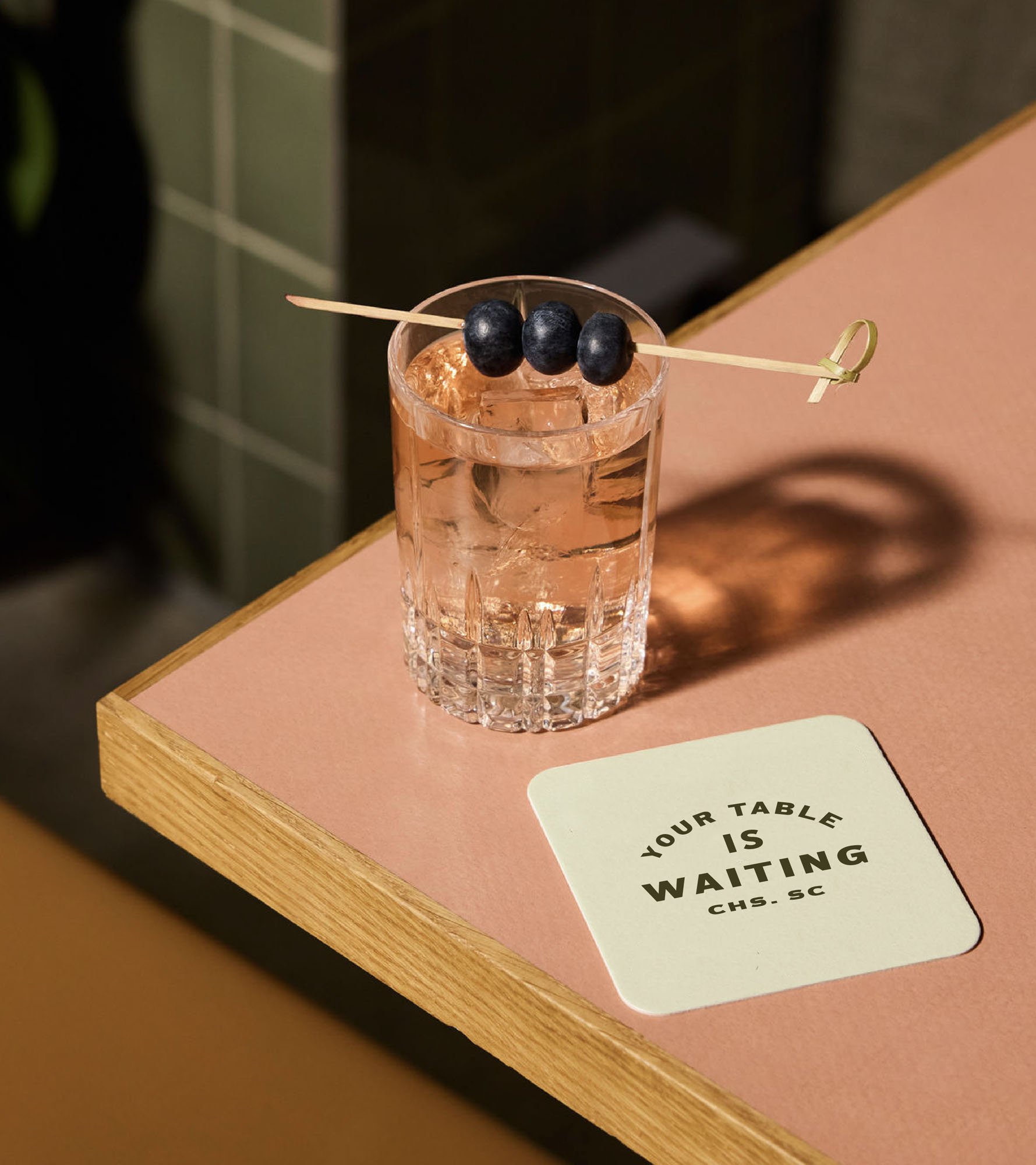
Luma came to STUDIO ANDOR as a new business with a clear soul and a lot still in motion. Interiors, architecture, and brand were all being decided at once, which meant the identity needed to do more than represent the restaurant. The brief was deceptively simple: build a brand warm enough to welcome someone straight off a yoga mat, yet elevated enough to honor the food and coffee being served there. The solution was a system rooted in earned character. The colors Olive, Melon, Mint, and Ceramic work together to create the feeling of a place that has been part of the neighborhood longer than it has. Typography spans three registers: bold, condensed lettering for declarations, circular badge lockups with the quiet authority of a brass plaque, and a loose script for personal moments. The copy voice followed the same logic: warm and direct, never precious. "Good Food, Better Company" says everything without trying. And "Thank You, Meet Again" (a riff on the classic to-go bag) became the brand's goodbye, the kind of line that makes you smile on the way out the door.
RESULTS
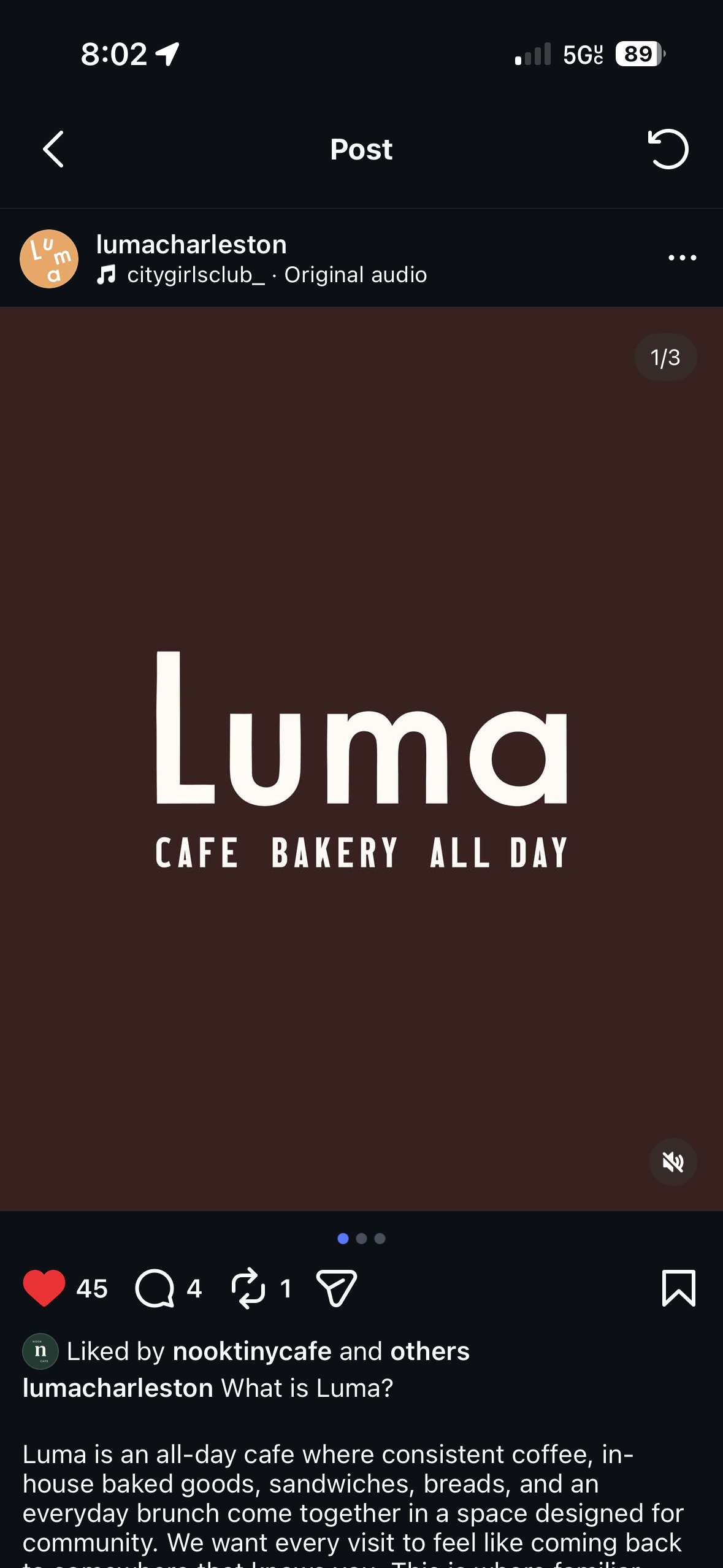
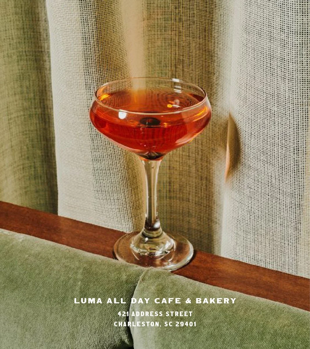
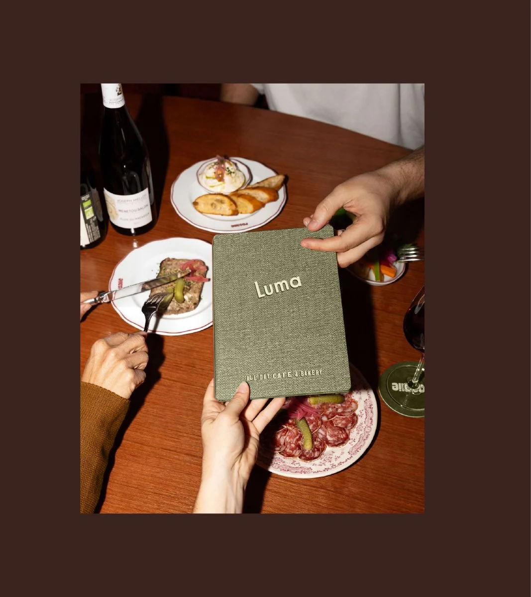
The final brand system for Luma extends across every surface a guest touches. Butcher paper wrap printed with the full lockup suite, custom-branded dinnerware, coffee cups, tote bags, staff aprons, and a long-form menu…each piece speaks the same language while finding its own moment within it. The graphics suite gives the brand range: from bold social declarations to quiet, intimate packaging details. Nothing feels like it was designed. It feels like it was always there. The result is an identity built around the pleasure of return, one that earns its place in the neighborhood before the doors even open.
OTHER PROJECTS
-
![Outdoor sign with "OMIKA" on a round, decorative background attached to a building.]()
OMIKA
Brand Identity, Packaging, and Marketing for a women’s clothing brand inspired by the vibrant prints of India.
-
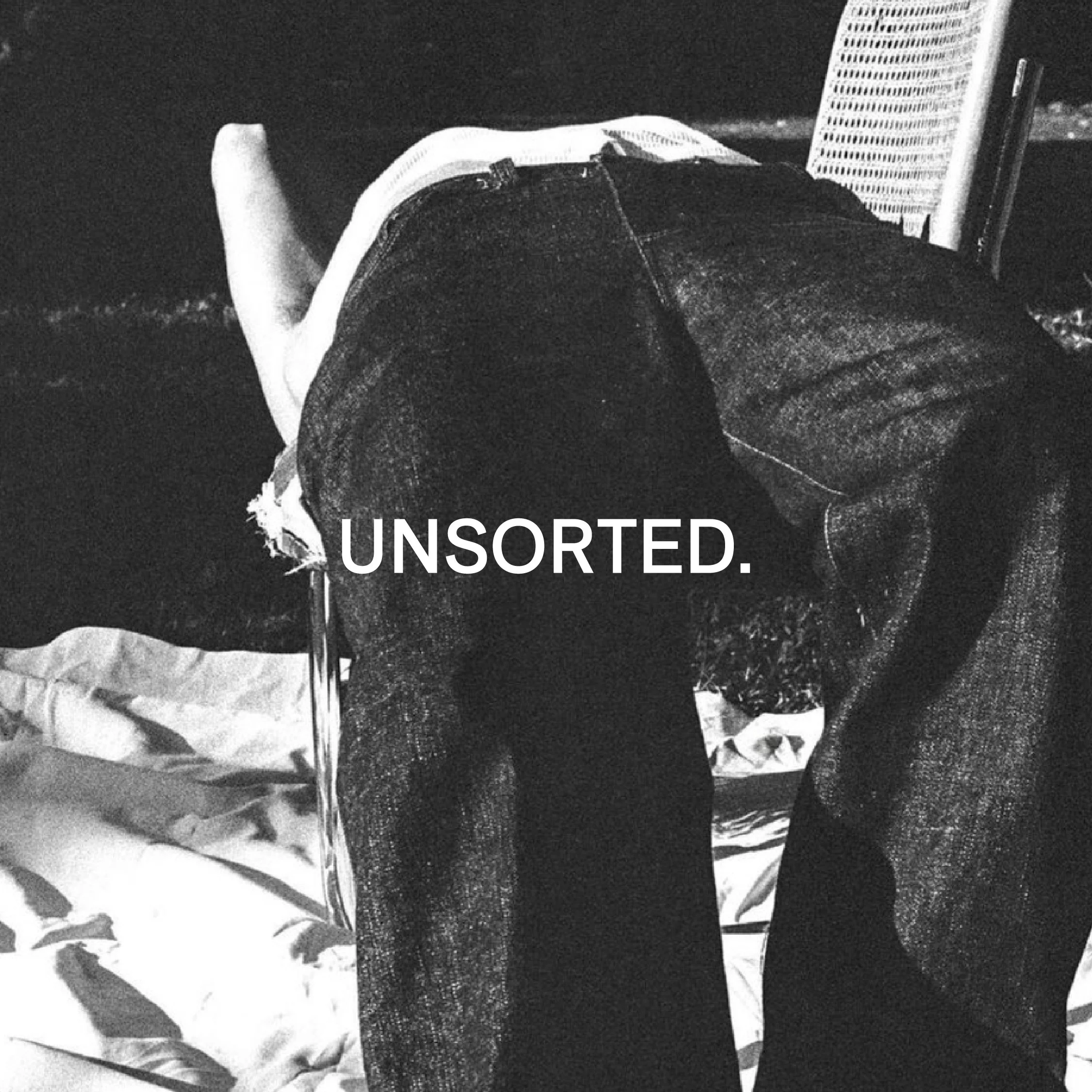
![Black and white image of a person lying face down on a chair outdoors with text "UNSORTED."]()
UNSORTED.
An independent label by Hunter Hardee inspired by technique and voracious curiosity. A line of clothes that challenges the notion of what clothes can be.
-
![Person holding a smartphone displaying a menu for 'Ethos' with options like Club Culture, Ethos News, Team, Schedule, Classes, Memberships, Gallery, Contact, and a 'Become a Member' button.]()
ETHOS ATHLETIC CLUB
A bold website to attract new members, host class signups, and digitally express the world of Ethos A.C.
-
![Person wearing a T-shirt with 'Roseline' text facing shelves of wine bottles and a table with wine glasses.]()
ROSELINE
Brand identity and collateral for an intimate wine bar that boasts fine wines with a side of funky vibes.