MEREDITH WIKSELL
BRAND IDENTITY
STRATEGY
COLLATERAL


STRATEGY
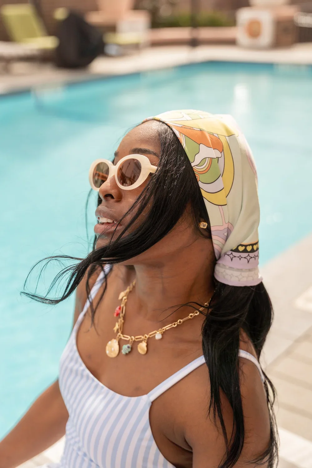
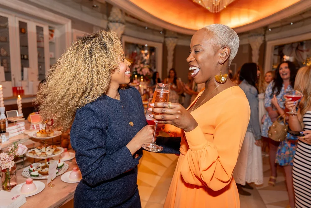
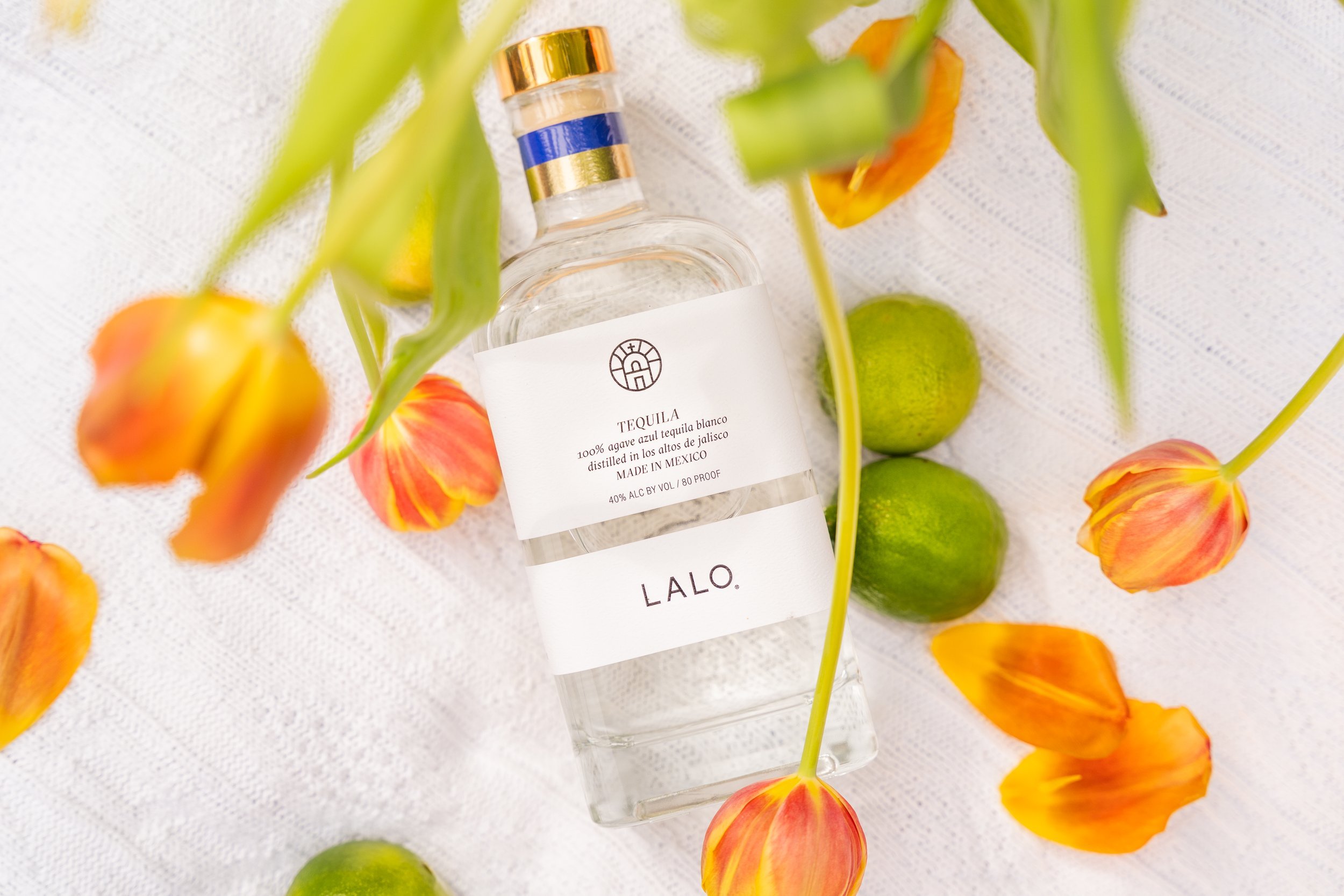
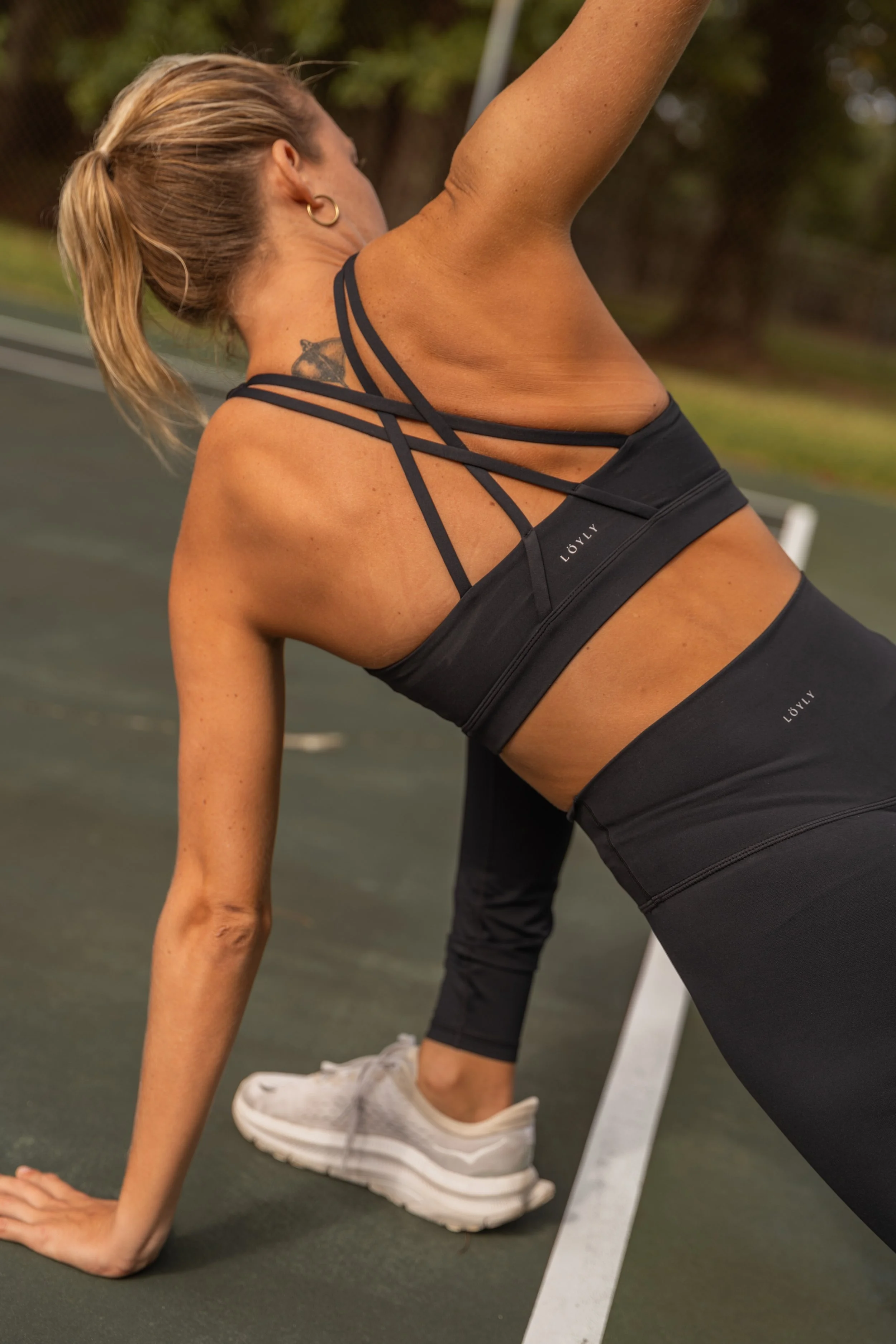
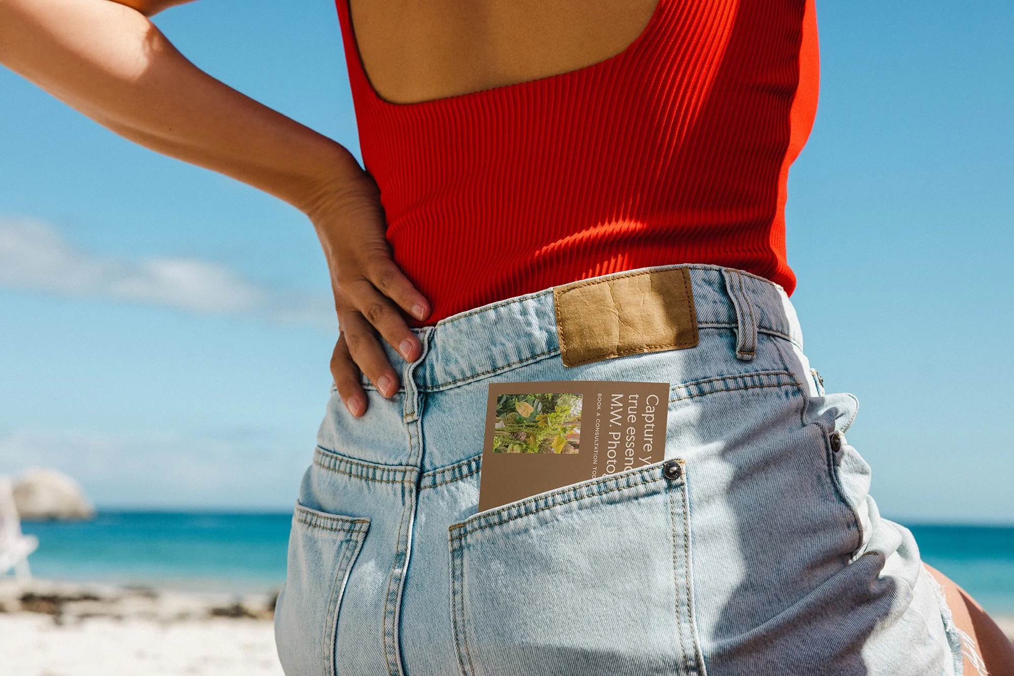
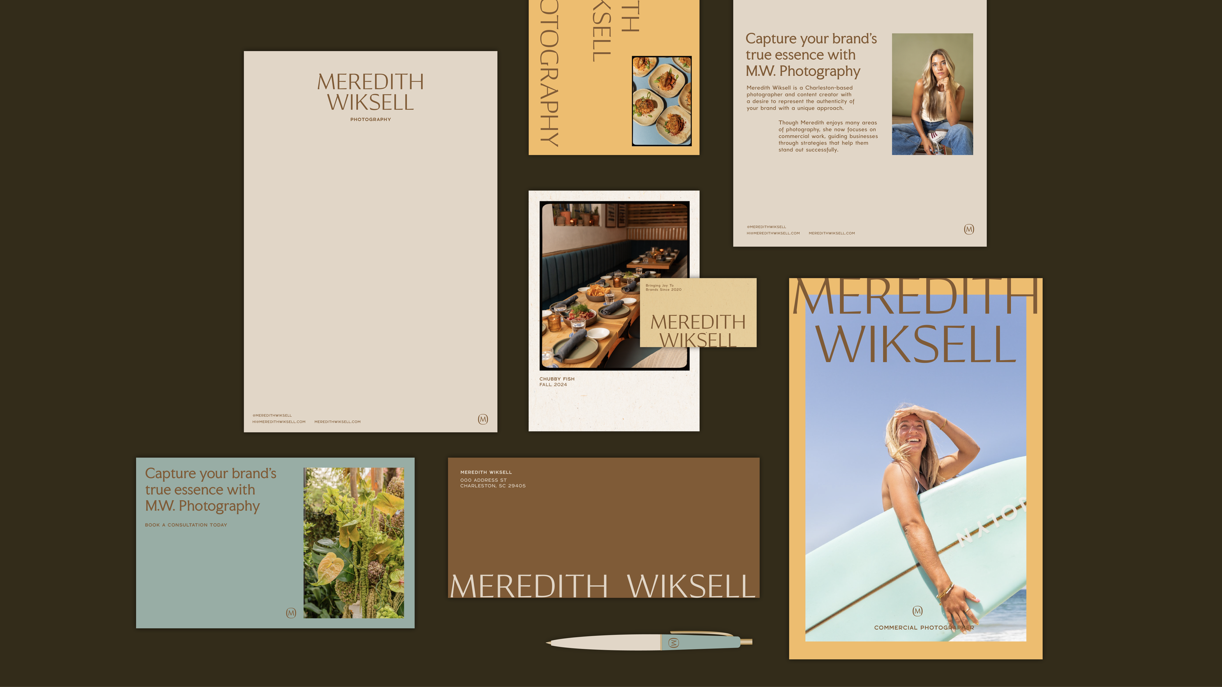
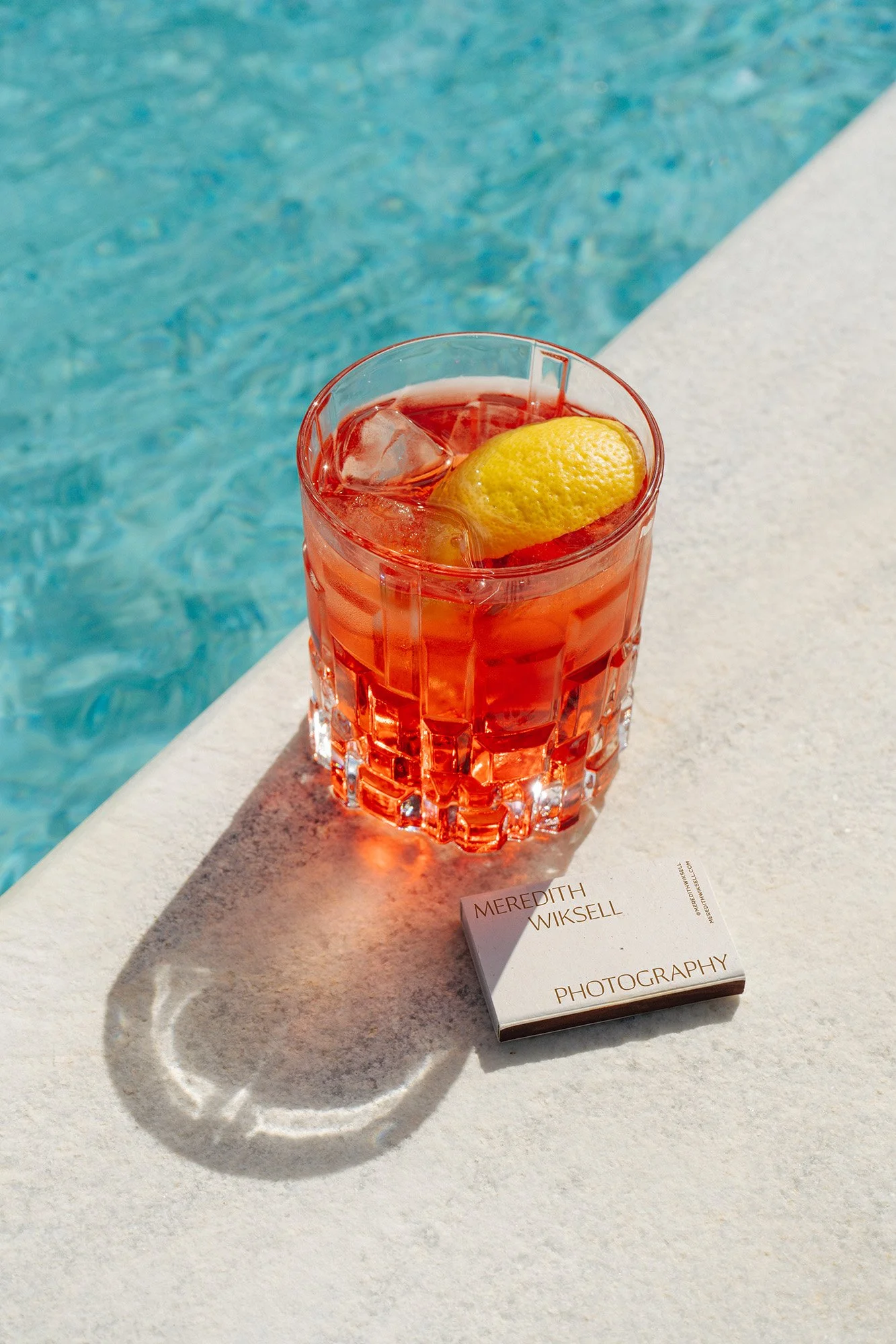
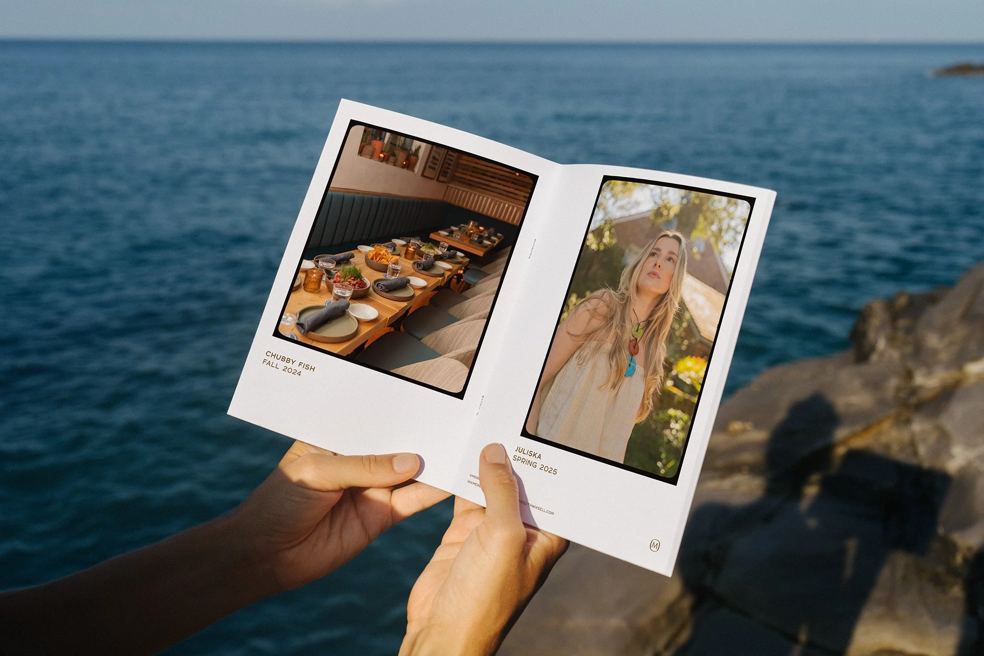
Meredith Wiksell, a commercial photographer specializing in sunny, retro-feeling imagery, needed a brand identity that was as vibrant and authentic as her work. The goal was to build a visual strategy that would not only reflect her personal style—heavily influenced by the warm, nostalgic vibes of 60s and 70s California—but also help her stand out in a competitive market. We aimed to create a brand that felt both distinct and professional, speaking directly to her ideal clients in hospitality, lifestyle, and luxury. By focusing on a sunny yet sophisticated color palette and a mix of classic and personable typography, we crafted a brand that is both playful and polished, allowing Meredith to attract high-end clients while staying true to her unique creative voice. The result is a brand that feels effortlessly chic and perfectly captures the essence of her art.
RESULTS
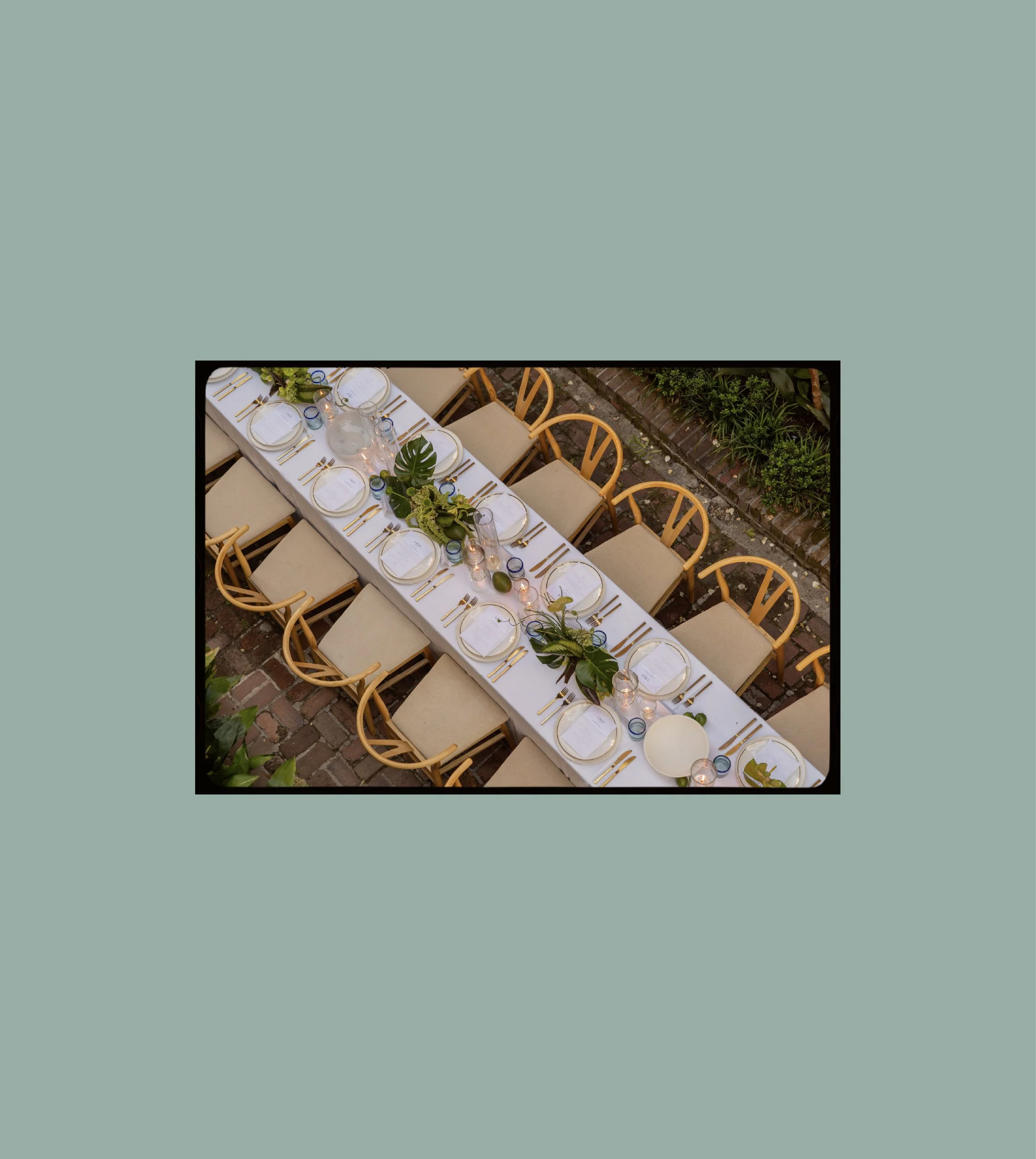
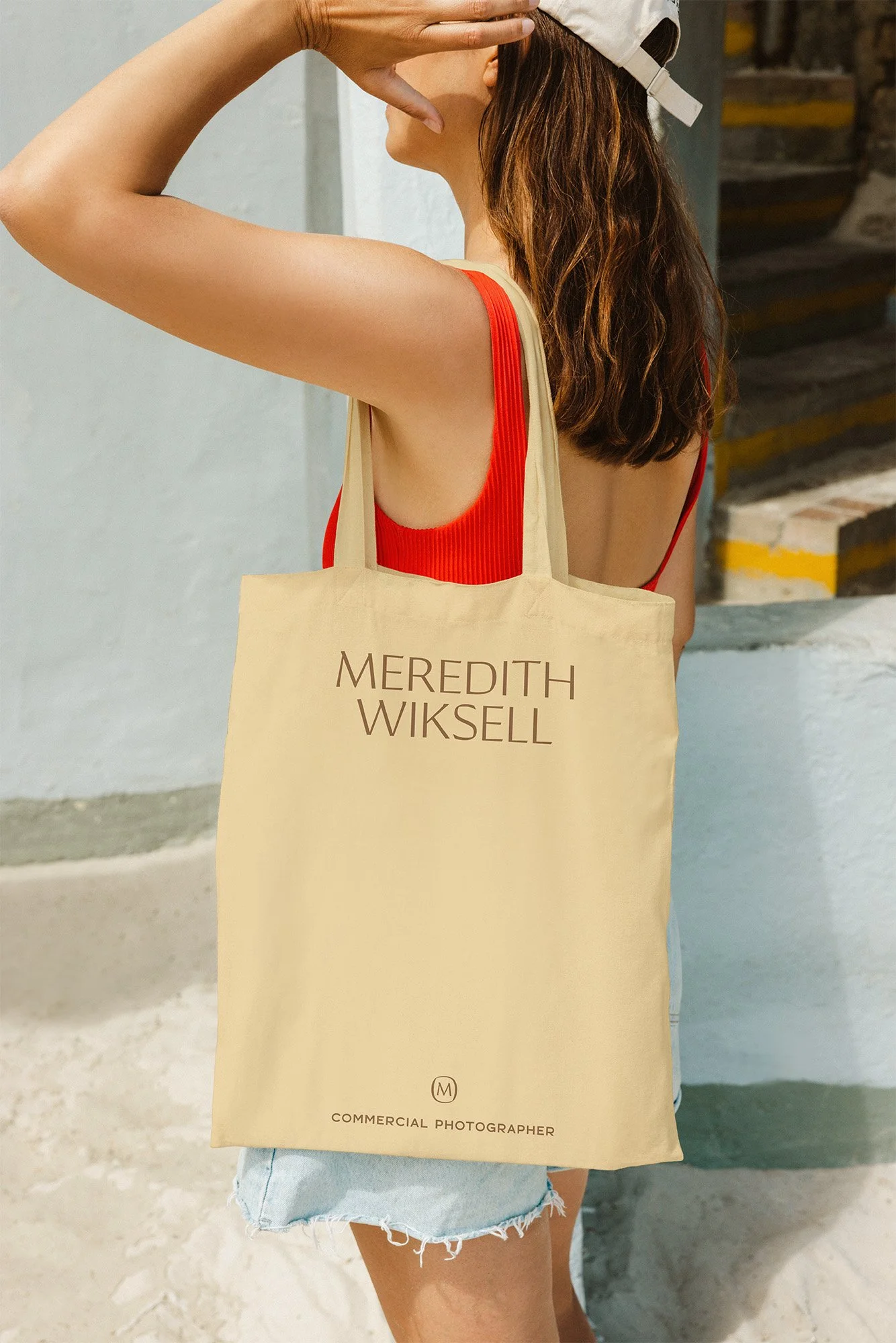
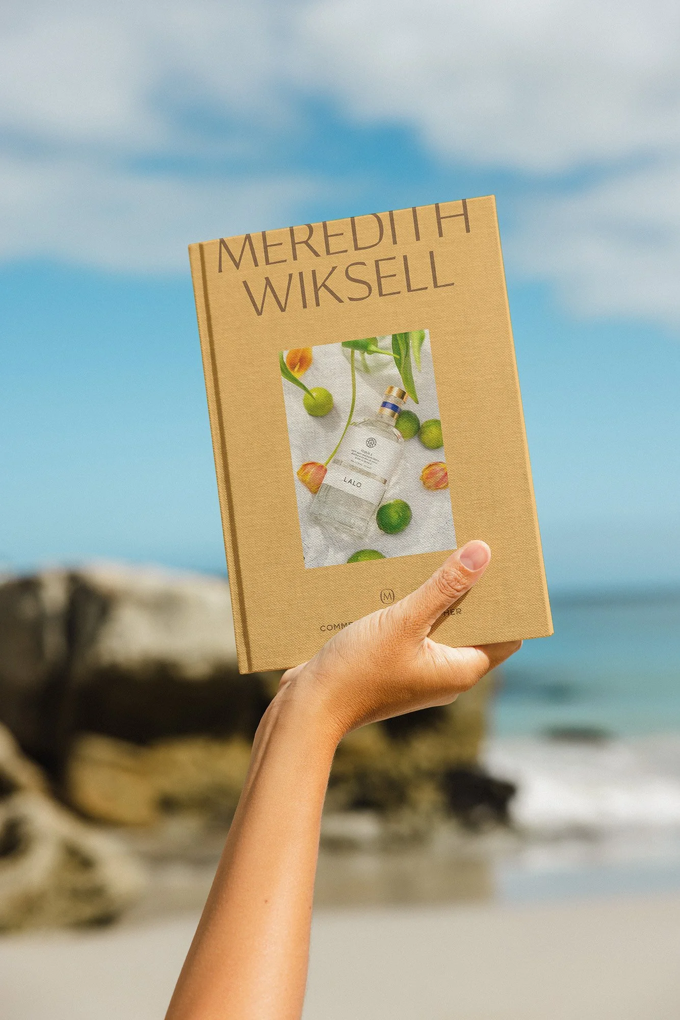
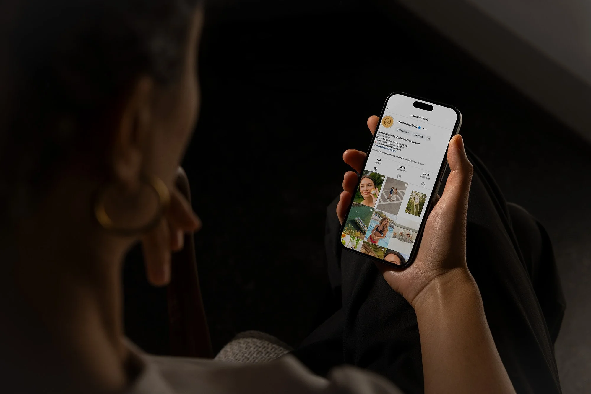
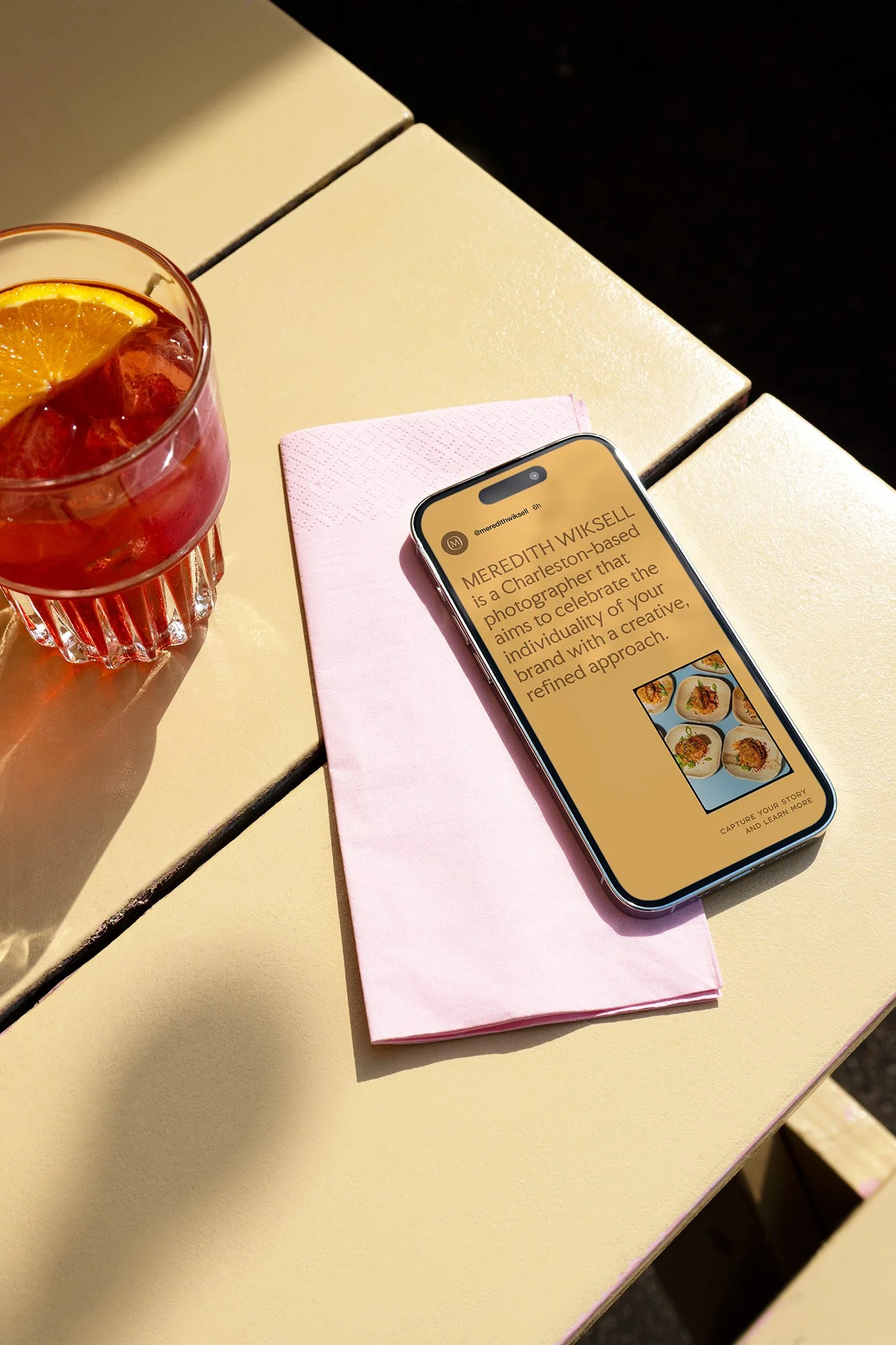
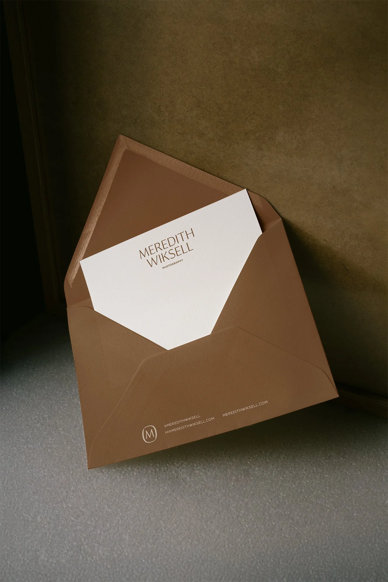
The final brand system for Meredith Wiksell delivers a warm, polished, and authentic visual language that perfectly mirrors her signature photographic style. The color palette, reminiscent of a sun-drenched, washed-out film photo, balances golden yellow and earthy tones with a calming sage and creamy beige. This low-contrast yet vibrant scheme allows her photography to be the hero, while the brand elements subtly enhance the overall aesthetic. The typography further reinforces this duality, pairing a classic, sophisticated wordmark with a hand-drawn subhead font that adds a touch of retro charm and personality. Every detail, from the stationery to the social media graphics, works together to create a cohesive and memorable brand presence. The system positions Meredith not just as a photographer but as a creative partner who brings a unique, artistic perspective to every project.


FEATURED PROJECTS
-
![Business cards for Marmalade clothing brand in blue, yellow, and orange colors displayed on a dark green background.]()
MARMALADE
The rebranding of a series of women’s brick-and-mortar and online boutiques that highlights the playful, enigmatic side of going shopping.
-
![Black and white image of a person lying in a chair outdoors, with "UNSORTED" text overlayed.]()
UNSORTED.
An independent label by Hunter Hardee inspired by technique and voracious curiosity. A line of clothes that challenges the notion of what clothes can be.
-
![An orange book titled 'Curated by Caroline' lies on a marble floor next to a lamp stand.]()
CURATED BY CAROLINE
A high-end, personable brand for personal styling and curation service by Caroline Bishop Cundith.
-
![Person holding a smartphone showing a menu for the Ethos club, listing options like Club Culture, Ethos News, Team, Schedule, Classes, Memberships, Gallery, and Contact, with a "Become a Member" button at the bottom.]()
ETHOS ATHLETIC CLUB
A bold website to attract new members, host class signups, and digitally express the world of Ethos A.C.
-
![Person wearing a shirt with the text 'Roseline' in a wine bar setting, surrounded by bottles and a set dining table.]()
ROSELINE WINE BAR
Brand identity and collateral for an intimate wine bar that boasts fine wines with a side of funky vibes.