NETTE.
BRAND EXPANSIONS
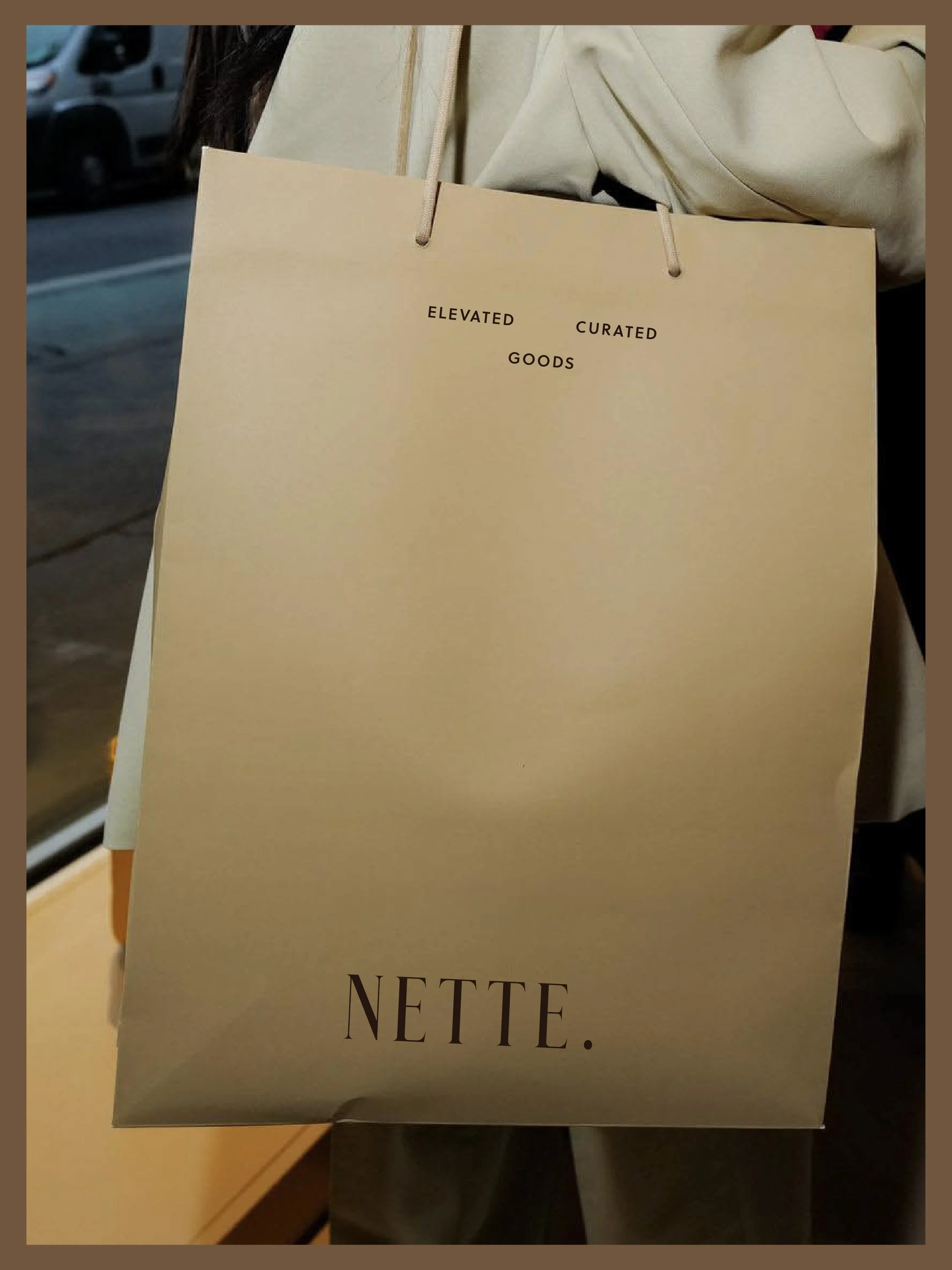
PACKAGING DESIGN
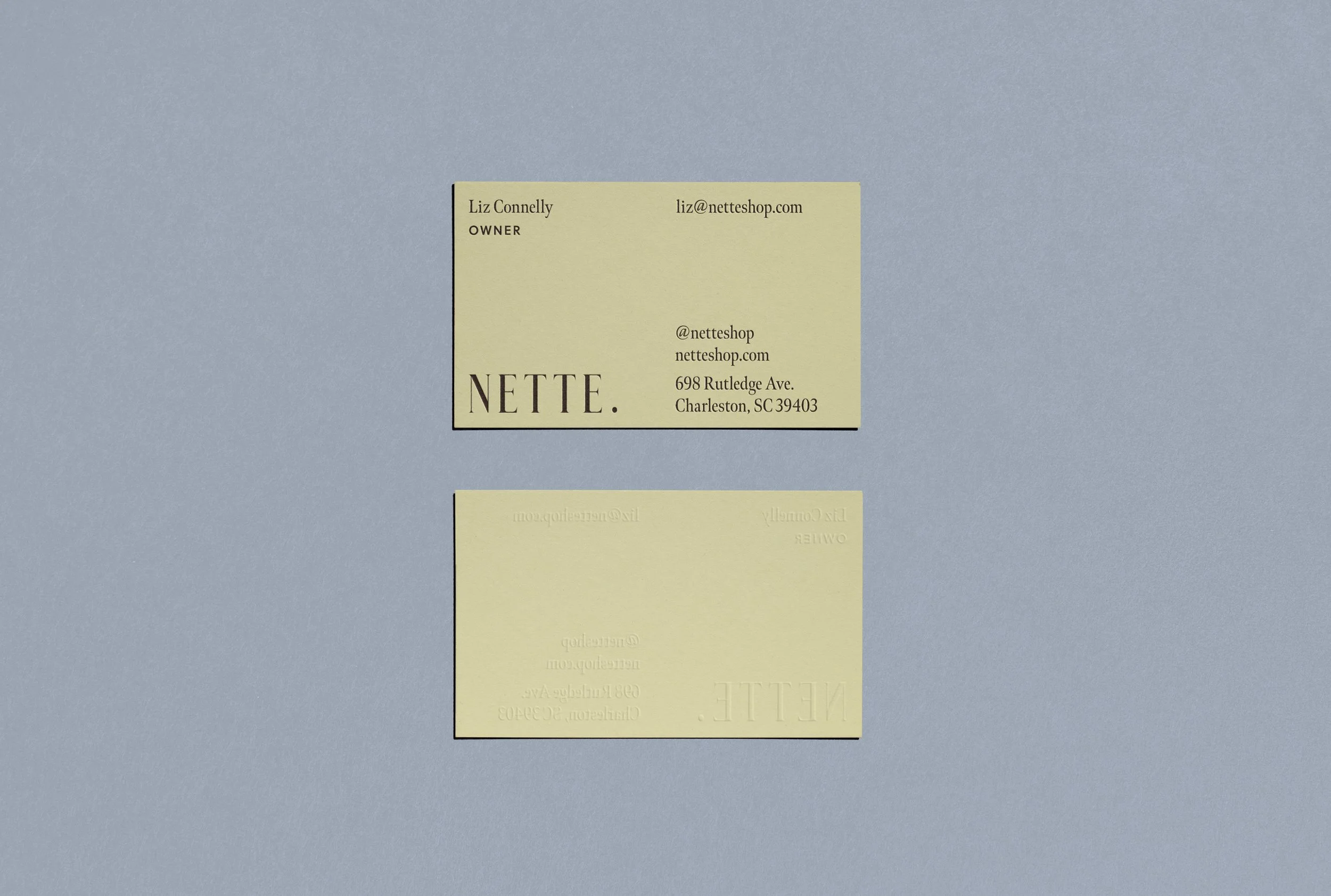
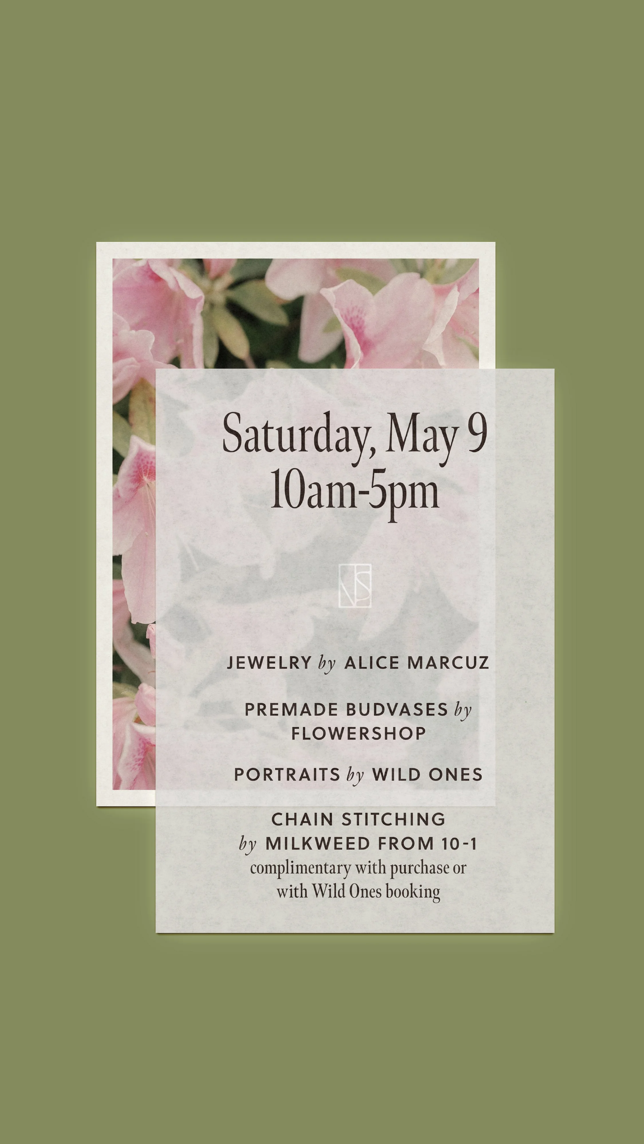
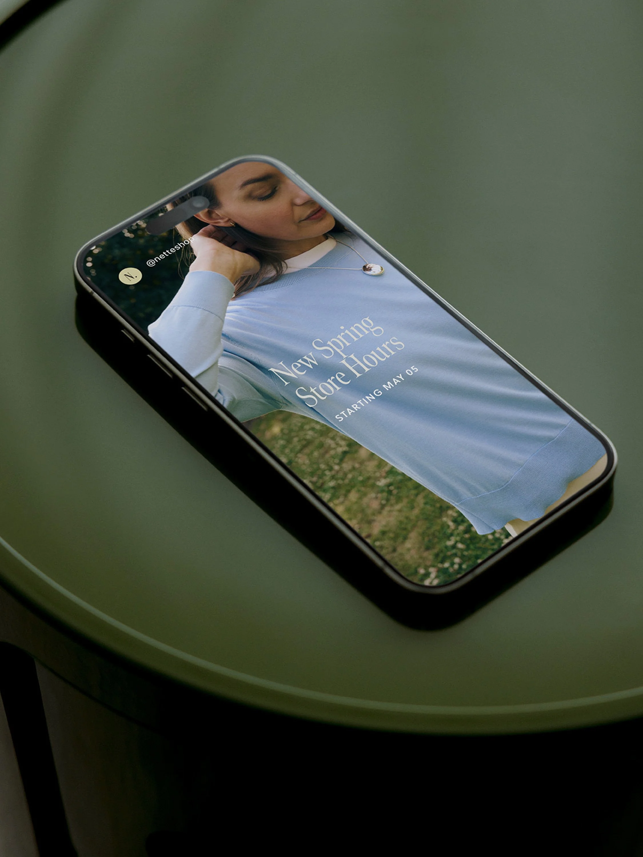
COLLATERAL
WORDMARK CREATED BY GADABOUT CREATIVE
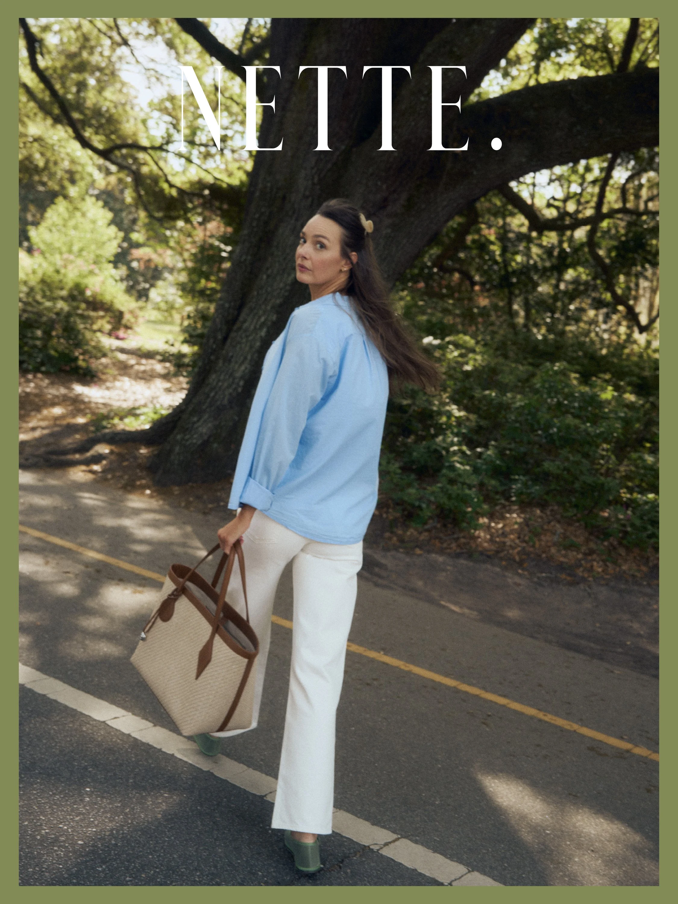
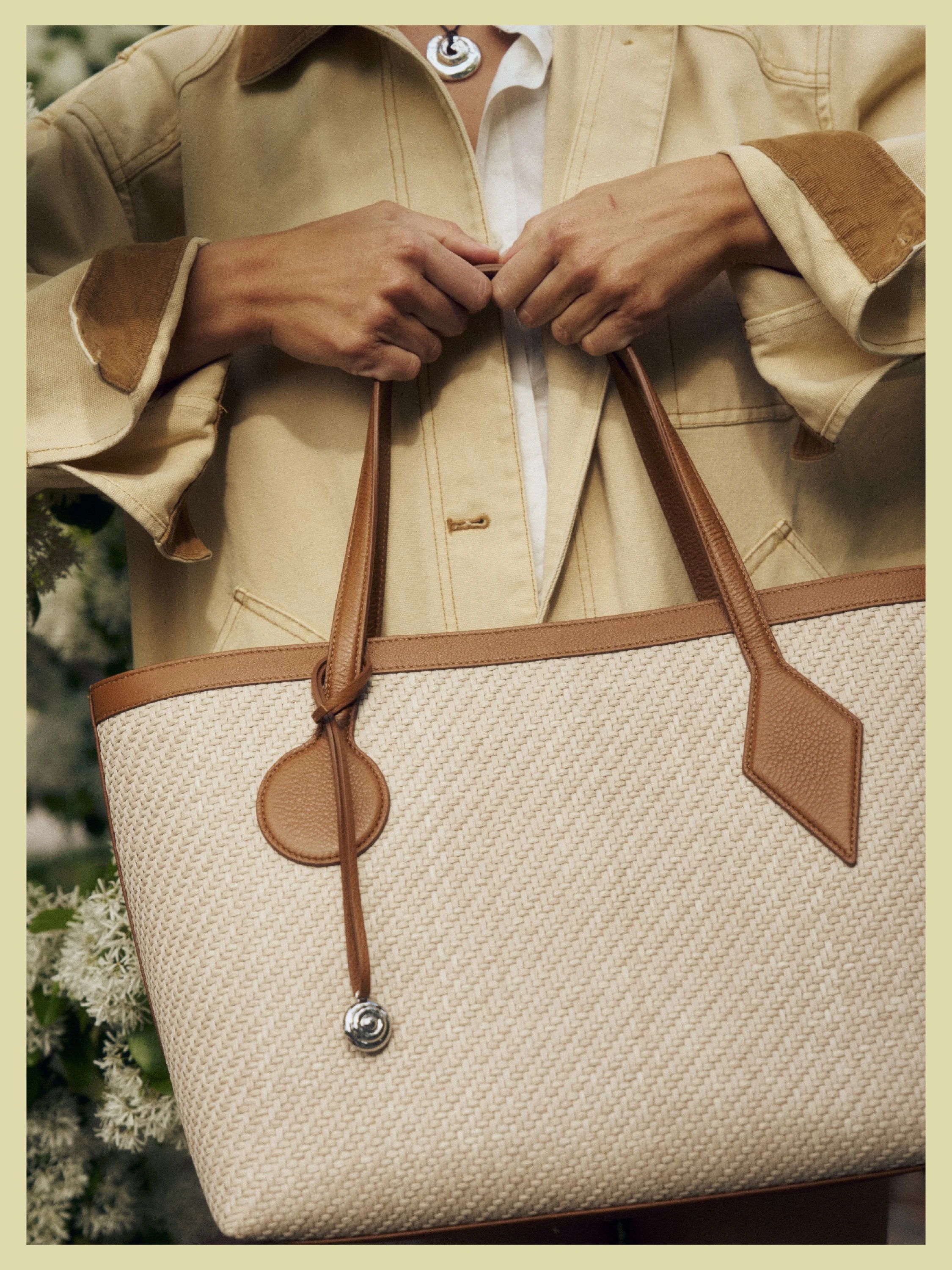
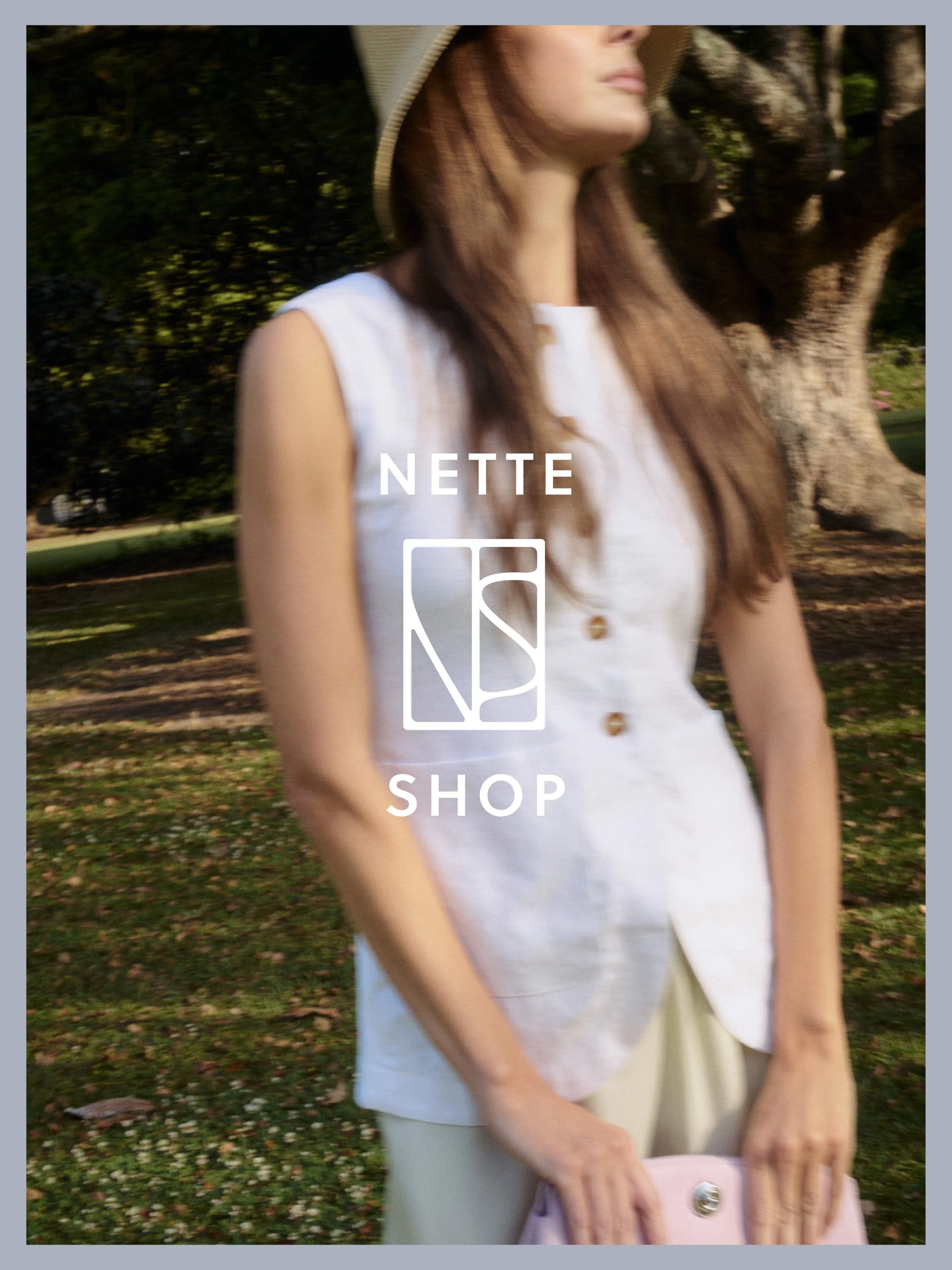
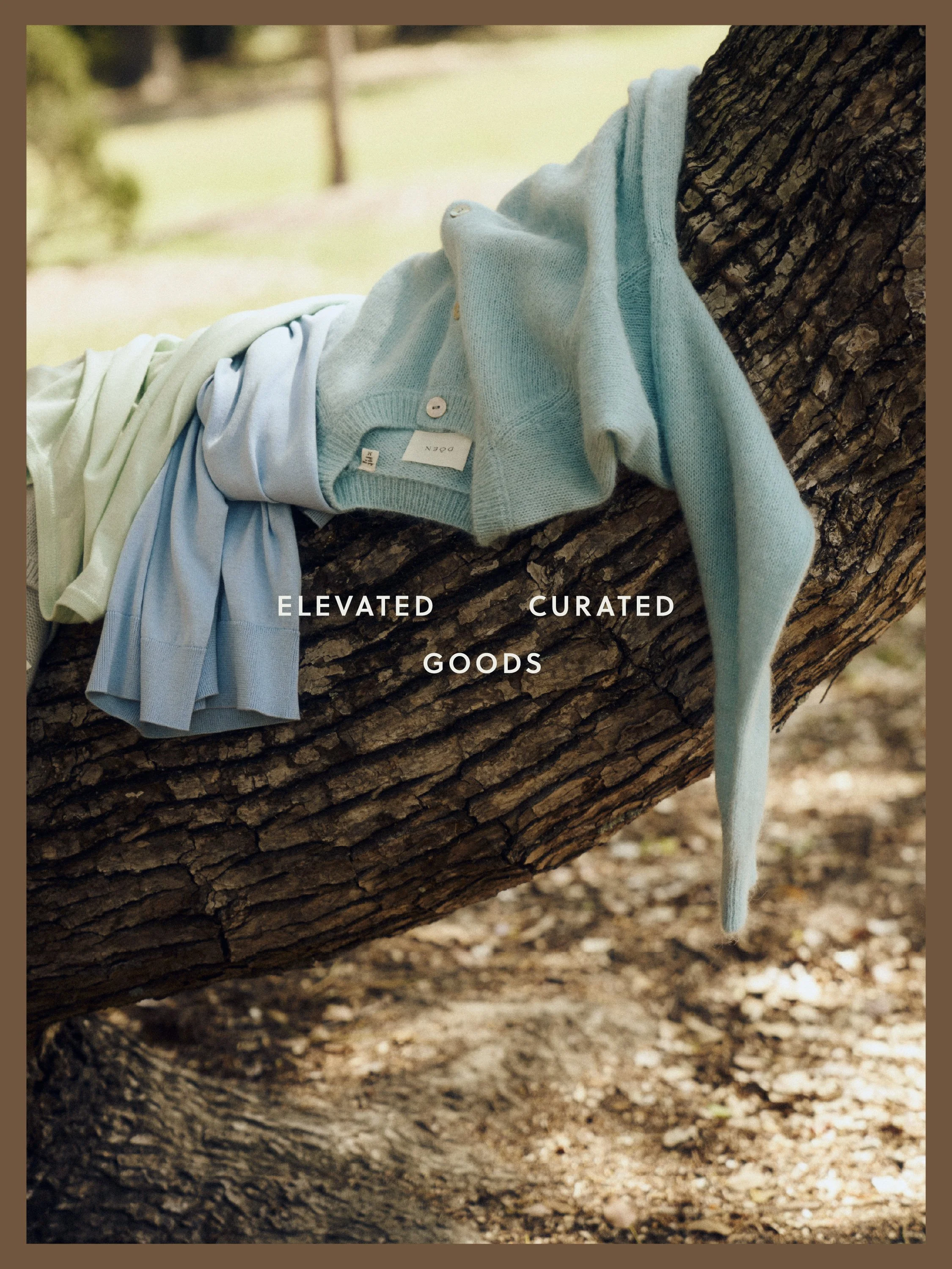
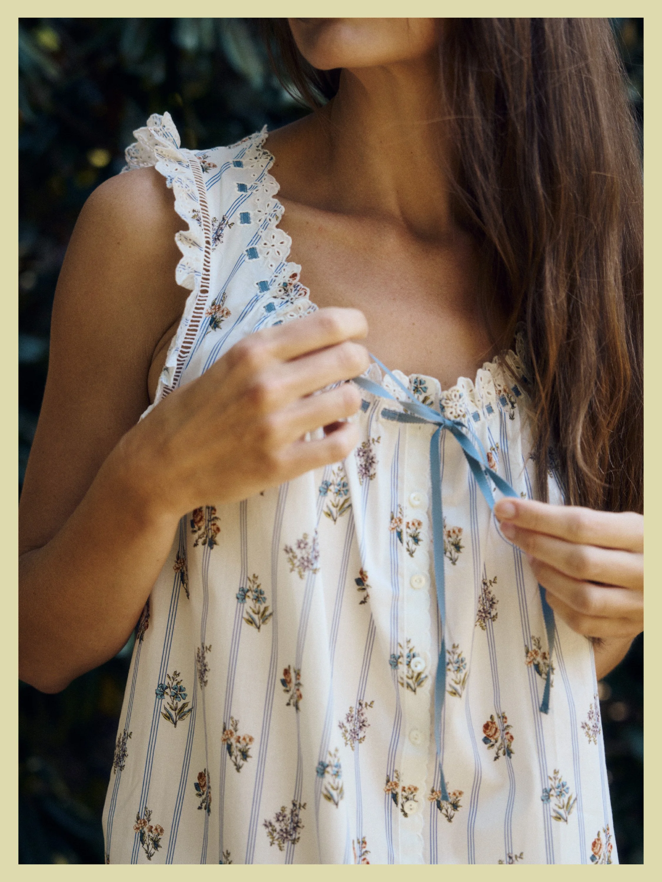
PHOTOGRAPHY BY BLAKE SHORTER

STRATEGY
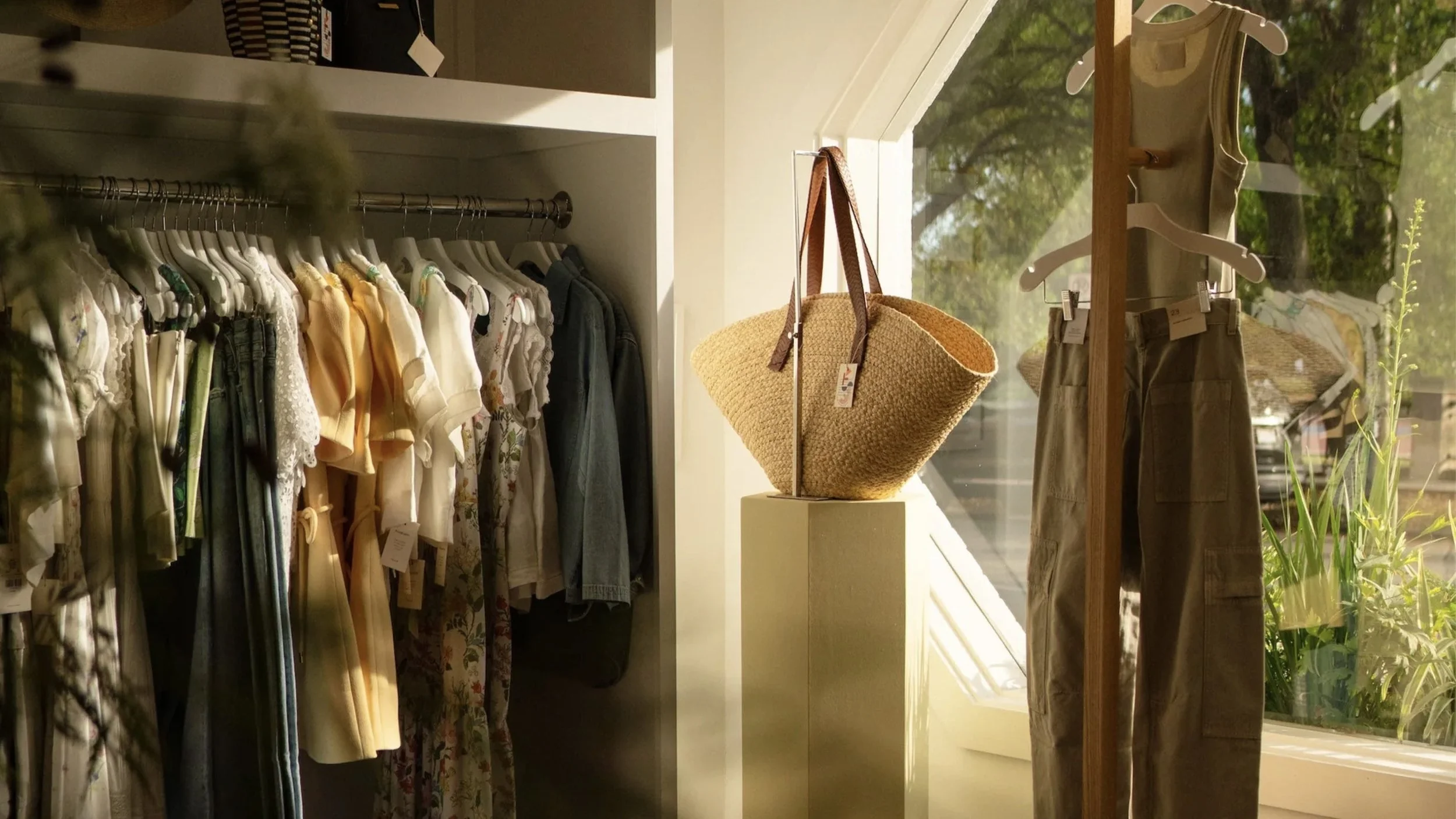
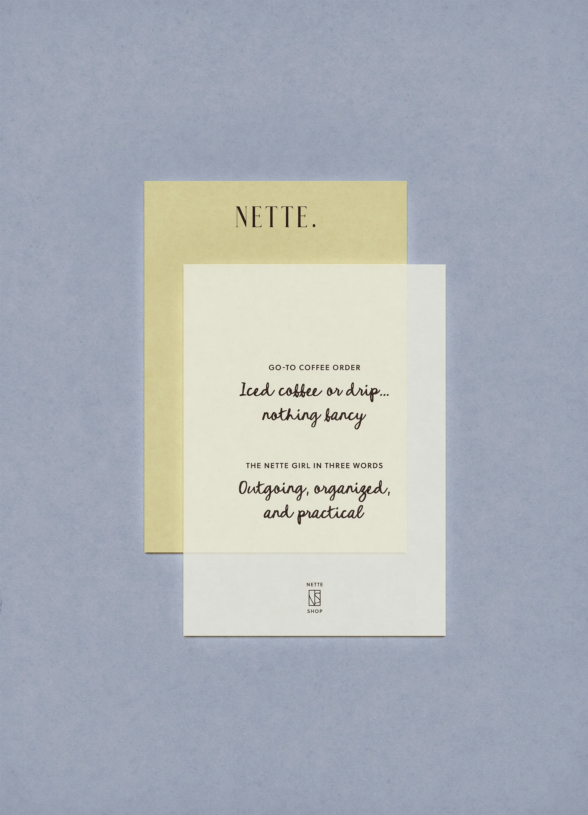
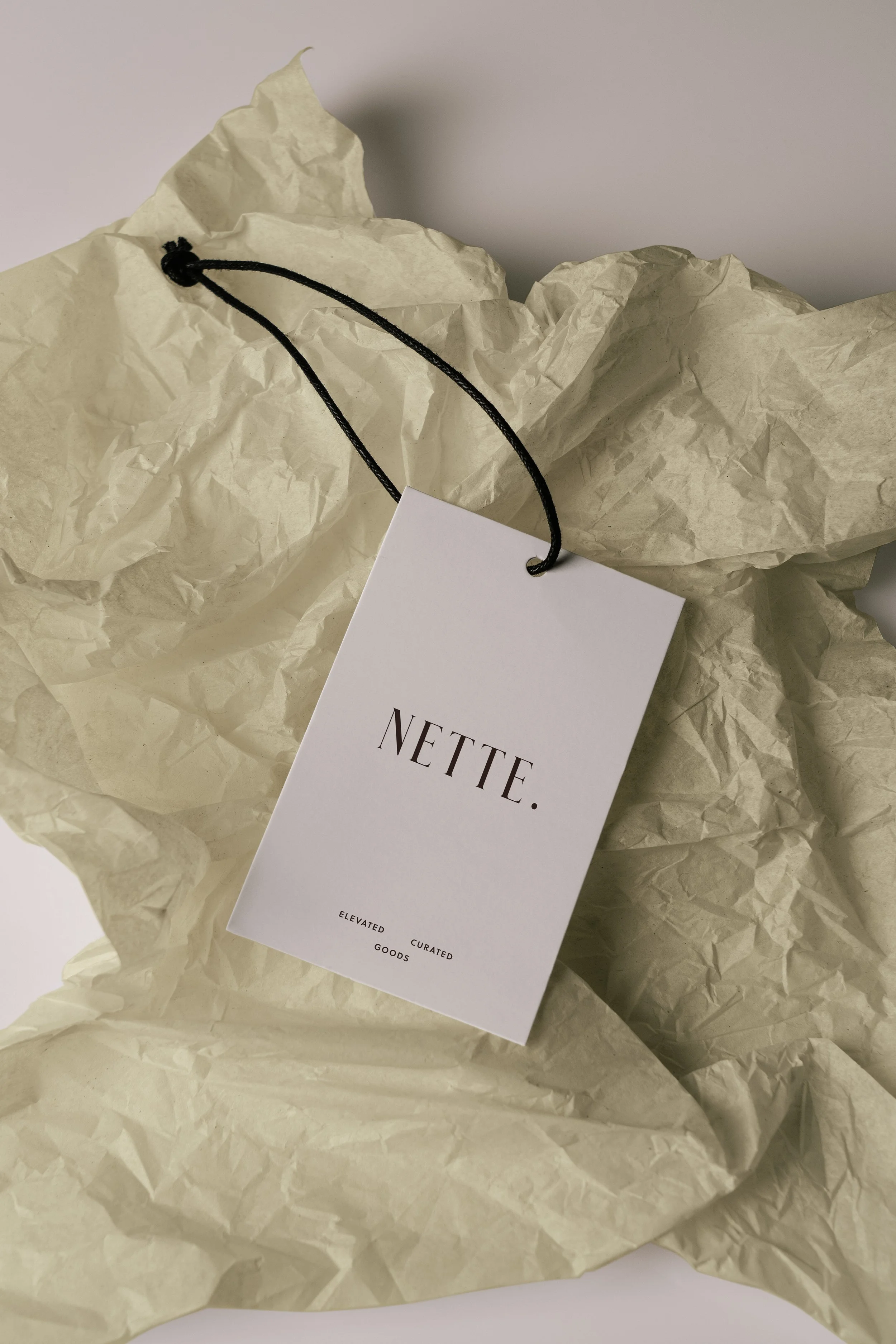
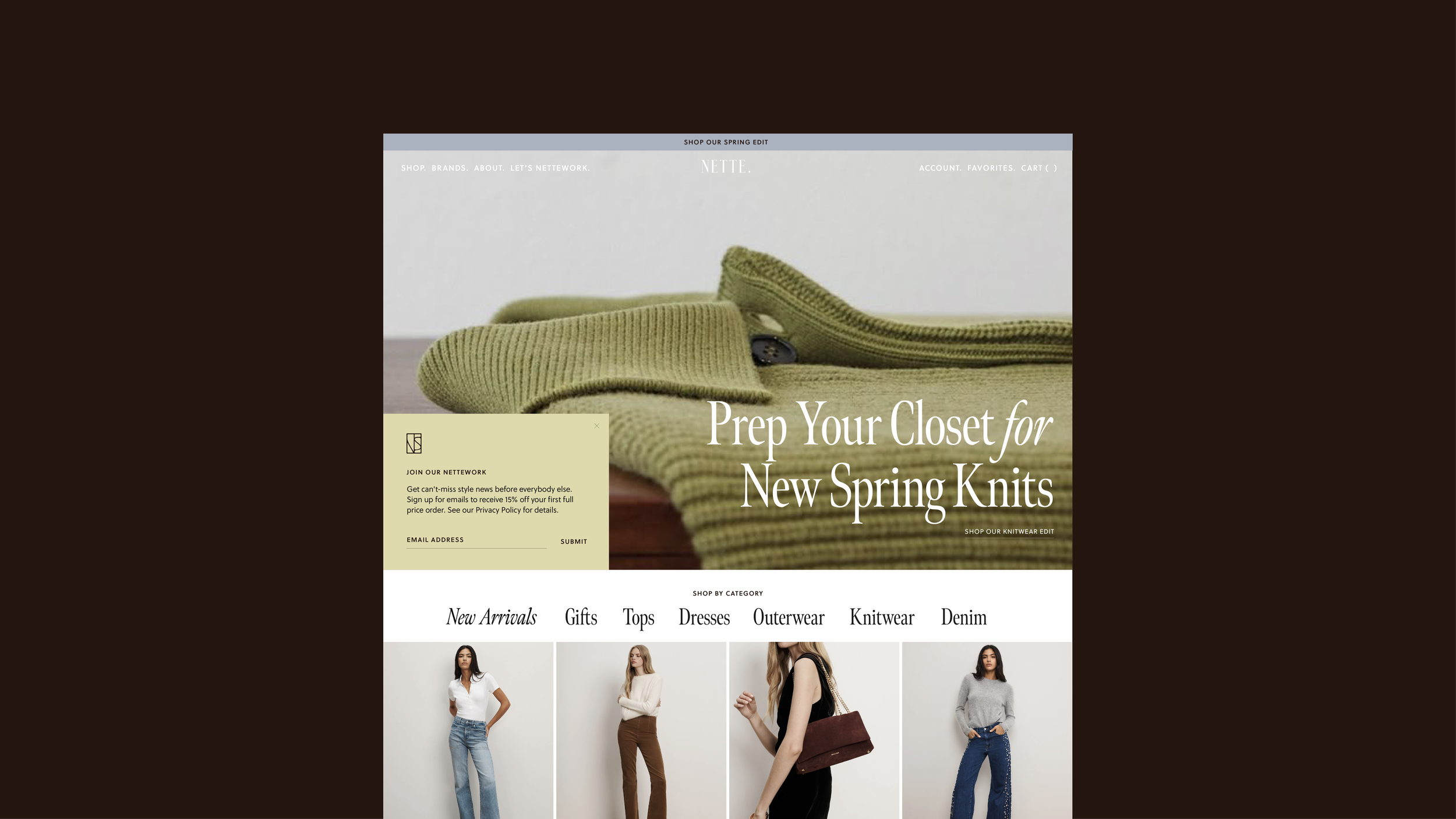
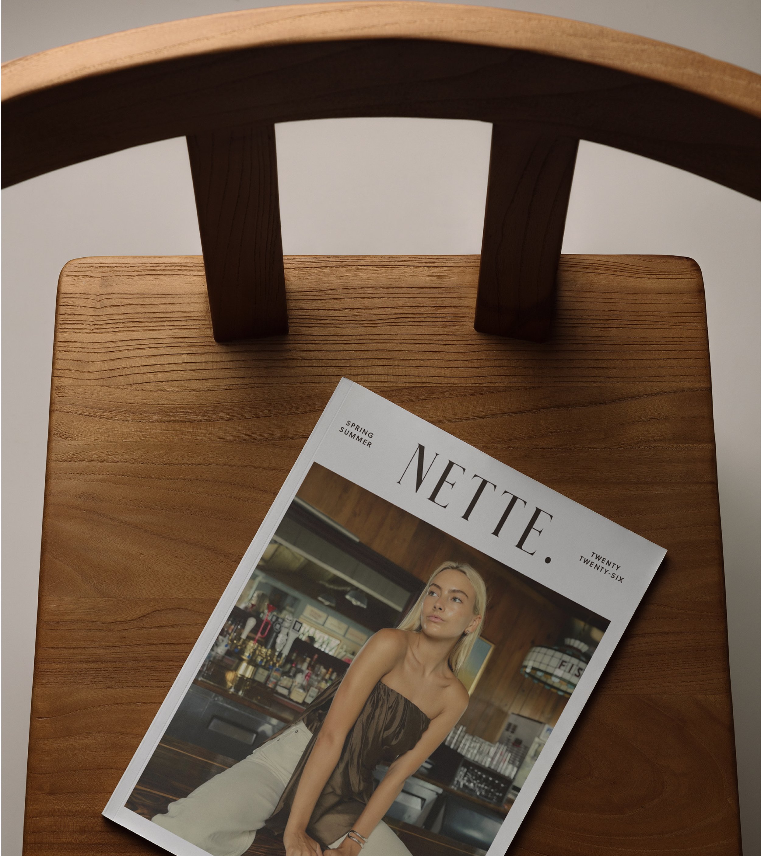
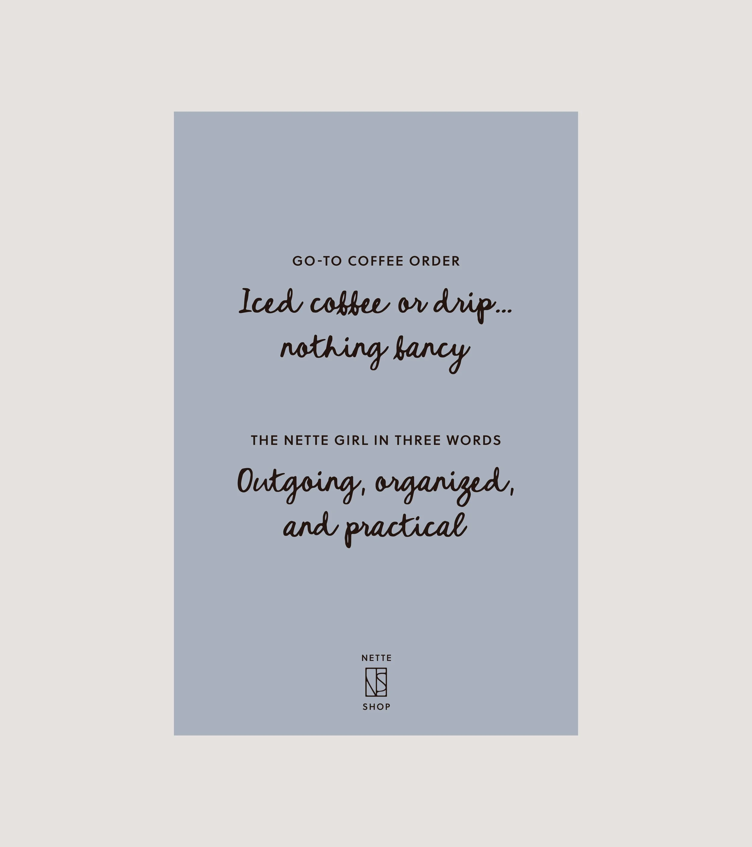
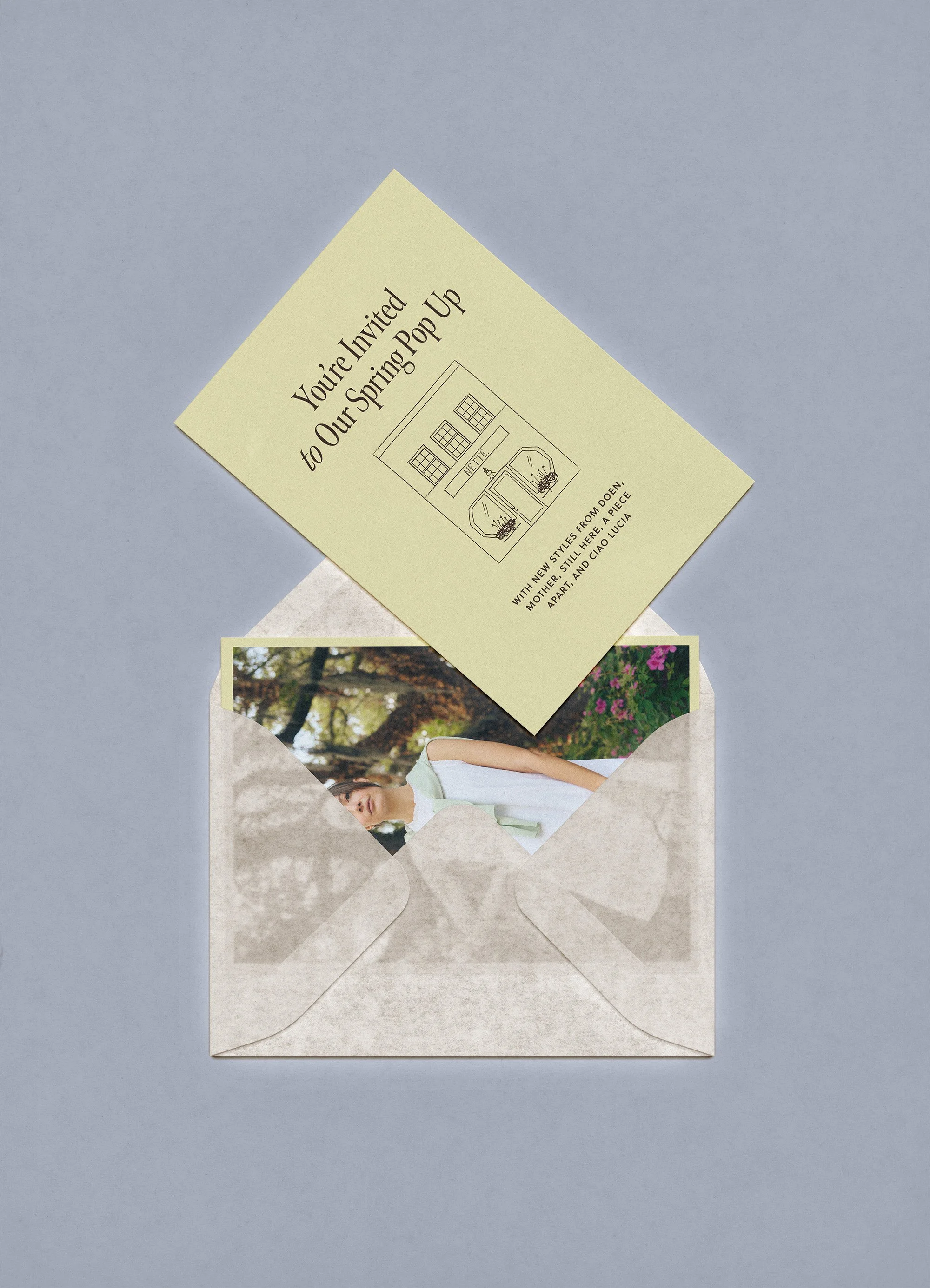
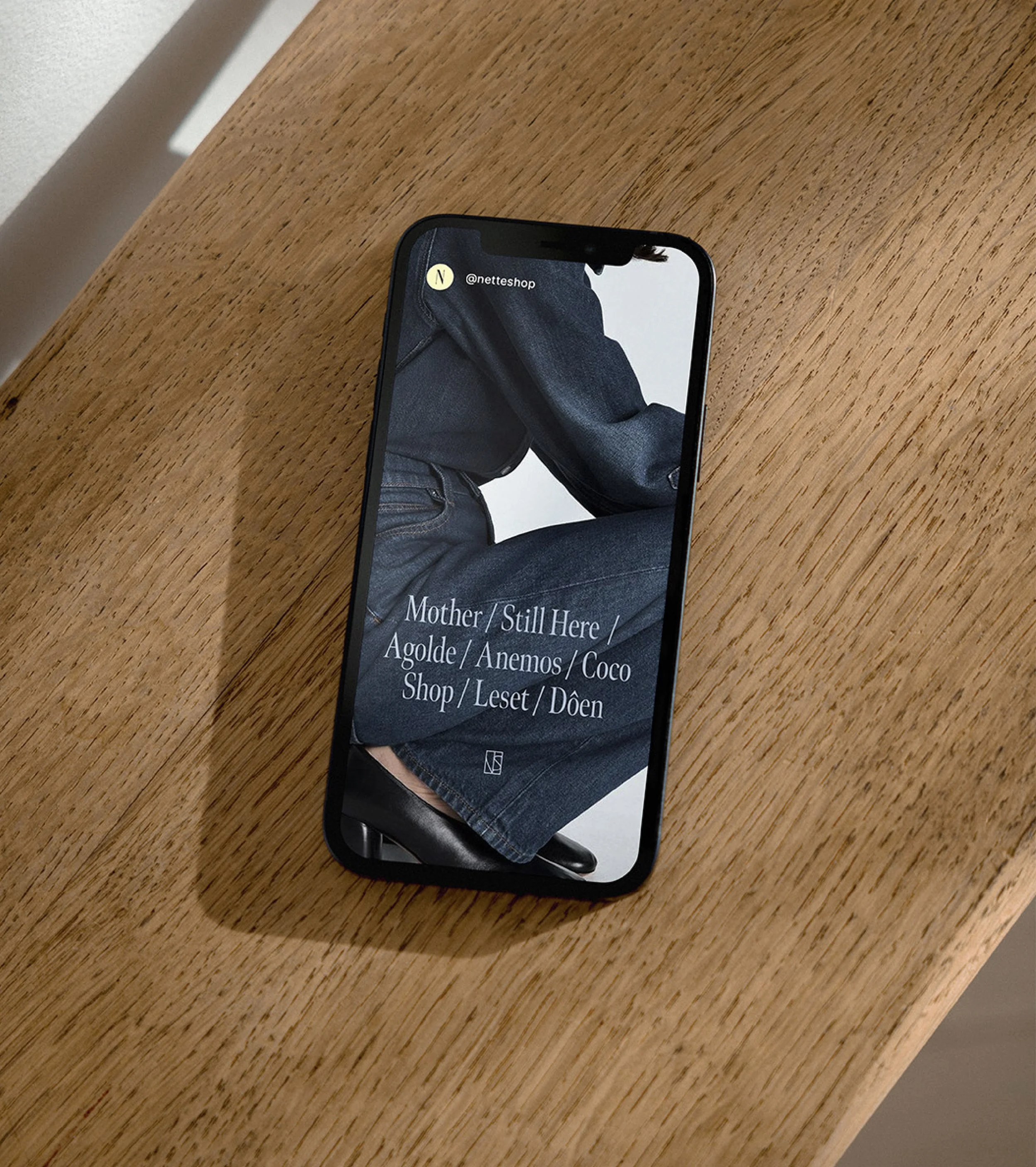
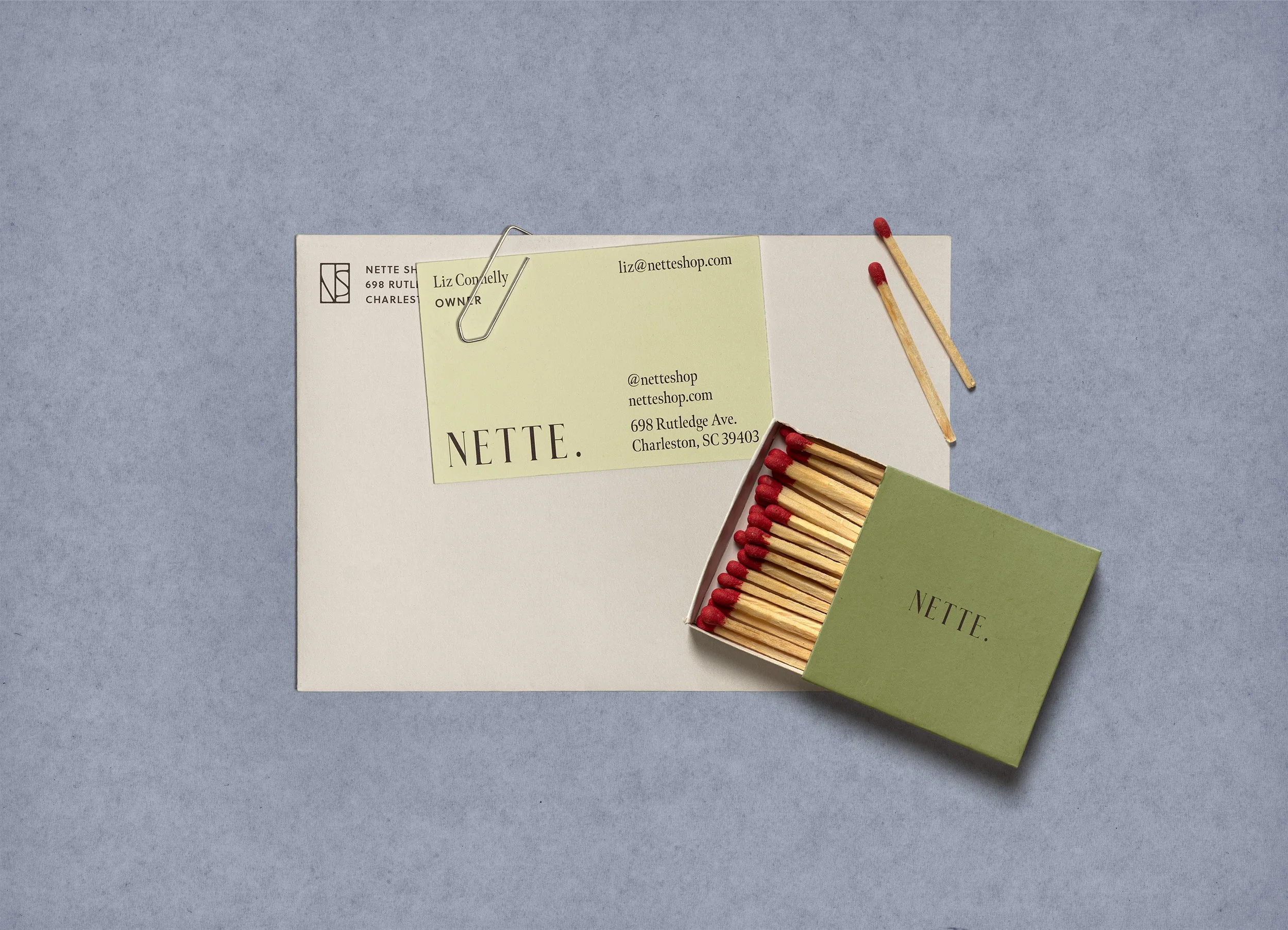
Nette Shop came to STUDIO ANDOR with a beloved wordmark and a loyal customer in mind, but no system to hold the brand world together. The opportunity was to build outward from their existing identity into a full visual language that felt as curated and confident as the shop itself. The palette began with a happy accident: a printer's misread of "cream" produced buttery yellow bags that the owner loved immediately, and that serendipity became the emotional anchor of the entire system. From there, we built a palette rooted in the coastal South. A spring grass green, a greyed slate blue, warm cream, and a grounding dark brown that tied it all together without leaning into cliché. Typography was treated editorially, with clean, high-contrast serifs that let the clothing photography breathe and lead. The final layer was a handwritten script giving literal voice to the Nette girl, the outgoing, practical, organized woman at the center of every brand decision.
RESULTS
The expanded Nette brand identity delivers a system that is both rigorous and warm, a balance that mirrors the shop's and shop owner’s own character. With a defined palette, a flexible typography hierarchy, and a distinct tonal voice, the brand now scales across print collateral, digital, social, and in-store touchpoints with consistency and ease. The handwritten script became a signature device that customers recognize and connect with, adding intimacy to what could otherwise feel like a polished but distant retail identity. The result is a brand world that doesn't just house Nette's product; it tells her story and creates an intimate space where you want to hang out. One that feels like it was built with intention, a little luck, and a lot of personality.
OTHER PROJECTS
-
![Outdoor sign with "OMIKA" on a round, decorative background attached to a building.]()
OMIKA
Brand Identity, Packaging, and Marketing for a women’s clothing brand inspired by the vibrant prints of India.
-
![Black and white image of a person lying face down on a chair outdoors with text "UNSORTED."]()
UNSORTED.
An independent label by Hunter Hardee inspired by technique and voracious curiosity. A line of clothes that challenges the notion of what clothes can be.
-
![Person holding a smartphone displaying a menu for 'Ethos' with options like Club Culture, Ethos News, Team, Schedule, Classes, Memberships, Gallery, Contact, and a 'Become a Member' button.]()
ETHOS ATHLETIC CLUB
A bold website to attract new members, host class signups, and digitally express the world of Ethos A.C.
-
![Person wearing a T-shirt with 'Roseline' text facing shelves of wine bottles and a table with wine glasses.]()
ROSELINE
Brand identity and collateral for an intimate wine bar that boasts fine wines with a side of funky vibes.