NOOK TINY CAFE
& MARKET
BRAND IDENTITY
STRATEGY
COLLATERAL

STRATEGY
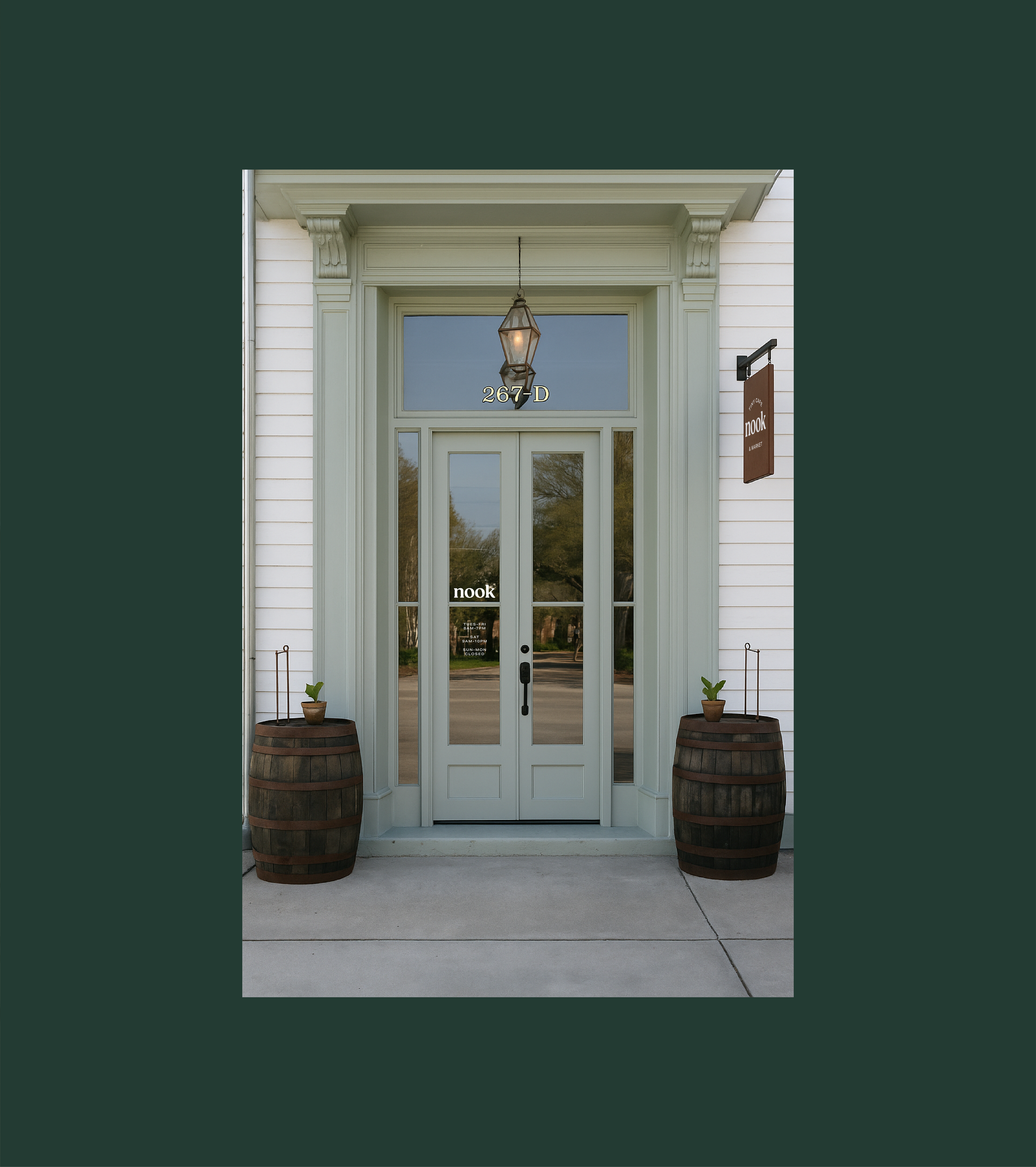
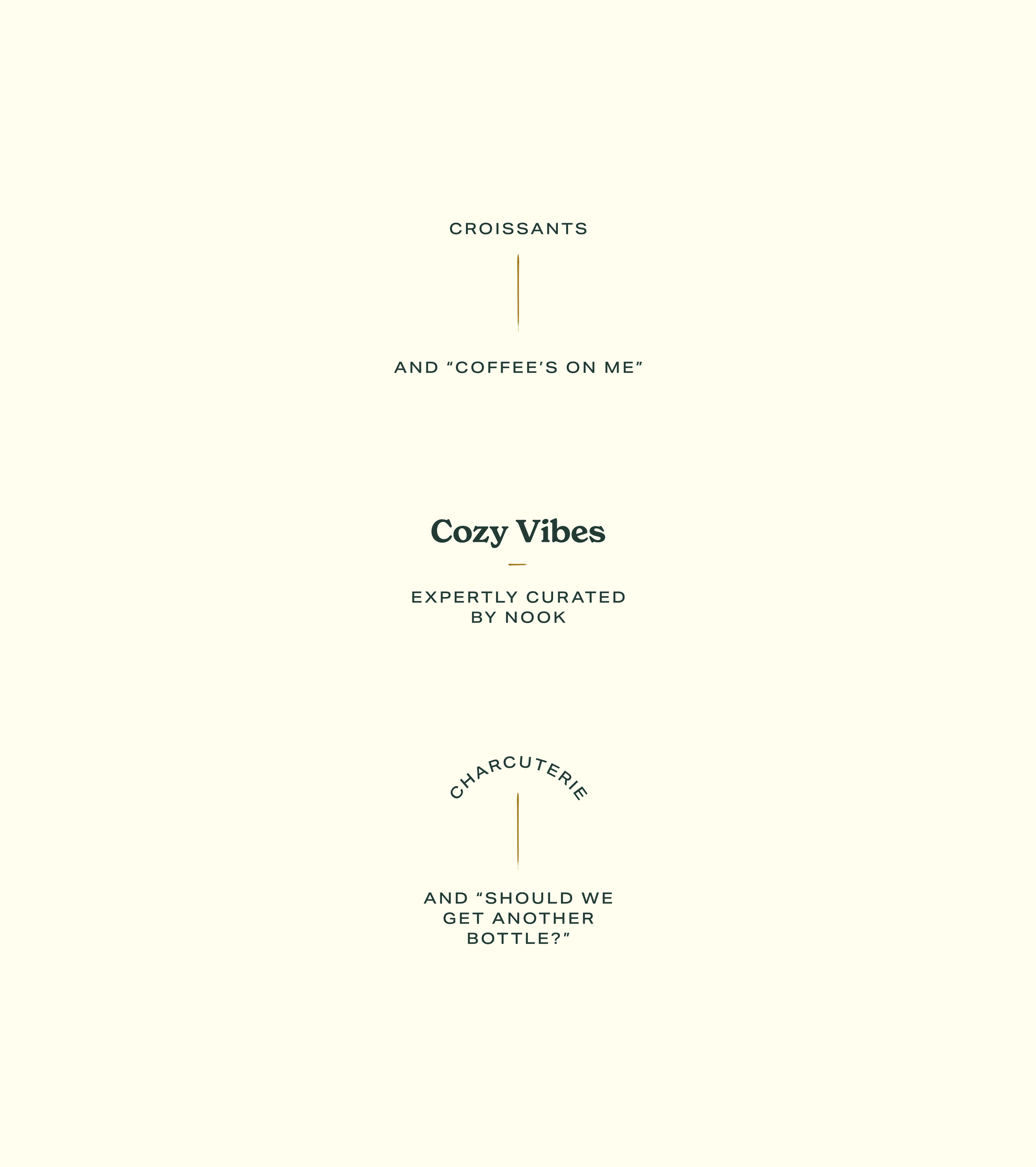
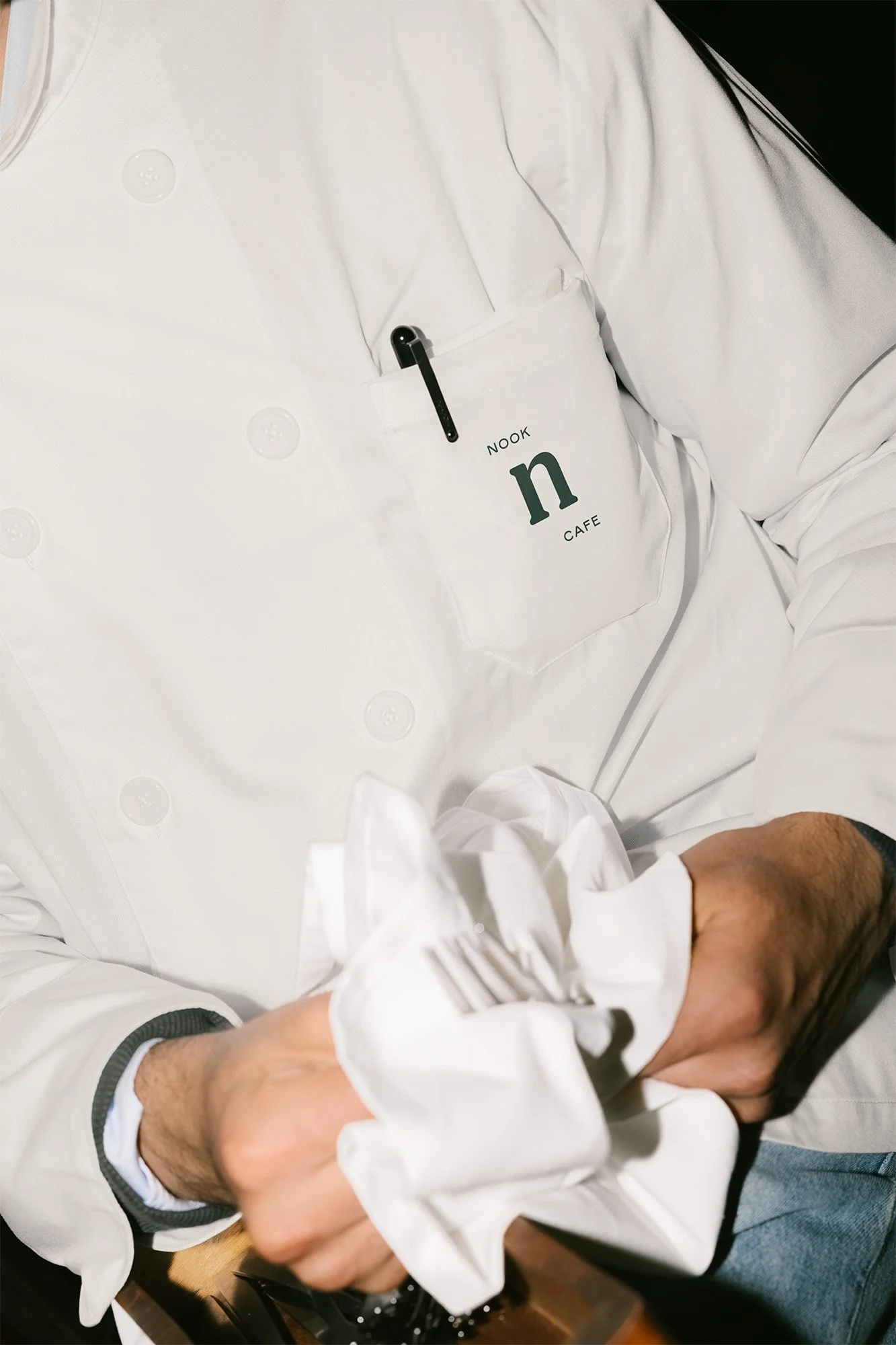
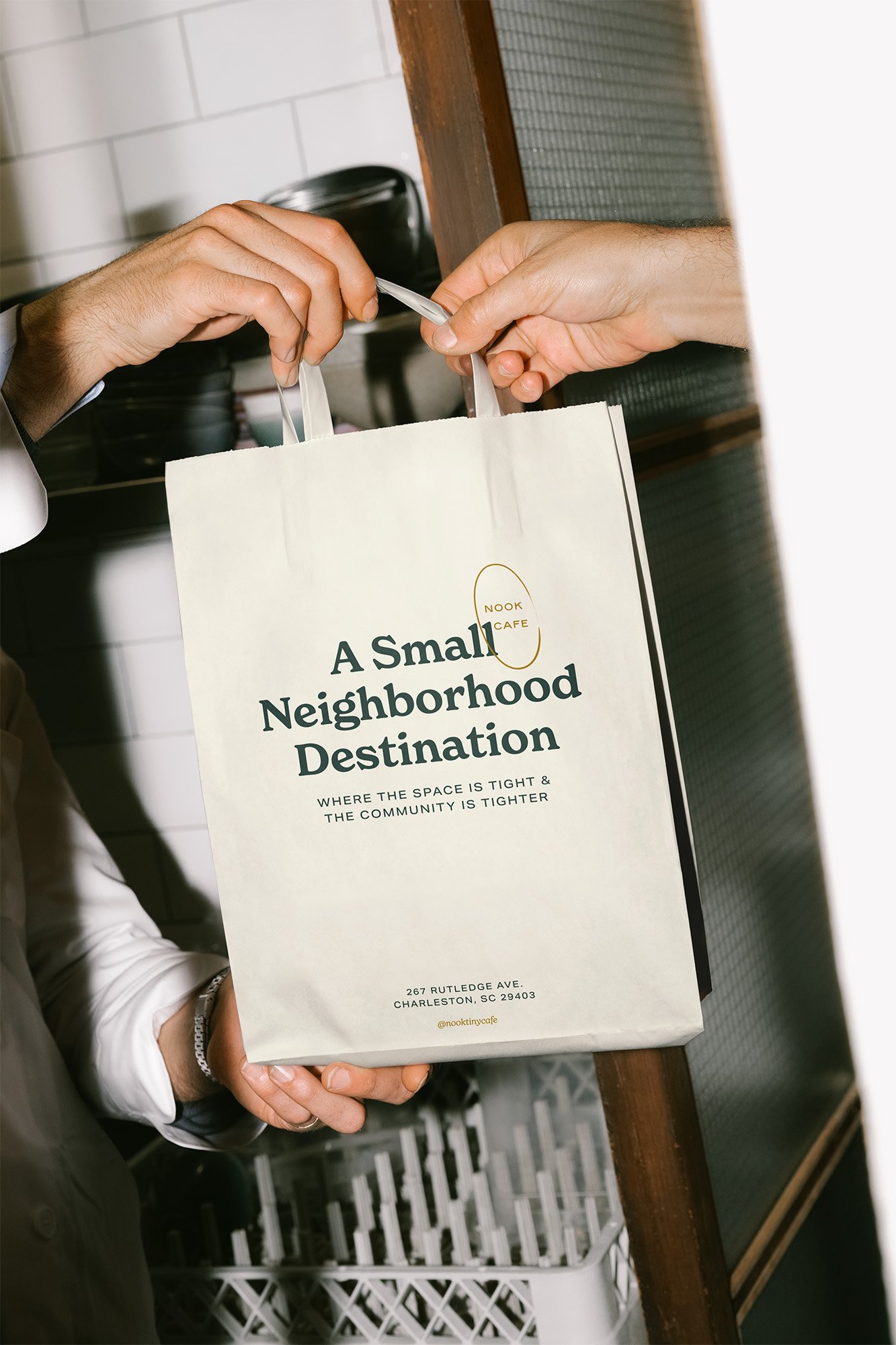
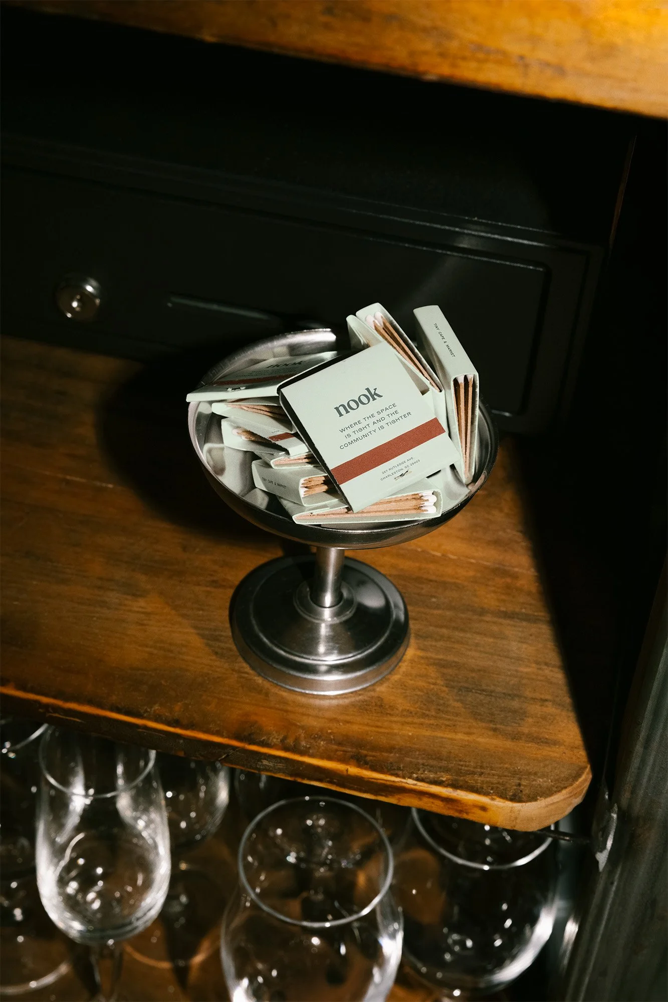
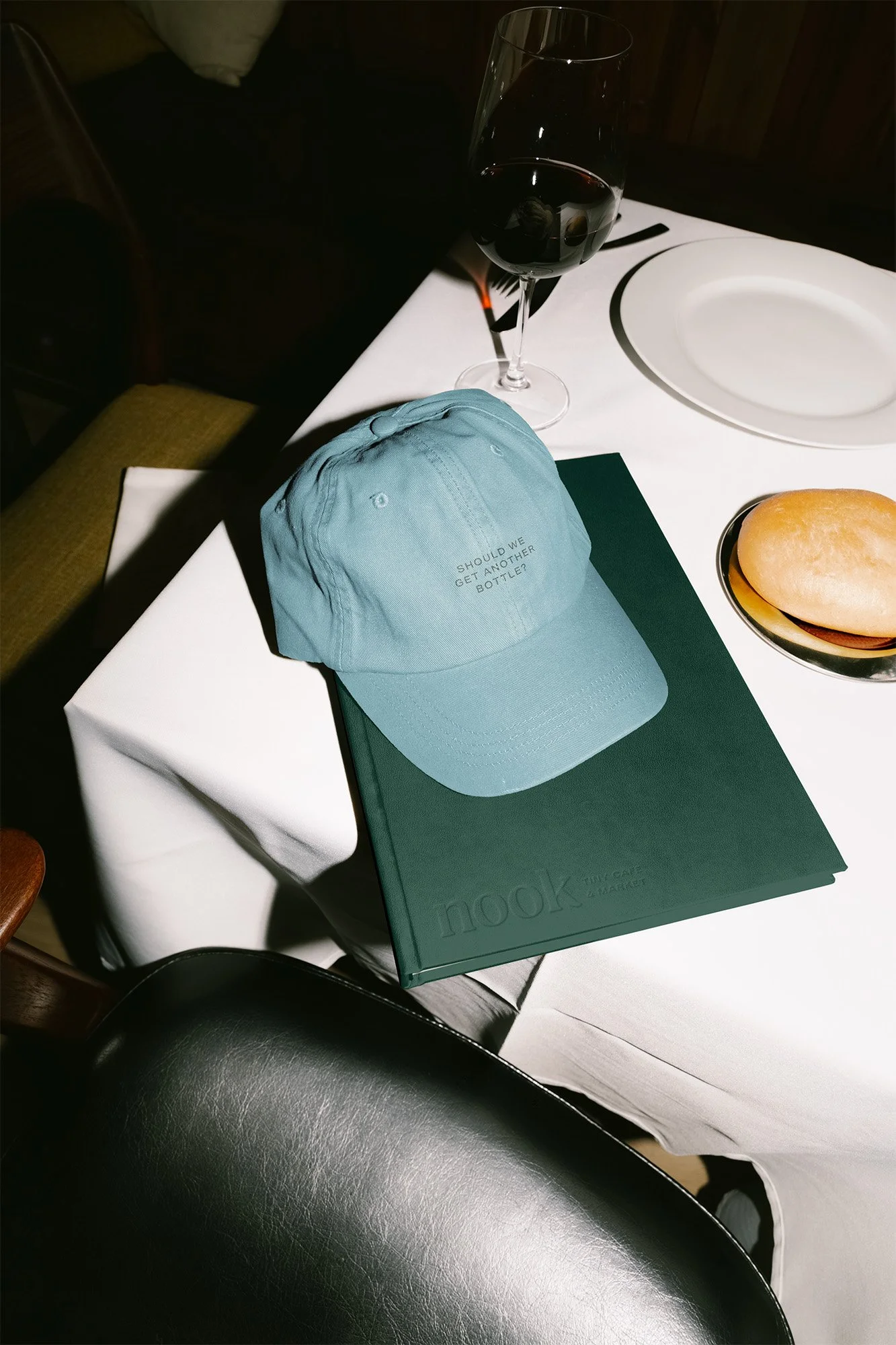
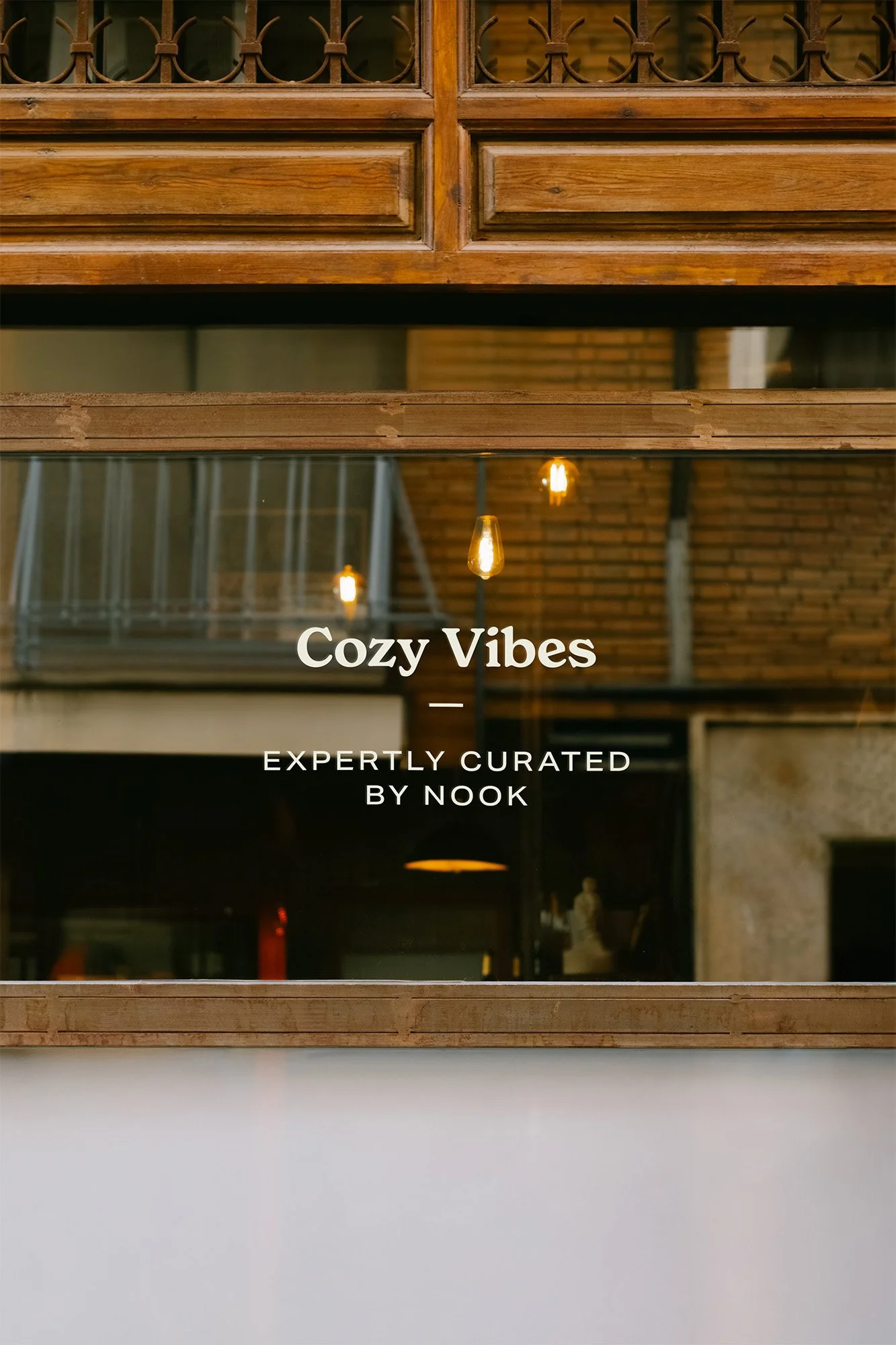
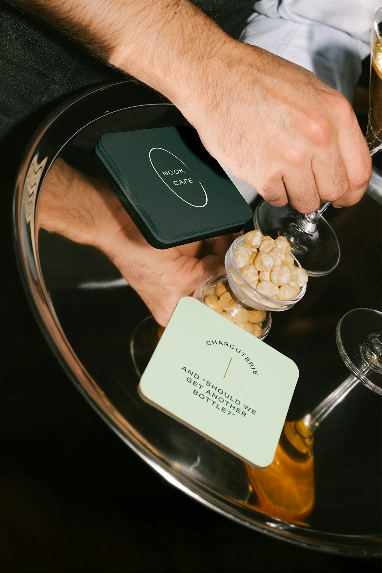
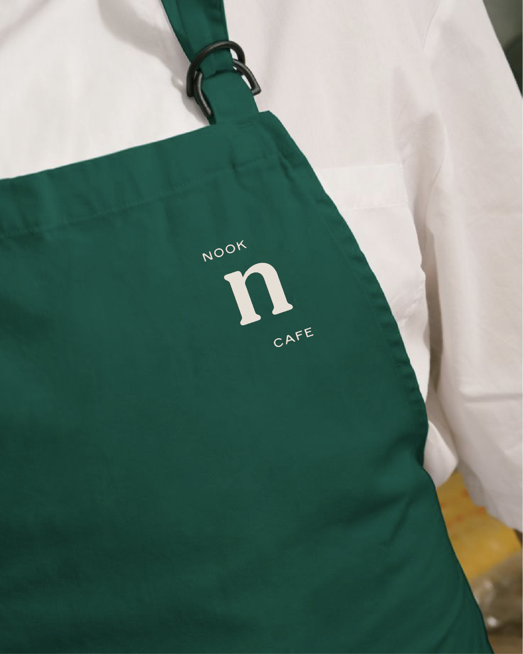
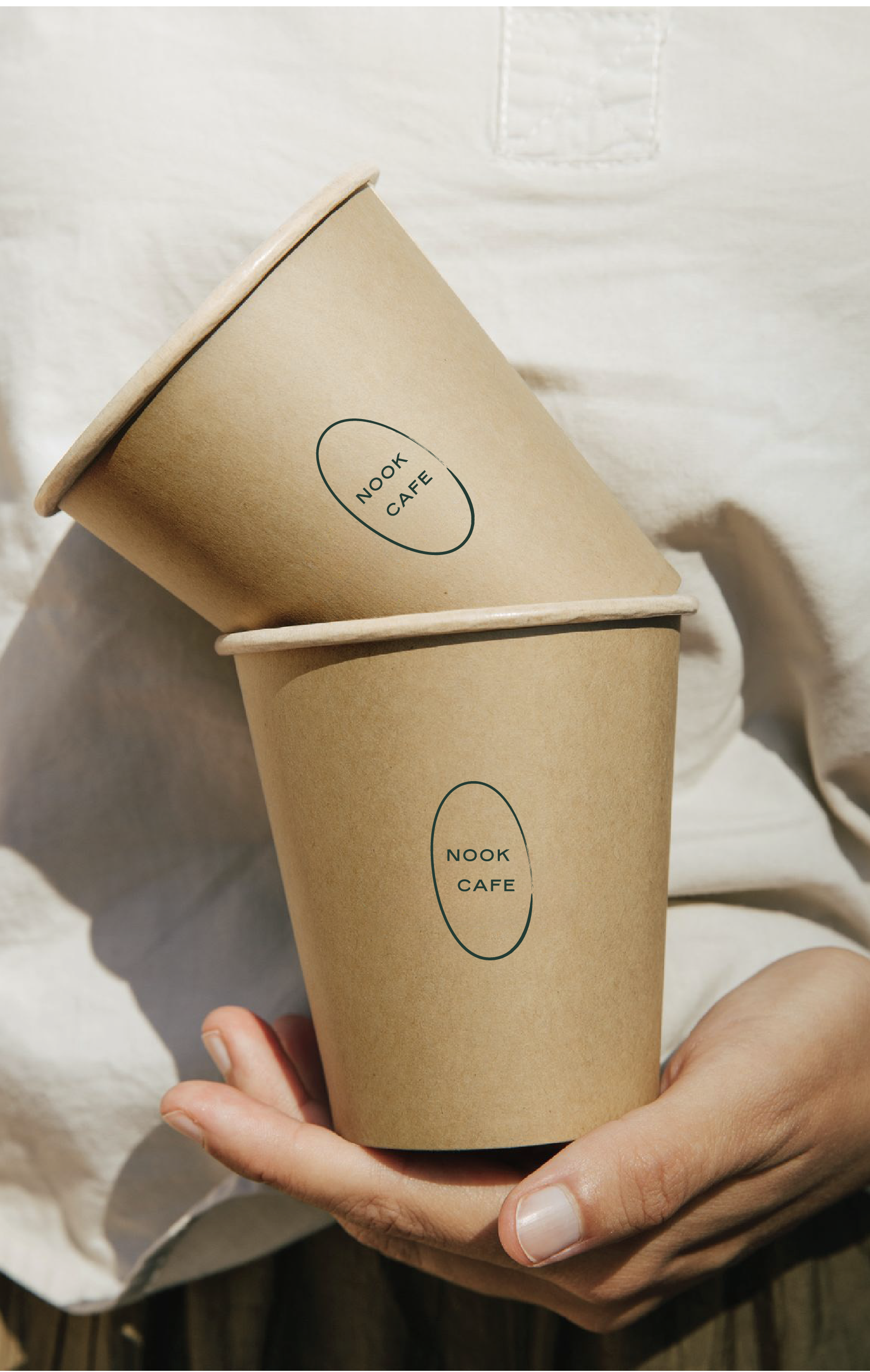
Nook Tiny Cafe & Market required a brand identity that was as warm and approachable as its community-focused mission. As a new gathering spot for locals, this cafe, market, and wine bar needed a strategy that would soften its upscale offerings with a friendly, inviting presence. Our goal was to create a visual language that felt both elevated and effortlessly welcoming, bridging the gap between high-quality products and the tight-knit spirit of Charleston. Inspired by the relationships and communal feel of a small town, the brand was built to be a communal hub. We achieved this through a vibrant, yet grounded, color palette, a mix of playful and classic typography, and charming, hand-painted illustrations. The result is a brand that feels both nostalgic and fresh, positioning Nook as the heart of its neighborhood: a place where people can gather, connect, and feel right at home.
RESULTS
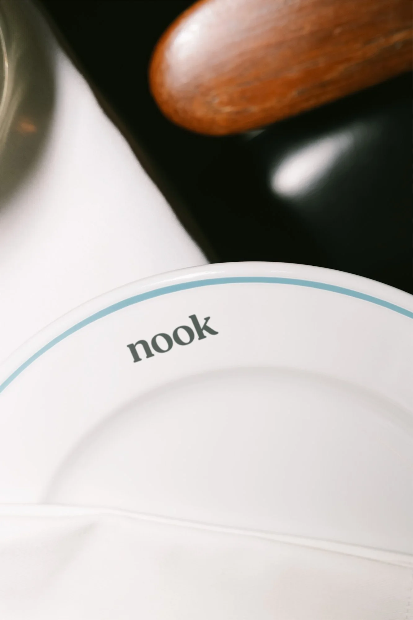
The final brand system for Nook Tiny Cafe & Market delivers a friendly yet refined visual language that perfectly balances the cafe's high-end offerings with its welcoming atmosphere. The color palett, a playful twist on Italian cafe tradition, marries a classic Italian green with a grounding cream, a soothing sage, and an energetic robin’s egg blue, creating an inviting and refreshing feel. Typography strikes a balance between vintage charm and modern sophistication, with rounded, almost retro headlines pairing with a clean, classic sans-serif. This duality is carried throughout the brand, from the charming, paint-brushed illustrations to the vintage-inspired type lockups. Every element, from signage to digital touchpoints, reinforces Nook's identity as a cozy, communal space where the quality of an upscale establishment meets the comfort of a local hangout.


FEATURED PROJECTS
-
![Business cards for Marmalade clothing brand in blue, yellow, and orange colors displayed on a dark green background.]()
MARMALADE
The rebranding of a series of women’s brick-and-mortar and online boutiques that highlights the playful, enigmatic side of going shopping.
-
![Black and white image of a person lying in a chair outdoors, with "UNSORTED" text overlayed.]()
UNSORTED.
An independent label by Hunter Hardee inspired by technique and voracious curiosity. A line of clothes that challenges the notion of what clothes can be.
-
![An orange book titled 'Curated by Caroline' lies on a marble floor next to a lamp stand.]()
CURATED BY CAROLINE
A high-end, personable brand for personal styling and curation service by Caroline Bishop Cundith.
-
![Person holding a smartphone showing a menu for the Ethos club, listing options like Club Culture, Ethos News, Team, Schedule, Classes, Memberships, Gallery, and Contact, with a "Become a Member" button at the bottom.]()
ETHOS ATHLETIC CLUB
A bold website to attract new members, host class signups, and digitally express the world of Ethos A.C.
-
![Person wearing a shirt with the text 'Roseline' in a wine bar setting, surrounded by bottles and a set dining table.]()
ROSELINE WINE BAR
Brand identity and collateral for an intimate wine bar that boasts fine wines with a side of funky vibes.