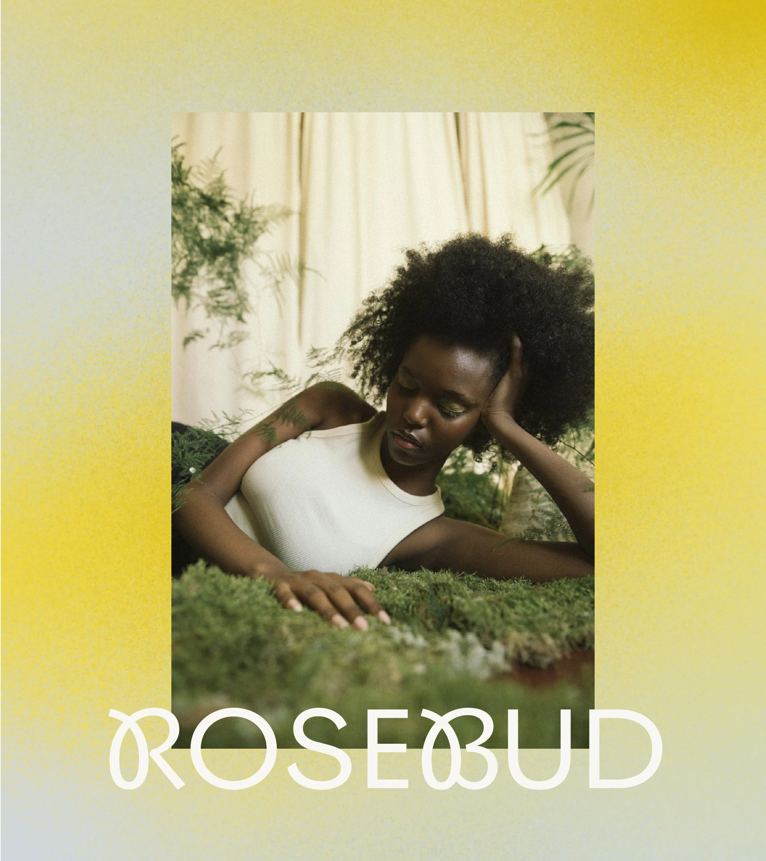
ROSEBUD MATCHA
BRAND IDENTITY
NAMING
BRAND STRATEGY
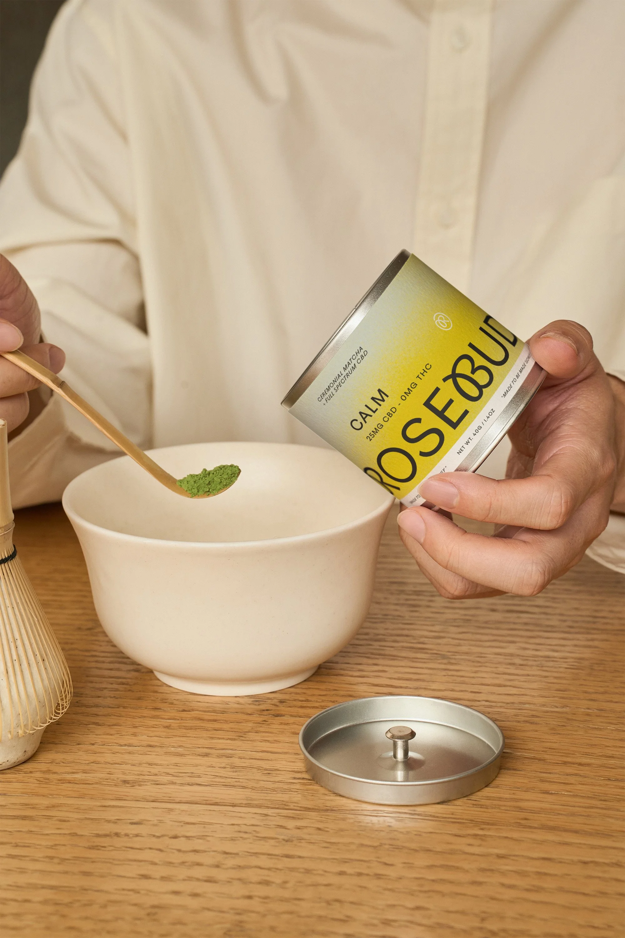
PACKAGING
COLLATERAL


STRATEGY
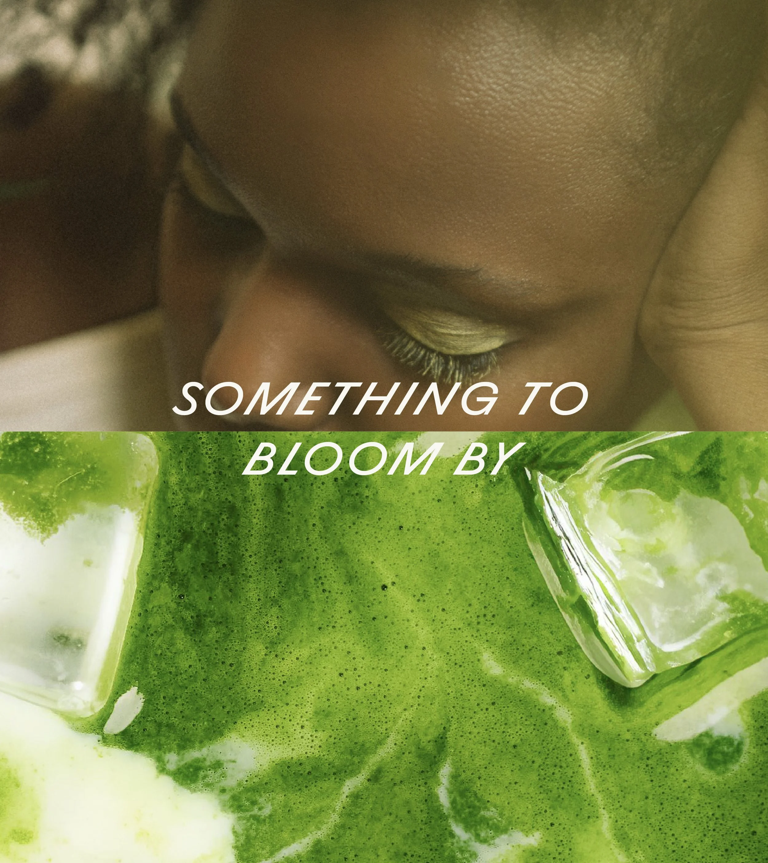
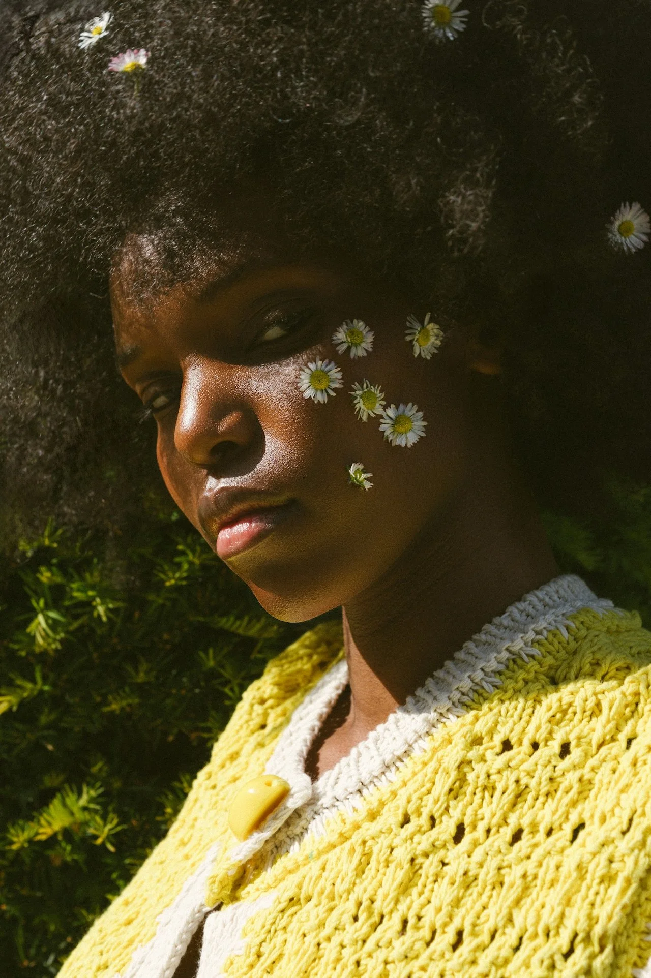
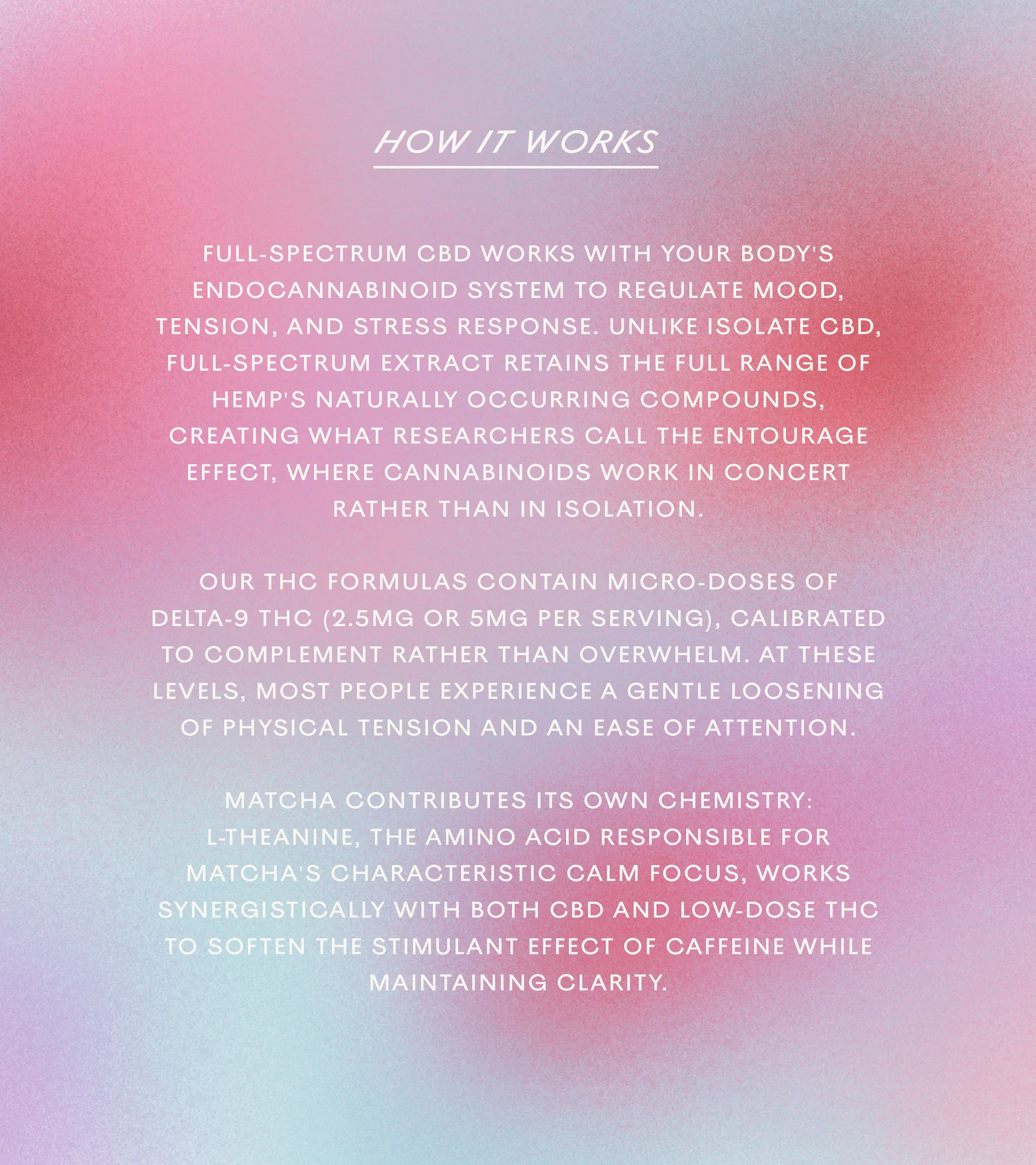
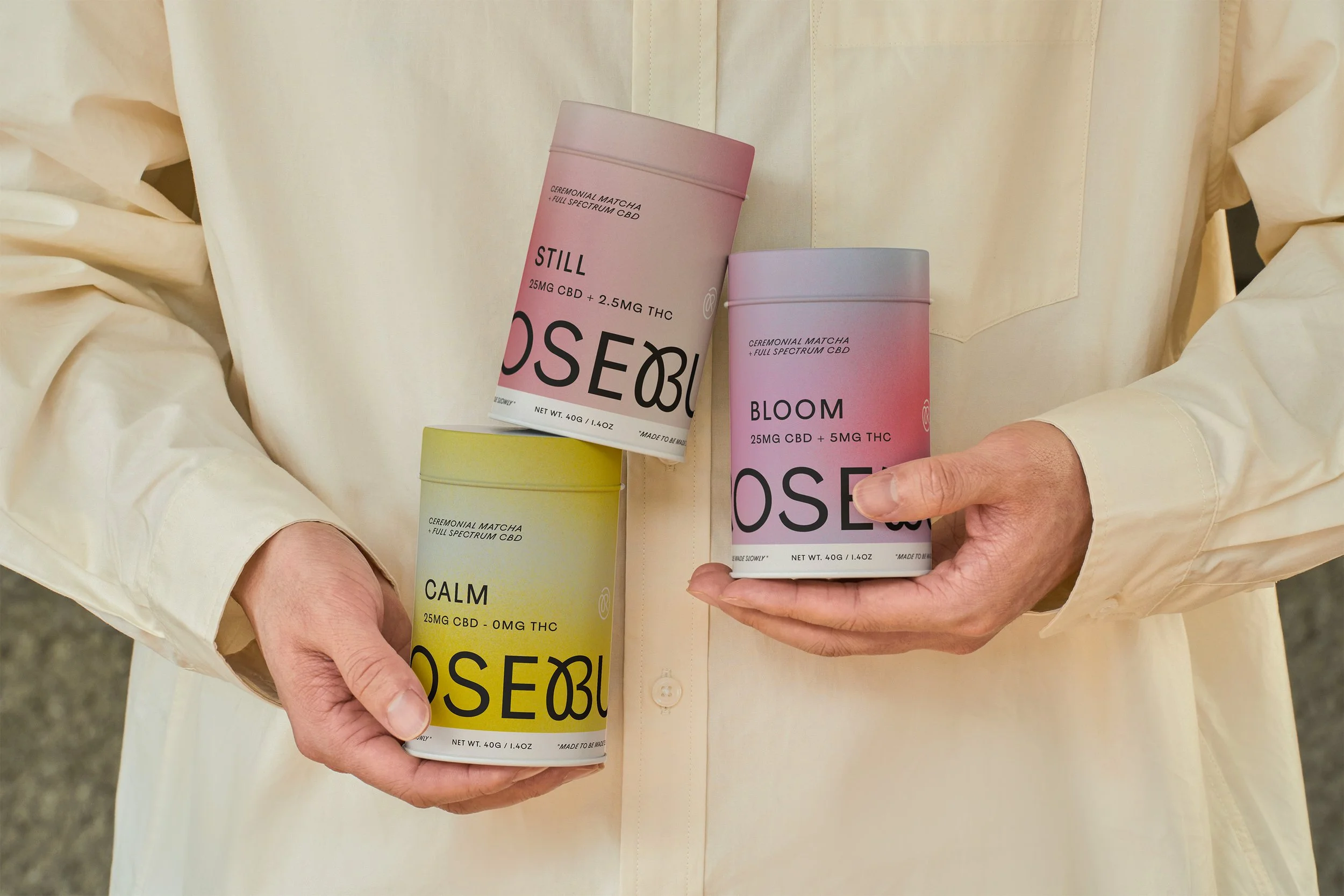
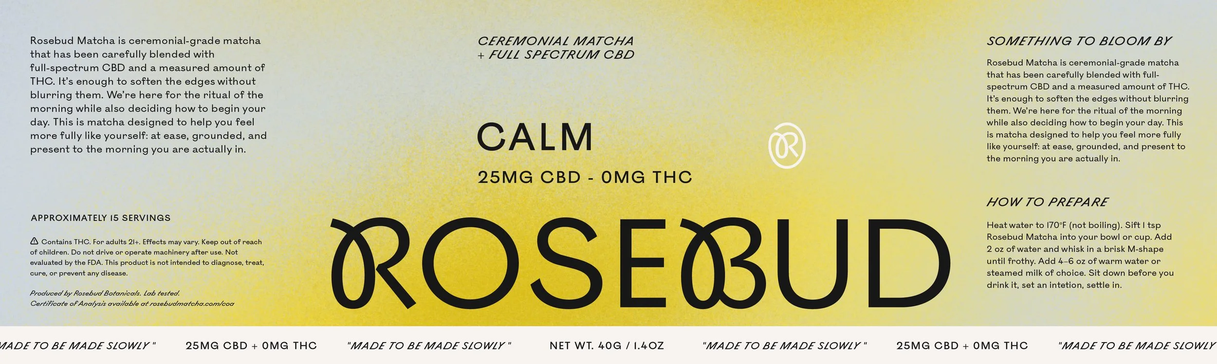
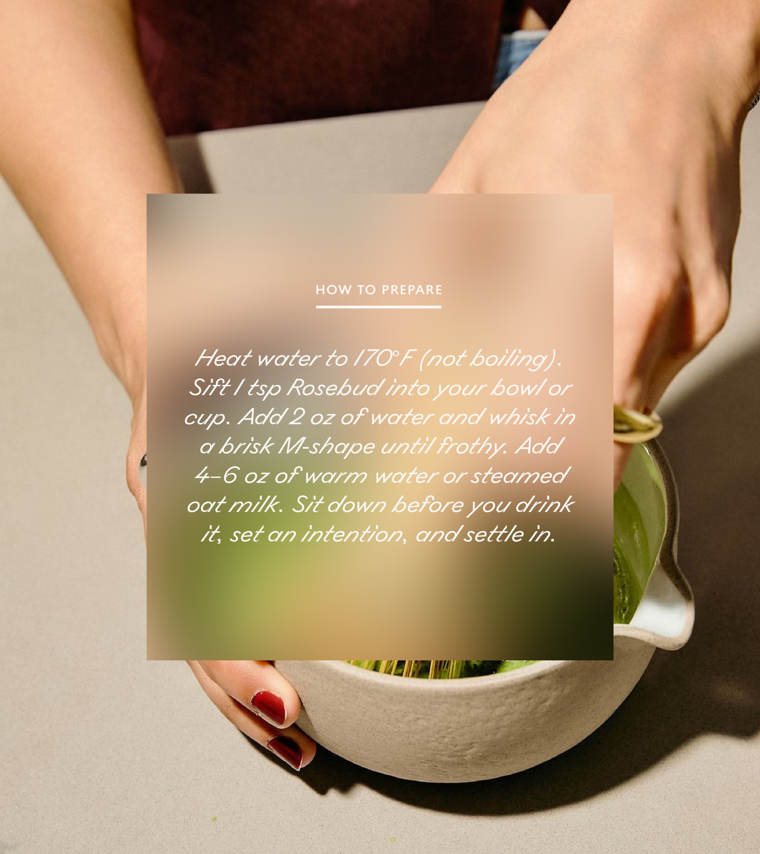
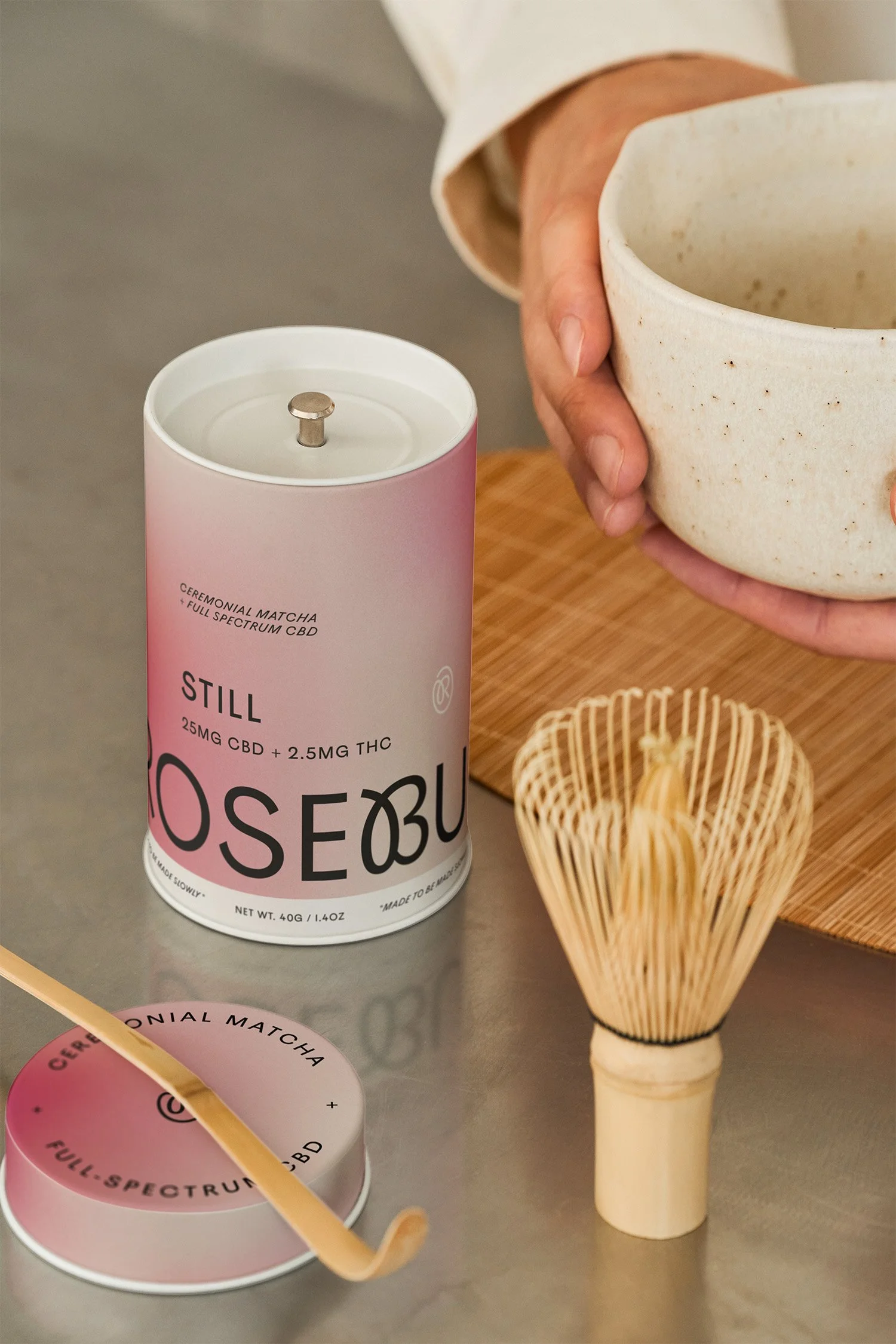
Rosebud Matcha, a functional matcha infused with full-spectrum CBD, occupies a unique space: it’s serious enough to be used medicinally, yet ritualistic enough to make morning routines enjoyable. Everything began with the name, developed by STUDIO ANDOR. The name evokes the slow ritual of ceremonial tea and the “bud' from cannabis, offering a playful nod that avoids feeling clinical or overtly THC-focused. This emphasis on ritual and experience shaped the brand identity: slightly swirled typography in the logo; clean, slanted type for emphasis; gradients that mimic the sensation of the product taking effect; and soft nature photography, reminiscent of a warm, hazy cup. The gradient on the canisters was designed to reflect a gradual loosening, from clarity to relaxation. The wordmark visually captures this idea too: the R and B loop and cross resemble a rosebud, adding a subtle, playful element to an otherwise restrained, almost clinical font. Rosebud’s identity strikes a balance between quirky and polished, thoughtful and tranquil.
RESULTS
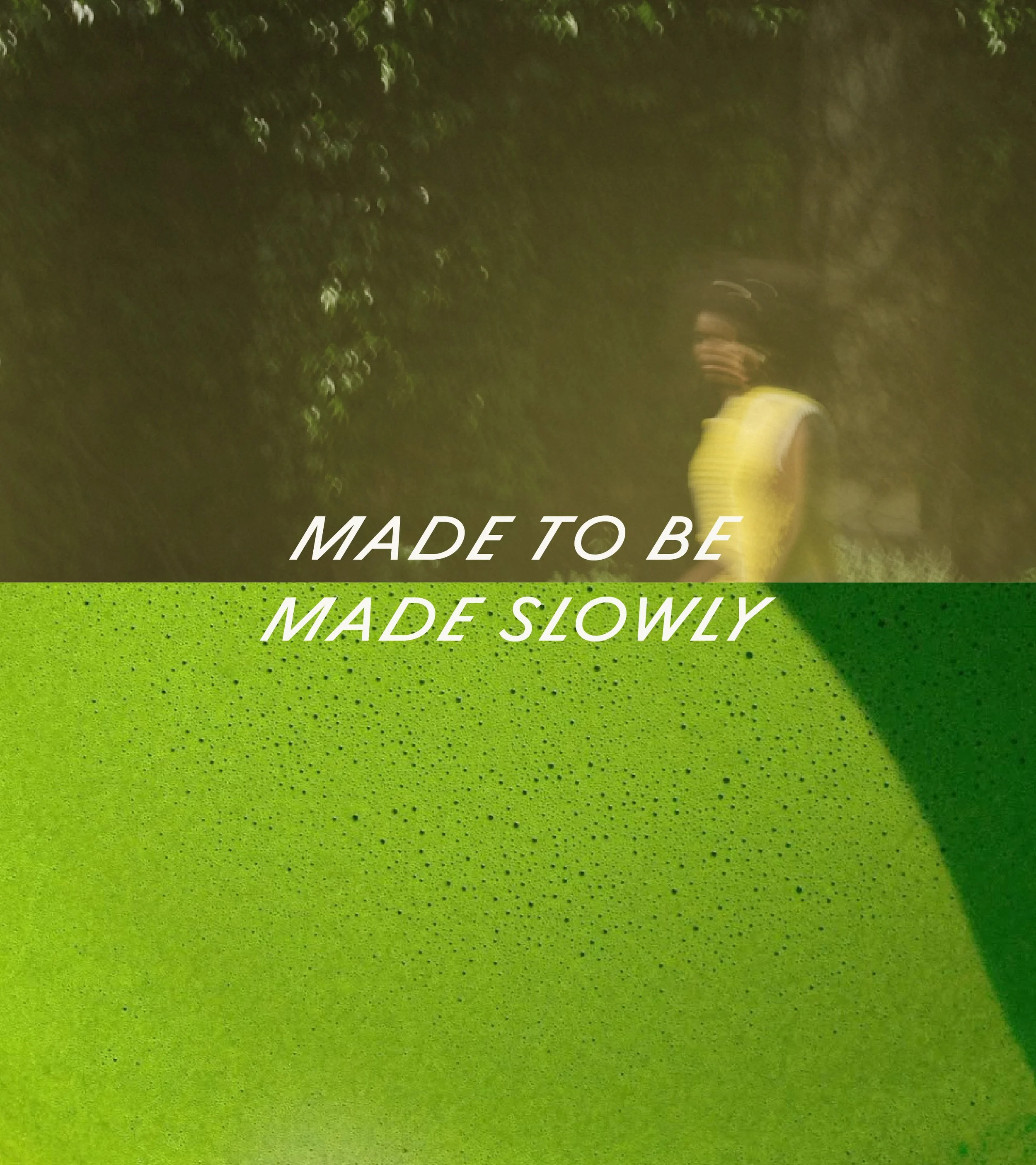
The system remained cohesive across all brand touchpoints, from the canister to lifestyle imagery and the necessary explanatory content for a regulated product. The gradient-inspired palette transformed dosage differentiation from a compliance obligation into a deliberate design choice. The tagline "Made to Be Made Slowly" achieved more impact than typical taglines, linking everything from the lid and social media to the brand film stills without feeling repetitive. Crucially, this project validated a key insight: that a regulated, potentially intimidating product can be made approachable through ritual and restraint, rather than louder marketing or softer euphemisms.


OTHER PROJECTS
-
![Outdoor sign with "OMIKA" on a round, decorative background attached to a building.]()
OMIKA
Brand Identity, Packaging, and Marketing for a women’s clothing brand inspired by the vibrant prints of India.
-
![Black and white image of a person lying face down on a chair outdoors with text "UNSORTED."]()
UNSORTED.
An independent label by Hunter Hardee inspired by technique and voracious curiosity. A line of clothes that challenges the notion of what clothes can be.
-
![Person holding a smartphone displaying a menu for 'Ethos' with options like Club Culture, Ethos News, Team, Schedule, Classes, Memberships, Gallery, Contact, and a 'Become a Member' button.]()
ETHOS ATHLETIC CLUB
A bold website to attract new members, host class signups, and digitally express the world of Ethos A.C.
-
![Person wearing a T-shirt with 'Roseline' text facing shelves of wine bottles and a table with wine glasses.]()
ROSELINE
Brand identity and collateral for an intimate wine bar that boasts fine wines with a side of funky vibes.