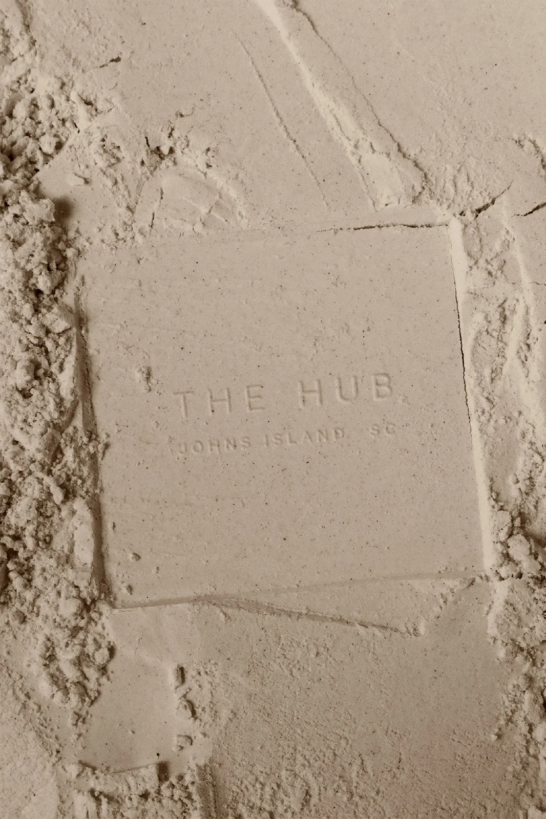
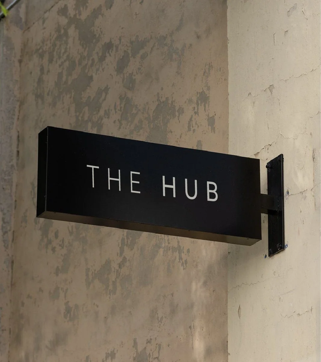
THE HUB ATHLETIC CLUB
BRAND IDENTITY
BRAND STRATEGY
COLLATERAL


STRATEGY
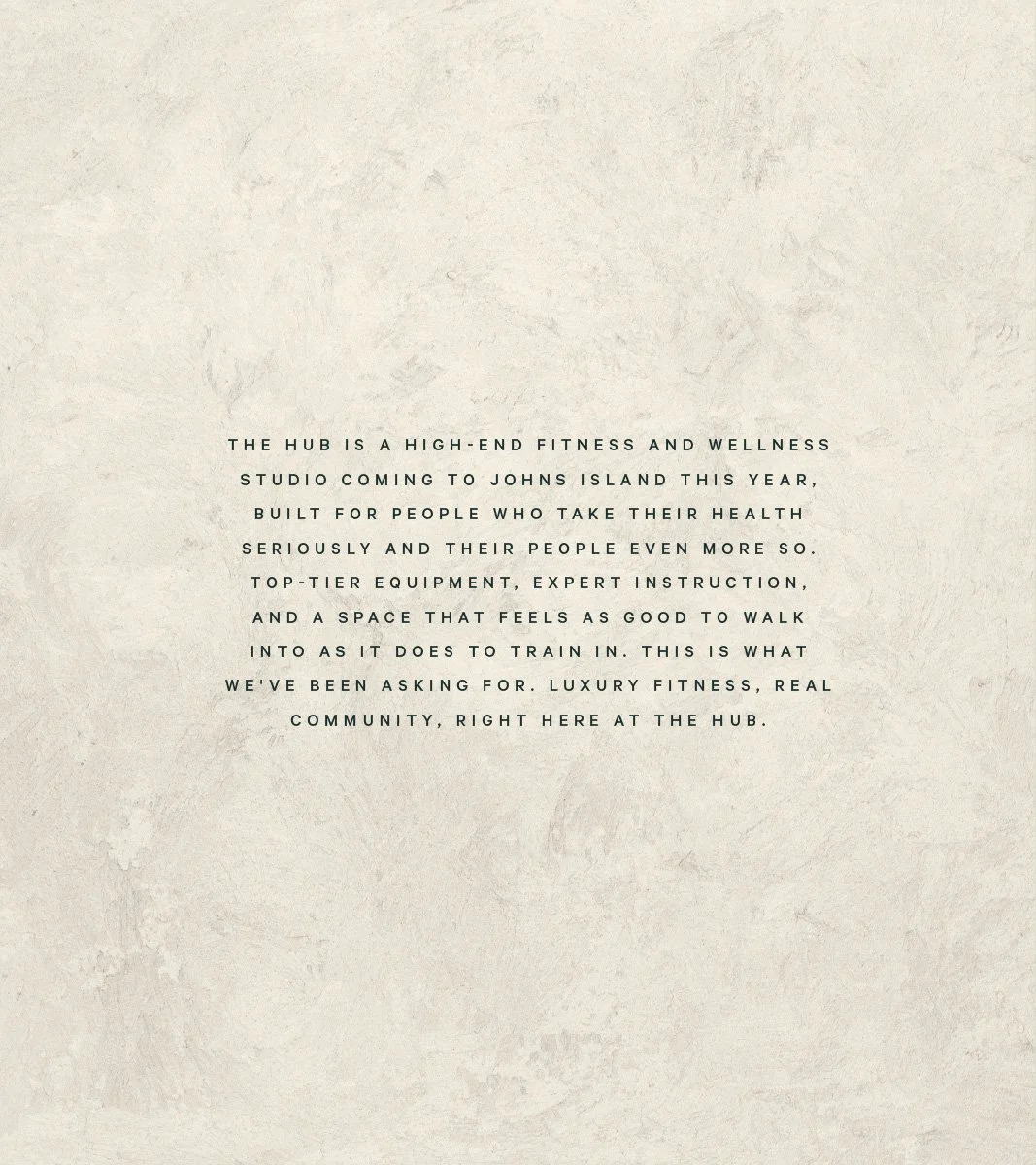
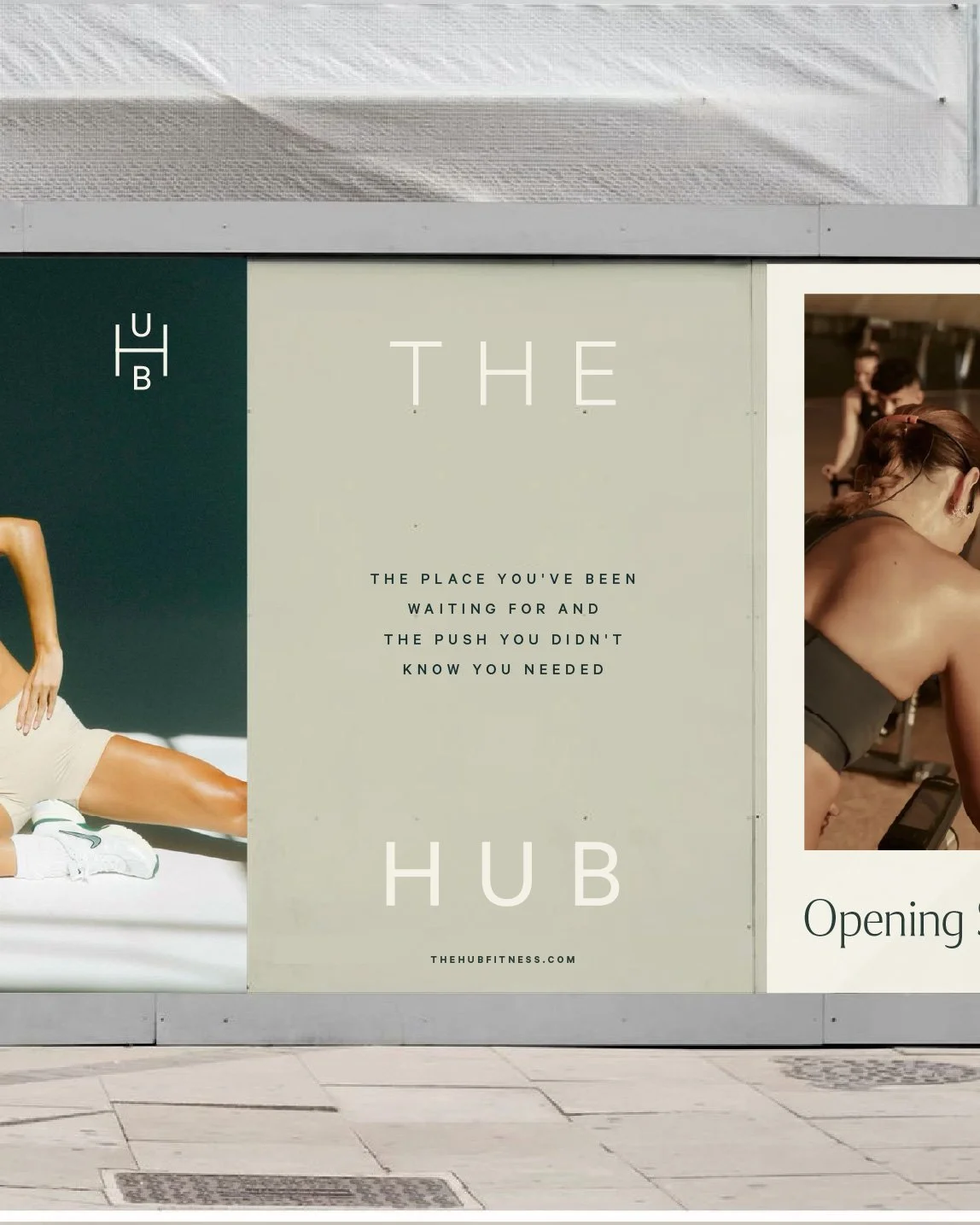
THE HUB came to STUDIO ANDOR with a name that already did a lot of work. A hub is a center point, the thing everything else revolves around, and the brand needed a visual system that could carry that weight without overstating it. The challenge wasn't convincing people this place would be good, but rather making them feel that it had always belonged there and they had always belonged.
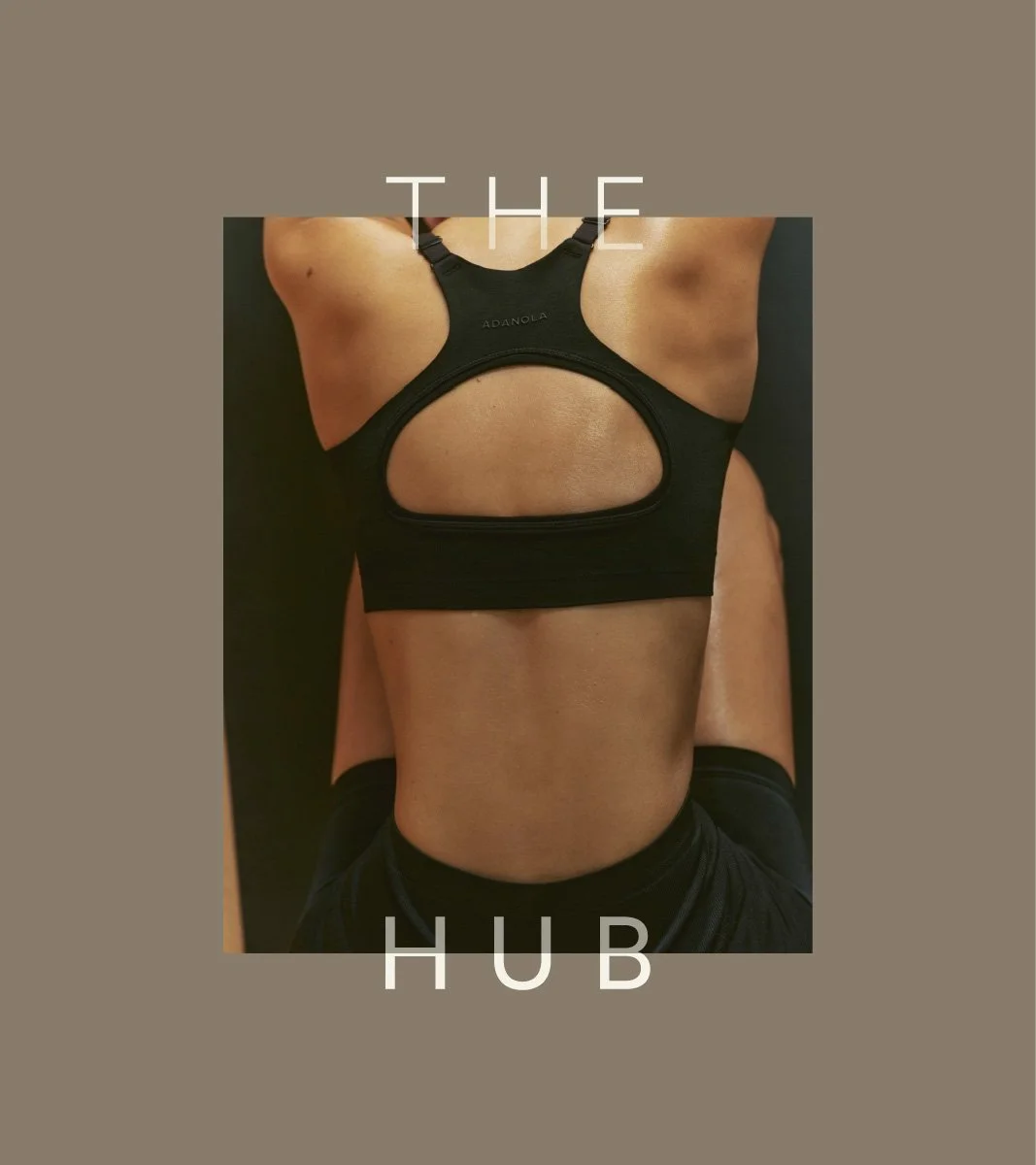
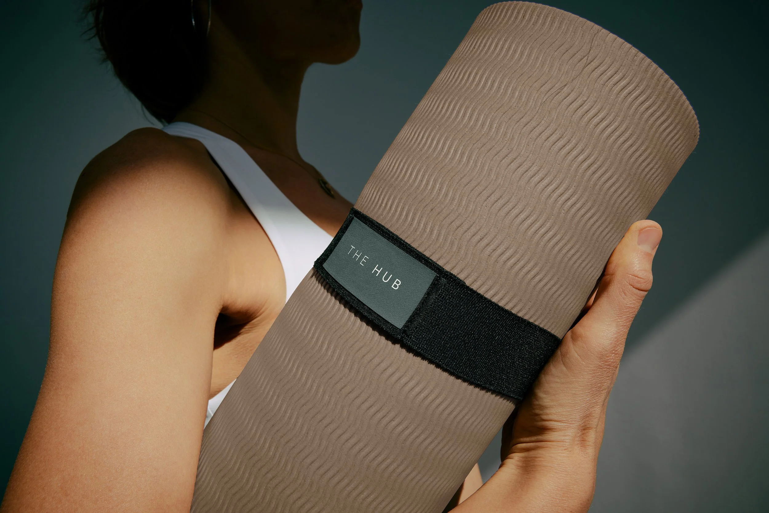
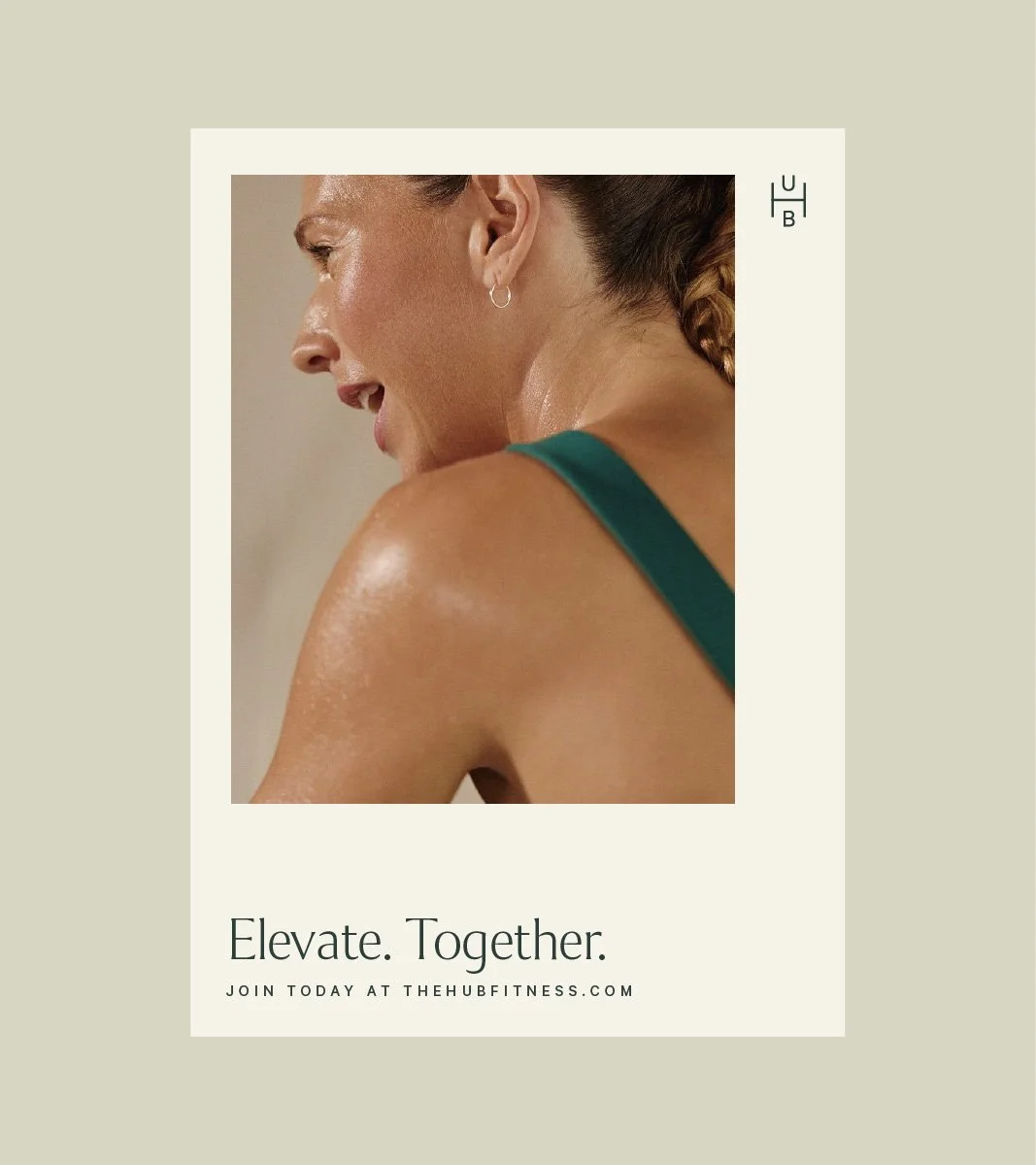
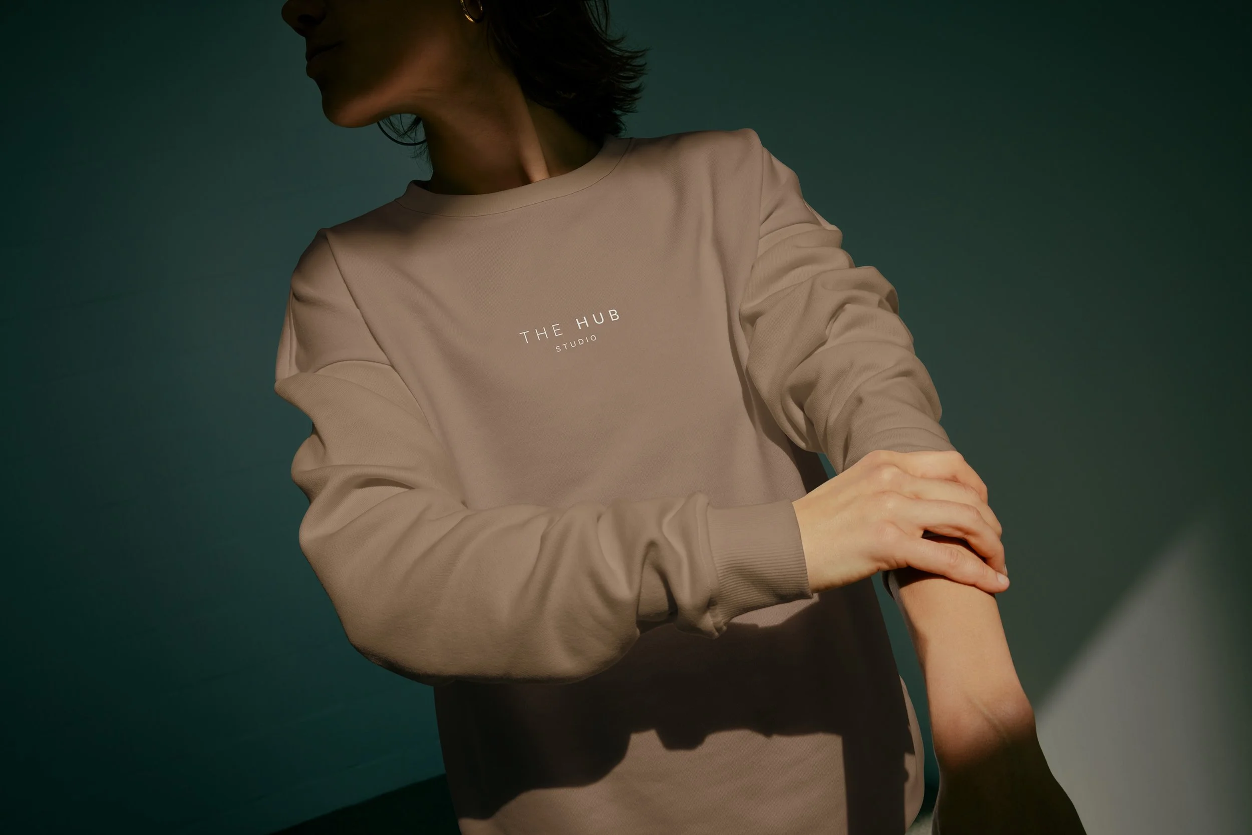
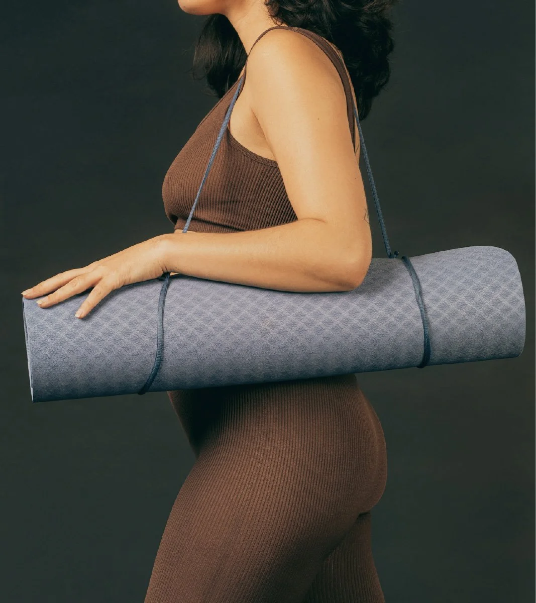
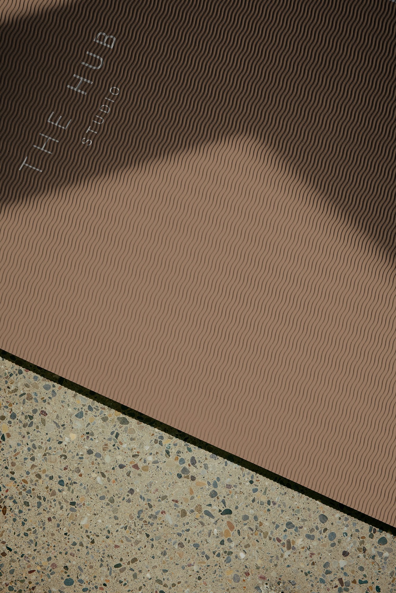
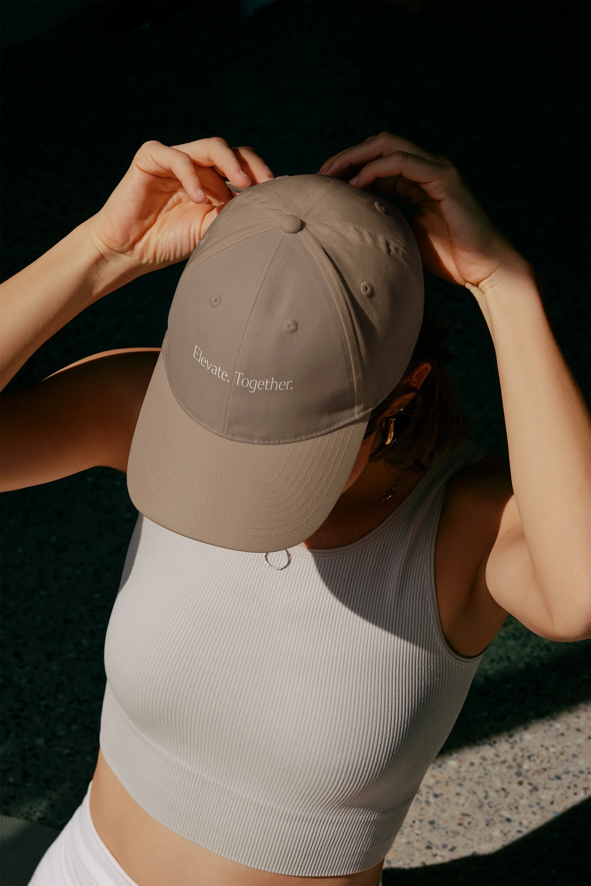
The identity had to hold two things at once: a place where people work hard, and a place they genuinely want to return to. The palette drew from the land itself: warm stone, deep forest green, parchment. These are colors that read as luxury because they're grounded, not because they're shiny, but also calm and refresh members who come to THE HUB. Typography was chosen for presence and restraint, and copy followed the same discipline. We grow better together.
RESULTS
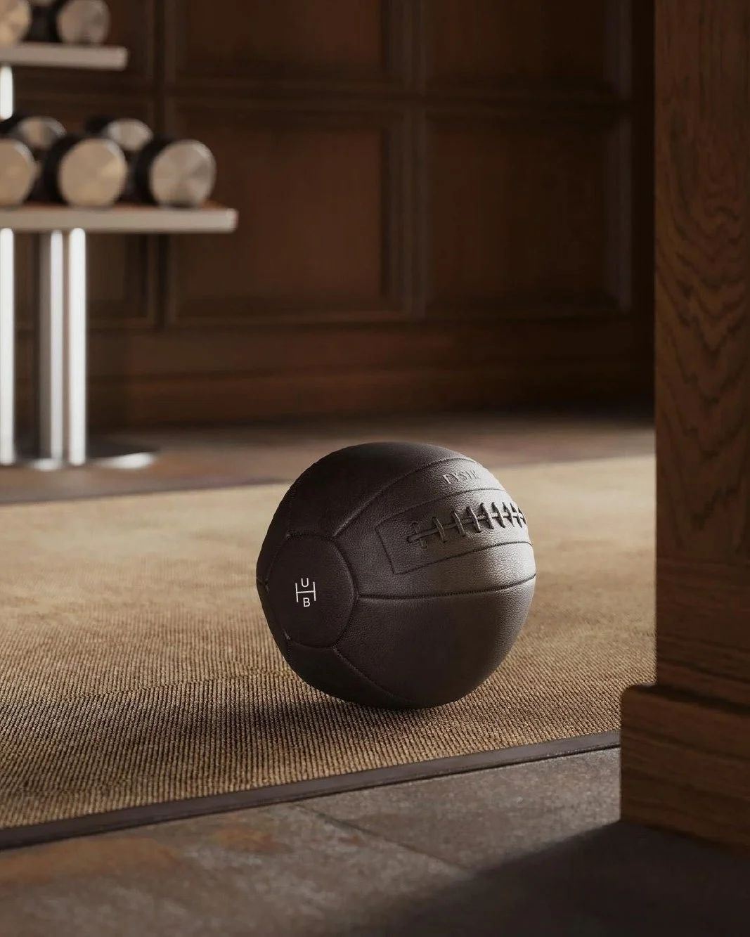
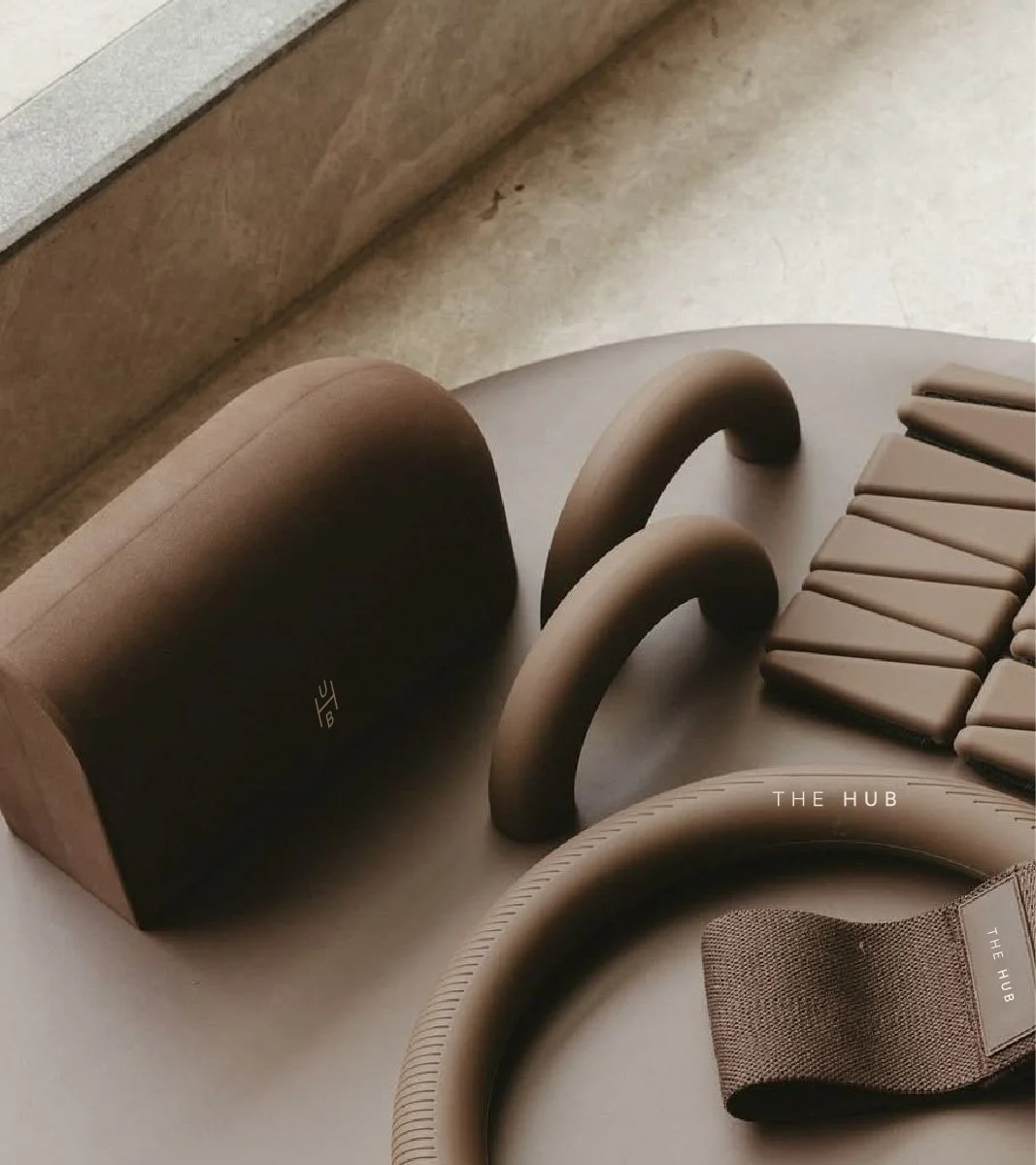
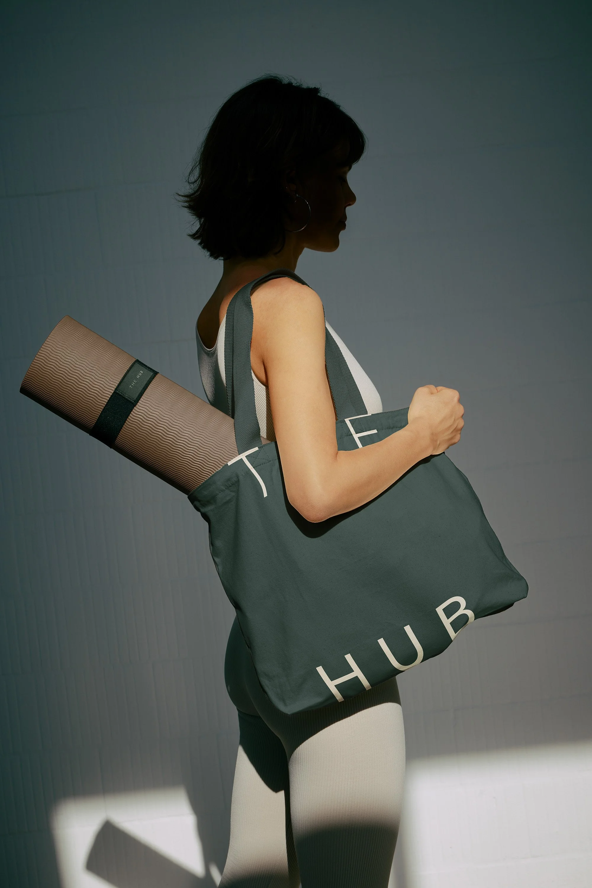
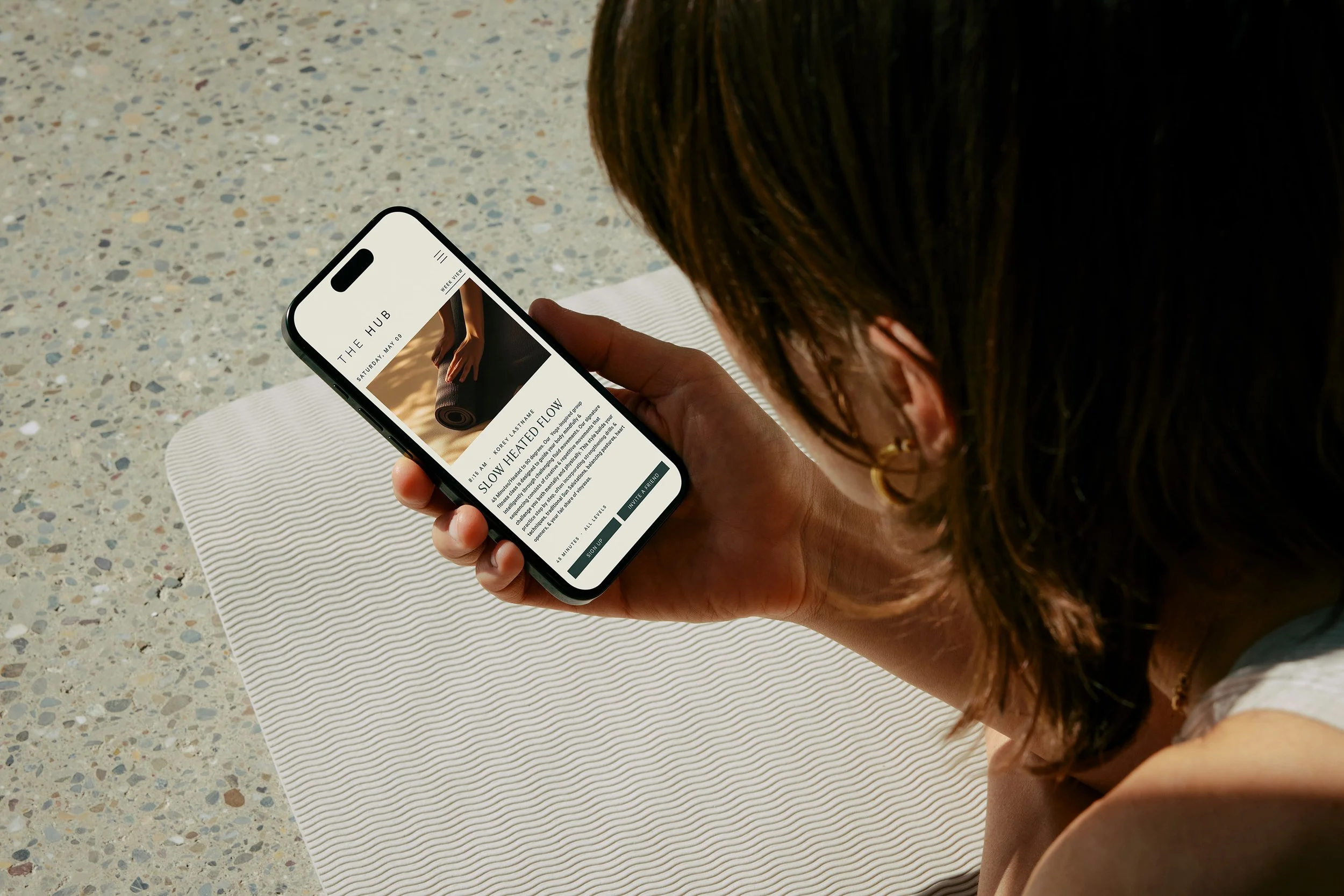
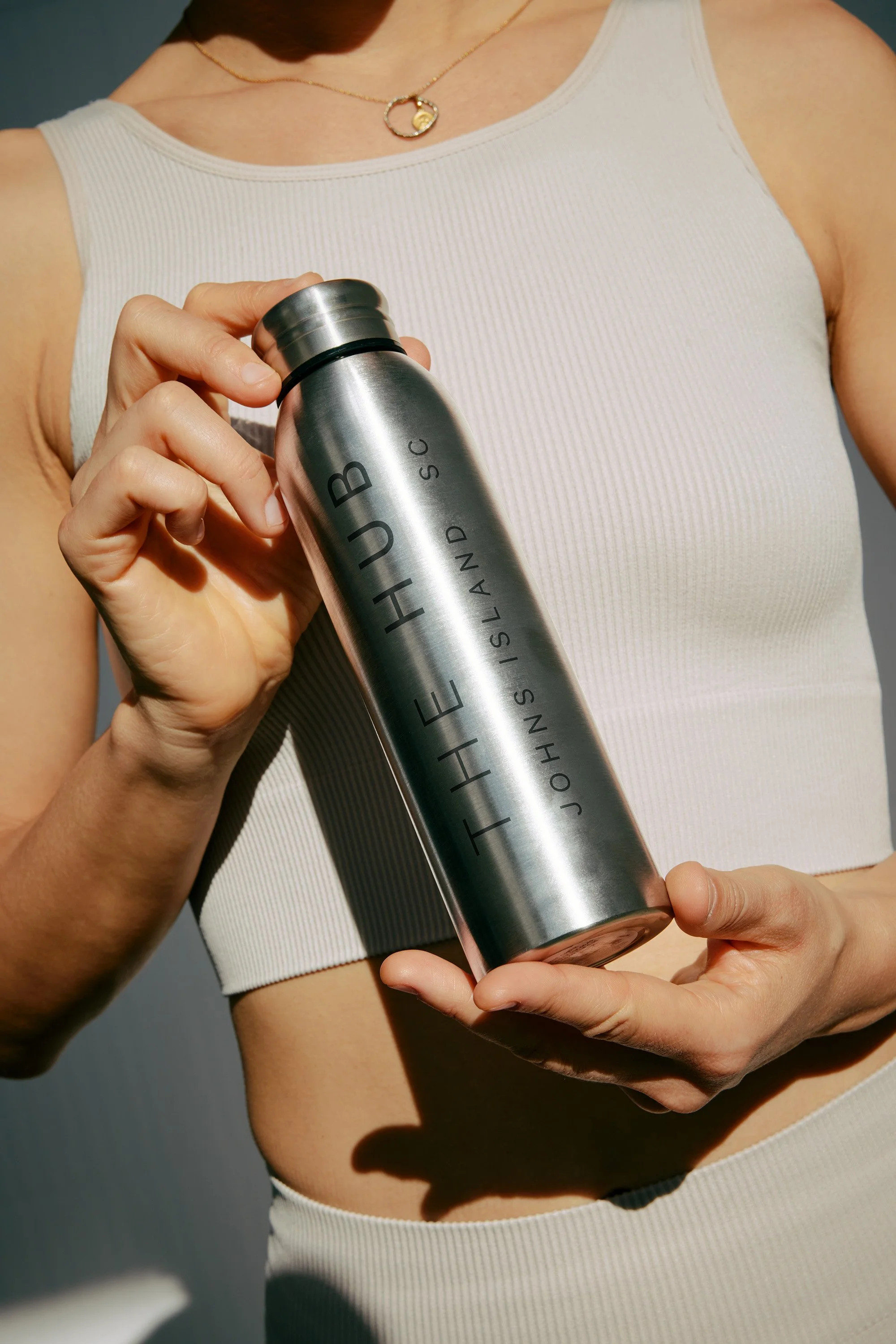
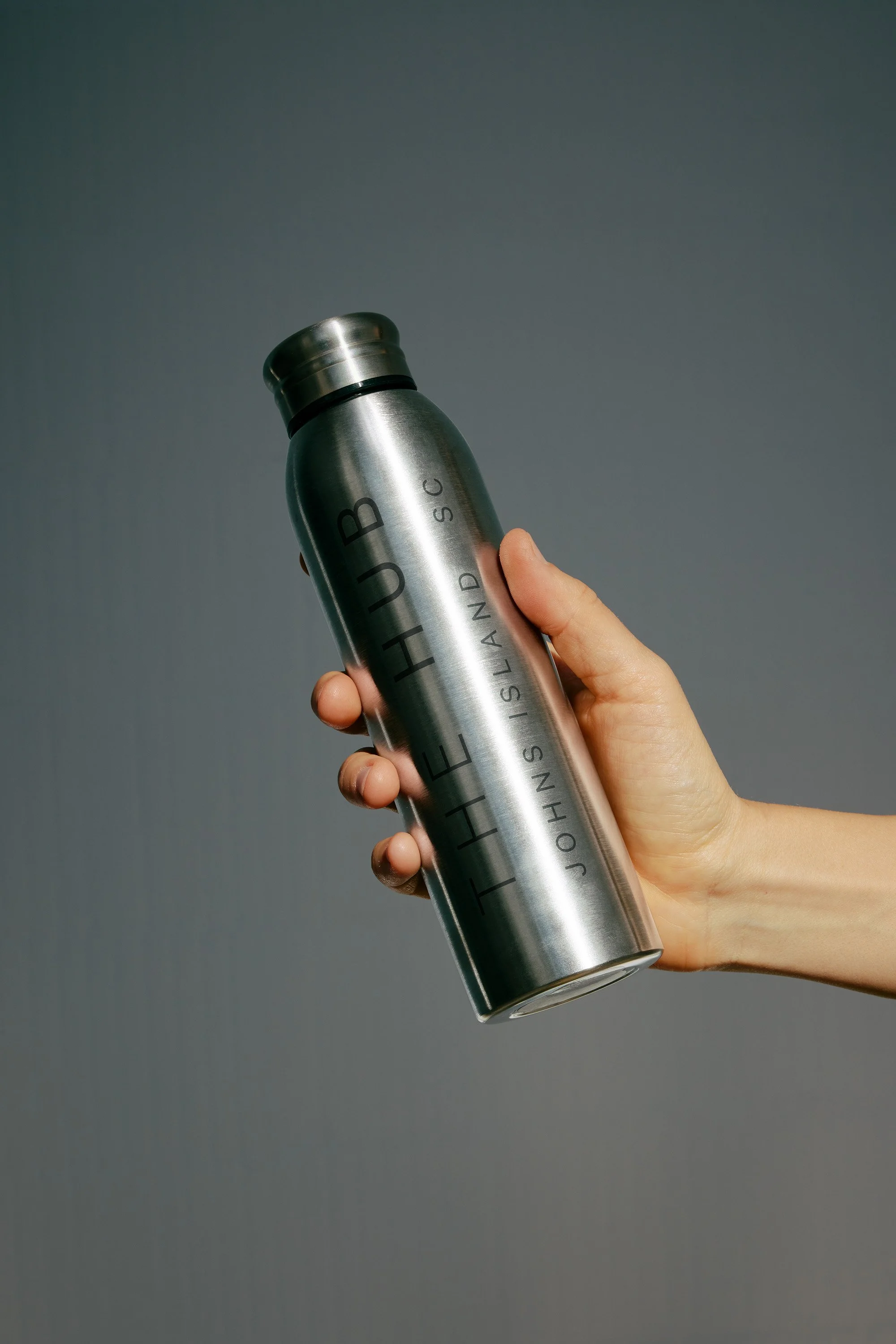
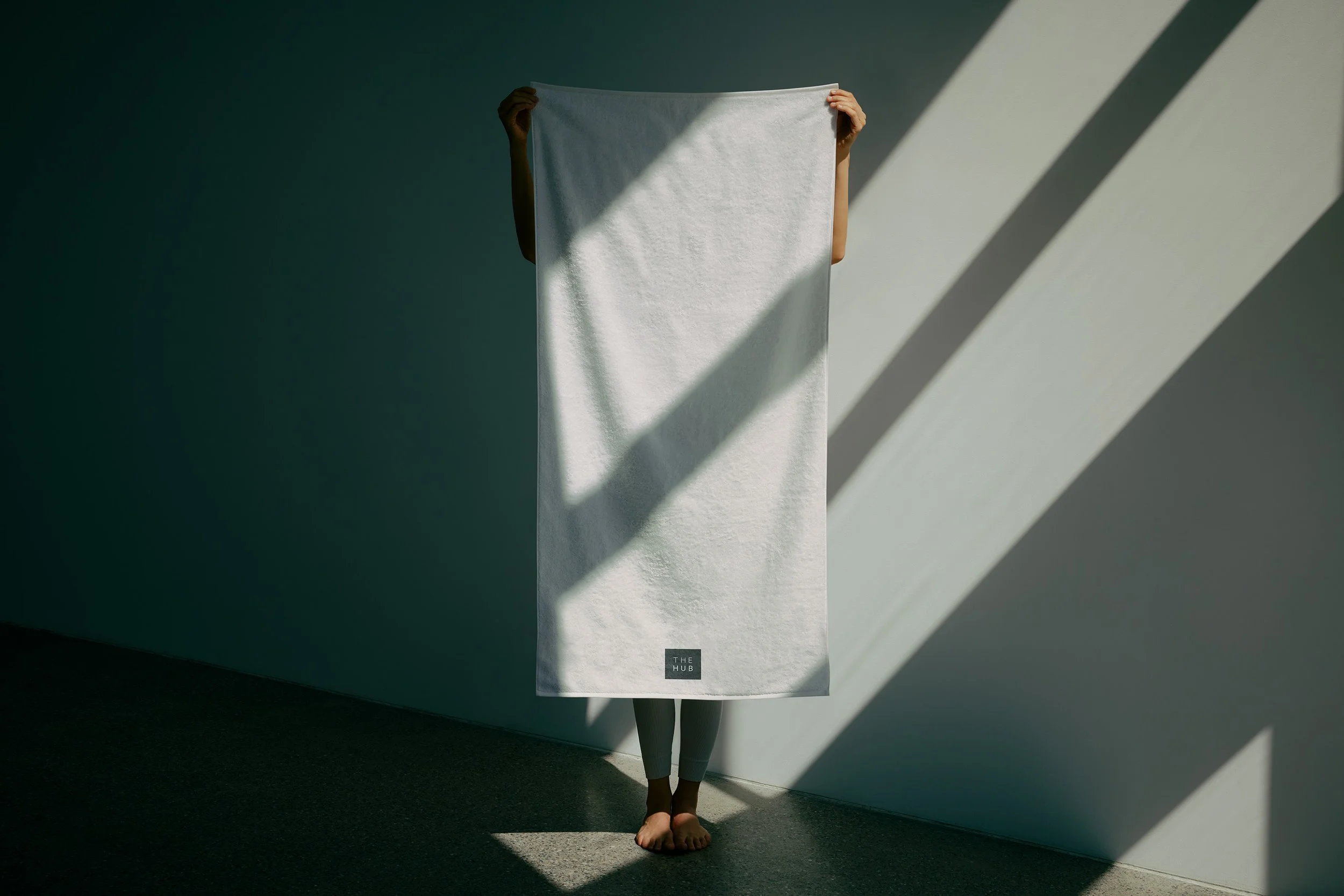
The final system is built for a brand that's still becoming, which means it needed to scale. From water bottles to oversized tote bags, from a mobile class-booking UI to a woven patch on a studio towel, every surface holds the same quiet authority. You are welcome at THE HUB. Bring a friend to sweat the hard stuff with.
With premium, aesthetic merch, the totes, hats, sweatshirts, and bottles turn members into ambassadors before the doors even open. The identity makes joining feel less like signing up and more like arriving somewhere you already belong.
OTHER PROJECTS
-
![Outdoor sign with "OMIKA" on a round, decorative background attached to a building.]()
OMIKA
Brand Identity, Packaging, and Marketing for a women’s clothing brand inspired by the vibrant prints of India.
-
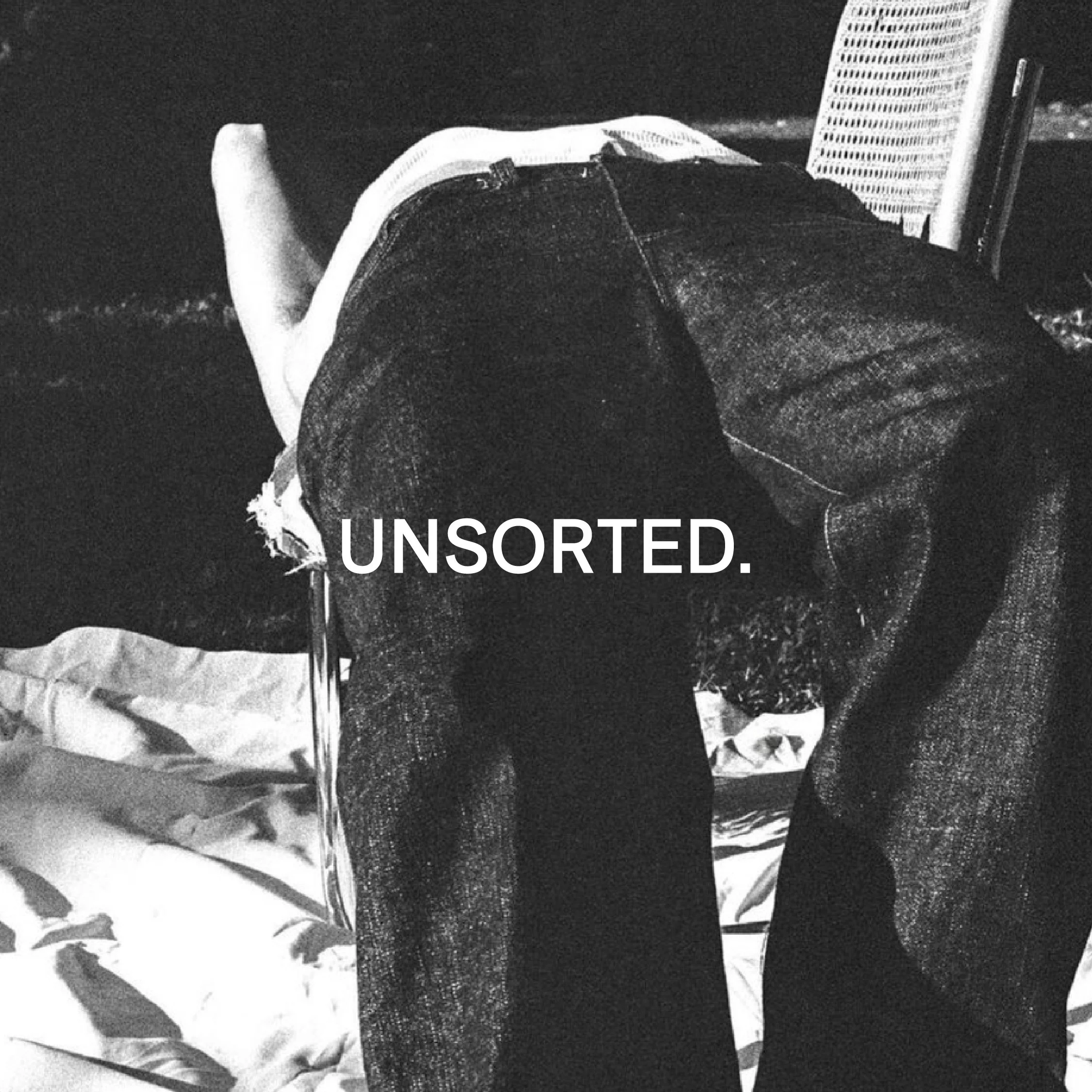
![Black and white image of a person lying face down on a chair outdoors with text "UNSORTED."]()
UNSORTED.
An independent label by Hunter Hardee inspired by technique and voracious curiosity. A line of clothes that challenges the notion of what clothes can be.
-
![Person holding a smartphone displaying a menu for 'Ethos' with options like Club Culture, Ethos News, Team, Schedule, Classes, Memberships, Gallery, Contact, and a 'Become a Member' button.]()
ETHOS ATHLETIC CLUB
A bold website to attract new members, host class signups, and digitally express the world of Ethos A.C.
-
![Person wearing a T-shirt with 'Roseline' text facing shelves of wine bottles and a table with wine glasses.]()
ROSELINE
Brand identity and collateral for an intimate wine bar that boasts fine wines with a side of funky vibes.