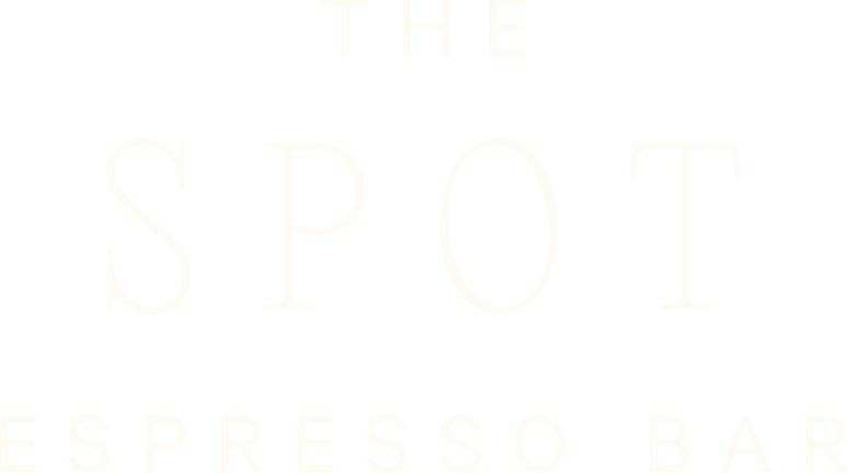
THE SPOT ESPRESSO BAR
BRAND IDENTITY
BRAND STRATEGY
PACKAGING DESIGN

STRATEGY
The Spot came to Studio Andor with a name that already had personality The challenge was building a visual system worthy of it. The brief was deceptively simple: a craft espresso bar rooted in Japanese minimalism, where the coffee is serious, but the atmosphere isn't. The identity needed to honor both the precision of the craft and the ease of a place people actually want to return to.
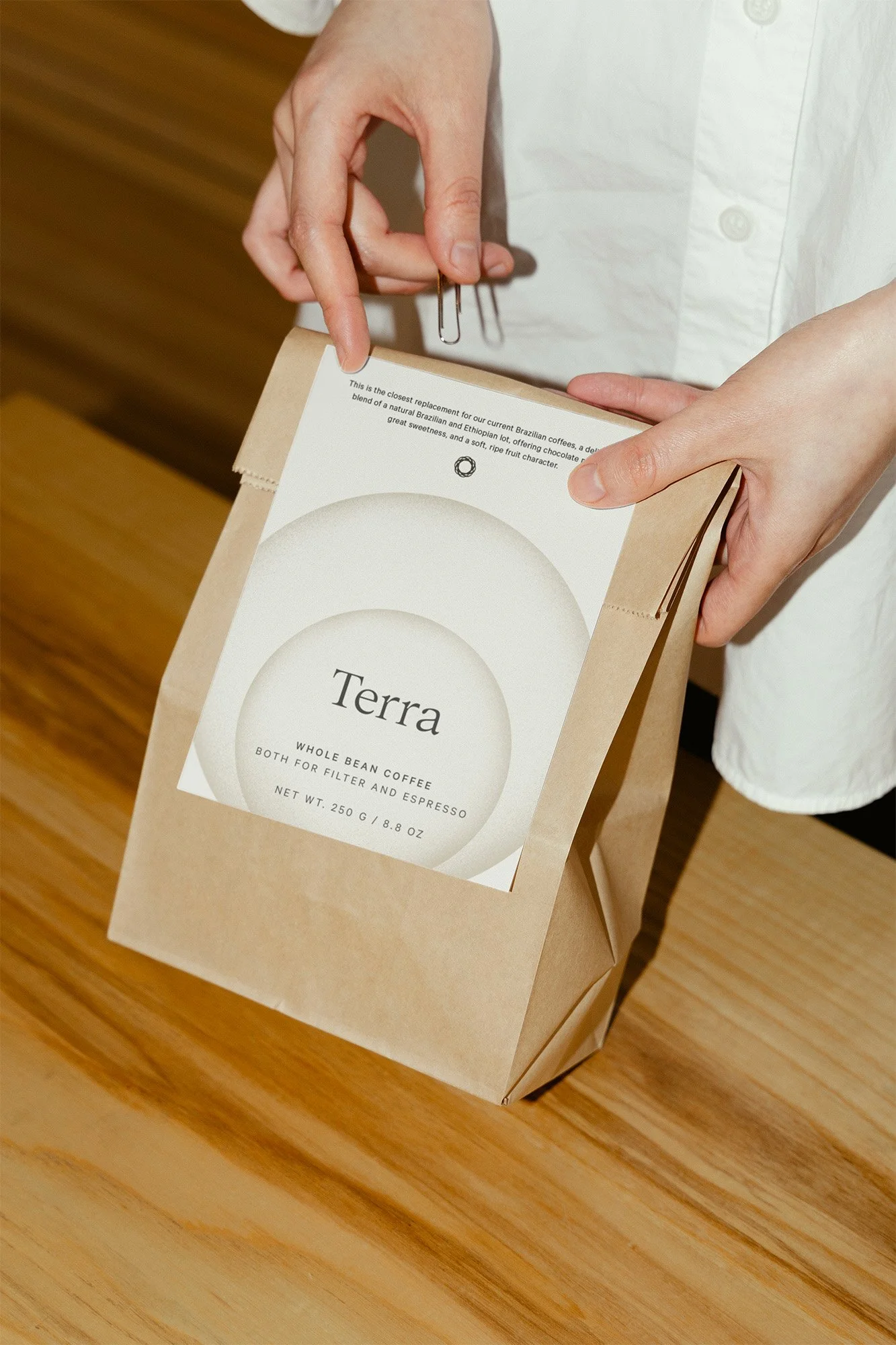
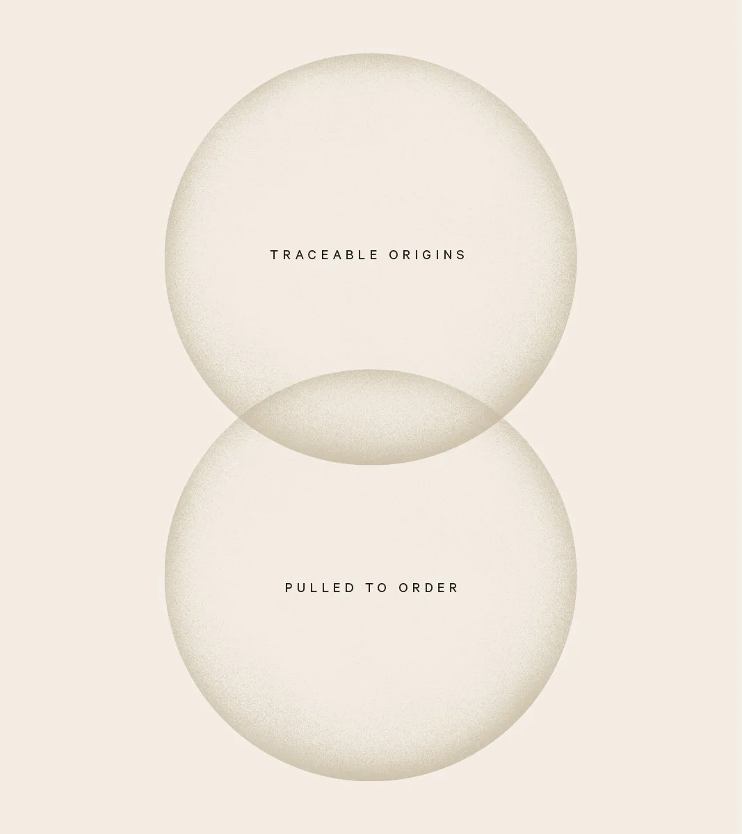
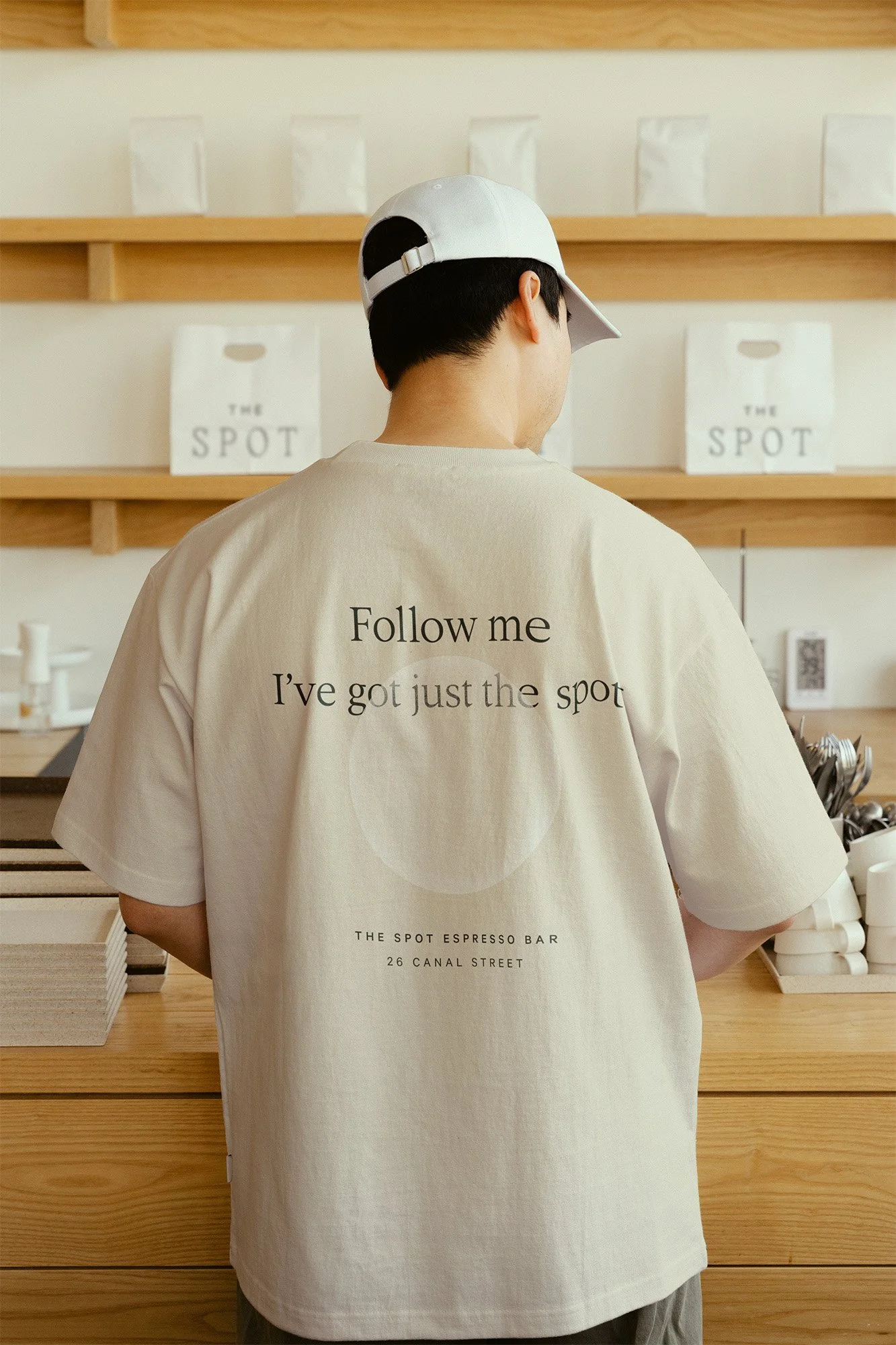
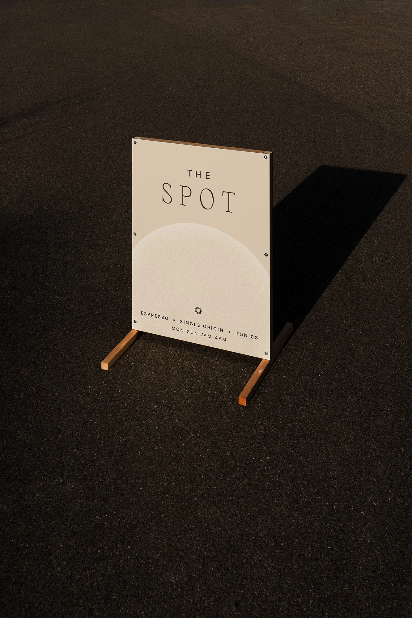
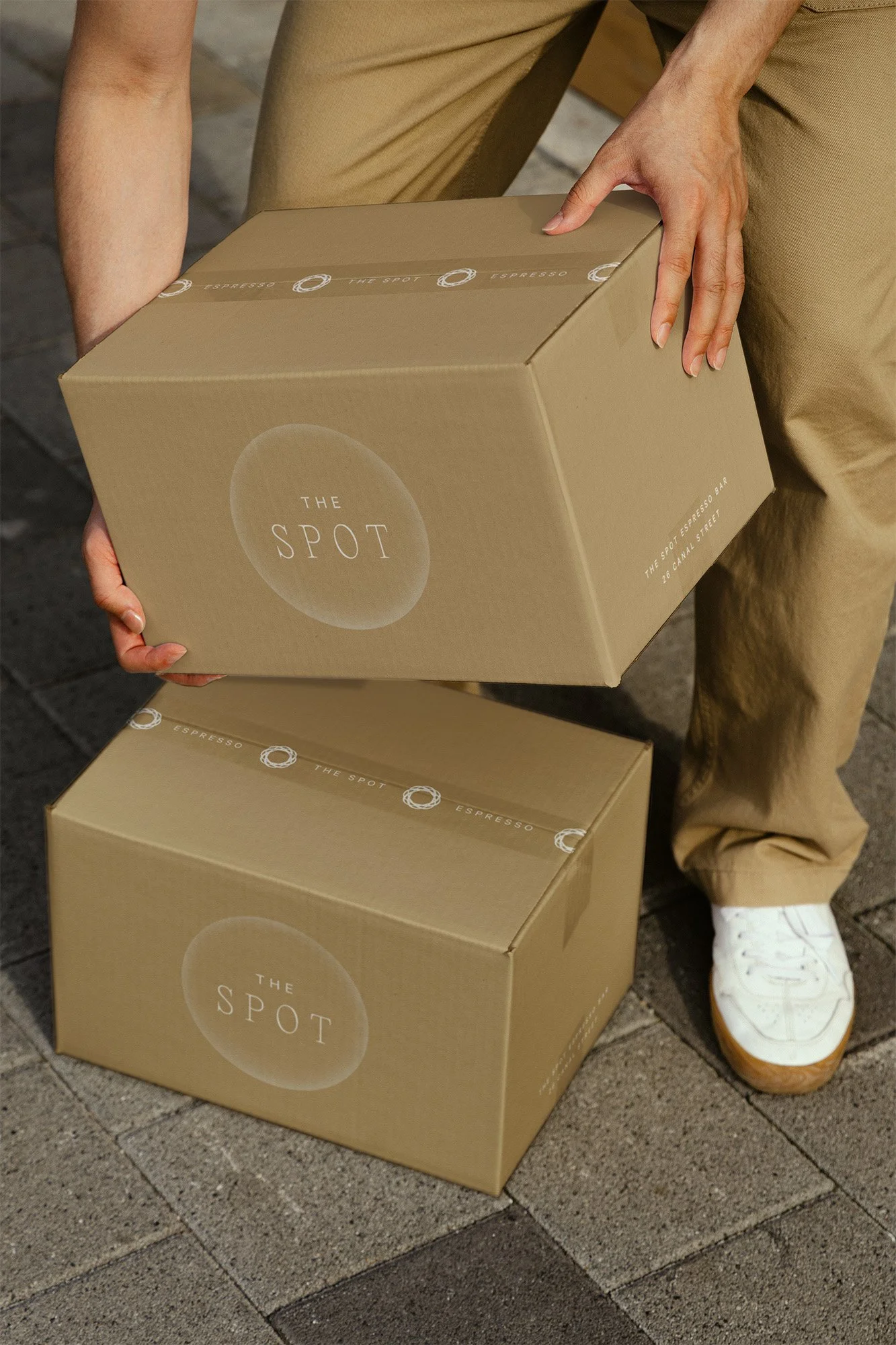
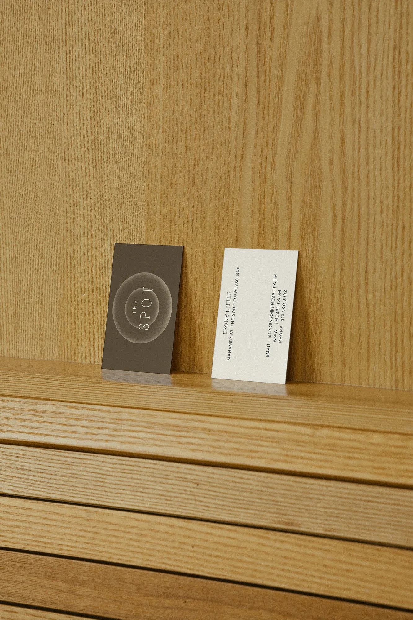
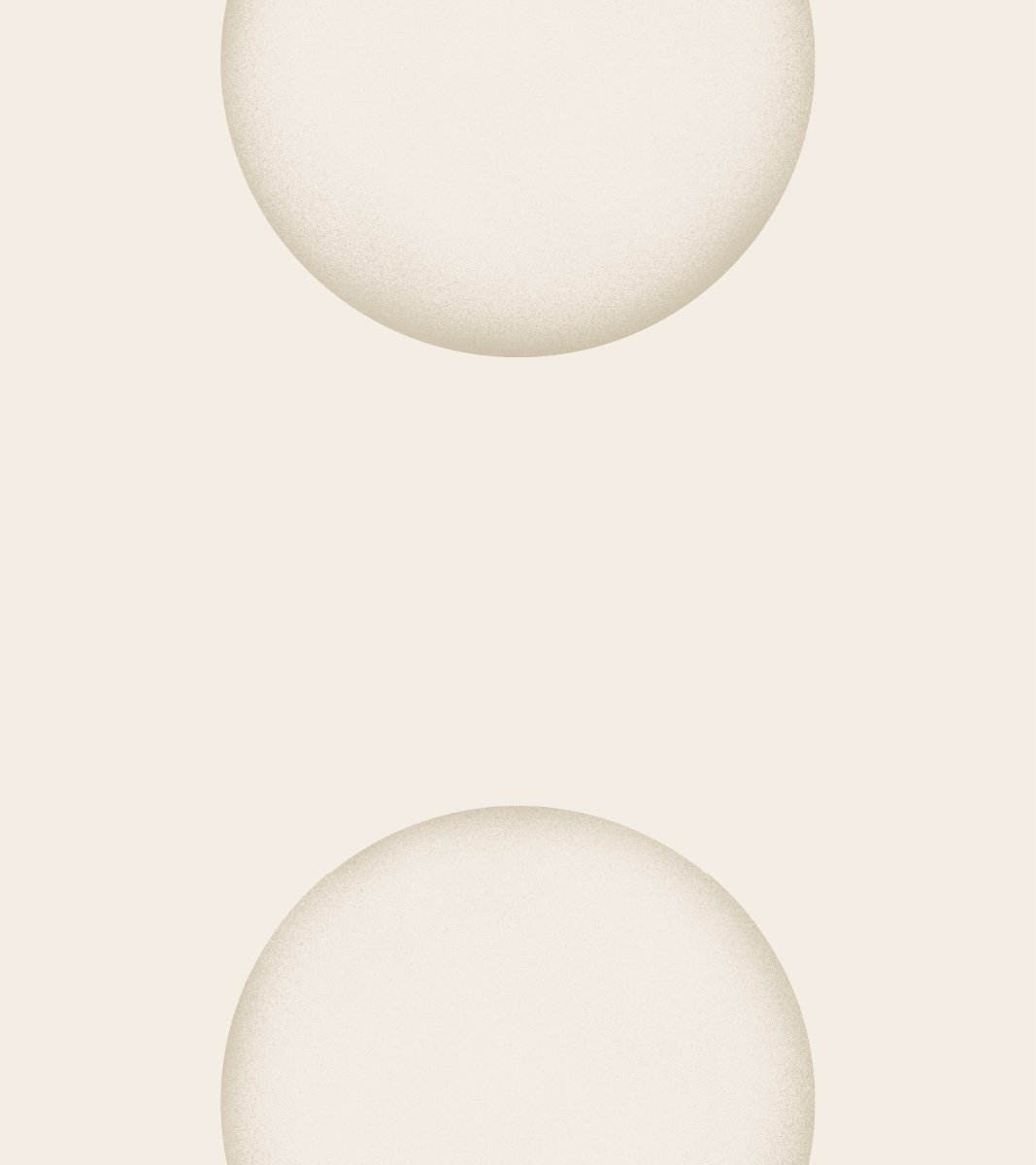
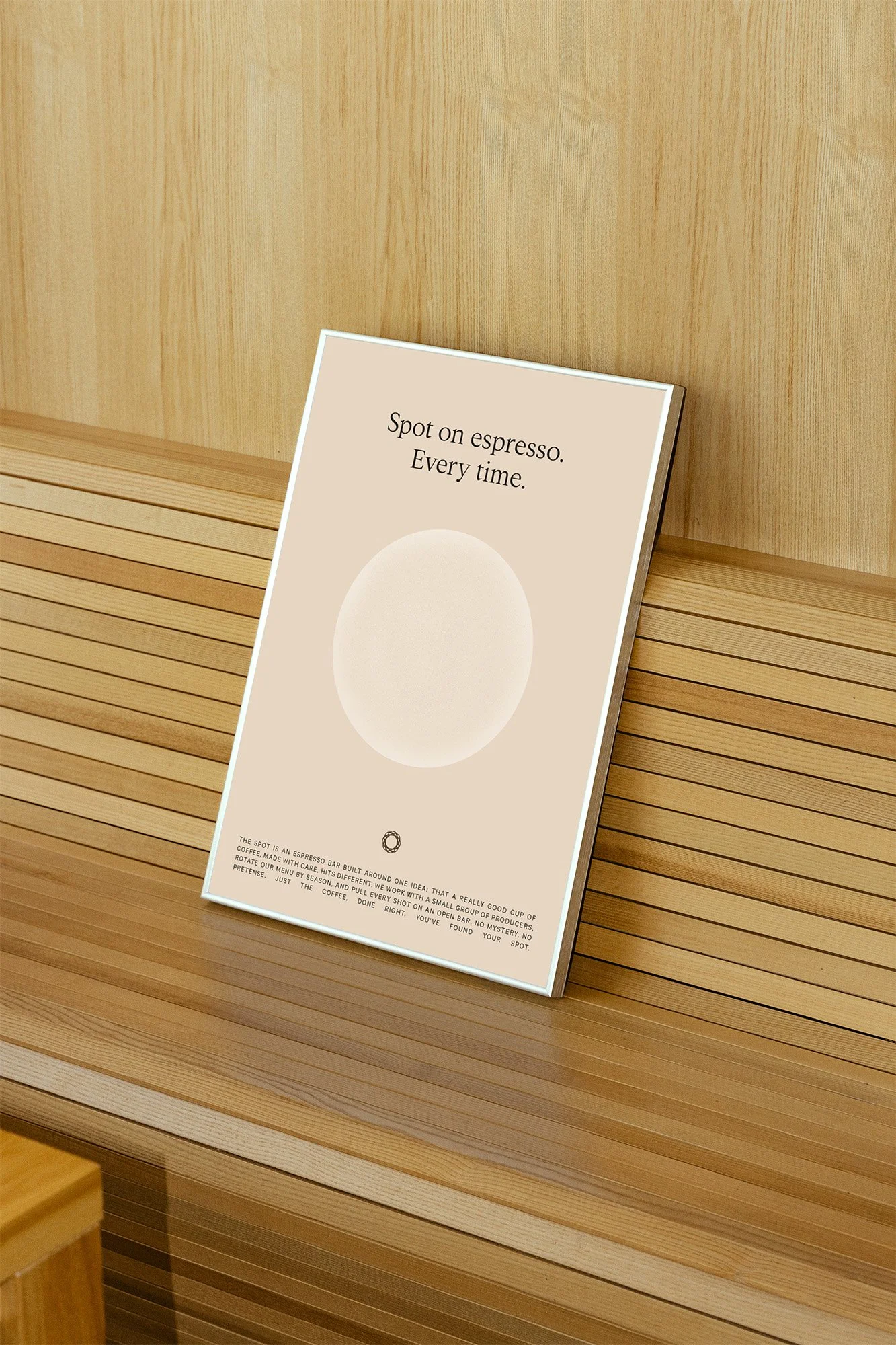
The design system was built around a single form: the circle. The espresso process is circular at every turn: the group head, the portafilter, the cup, the pour, the swirl of steamed milk finding its shape. The brand's signature mark takes the O from SPOT and turns it into an imperfect circle rotated and layered until a uniform form emerges, the way a barista works the pitcher around the cup again and again until the milk and espresso become one. Graphic concentric rings appear throughout the system, doubling down on the spot motif.
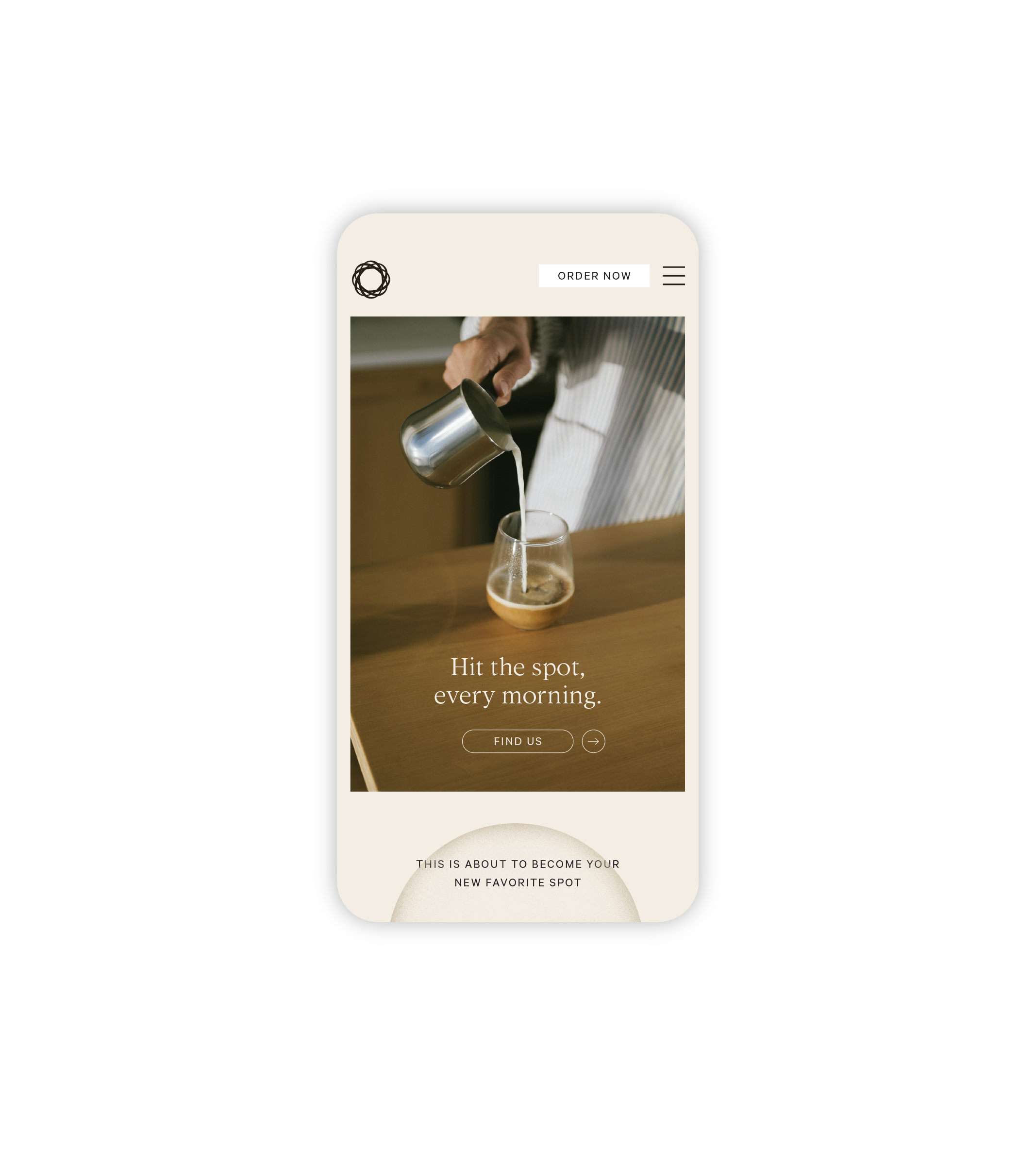
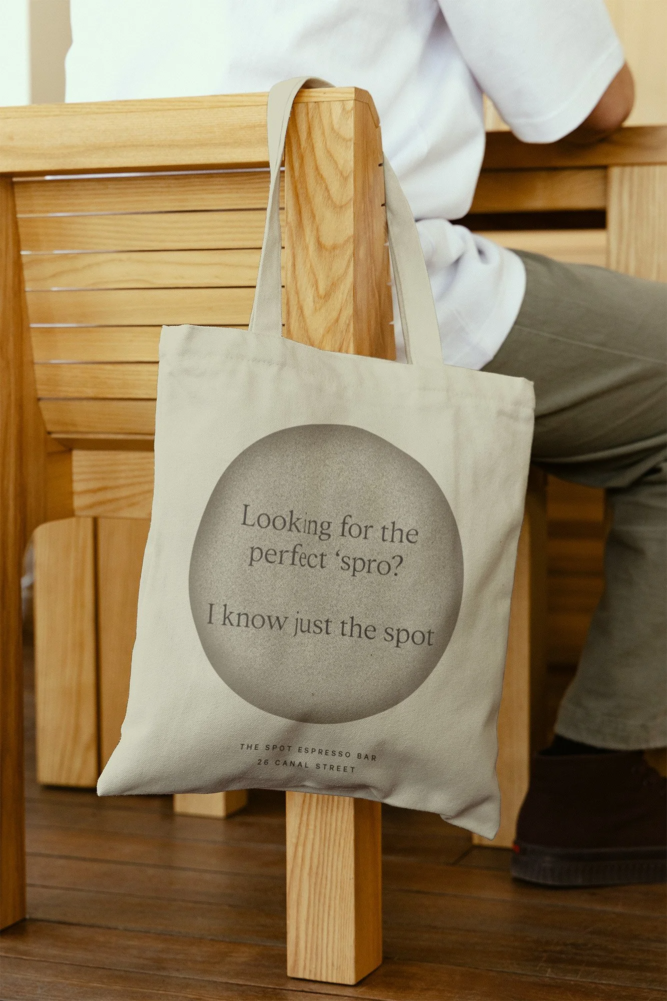
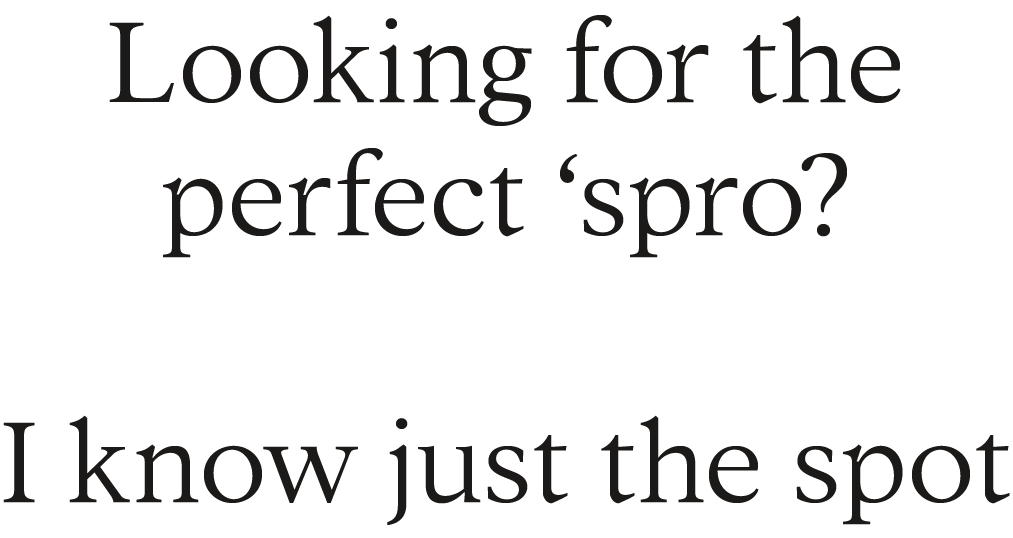
Color follows the same logic. The palette draws from coffee itself: the near-black of a straight shot, the warm caramel of a cortado, the soft ivory of a well-pulled flat white. Every tone exists somewhere between the bean and the cup, depending on how much milk you add. Typography was chosen for its ease: a breezy, tight serif that reads clearly at small scale and carries the puns with a straight face. The copy voice followed: warm, a little knowing, never try-hard. Hits the spot. I know just the spot. Follow me, I've got just the spot.
RESULTS
The final system is minimal by design and generous by nature, with lots of breathing room, deliberate negative space, and every element placed with the same intention as a barista setting up their station before the first pull of the day. The identity extends across cups, totes, staff tees, packaging, shipping boxes, signage, and business cards, each surface finding its own moment within the same quiet vocabulary.
The circular mark scales from a debossed whisper on kraft paper to a full-bleed presence on a sidewalk sign. The staff tees and totes turn regulars into walking word-of-mouth. The to-go cup says Hits the spot and means it. The whole system is perfectly balanced, both invitational and upscale. It’s sure to be your new favorite spot.


OTHER PROJECTS
-
![Outdoor sign with "OMIKA" on a round, decorative background attached to a building.]()
OMIKA
Brand Identity, Packaging, and Marketing for a women’s clothing brand inspired by the vibrant prints of India.
-
![Black and white image of a person lying face down on a chair outdoors with text "UNSORTED."]()
UNSORTED.
An independent label by Hunter Hardee inspired by technique and voracious curiosity. A line of clothes that challenges the notion of what clothes can be.
-
![Person holding a smartphone displaying a menu for 'Ethos' with options like Club Culture, Ethos News, Team, Schedule, Classes, Memberships, Gallery, Contact, and a 'Become a Member' button.]()
ETHOS ATHLETIC CLUB
A bold website to attract new members, host class signups, and digitally express the world of Ethos A.C.
-
![Person wearing a T-shirt with 'Roseline' text facing shelves of wine bottles and a table with wine glasses.]()
ROSELINE
Brand identity and collateral for an intimate wine bar that boasts fine wines with a side of funky vibes.