

Where I Actually Find Visual Inspiration (That Isn’t Pinterest)
When I was growing up, my neighbor’s parents were a fine art painter and a graphic designer. I spent a lot of time in their house as a kid, perusing their bookshelves, listening to the Beatles, playing with their sculptures, eating snacks while surrounded by mid-century modern furniture and Venezuelan artifacts. During the summertime, my artist grandmother took my sisters and me to ballets, orchestras, and museums. My best friend and I practically lived at Barnes & Noble, poring over interior design and fashion magazines. As a craft, I used to collect my parents’ catalog mailers and collage Victoria’s Secret ads into Crate and Barrel living rooms on my bedroom floor.
I didn’t realize until much later that all of that was the basis of curation.
(P.S., I’m going to use curation, research, and moodboarding interchangeably in this essay. To me, they are all part of the process of figuring out where your designs are going.)
Design school made the process more formal. Our professors had very little patience for Pinterest or Behance references, and for good reason: if you showed up with something you’d found on a mood board platform, odds were that at least one classmate had found the exact same image. They sent us to the library instead, into the photography archives, the lithography collections, whatever was relevant to the project. Dig deeper, they’d say, and you’ll make richer work.
My great-uncle built many of the buildings in Dallas, all influenced by the Gothic style he’d encountered while traveling through Europe early in his career. His theory was simple: if you mimic what’s modern, your building will one day look dated. If you pull from history, it never will. I think about that a lot. Rooting your references in something with substance, rather than in whatever is passing for cool right now, is the difference between work that lasts and work that has an expiration date.
So, here’s where I actually go when I need to fill the creative well.
Independent Bookstores
The key is not to go to a chain (while you will still definitely find great inspiration there). The real treasures are found at the hole-in-the-wall, this-was-my-dream-to-open-a-bookshop kind of stores. The kind you stumble into on a narrow street and spend two unplanned hours inside (think Notting Hill). Good Company Books in Lisbon. Printed Matter in Manhattan. Wild Detectives in Dallas. These are places where the inventory itself has a point of view, and the person who curated the shelves clearly has opinions.
What you find in stores like this isn’t just books, it’s bookbinding as design. The covers are letterpressed, the pages use risograph printing processes, and the book designer used paper combinations you’d never think to put together yourself and employs illustration styles that predate every trend currently circulating. I always leave wishing I could have seen everything, knowing I can always go back, and usually carrying home something I didn’t plan to buy. My suitcase is usually over the weight limit due to the books I can’t leave behind.
Wherever I travel now, I plan to go to two things: a modern art museum and a good independent bookstore. Everything else is flexible.
YOUR HOMEWORK
Find the best independent bookstore or art book shop within an hour of you and go without a list. Pick up anything with a cover that stops you. You don’t have to buy it, just hold it, look at it, and figure out why it works. Take lots of pictures. Pictures are free.
The Park (Or Anywhere You Sit Still)
There was a park I used to go to every Saturday morning after pilates. I’d sit on a bench with a cheap black coffee in hand, recovering from the workout and letting my mind wander. At this park, I would watch dogs hop up onto the fountain rim to bark at birds and watch the sleepy town slowly wake, people shuffling with a friend to get breakfast. Immediately. I loved it there because it had the particular kind of quiet that only exists before noon on a weekend.
I always had a novel and a notebook in my bag, so at this park, I would find myself sketching the latticework on the garden fence, trying to make sense of its unusual rhythm. I would catalog how people dressed: a symphony of stripes, billowing trousers, rumpled linen with polished loafers. Some of the most interesting color combinations I’ve ever encountered were worn by strangers on park benches who had no idea they were a reference. I have a whole folder on my phone of candid photos from those Saturday mornings, all of them useful in ways I couldn’t have predicted.
When researching, you don’t always come home with something concrete, and that’s okay. Sometimes you just come home with a clearer head. The best ideas tend to arrive when you stop forcing the agenda and give your brain somewhere beautiful to wander.
YOUR HOMEWORK
Go somewhere with people and no task. Bring your camera (a phone works) and give yourself permission to photograph anything that catches your eye: an outfit, a shadow, a texture, a color combination you didn’t expect. Don’t curate in the moment. Just collect. I like to bring a sketchbook with me, too, to press leaves, put flyers or business cards into, or draw interesting moments.
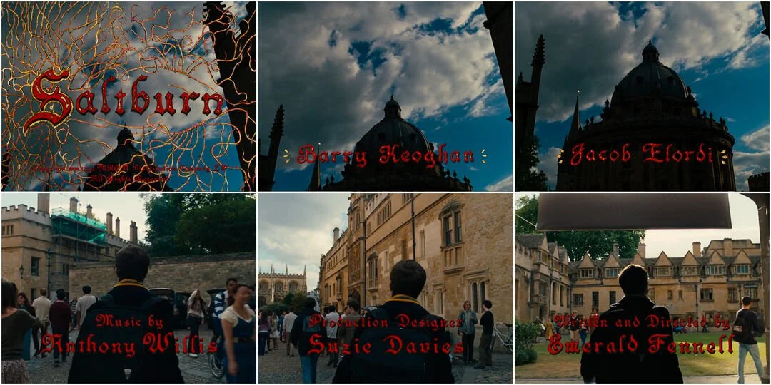
Films
I know this might come across as pretentious or performative, but stay with me here.
Films are some of the most complete works of visual world-building that exist. Every choice is deliberate and working together: the color grading, the set design, the costuming, the typography in the title sequence. The cold sterility of one film’s palette vs. the warm, sun-dappled nostalgia of another. Saltburn’s opening credits informed a project I was working on last year in ways I’m not sure I could fully explain. Wes Anderson’s typography (by Designer Annie Atkins) has quietly shown up in more of my work than I’d like to admit.
What I find most useful isn’t the visual style alone, it’s the logic behind the choices. Sofia Coppola scores Marie Antoinette with modern punk and rock. It shouldn’t work. But it totally works because the music isn’t about the period; it’s about how a teenage girl might feel being forcibly married into a foreign court. One unexpected creative decision reframes the whole film. That kind of thinking translates directly into design, and it’s the kind of thing you can only absorb by watching closely.
YOUR HOMEWORK
Watch the first ten minutes of a film you’ve been meaning to see, but watch it on mute first. Pay attention to what the visuals alone communicate about mood, world, and character. Then watch it again with sound and notice what changes.
The Record Store (Or the Music Section at a Thrift Store)
Album covers are a masterclass in constrained design. They have to stop you cold, communicate genre and vibe, build a whole world, and be memorable, all within a 12-by-12-inch square.
What I love about digging through records/CDs is the typographic fearlessness. Album cover designers have never cared much about rules, and every decade left its own visual fingerprint: the hand-lettered psychedelia of the sixties, the brutalist photography of punk, the maximalist excess of the eighties, the grainy lo-fi rawness of nineties indie. You can hold a decade in your hands and feel its entire cultural mood through the cover art alone. Thrift store music sections are especially good for this because everything is scrambled together, and you never know what you’re about to pull out.
YOUR HOMEWORK
Next time you’re near a thrift store or record shop, spend twenty minutes flipping through covers. Again, take LOTS of photos! You’ll be glad you did.
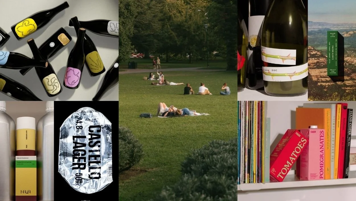
The Wine Aisle
I took wine classes in college (best semester ever) and once did tastings for a restaurant opening. The labels that I had always assumed were free rein opportunities for art turned out to be something much more considered. Unbeknownst to me, every wine has a story, and the label is where that story is distilled into a single image, often packed with history and meaning in a very small space.
I love the Lan bottles with their little space to write the time you opened the bottle and a note about the moment, the environment, and who you were with. A wine that builds in documentation of your own experience with it (I’m definitely recycling that idea for a brand I’m working on right now, FlyBoy). I love the scrapbook collage energy of 8 Years in the Desert, the illustration and layered meaning of Es Okay, the playfulness of Kid Sister, the funk of Good Boy, and the easy warmth of Ercole. Each one is a small world.
What the wine aisle teaches you practically is how two-dimensional design wraps a three-dimensional object, how typography has to work at different reading distances, how color and print technique interact when you can actually hold the thing in your hand. You’ll learn more about hierarchy and visual accessibility in twenty minutes in that aisle than in most design articles.
YOUR HOMEWORK
Next grocery run, give yourself ten minutes in the wine aisle with no shopping agenda. Pick up three bottles with labels that catch your eye and look at them the way you’d look at a client’s brand. What’s the story? What is the design doing to tell it?
Honorable Mentions:
Museums. Duh. Art is everywhere, and the collection presentations are usually interesting applications of design.
Hotels. Hotels feel like the happy medium between museums and homes. They (the good ones) are painstakingly curated, with a specific feeling they aim to evoke and a specific type of person they aim to attract. It’s where architecture and interior design can take risks, while also creating a space that feels like a second home.
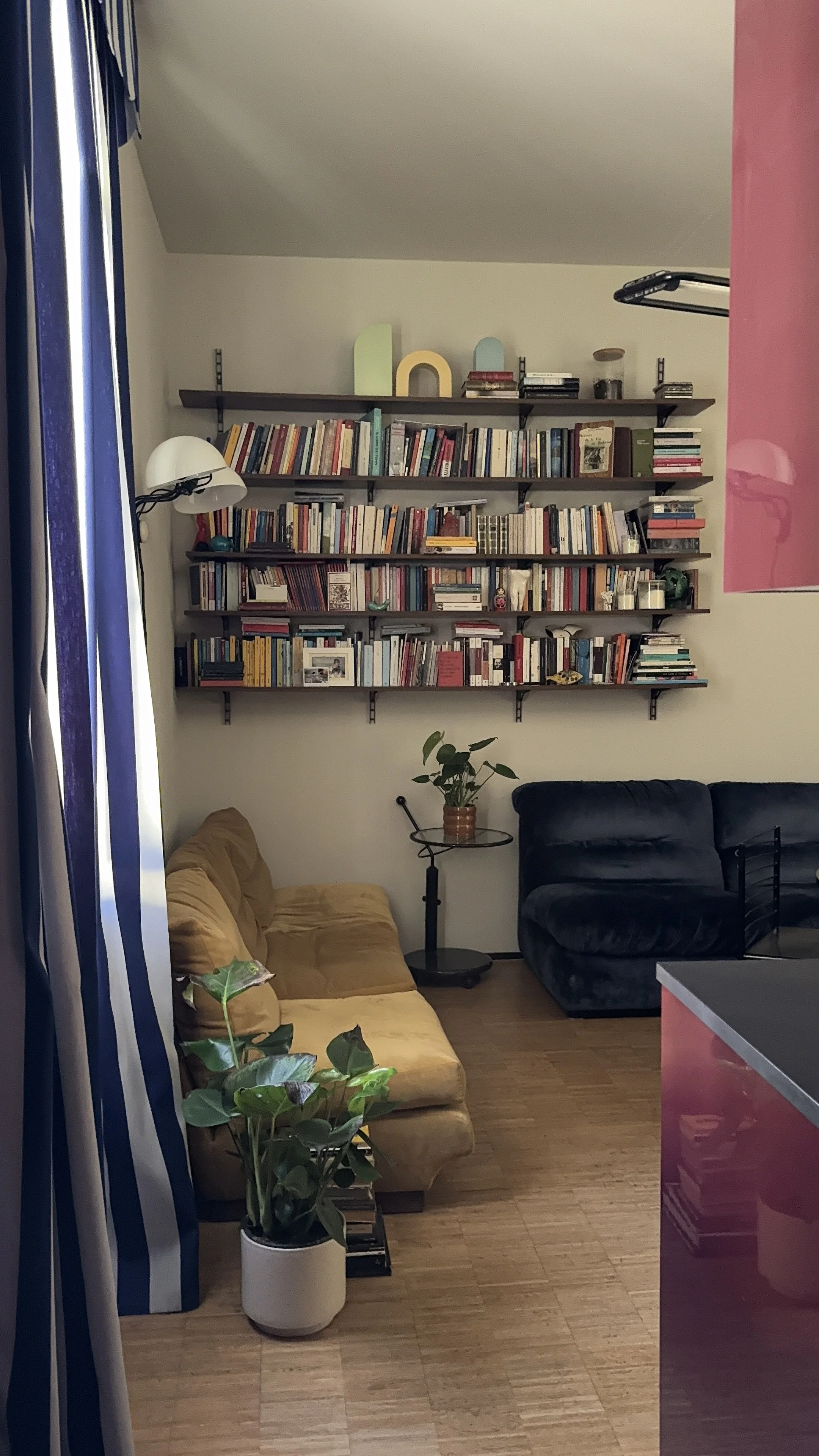
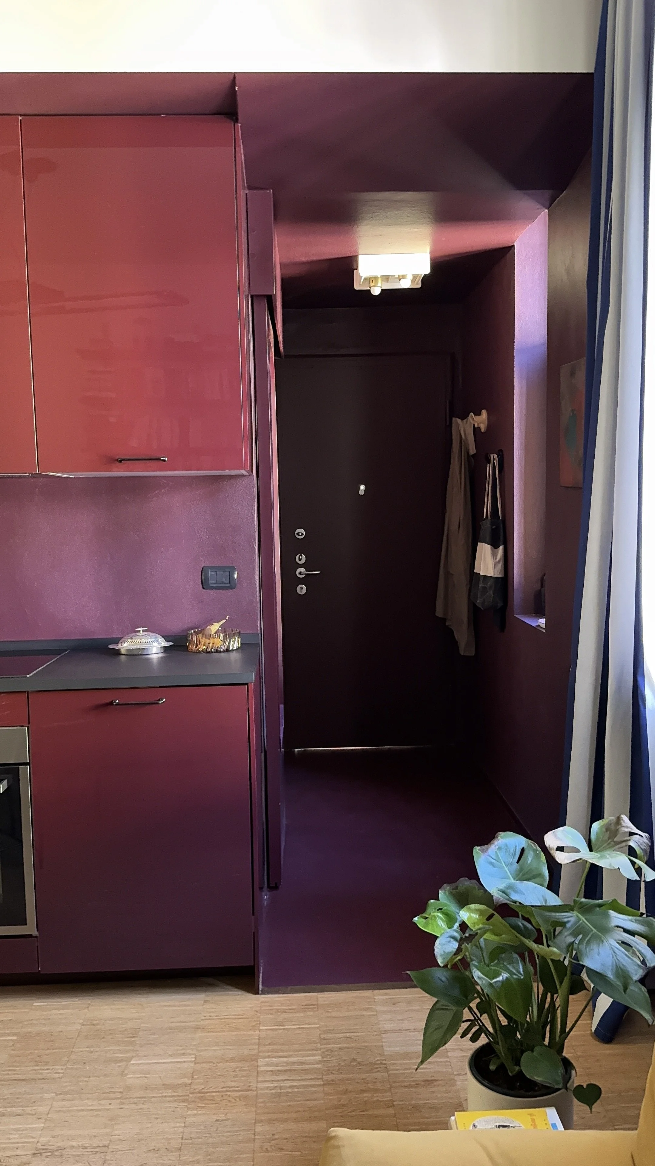
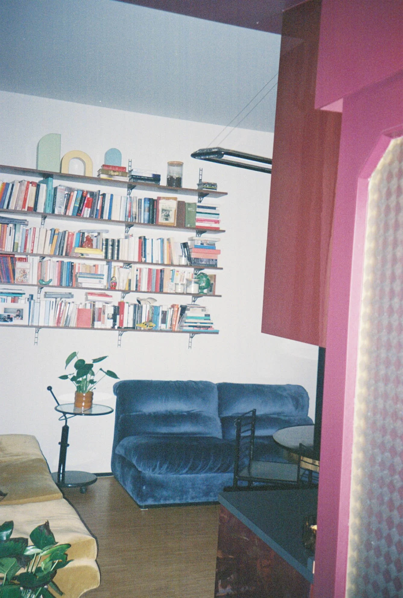
Other people’s houses. Looking at how people live, how they pile books, how they organize objects, what colors they use and how, the balance of practicality vs. decoration. It’s always an interesting study in how to evoke personality through color (in an inhabitable way). Like, neon yellow walls would drive you crazy, but a hit of neon in the bookshelf is so intriguing.
Clothing stores. Especially ones with a distinct POV. Nude Concept, Christy Dawn, Buck Mason, and Zimmerman all have unique worlds that you get to step into when you walk into the store. Next time you’re window shopping, window shop for inspiration for future projects.
None of these places will hand you a finished concept. That’s not what they’re for. What they do is build a private library of references that are genuinely yours, collected over time from places that had nothing to do with design and everything to do with being a curious, attentive person moving through the world.
“If you mimic what’s modern, your work will one day look dated. If you pull from history, it never will.”
The further you get from the screen, the more original the work tends to be. Now go find something!
Class Dismissed.
Now I want to know, where do YOU find inspiration? These are my go-tos, but I’d love to hear where you collect and curate. Add it to The Collective chat.