

Your Mood Board Might Be Lying to You
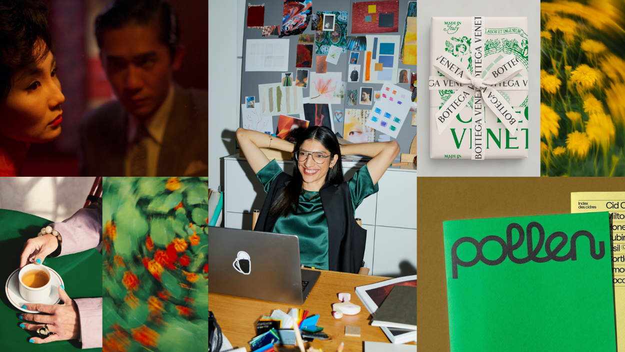
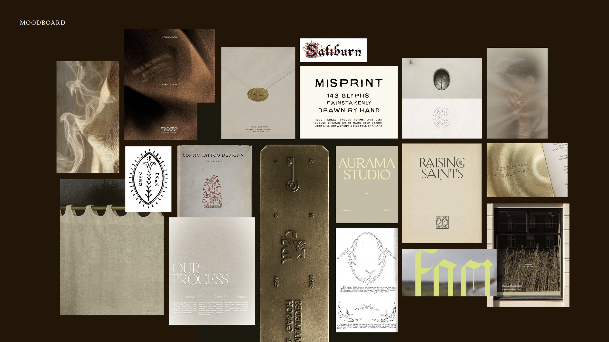
A few weeks ago, I was building a moodboard for an upcoming women's conference. The organizer had given me a single word as her creative anchor: altar. And I went all the way in. Old-world gothic imagery. Scans from a book (literally titled Celtic Tattoo Designs) that I'd been sitting on for a month, waiting for the right project. Light ceramic textures. Illuminated manuscripts. I was genuinely jazzed about where it was going.
Then I went back to my notes from the kickoff call.
She’d said, clearly, that she wanted the theme to lean modern, dark, and moody, with light accents that emulated “the flicker of hope.” What I had pulled was the opposite: old-world, distressed, all creams and parchments. No darkness. No modern tension to balance it. I had gathered a moodboard that answered the word altar the way I heard it, not the way she’d described it.
I tossed half the board and started pulling in different references. Darker ambiance. More contrast. I kept some of the Celtic imagery—the pared-back versions, not the ones I’d originally been most excited about. When I presented it, she had next to no revisions. She loved the old-world touches, and the project moved fast. Success!
But before I edited that moodboard, I had almost shoehorned my design ideas into her project. The only thing that stopped me was going back to my notes. Thank God I did.
The Brief Is the Only Filter That Matters
The problem with moodboarding isn’t that you choose images you love. Great design often comes from the marriage of beautiful, unexpected references. The problem is choosing images before you’ve fully sat with what the client actually said…and then convincing yourself it all works anyway.
We’ve all done it: gathered things that excite us, references we’ve been saving for months, and arranged them until the board looks incredible. Then glanced at the brief and quietly hoped it still applies (or that they had forgotten what they said). Sometimes we can make it work. Sometimes we can BS a beautiful faux explanation for why we did what we wanted to do. But somewhere in the back of our minds, we still know it wasn’t the best solution. And here’s the thing: the client can usually tell something is not aligning, too. Not always in the moment…but the revision rounds will tell you.
"A good moodboard isn't a group of things that feel right.
It's proof of decisions you've already made."
Every image should connect back to something the client said: a word they used, a quality they described, a feeling they want, a competitor they want to avoid. If you can’t make that link, save it for another project. Or save it to a folder on your desktop or a secret Pinboard and stare at it later. That Celtic tattoo book isn’t going anywhere.
The order you work in matters, too. Start with the brief. Spend time with it until you’re sure about your direction. Then find images that support the choices you’ve already made. The brief isn’t something to check at the end; it’s the filter you work through the whole time.
Pull From Everywhere…Except Design
I listened to a podcast conversation between Kelly Wearstler and Rick Rubin this morning, and I couldn’t stop thinking about moodboards and POV the whole way through. (Rick Rubin keeps showing up in this newsletter. He’s earned his place.) Wearstler said her designers aren’t allowed to use contemporary reference points. If they’re making a glassware line, they look at jewelry. If they’re making a chair, they look back 80 years. Her theory: how can you make anything interesting if you’re replicating what already exists right now?
Her own work is informed by the way a garment is sewn, the pattern on a vintage tie, the glimmer of costume jewelry, the smell of rain. She blends print, digital, art, photography, furniture, and fashion, knowing that a well-rounded POV is where the interesting work actually starts.
If you only pull from Behance/Muzli/Pinterest and branding archives, you're starting every project inside someone else's ideas (P.S, everyone else is using that same inspo pic, too). Look beyond pure graphic design. Browse the grocery store aisles and wine shops to discover interesting packaging. Go to the library or bookstore and flip through the CD album covers. Take a look at film stills, architecture, textiles, and colors in nature. Sometimes a photo of light on a couch says more about a brand's feeling than any logo ever could.
Emotional vs. Literal, And Why You Have to Say Which Is Which
Not every image on a moodboard is meant to be taken literally. Some are there for color. Some for texture, or the mood a certain quality of light creates. If you don’t tell your client this, they will misread it every time.Early in my career, I watched this happen at a studio I worked at. We’d built a moodboard for a wedding coordination brand—elegant, intentional, every image carefully curated. One of the references had gorgeous script typography, exactly the style we were planning to use for the logo. But the poster it was on was for Wu-Tang Clan.
The client could not get past it. The whole presentation derailed into an explanation of why Wu-Tang was on the board for her wedding-coordination business. The actual concept got lost. We reworked the moodboard twice before getting approval, and by then, we’d spent time we should have spent designing.
Now I present the moodboard alongside the design direction, not before it. The images become evidence that the concept is grounded and intentional. Instead of clients approving references, now they’re seeing proof that you were listening. When you do walk through a board, say the quiet part out loud. “This is here for the warmth in the color palette…please ignore the actual objects.” “Pay attention to the light in this one, not the typography.” These small clarifications do a lot of work. They remind the client that there’s method behind what they’re looking at, and they keep the conversation where it belongs: on the bigger picture.
Build It. Then Edit It.
The first version of your moodboard is just for you. Cast a wide net. Trust your instincts even when it gets messy. Then stop, step away, and read the brief again like it’s new.
Go through every image and ask yourself why it’s there. If the only answer is “I like it” or “it goes with the others,” remove it. If it connects to something the client said, or to a direction you’ve already decided to go, you can keep it (yippee!).
This is the editing step. It’s where the board stops being a mood and becomes an argument. A focused, ruthlessly edited board is almost always more persuasive than a beautiful collage of things. It shows conviction. Clients respond to conviction.
And if you can, print the images out. Tape them to a wall. Move them around until the relationships between them make sense in a way that's hard to see on a screen. The screen is what the client sees. The wall is where you figure out what it actually is.
Please don’t overwhelm your client with an evidence-board, though
The reframe worth holding onto: a moodboard is an argument for a direction, backed by evidence, anchored in what the client told you they needed. When every image has been edited against the brief and presented as context rather than a question, clients can’t get lost in the details. They see that you were listening. That you built something intentional. That you have convictions about where the work should go.
Building that trust, before you’ve shown a single logo or color palette, is what actually gets clients on board.
Class dismissed.
This week's homework is to start asking yourself the hard questions. Get introspective with your design process. Reflect on the questions in this post and the previous post on POV (read it here if you missed it), and get locked in on what your POV actually is. As always, I’m more than happy to chat and help you figure this out in The Collective chat.